Enabling teachers to assess pupil, class and school performance
At a glance
B Squared is an entire suite of EdTech products, comprising an assessment progress system, learning evidence repository, and reporting & analytics platform which measure and assess a range of schools, pupils, curriculums and subjects.
Full Clarity were hired to help with a major overhaul of the legacy version of the platform, responsible for improving the UX/UI design and frontend development of the various applications. Our main goal was to make the platform modern and intuitive, reducing frustration and helping the value of the product shine through.
This project offered a great opportunity to apply our expertise in EdTech UX and EdTech UI design, helping to raise the standard for usability in educational software.
Project type
Sector
Technologies


Project length


Ed Kemp
Ed provided the UX strategy, starting by identifying the shortcomings of the legacy applications and considering user feedback.

Jon Hewines
Jon provided technical leadership for the project, selecting suitable tools and informing the design process in terms of feasibility.

Rose Kelly
Rose helped design the applications, creating wireframes, UI elements and a design system shared across the ecosystem.

Terence O'Donoghue
Terence built the apps using React and Redux, and also provided advice and guidance to the client on their Azure cloud migration strategy.
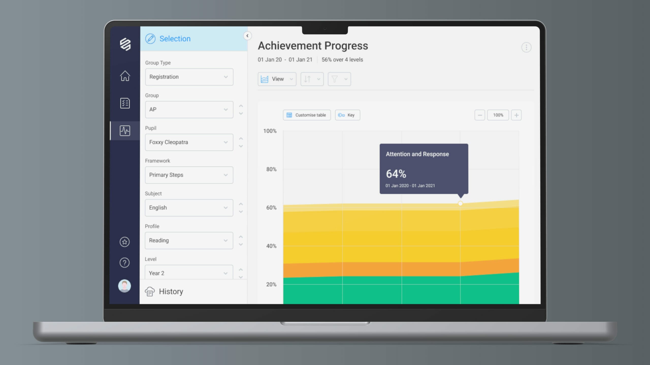
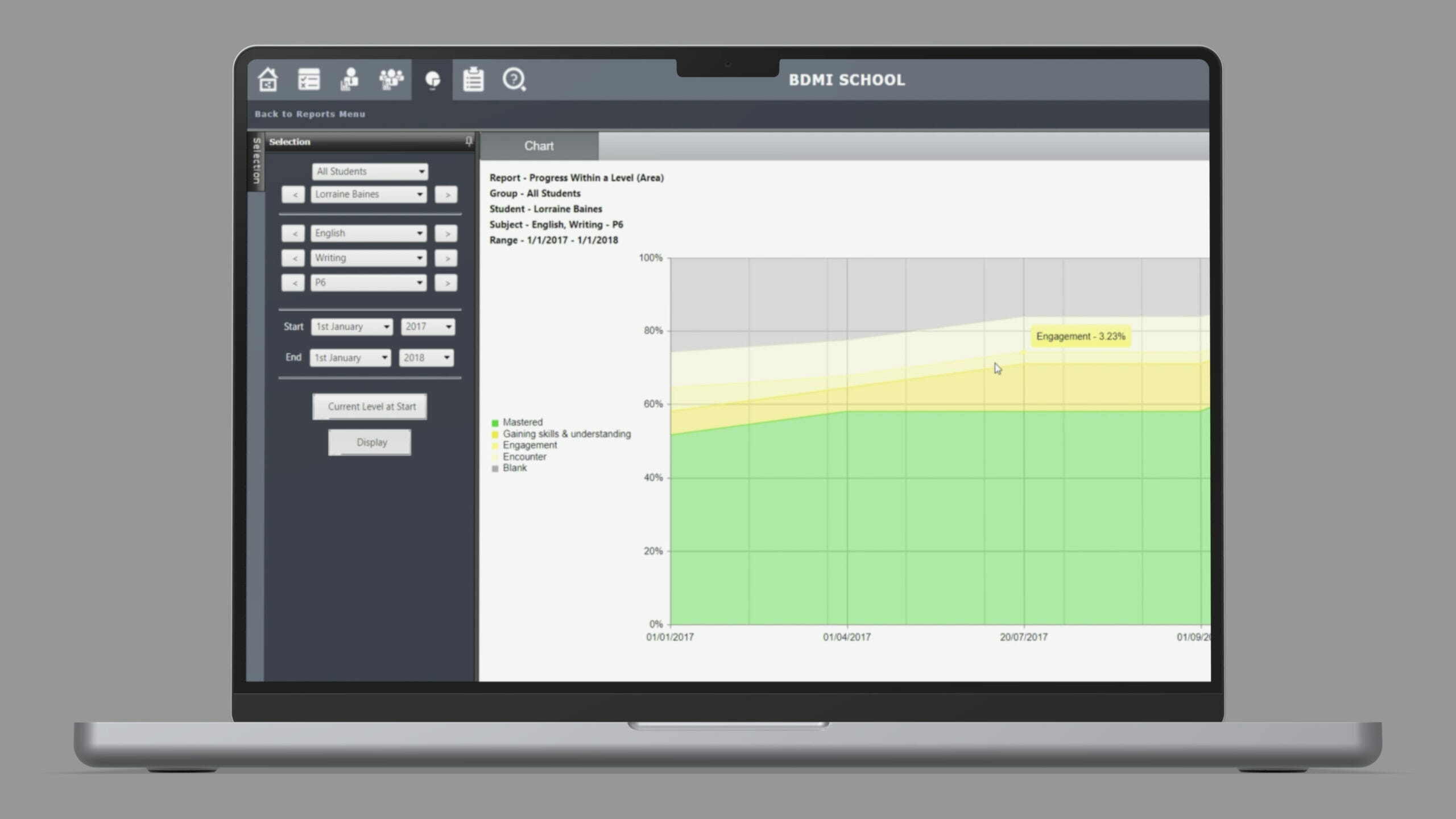
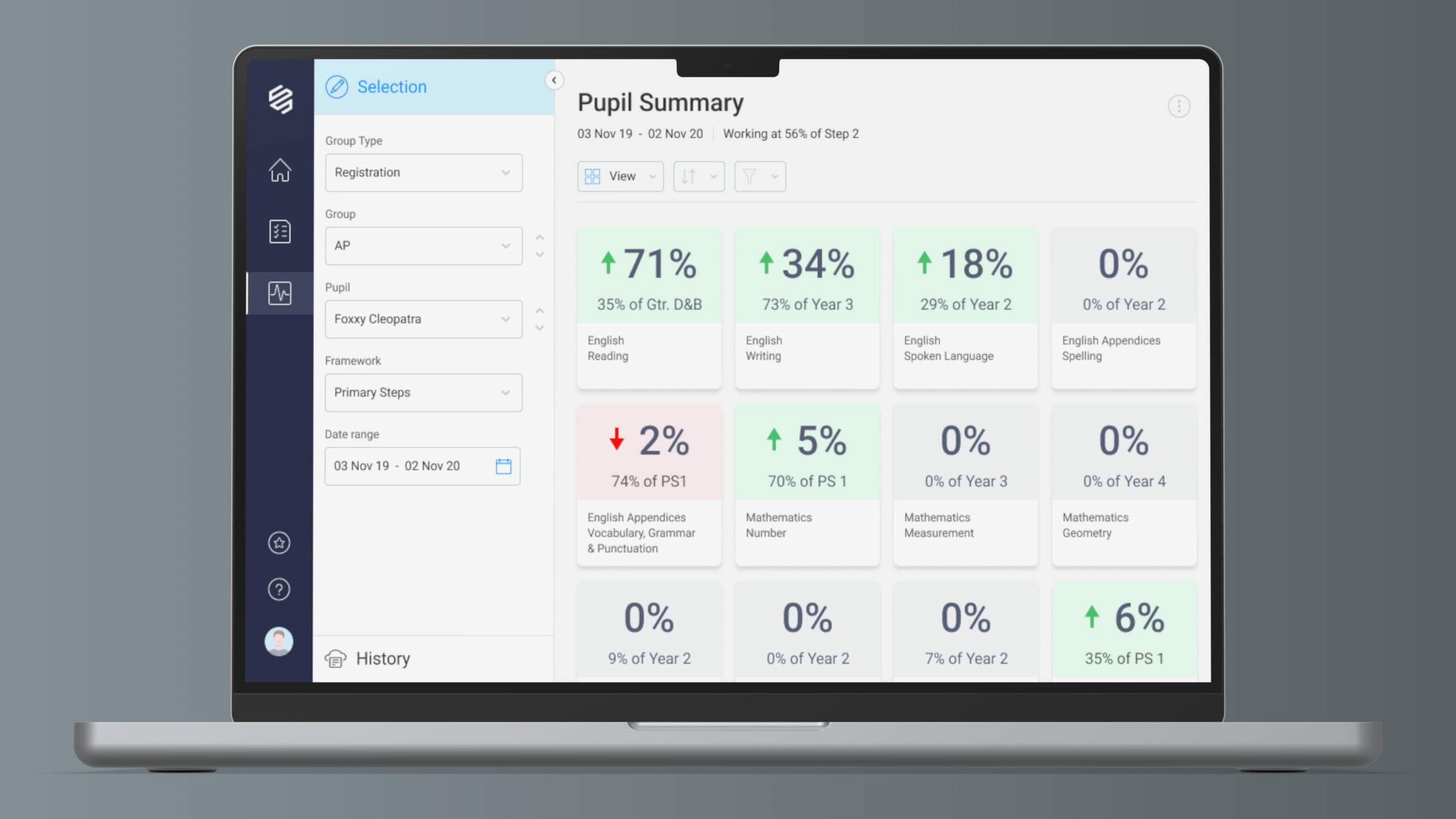
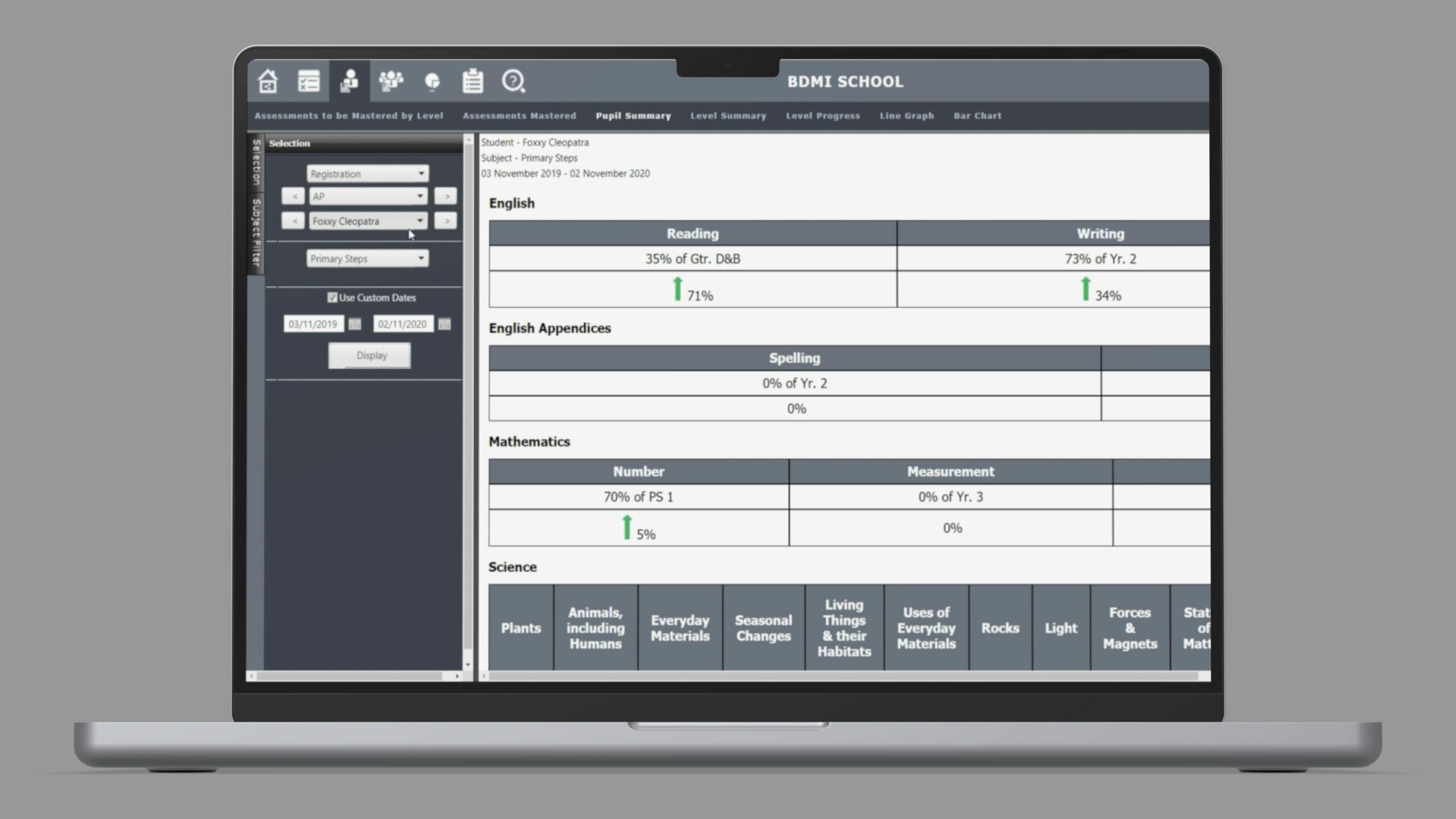
Presentation of learning data
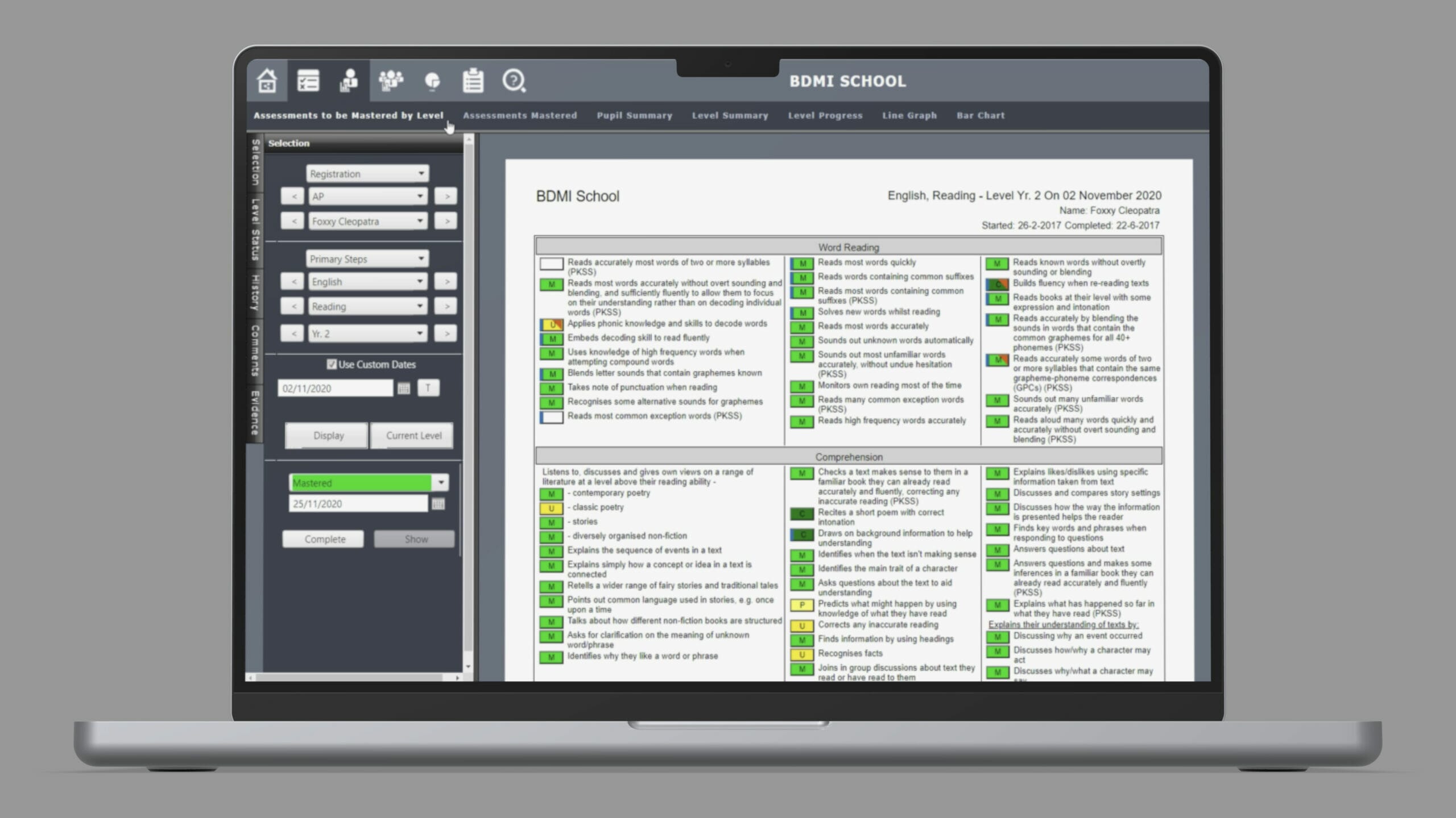
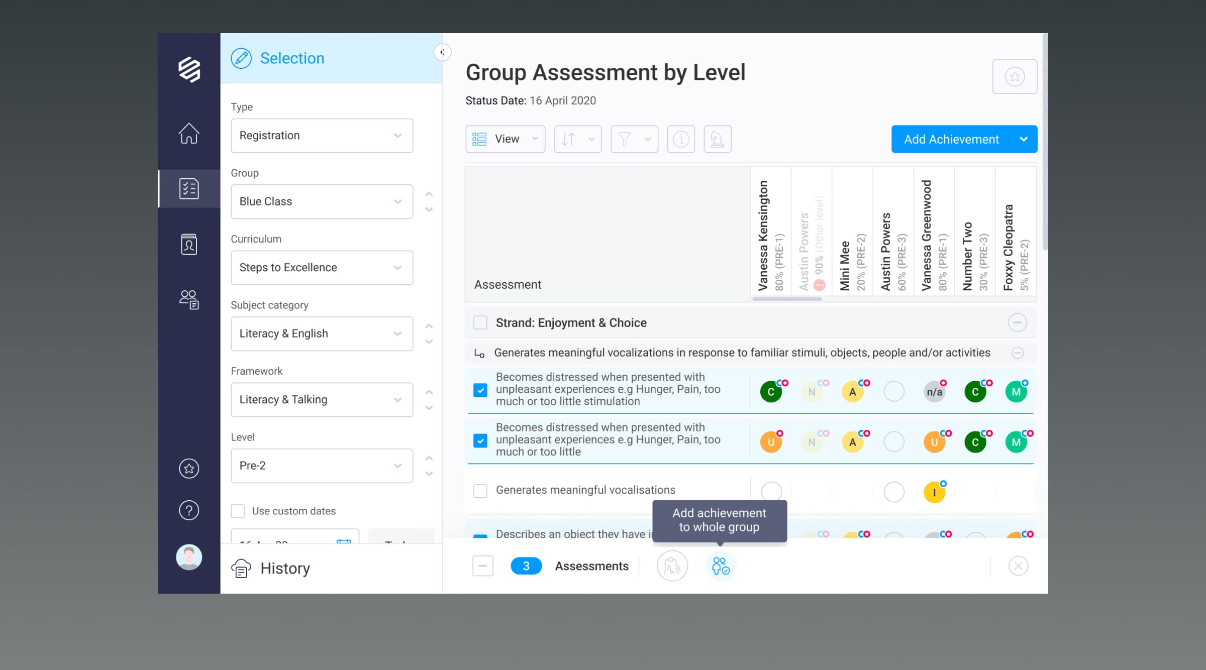
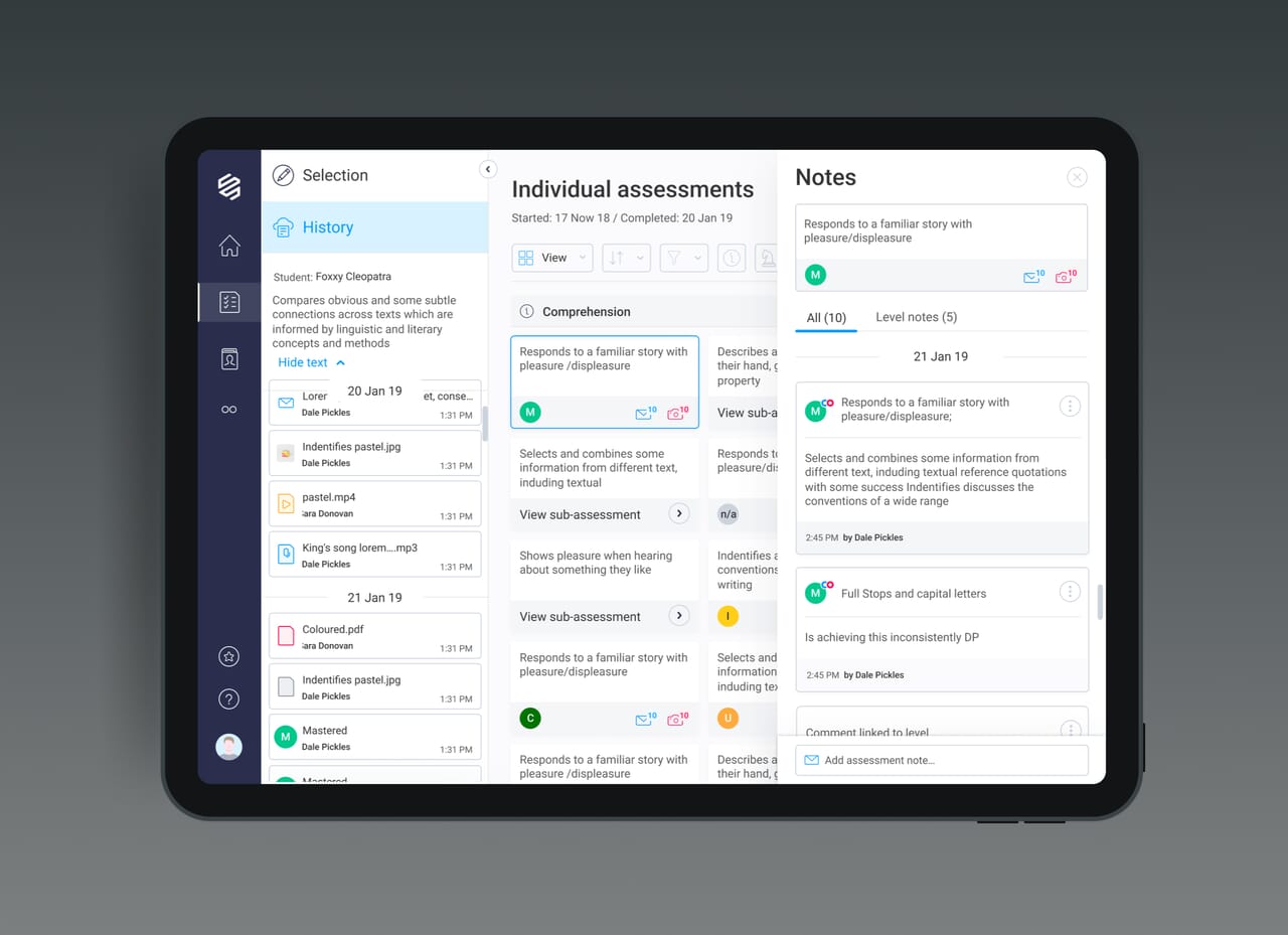
The application had a number of deep levels of content. Primarily there were ‘steps’; underneath the steps were ‘strands’ (of which there could be up to 20 on each page); and within each strand there were ‘assessment points’. In addition to this deeply routed information, some assessment points also had ‘sub-assessment points’. We therefore had to design an information architecture and navigation system which enabled the user to drill in and drill out, in a way which enables them to collapse and expand different strands and assessment points.
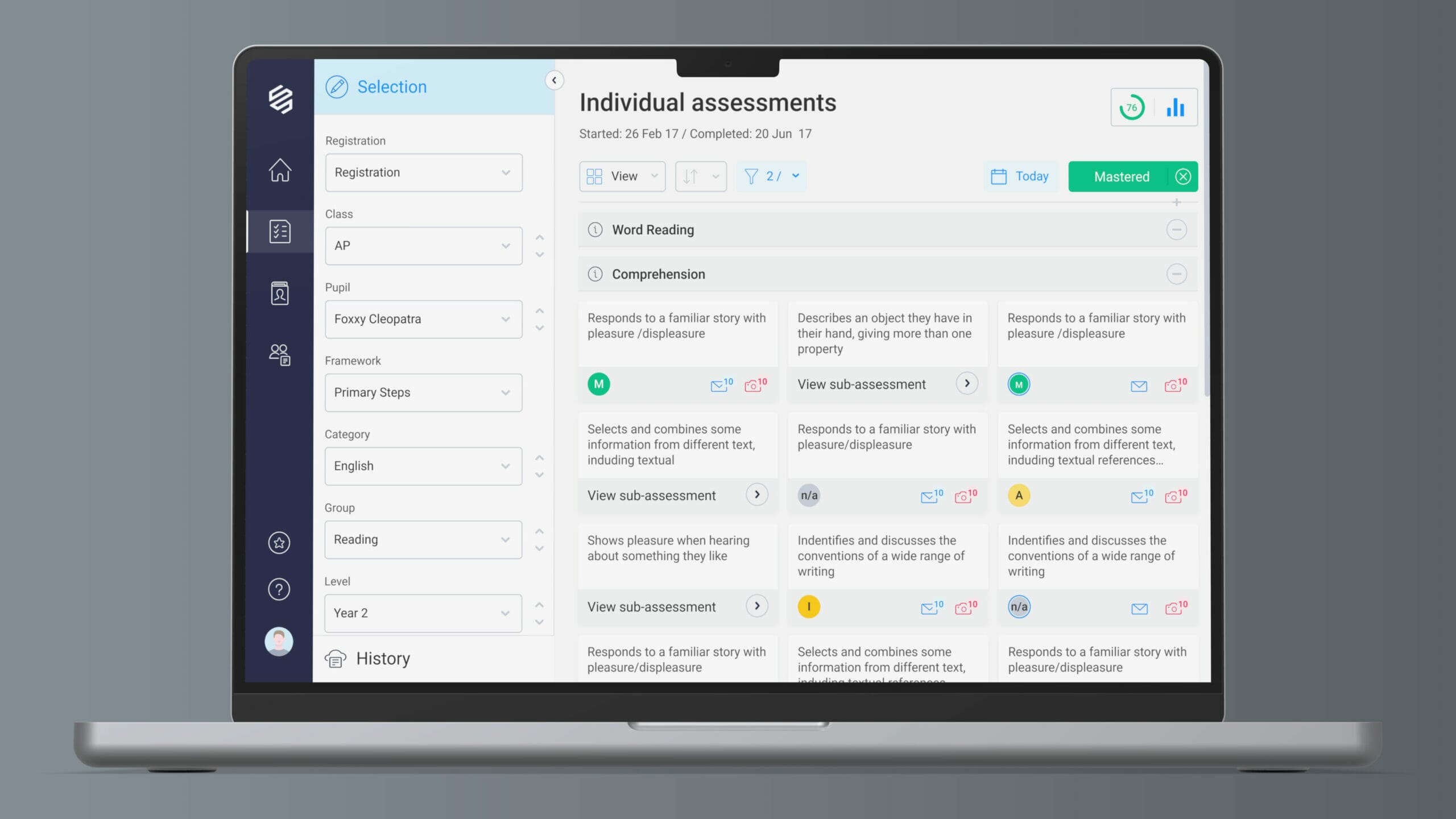
Improved usability and navigation
We identified that using better iconography and clearer labelling would assist in the overall user experience. We introduced a clearer colour scheme whilst keeping the very familiar RAG ratings (Red, Amber, Green) which users found helpful and intuitive. As there was a large amount of rich functionality, it was important that the colours on this project all had meaning, and designing a consistent and relevant colour language was a huge improvement in helping users to navigate around. This work was a key part of enhancing the EdTech UI design, making a complex interface feel more accessible and structured.
Touch-screen friendly
Furthermore, the platform was originally designed for desktop use only, but the client specified the benefits for teachers of using a tablet. To ensure the software was user-friendly on a tablet, we had to consider clever ways to enable the content to pack down easily on narrower breakpoints. We also designed the product using increased touchable areas for larger fingers to make it easier to use on touch screen devices.
We also designed a way to enable the left hand side Selection Menu to show and hide to enable more display space for the right hand side assessments information which helped with the responsive tablet users. On top of this, we made use of hiding and showing content on scroll.
From user research, we knew that a common use case was updating data on a tablet when in the classroom, so we paid careful attention to responsive breakpoints and ensured interactive elements were designed for touch.

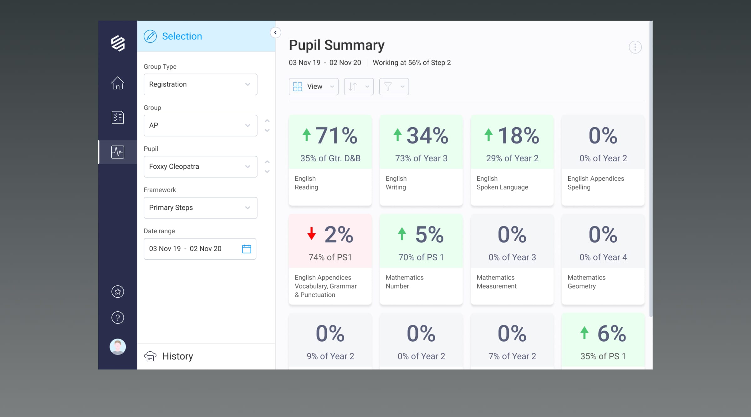
Comparing historical data
On the original platform, there were two date pickers that enabled the user to make a selection to step back in time to view the assessment in the past. Users highlighted that this action wasn’t clear so we did some work around improving this. It was an important feature, as it allowed users to go back in time to assess how the student used to perform, versus seeing their current performance.
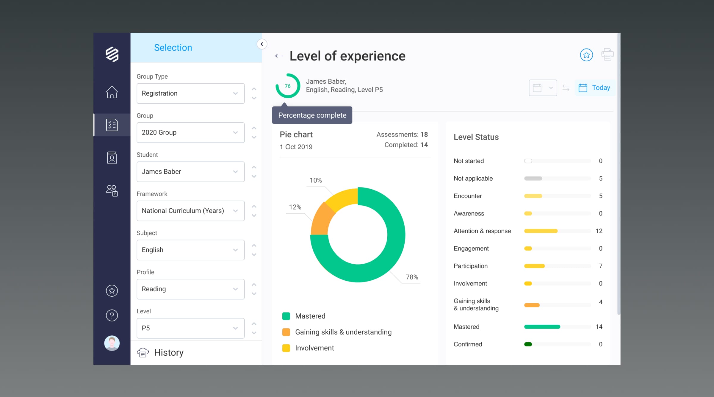
Date range
Although date pickers are commonly used, having two separate elements on the same screen is a complexity we hadn’t yet worked with. We broke down the action, by initially allowing the user to pick on a date in the selection menu. If the user then wanted to choose a second date to compare the results, they could do this in the panel above the assessments. This element was highlighted using a pattern which clearly represented a date range.
All of the previous issues with the speed and delays user experience of v4 have been addressed, the customers are delighted with v5. It’s like Apple who have spent money on the UX/UI, and it really shows. We did a speed test live with our customers in v4 and the old journey took 60 seconds, in the new version it was 20 seconds to complete the same actions so it is a lot faster which is down to a mixture of intuitive UX and making the development faster using better infrastructure.

Other client stories