Delighting customers with an AR Mirror experience
At a glance
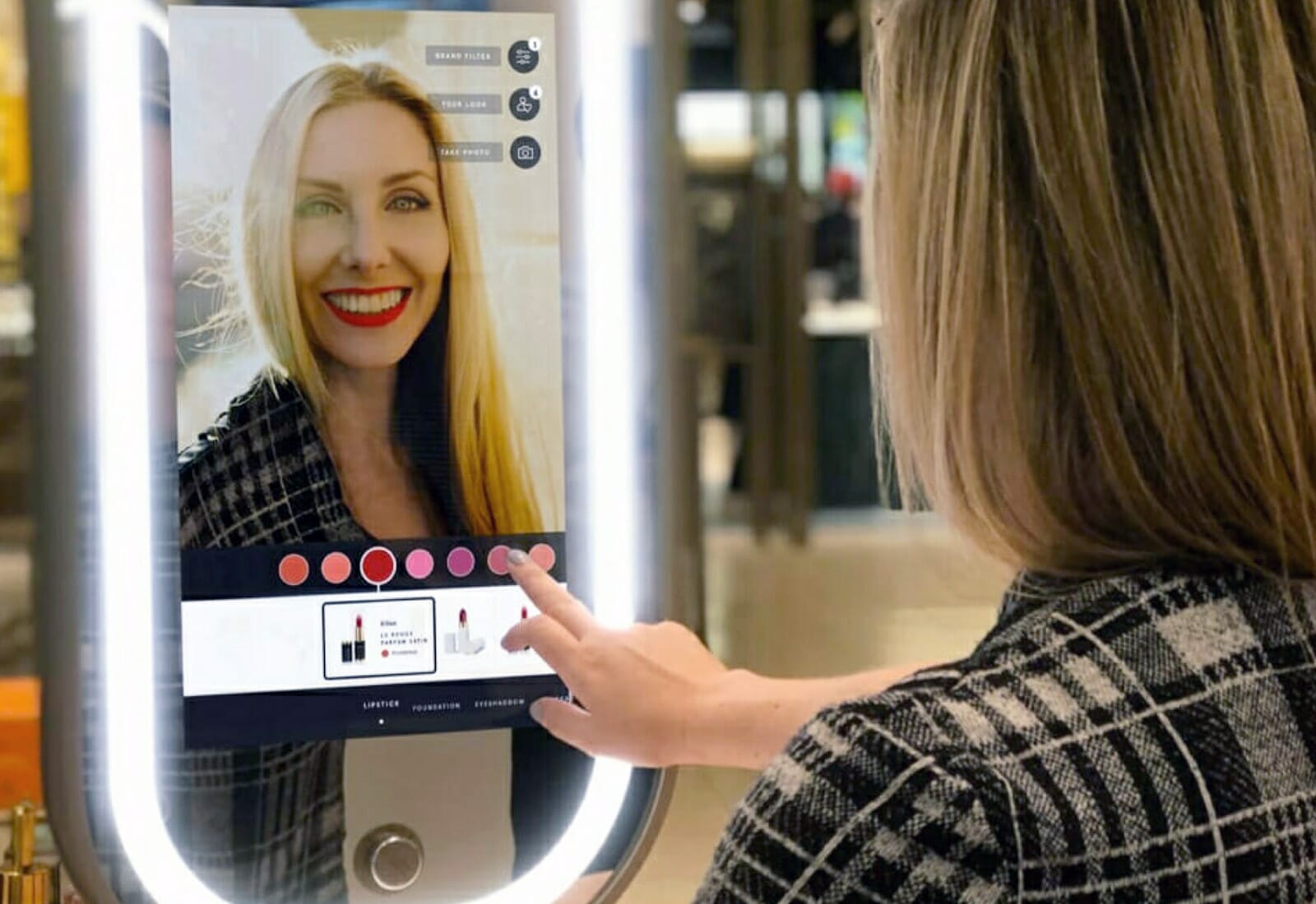
In March 2019, we were commissioned to develop a new, memorable AR Magic Mirror interface for a retail technology innovation project for one of the most famous department stores in the world, Harrods.
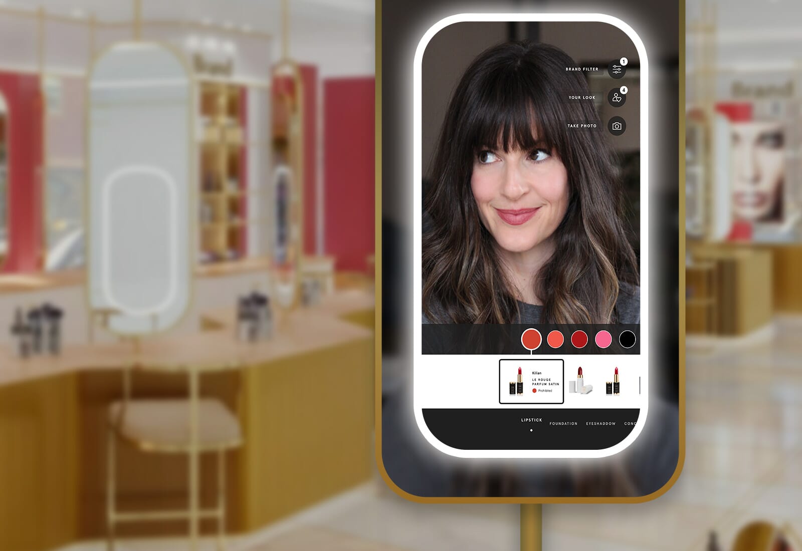
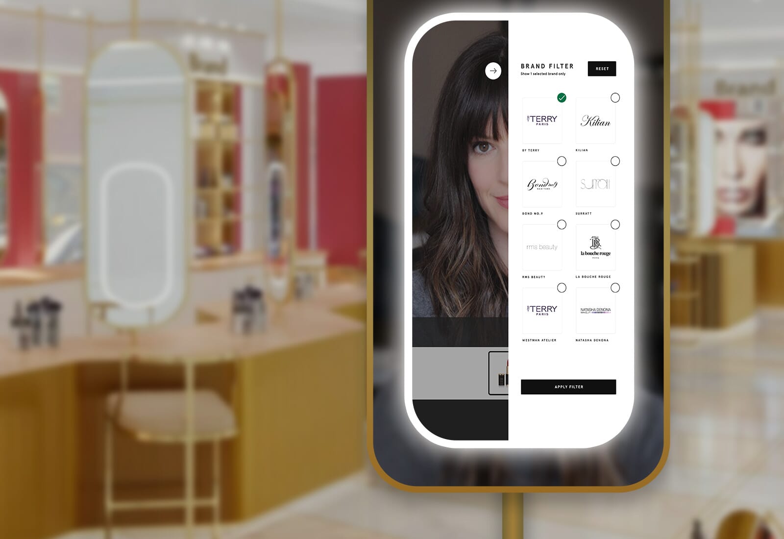
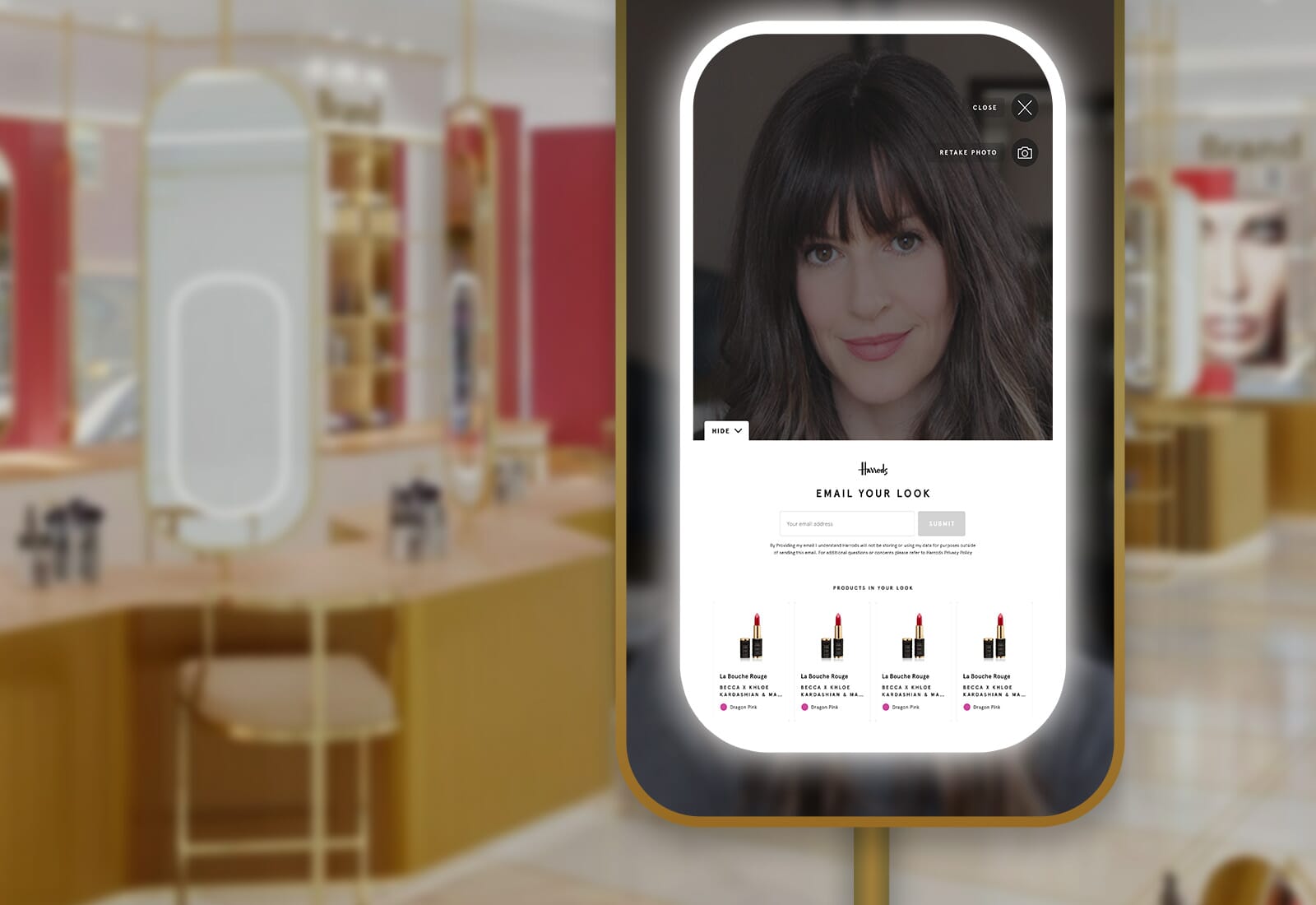
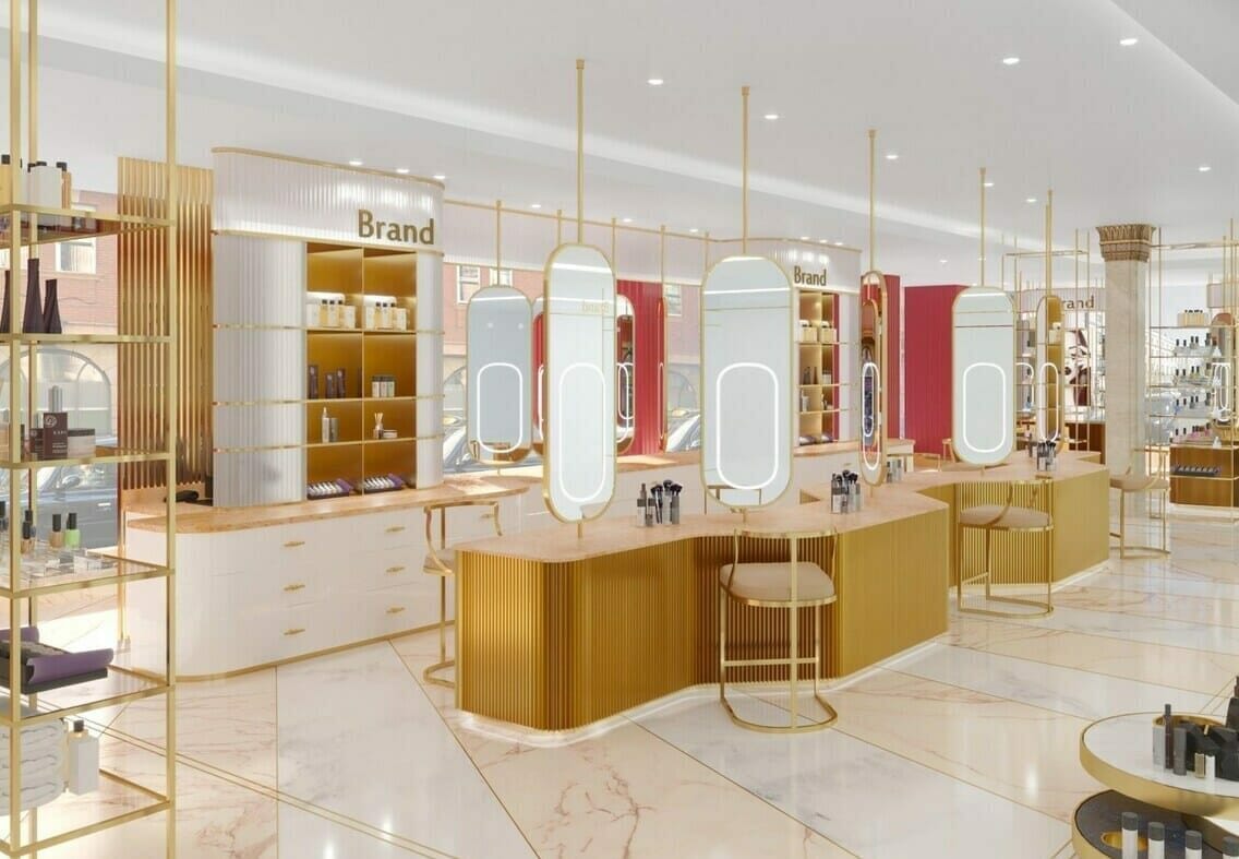
Harrods engaged Full Clarity to create an interactive ‘Magic Mirror’ AR experience for the beauty halls as part of a major in-store revamp to the iconic Knightsbridge store. The mirrors, using augmented reality technology, would provide customers all over the world with an interactive and playful experience that enables them to virtually try on different make-up styles, categories and brands. This AR UX design project helped Harrods deliver a cutting-edge, fun, and engaging experience.
Project type
Sector
Project length

Carli Glines
Carli was tasked with delivering a best-in-class customer experience for a magic AR makeup mirror makeup leaving users with a “wow” factor.

Mia Collins
Mia wanted customers to light up, for the mirror to be a real celebration of what beauty is all about: having fun and adding a bit of joy into their lives.

Mark Arnold
Mark oversees all the digital design output for Harrods and wanted to ensure the UX/UI work met the exceptional Harrods standards.

Stephanie Houle
Stephanie provided strategic insights and data-driven recommendations to assist with business processes and goals for the project.
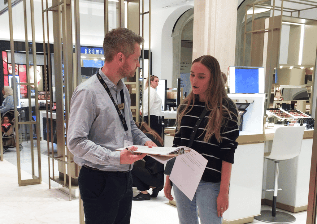
It was critical to understand who the users of the Beauty Halls were and the wider context, environment, and journey the customers were taking.
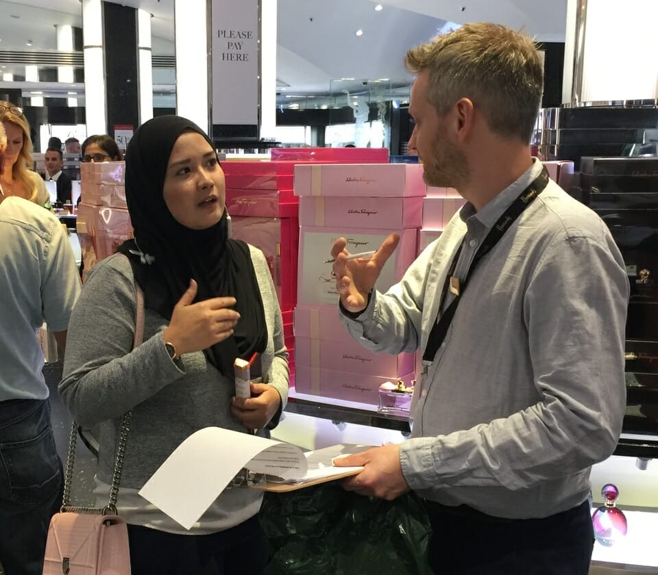
We conducted in-depth user interviews speaking directly with real customers in the Beauty Halls. We also did Ethnographic & Contextual Studies to understand and observe the environment the customers were operating in. Our user research strategy was based on spending time with real users in their environment and understanding their experience, emotions and motivations. Off the back of this work we were well informed to be able to create our personas and customer journey maps.
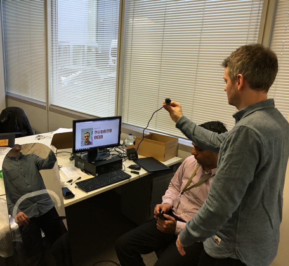
We also needed to understand the hardware and technologies we would be working with. So we travelled to meet the company producing the mirror hardware and software to see and interact with the physical mirror prototype.
Some of the considerations we identified through this were the responsiveness of the touchscreen, the quality of the camera being used and the light being generated from the screen. We were able to take away an early prototype of the mirror hardware which enabled us to mock up our designs and place in situation.
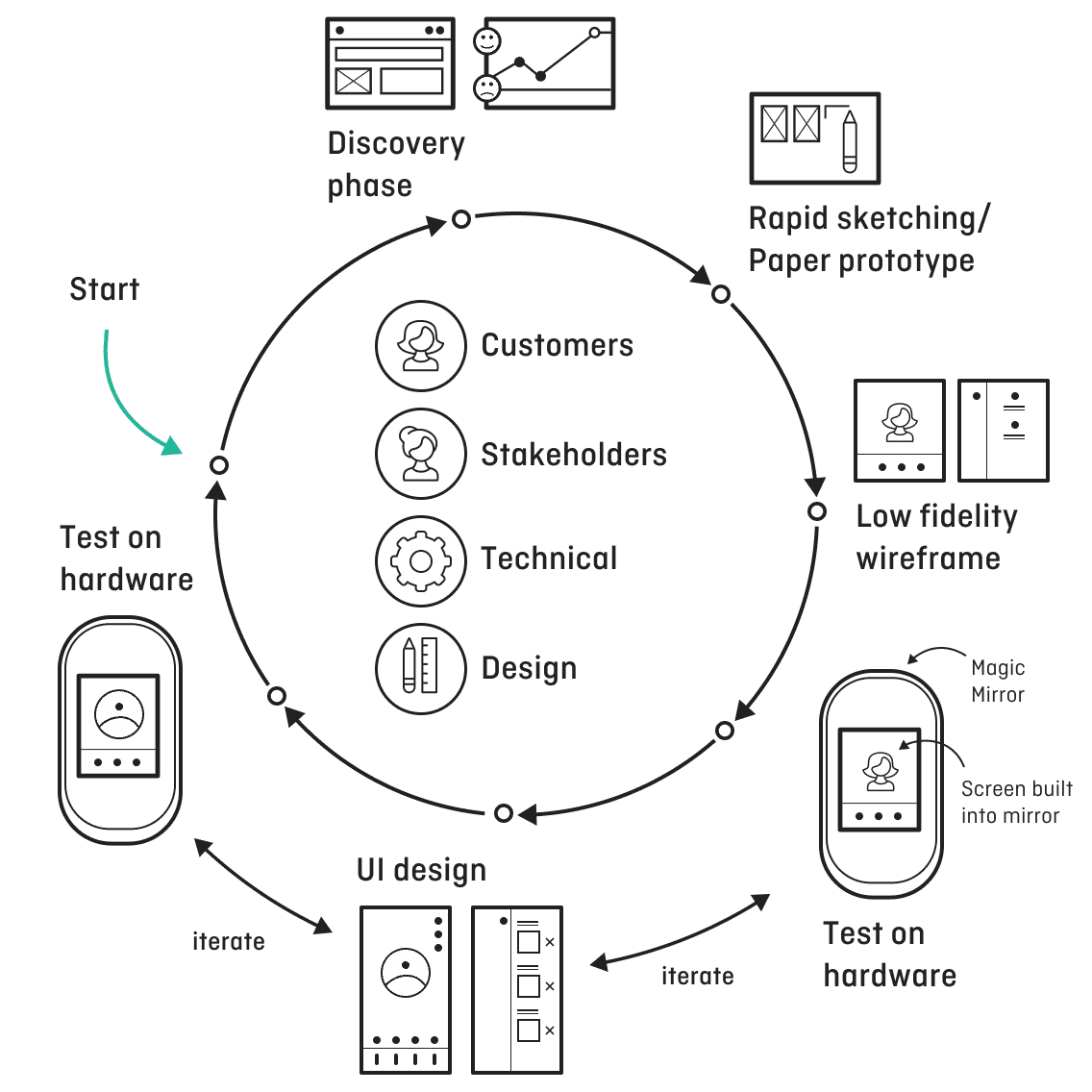
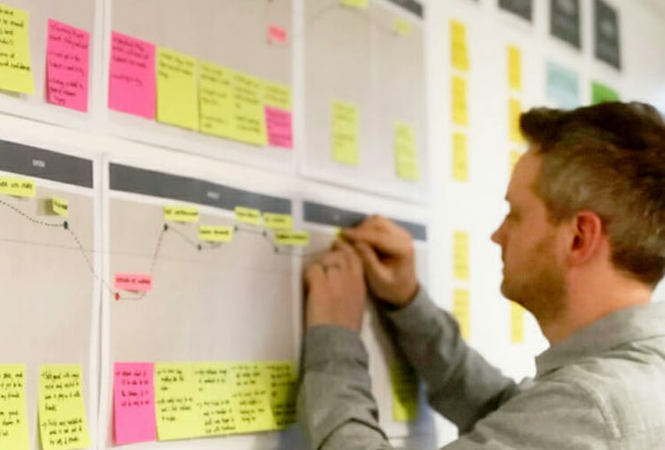
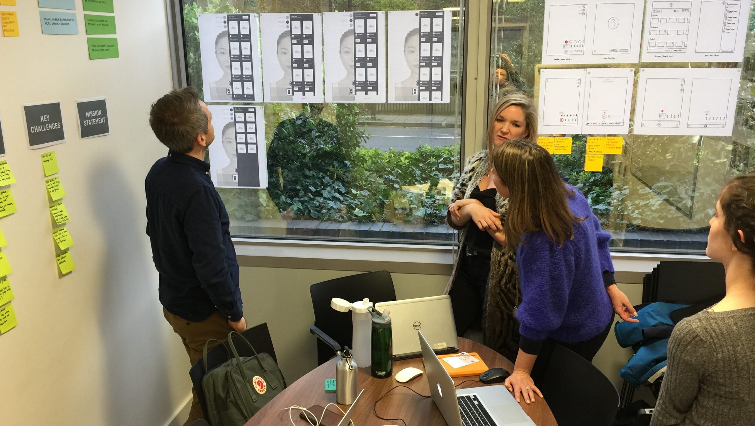
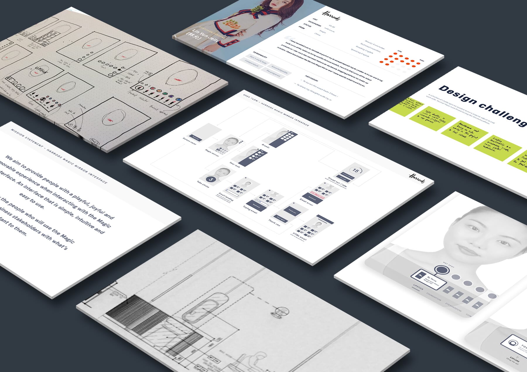
Next, we began the process of distilling our research, teasing out common themes, challenges and opportunities. We created detailed personas, user flows and customer journey maps to identify the touchpoints where we could remove friction and find opportunities to add moments of delight. This process created a firm foundation to inform our wireframes and UI design.
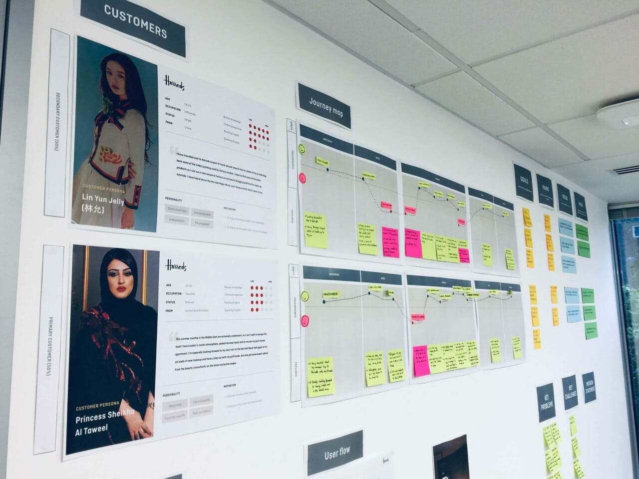
Full Clarity conducted extensive interviews, user research and onsite visits to the store, to ensure accurate and comprehensive user journeys.

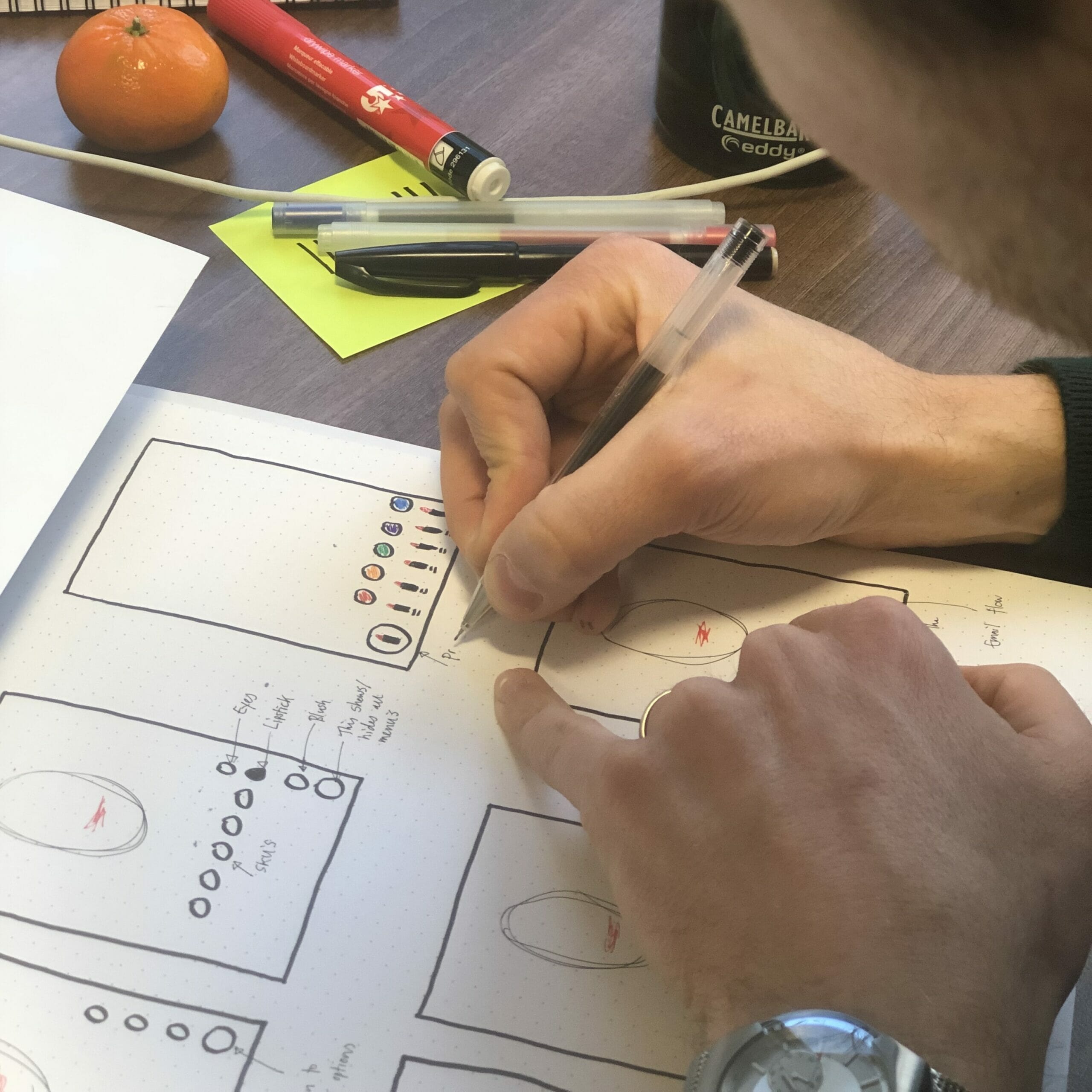
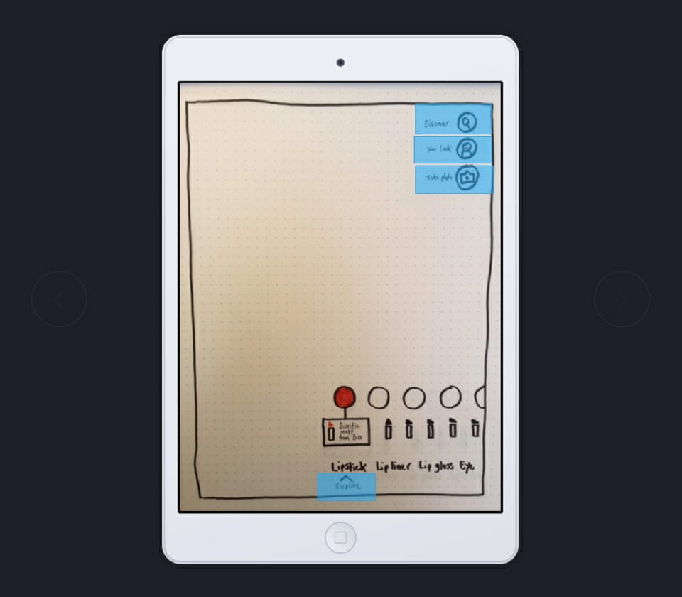
We began with sketches, paper prototypes and wireframes – constantly referring back to the insights uncovered during our research process. It was an iterative process which included regular validation through presentations to stakeholders and users. Once there was consensus that the designs would be both technically feasible and bring the desired sense of ‘magic’ to the project, we moved on to UI design.
Full Clarity provided a best-in-class customer experience for an Augmented Reality makeup mirror delighting in-store customers from a variety of cultural backgrounds. They conducted user research, interviews and onsite store visits with meticulous attention to detail during the process. Their high-quality end designs reflected the team’s willingness to provide a really top-notch service to Harrods.
Other client stories
