Empowering startup businesses with a suite of digital tools
At a glance
Over an 18 month period, Full Clarity designed a comprehensive mentoring software platform for business entrepreneurs. This platform features a suite of digital tools including, e-learning courses modules, live webinar events, a private social network, and robust messaging capabilities.
Our design enhanced mentor-mentee interactions, facilitated learning, and fostered community engagement, creating an integrated solution for business professionals.
Project type
Sector
Services provided
Technologies
Members lounge
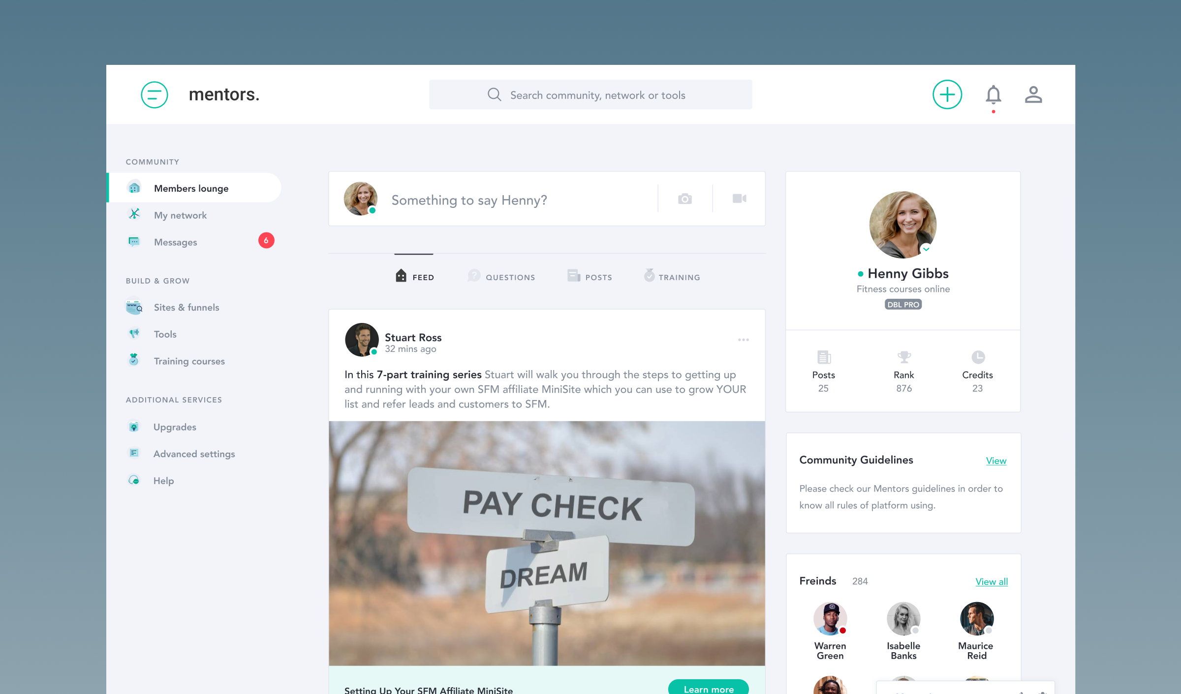
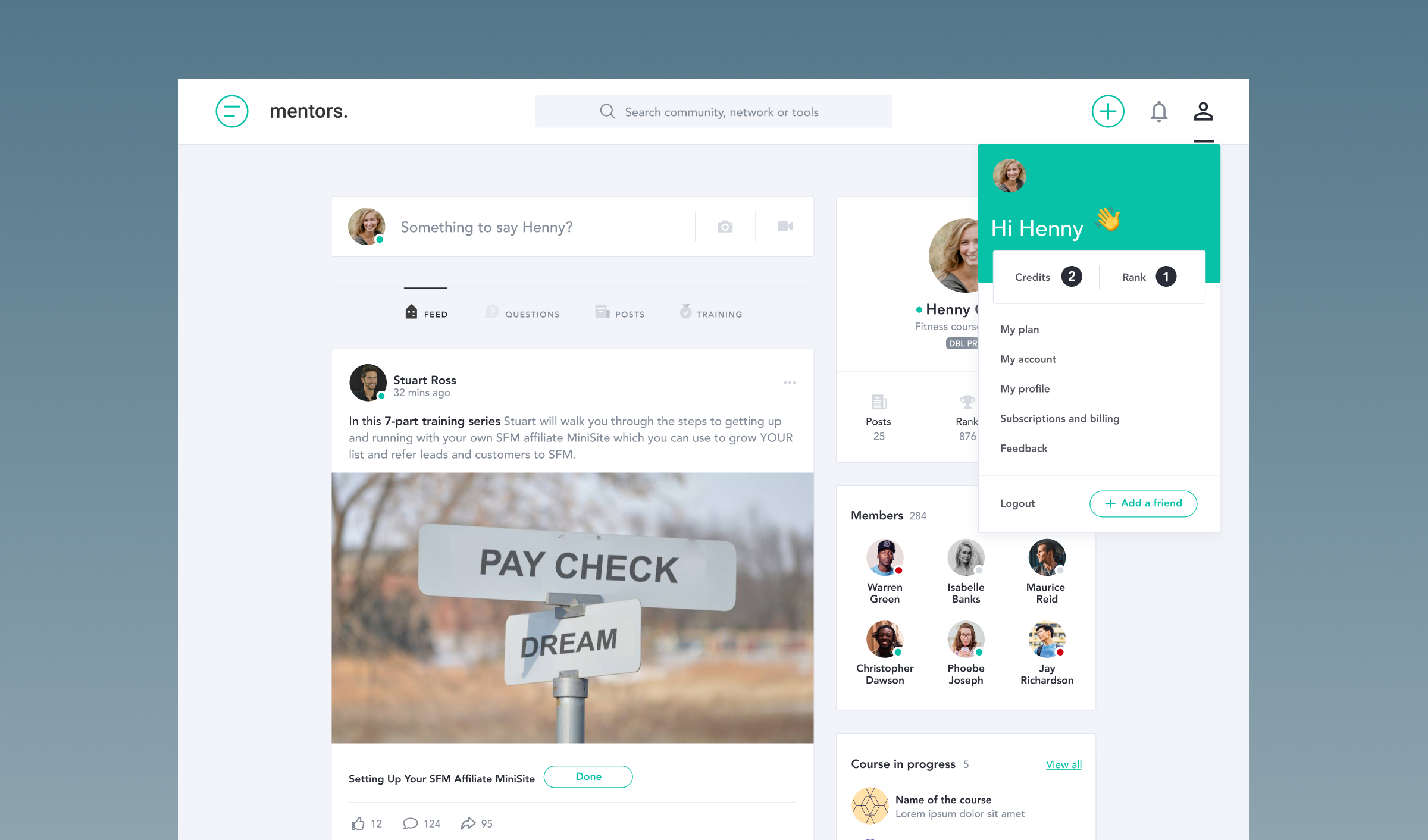
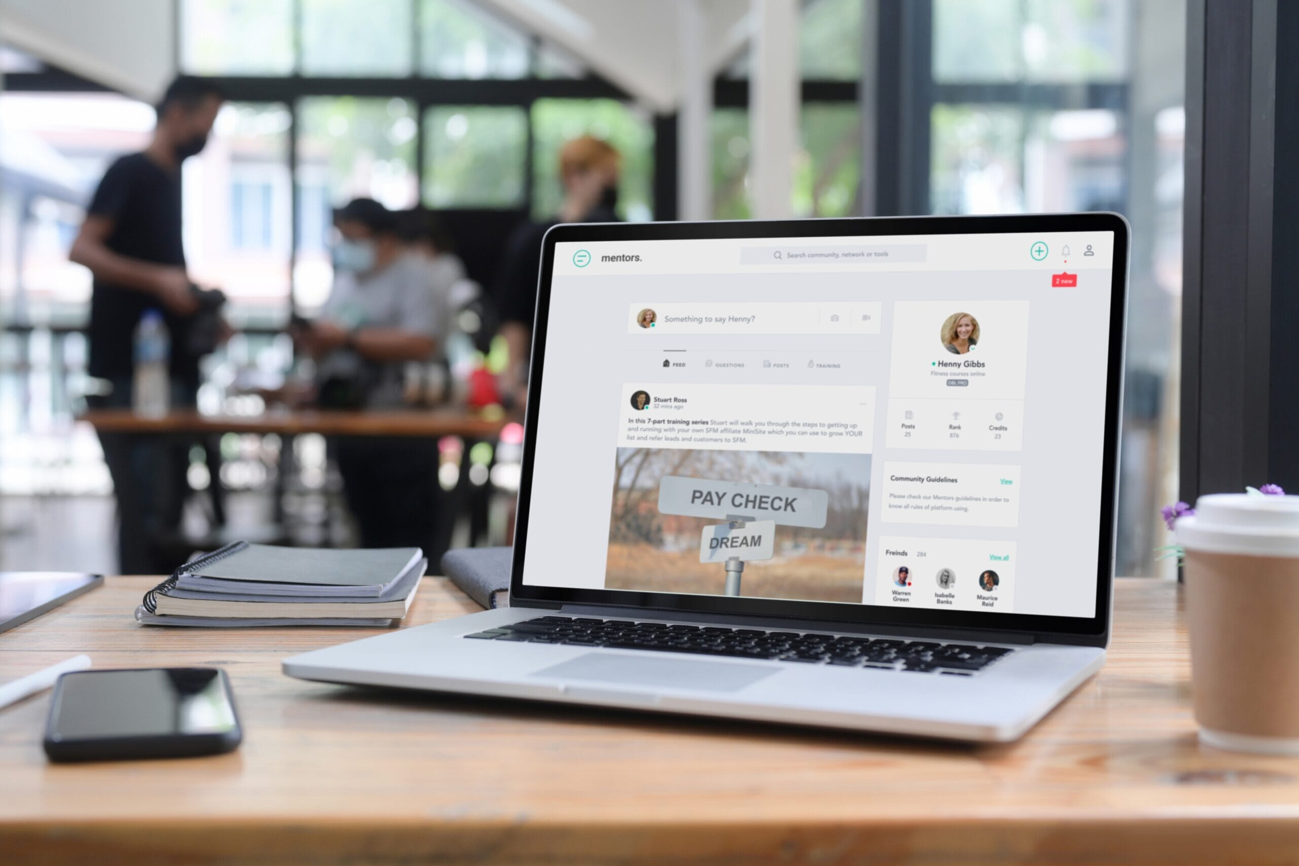
The core hub of the Mentors platform was designed to be a bit like a private social network with a familiar interface, similar to LinkedIn or Facebook. The main objective was to create an intuitive and familiar interface for business professionals seeking mentoring and development opportunities as they launched their new startup businesses.
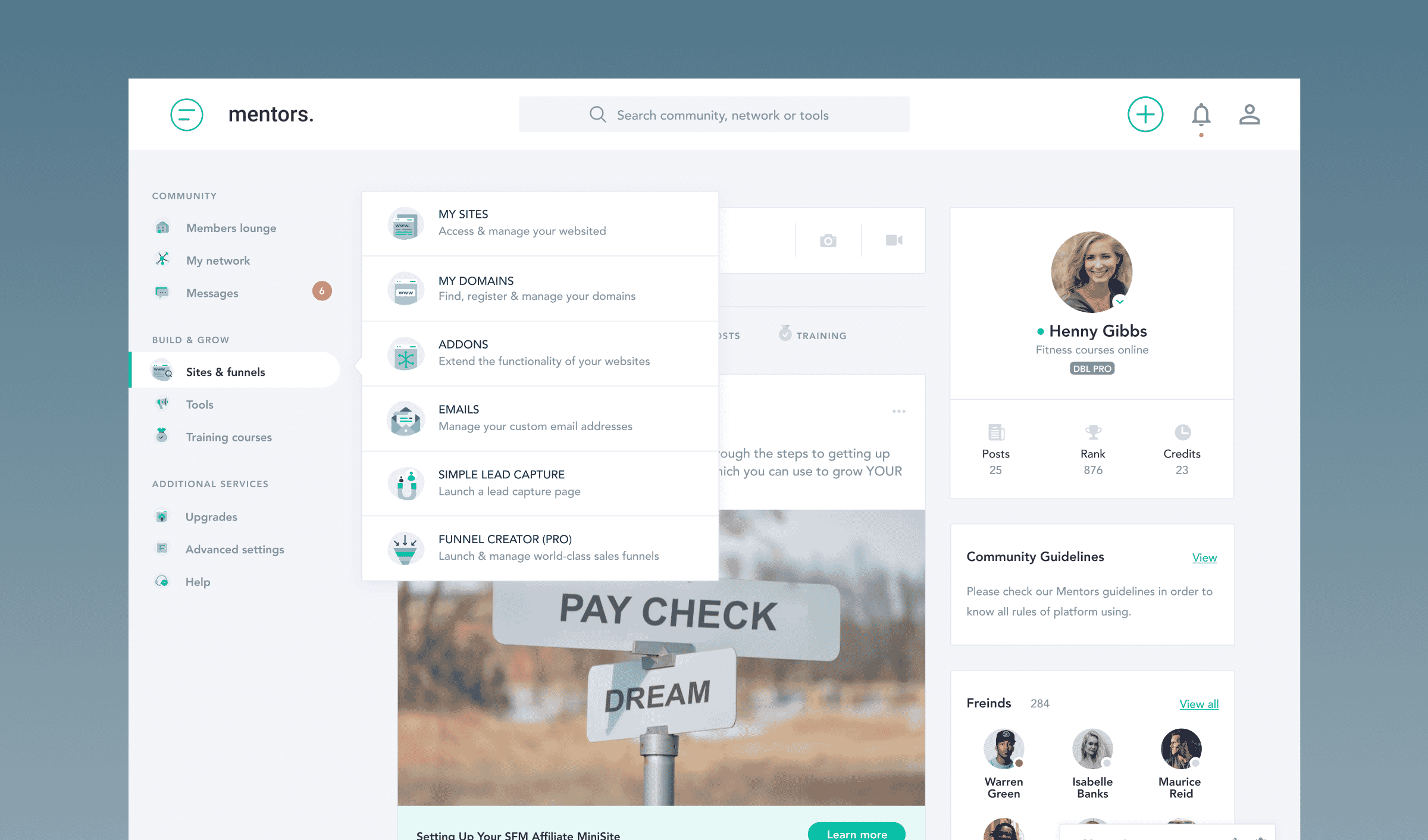
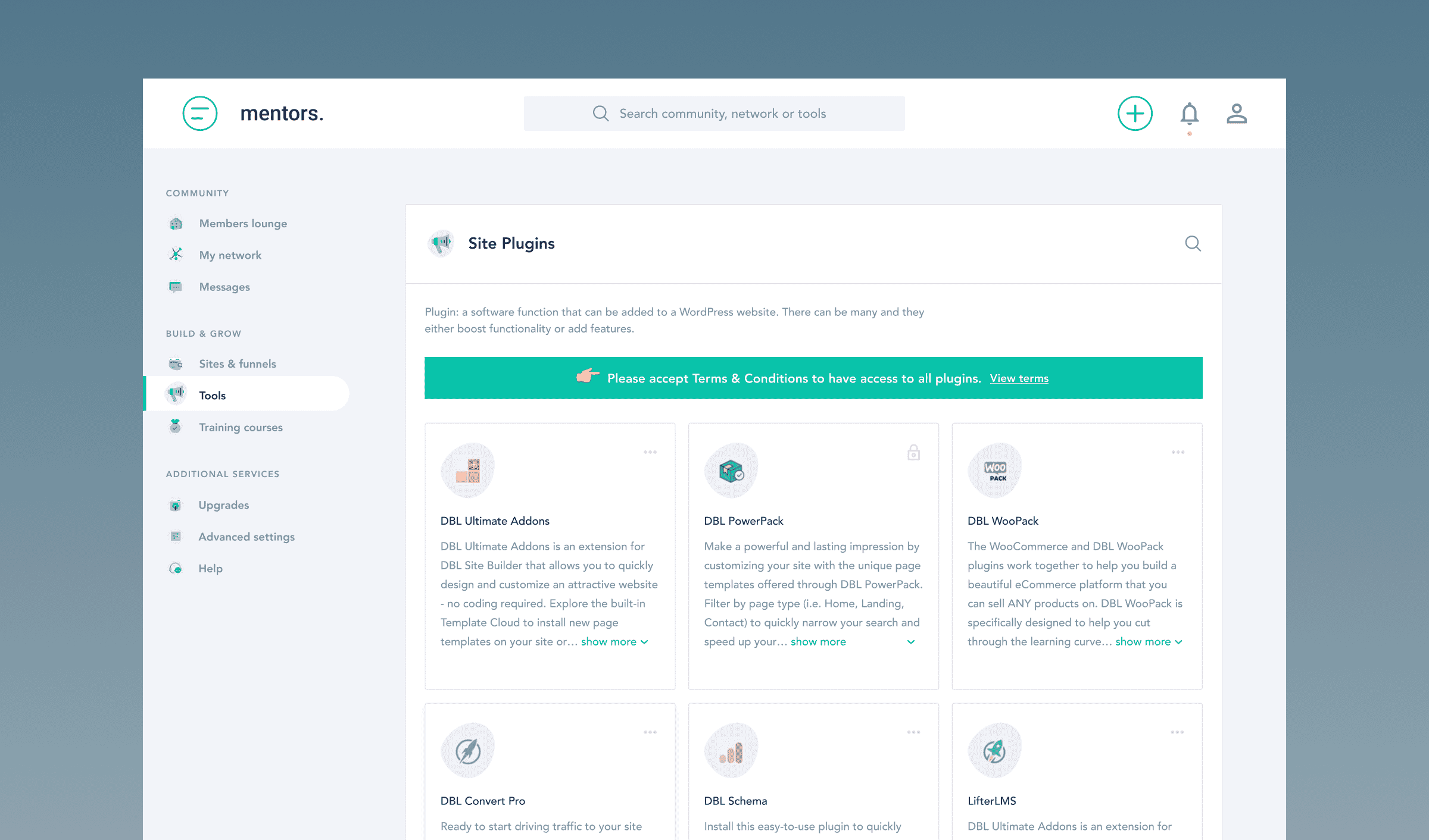
The platform features a header/navigation bar with a search function and accessible links to various sections, including community, training, and tools. A sidebar offers quick access to community features like the Members Lounge, News Feeds, Posts and Questions. The “Build & Grow” section provides tools for site and funnel management, graphic creation, content management, and SEO optimisation. Training courses and additional services are also easily accessible.
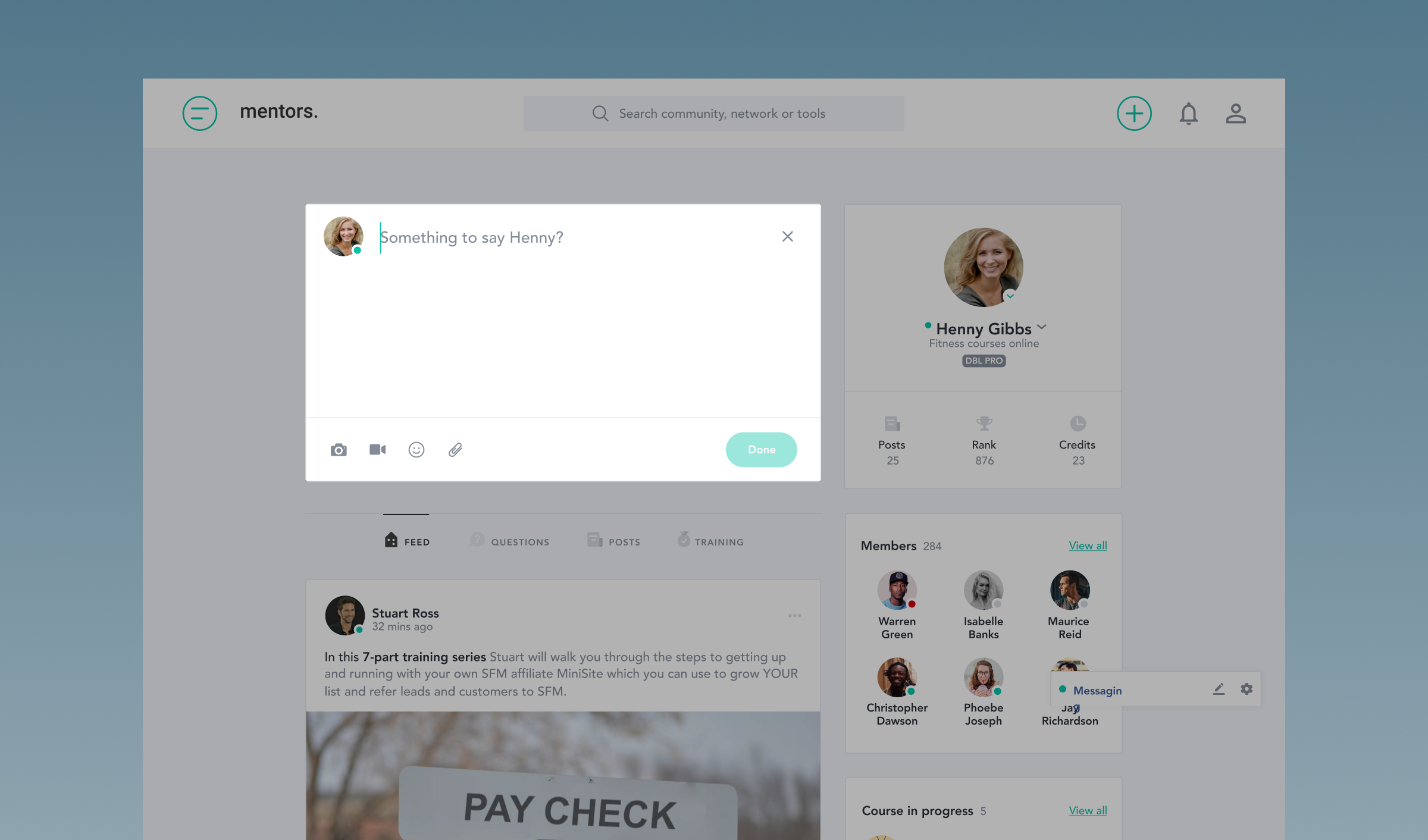
In the main content area, users can post updates, share photos and videos, and engage with the community through comments, likes, and shares. The feed can be filtered by feeds, questions, posts, and training. Special features include upcoming webinars with countdowns, user questions with interaction options, and detailed course information with ratings and reviews.
Digital toolkit wizards
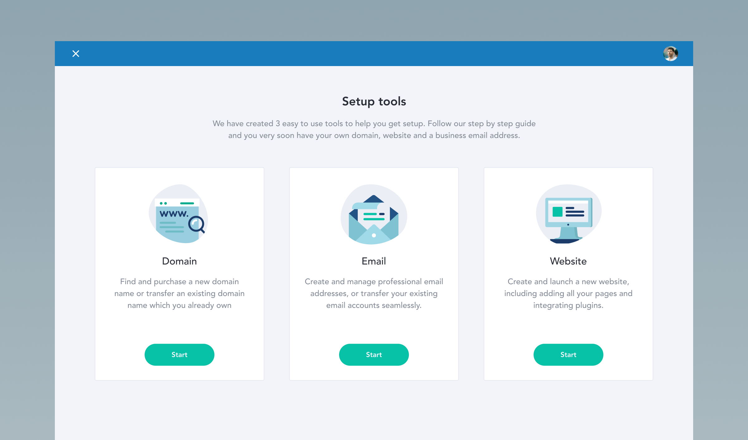
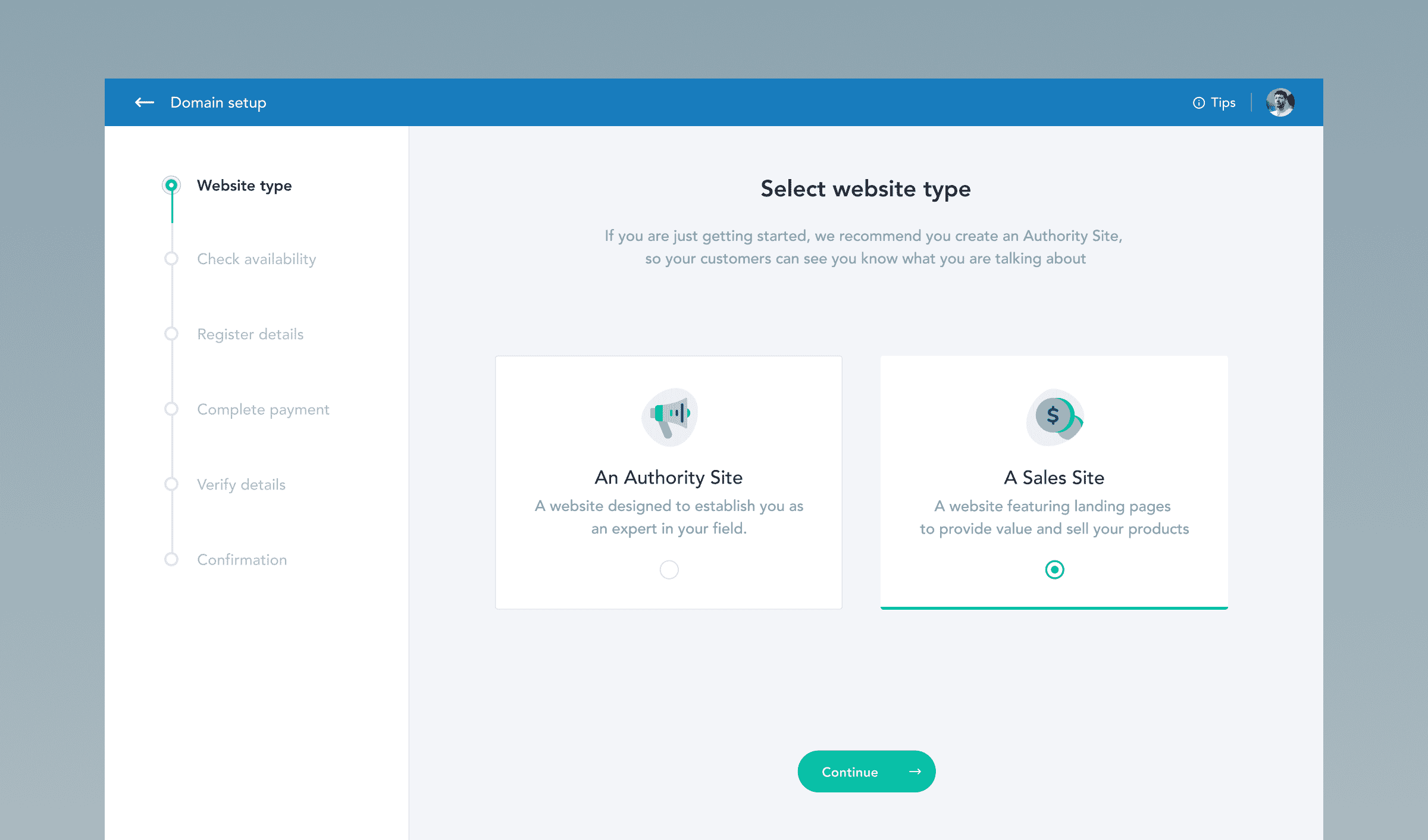
The platform contained a variety of different digital tools for the members, including some guided wizards to assist members.
The wizards included a website creation process with the focus was on guiding users through setting up a new website with an intuitive, step-by-step process. The wizard included tasks such as entering website details, login information, contact details, adding plugins, disclaimers, pages, setting up analytics, and selecting a theme. Each step was clearly defined and visually represented to ensure users could easily follow along.
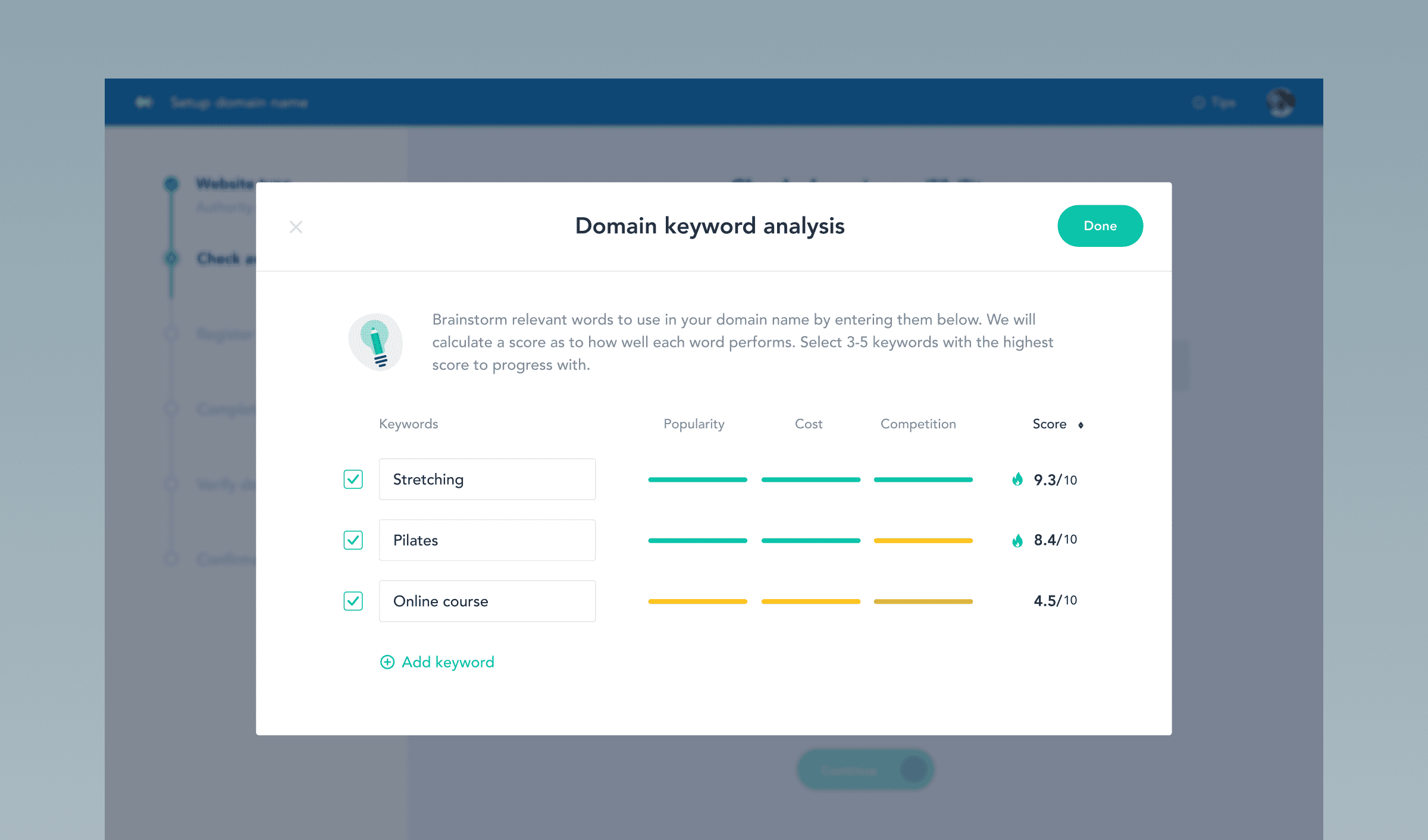
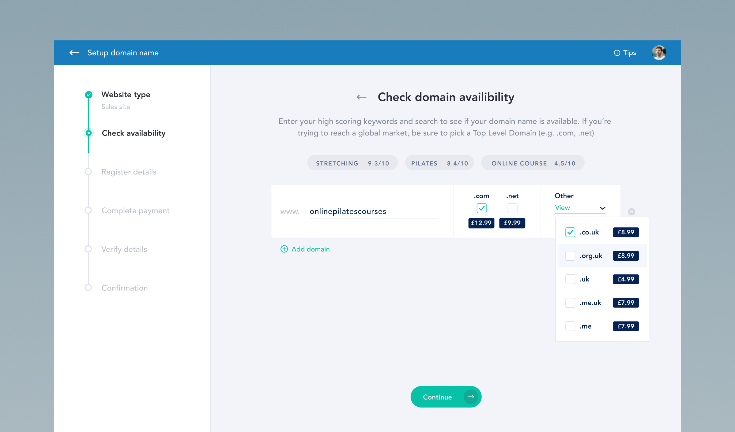
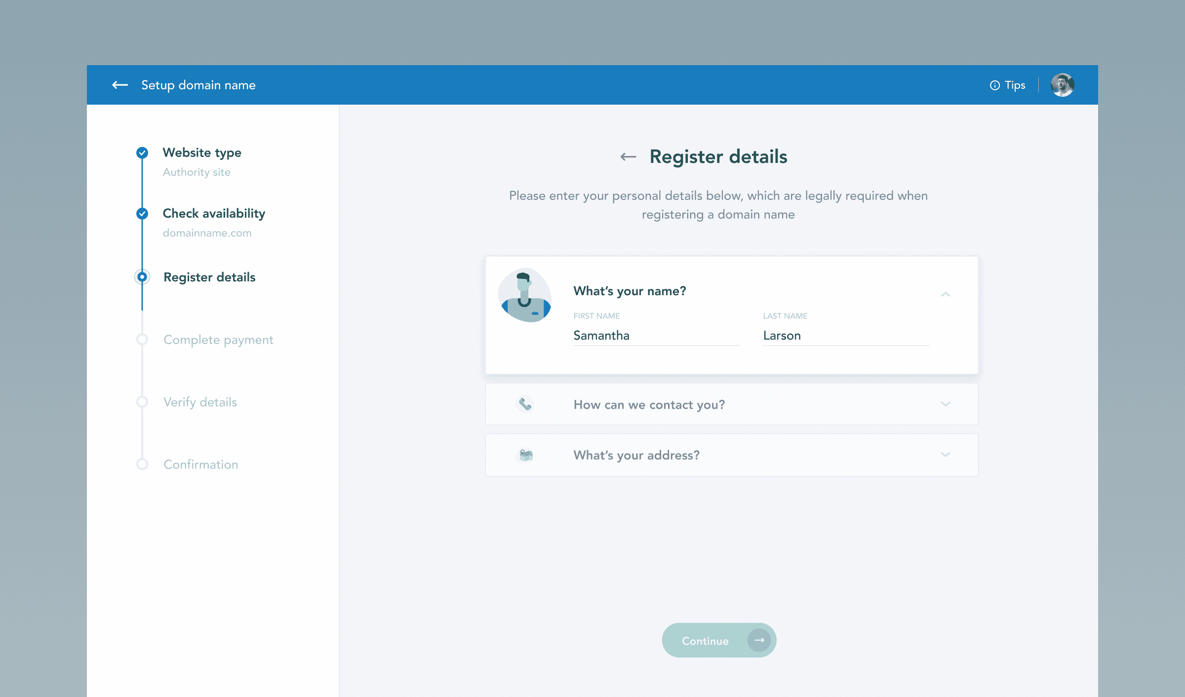
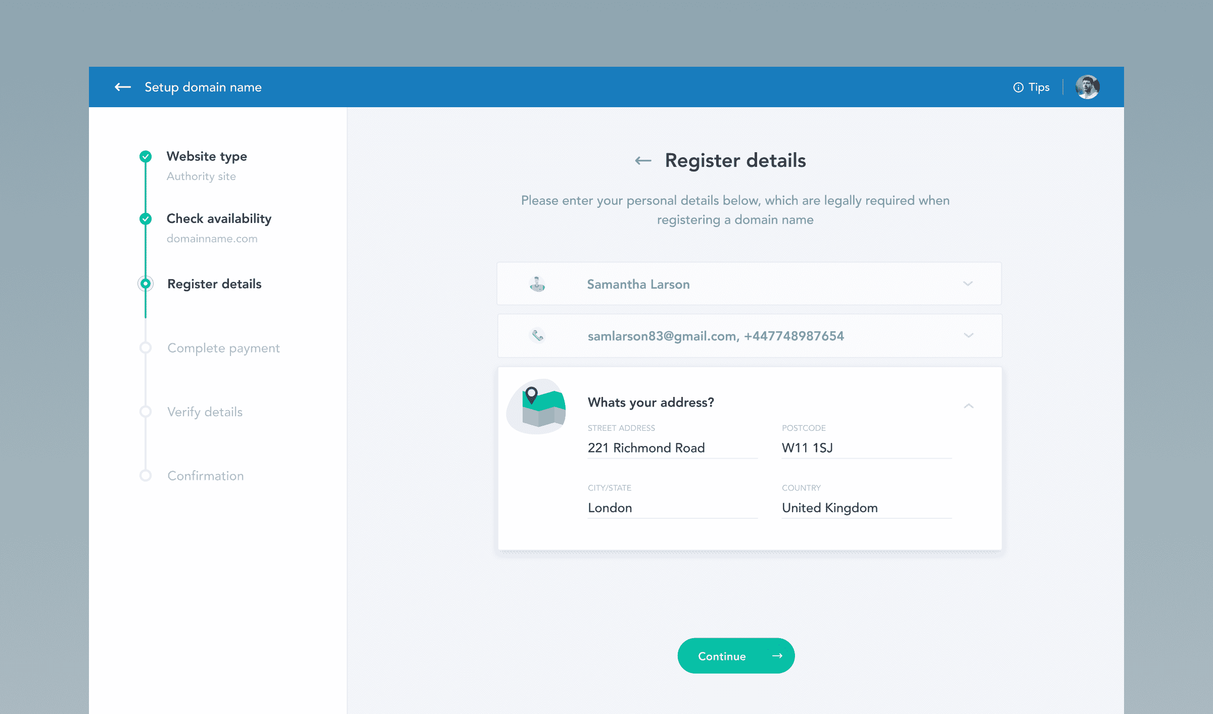
Another separate guided wizard was the Domain name wizard which was designed to help users either create a new domain or transfer an existing one. It included steps to update name servers, confirm domain details, and purchase the domain. The design emphasised simplicity and clarity, with instructions and confirmations provided at each stage to ensure users understood the process and its completion.
Lastly the third wizard, the WordPress site wizard guided users through setting up a new WordPress site. Steps included entering site details, login credentials, contact information, adding essential plugins, creating necessary pages, setting up analytics, and selecting a theme. The wizard provided clear, concise instructions and feedback at each stage, ensuring a seamless and efficient setup process.
Overall, Full Clarity’s intuitive designs ensured these wizards were user-friendly, streamlined, and efficient, providing a cohesive and intuitive experience for users setting up their online presence.
Live webinar experience
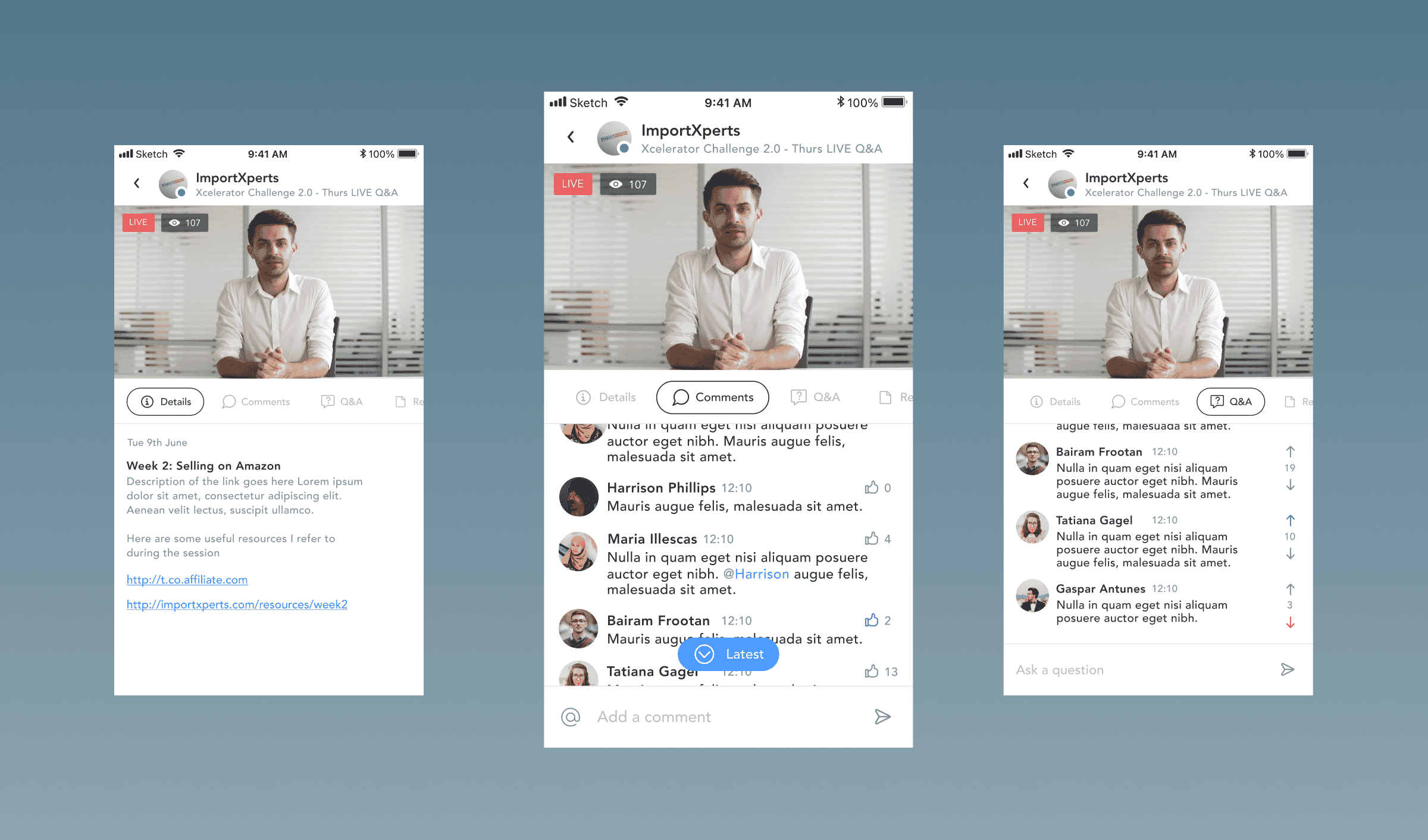
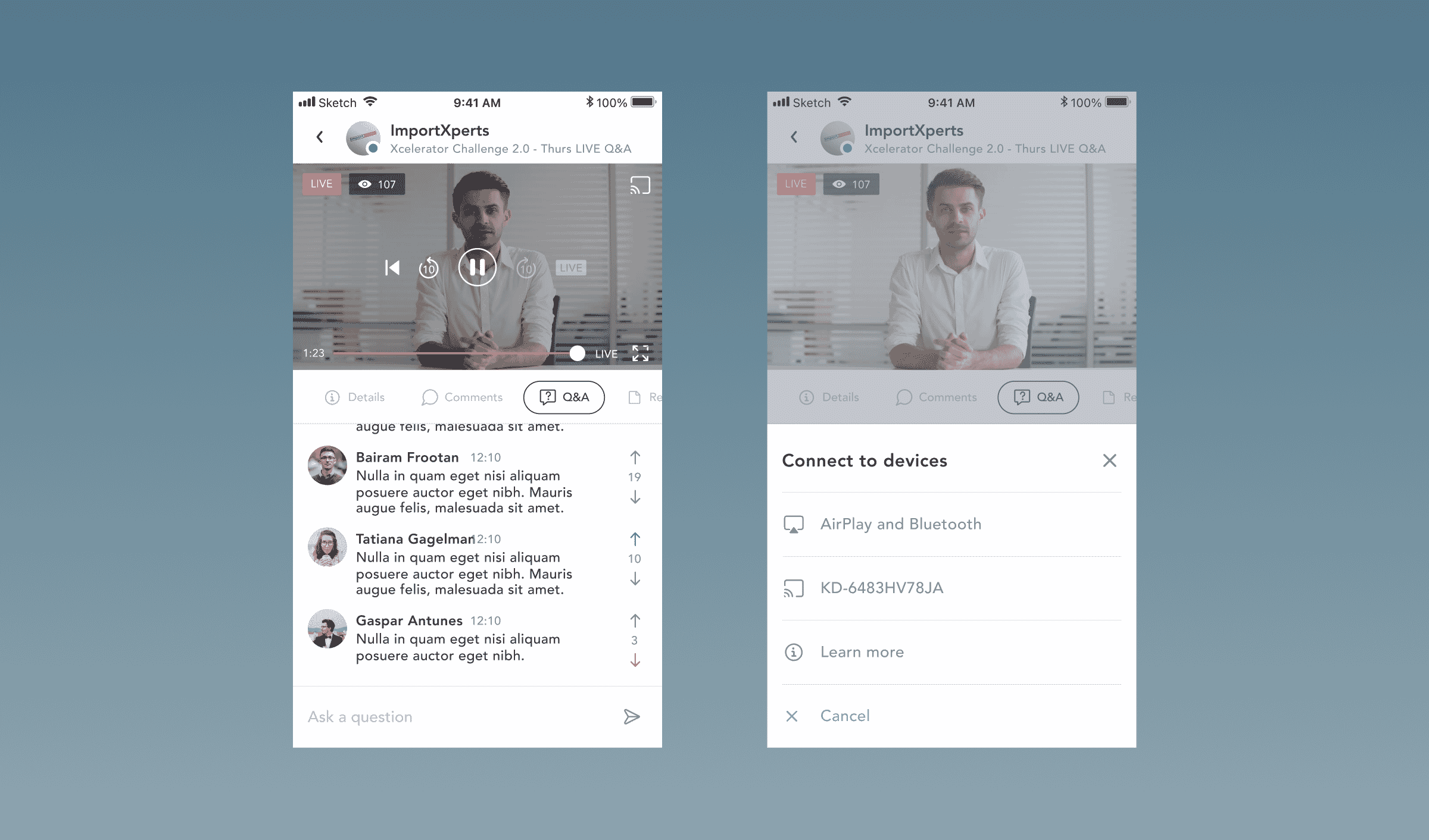
Full Clarity designed the UX/UI for the live webinar experience on the Mentors platform with a focus on user engagement and ease of access. The primary goal was to create an intuitive interface that allowed users to easily find, register, and participate in live webinars. The design included a clear and accessible navigation bar that guided users to the webinar section, where upcoming webinars were prominently displayed with countdowns to the start time. The webinar interface featured a seamless integration of video streaming, allowing users to join the session with a single click. During the webinar, participants could engage with presenters and other attendees through integrated chat and Q&A functionalities. This interactive experience was further enhanced by real-time updates and notifications about ongoing discussions and questions being addressed by the presenters.
Full Clarity also ensured that the design was responsive, providing an optimal experience across different devices, including desktops, tablets, and smartphones. Post-webinar, users could access recorded sessions, which were neatly organised and easy to navigate. The design incorporated features for rating and reviewing webinars, helping users to select the most relevant and high-quality content. Overall, Full Clarity’s design prioritised a smooth, engaging, and interactive user experience, making the live webinar feature a standout component of the Mentors platform.
Communications mobile app
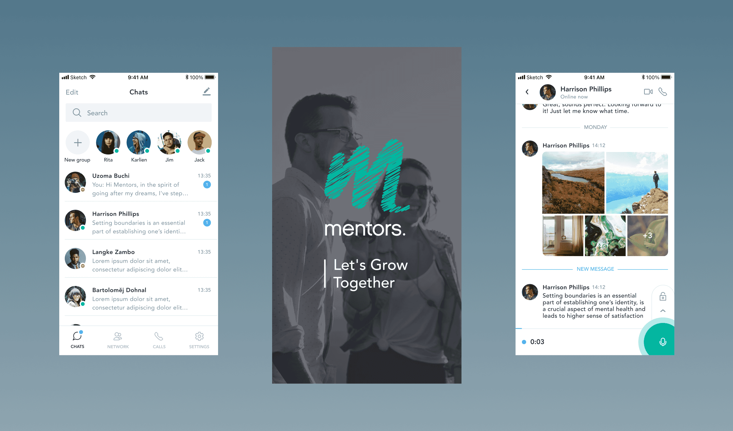
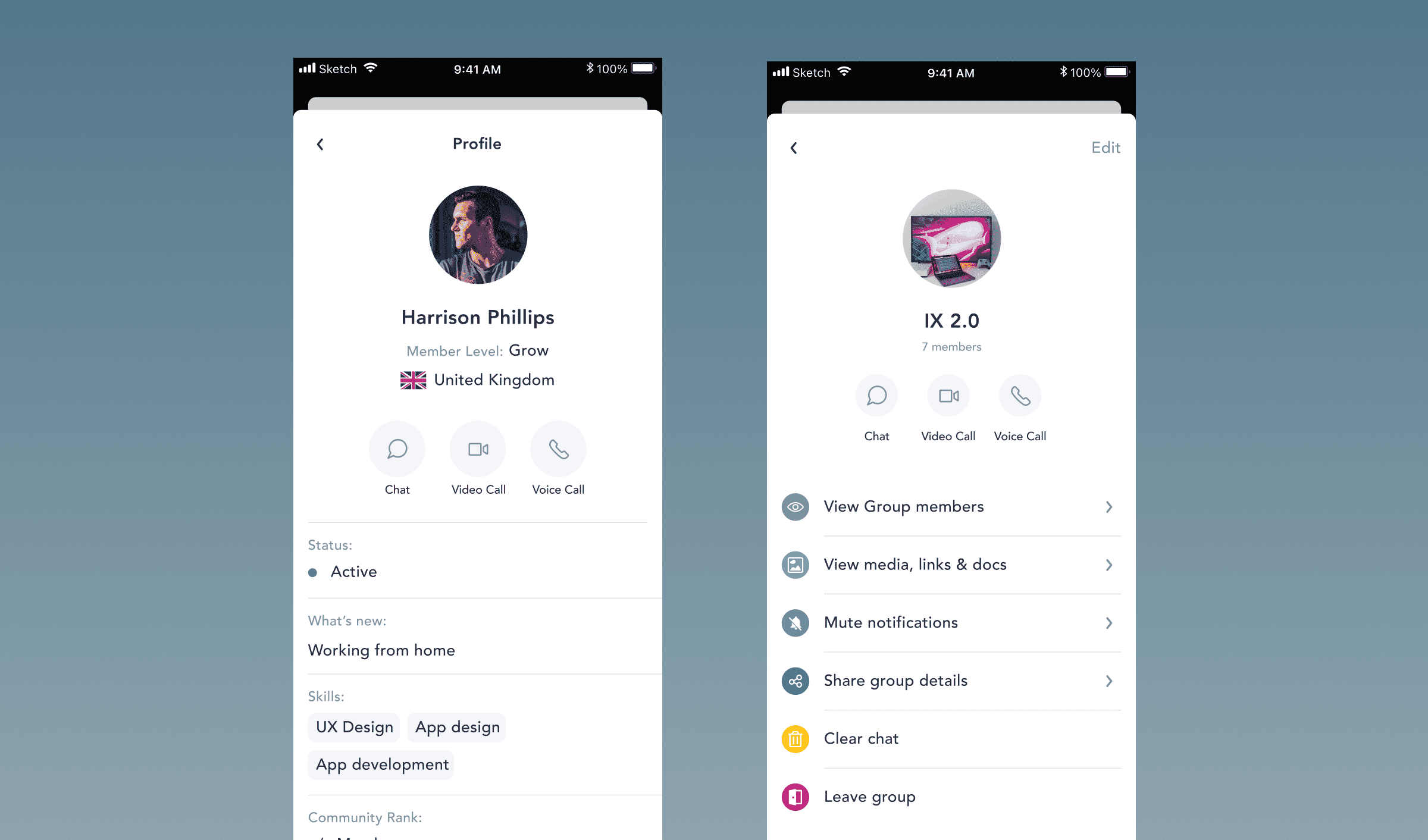
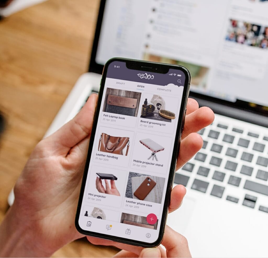
A separate package of work was to design the UX/UI for a native mobile communications app for hiring and communicating with your business mentors, and peer network.
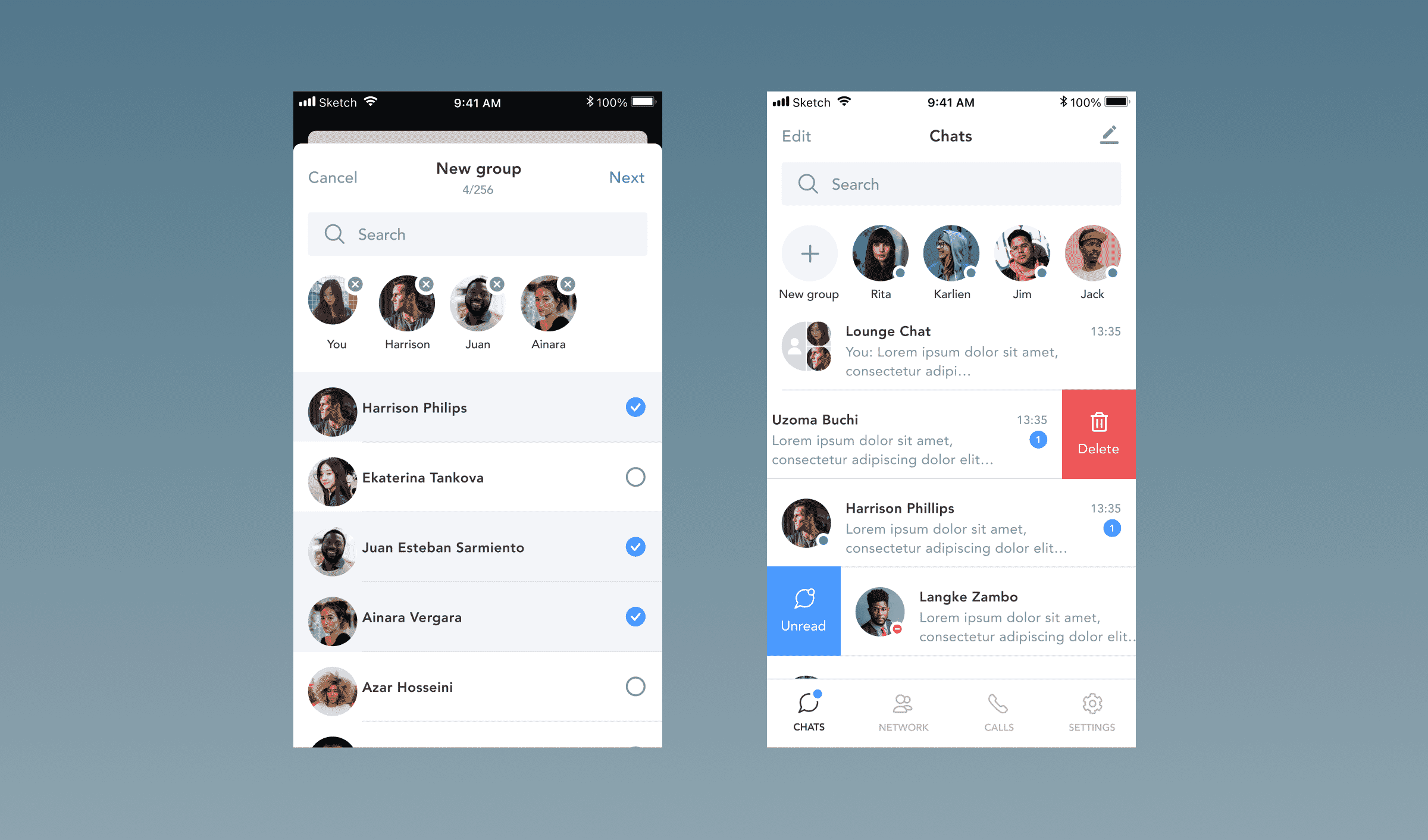
Initially the project included standard communication features such as 1-1 messages, group messages, voice calls and video calls. After that, we added 1-1 mentoring functionality which included a scheduler to find and schedule a call with one of the mentors the user can find in the platform including accessing video recordings of their calls.
We carefully designed the experience to re-use UI to make the build easy for the development team. For example the UX/UI for the “New chat” also worked for the “New Group”. Similarly the “New Call” flow worked for 1-1 as well as group calls and for both Audio and Video calls. Taking a component based approach to design this helped the development meaning the component flows can be reused in other parts of the app.
We used established messaging and audio/video calling patterns which we’re familiar to users from other popular messaging apps such as Facebook Messenger, What’s app, Skype and designed a smart and clean user experience for the business professionals in the Mentors network.
UI design system component library
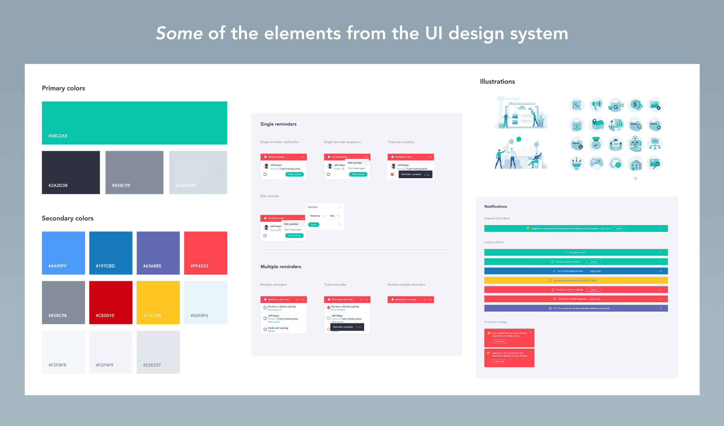
We created a UI design system component library aimed at ensuring consistency and efficiency across the mentoring platform. This library was pivotal in creating a cohesive user experience, allowing for seamless interaction across various devices and screen sizes.
The component library included a comprehensive set of reusable UI elements such as buttons, forms, icons, and navigation bars, all designed with scalability in mind. Each component was crafted to maintain visual and functional consistency, regardless of whether it was accessed on a native mobile app, mobile browser, or web application. This approach not only streamlined the development process but also reduced redundancy, enabling quicker iterations and easier maintenance.
Our design system ensured that components were adaptable to different breakpoints, providing a responsive experience that catered to various user contexts. By standardising the UI elements, we facilitated a unified look and feel throughout the platform, enhancing user familiarity and comfort.
Moreover, the use of SVG icons ensured scalability and clarity on all screen sizes, while the consistent use of colour schemes and typography reinforced the platform’s branding. This well-organised library of components was crucial in delivering a high-quality, efficient, and user-friendly mentoring platform for business professionals.
QA and Testing process
Full Clarity created a comprehensive front end release QA and testing strategy for the client, covering both web and mobile platforms to ensure consistent quality and performance. The goal was to create a standardised procedure for the client’s engineering team, ensuring consistent quality and performance. The process took into consideration new features, bug fixes, improvements, dependencies such as back-end servers, APIs, configurations, and the maintenance of the existing product within their testing scope.
For the testing strategy, we recommended covering desktop browsers like Chrome, Safari, Firefox, Edge, IE11, and Opera on Mac OS, Windows, and Linux, as well as major mobile browsers and native apps for iOS and Android. The approach focussed on multi-OEM devices, OS versions, and various network conditions.
Key areas of testing included application failure, new features and changes, regression testing, visual testing for layout consistency, design elements, and responsive breakpoints, and functional testing for user journeys, buttons, and cross-browser/platform functionality. We also suggested aiming for a Google page speed score of 90+ during performance testing.
We outlined execution levels starting with smoke tests for basic checks, visual tests for GUI and usability, functional and regression testing across priority browsers, integration testing for end-to-end functionality of combined components, and system testing to ensure overall functionality. This structured approach, supported by internal test execution levels and quick checklists, would ensure thorough testing and quality assurance for each software release.
By the way we are crushing it. Thank you for the work so far, we have about 1500 members a month joining at BETA!
Other client stories
