Addressing the UK’s social housing crisis through service design
At a glance
SimplyPhi is market leading, real estate and technology service provider to Public Sector Organisations and Real Estate Investors who strive to help solve the social housing crisis in the UK. They simplify the complex process of identifying, buying, selling, renting and renovating housing.
Phi had a functioning housing portal, Iris 1.0, covering property acquisition, rental, renovation and the asset management process; it was a complex, multi-faceted system. Although the original portal was an impressive build, it had been created internally and had grown organically. Full Clarity were hired to provide an end-to-end service design audit looking at where we could improve usability, streamline processes and address friction and pain points.
Project type
Sector
Services provided
Project length
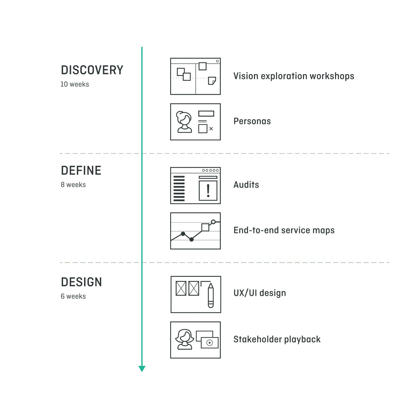
We carried out business analysis including running a vision exploration workshop with key stakeholders of the Phi team to tease out the business goals and future intentions for the company. At Full Clarity we prioritise understanding our clients values and business goals so we can create the most applicable solutions. We explored Phi’s business goals, values, focus, challenges as well as carried out an internal analysis of the company. The workshop meant that both teams agreed on priorities going forward, with a clear vision for an end solution.
User research
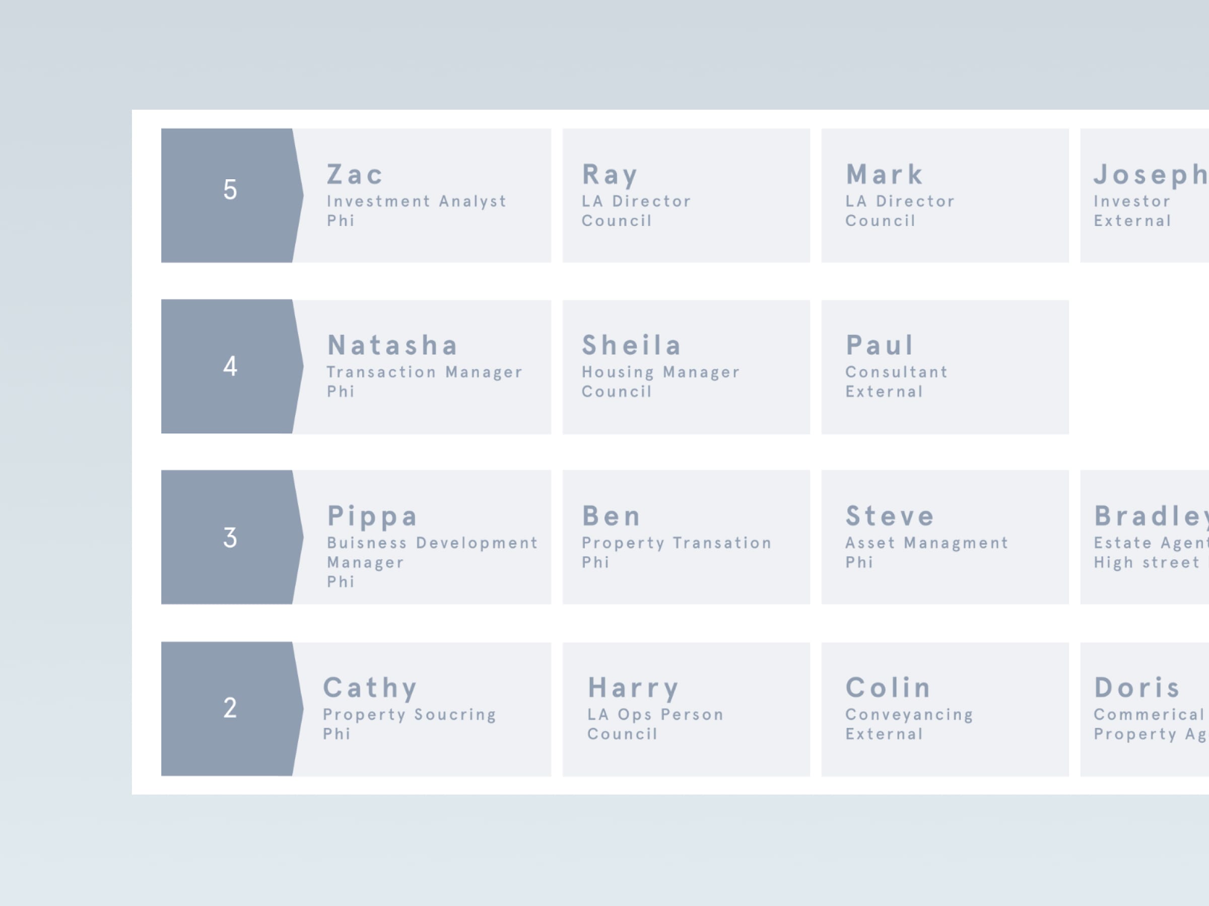
Extensive research was conducted in order to understand Iris’s complexities. The system was made up of various stages including a range of processes which are related to different users. The team at Phi carried out some initial work on the types of users who would interact with Iris and shared this research with us. We were given 18 different personas to represent the types of users who would interact with Iris at any given time across the process of supplying a house. It was here where we understood how complex the system really was. As a team we worked through the extensive list of personas and separated them into groups relating to related corporations and roles.
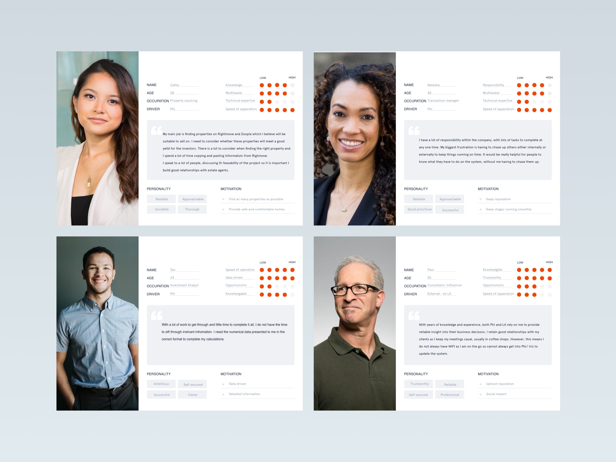
From the eighteen personas, we were able to whittle the count down to the nine key users who would interact with Iris, using a smart grouping system. We selected these users as they represented all touchpoints at each stage of the process, meaning we would consider all needs across each stage. They came from different corporations and had distinctive requirements and needs. We built up their profile from the information gathered and created a persona for each key user exploring their demographics, personalities, emotions and motivations.
With so many users involved, it was important to identify the importance hierarchy of the users so we could acknowledge whose needs should be primarily considered. Naturally, we found ourselves drawn to the needs of the senior users such as the CEO or an investor, however it became apparent that these users were not interacting with Iris on a daily basis like some of the other users. This gave us a better understanding of the system on the whole as well as an insight into the relationship between the users. We distilled out research down further to prioritise the needs of four main personas who this redesign would have the most impact on.
E2E service map
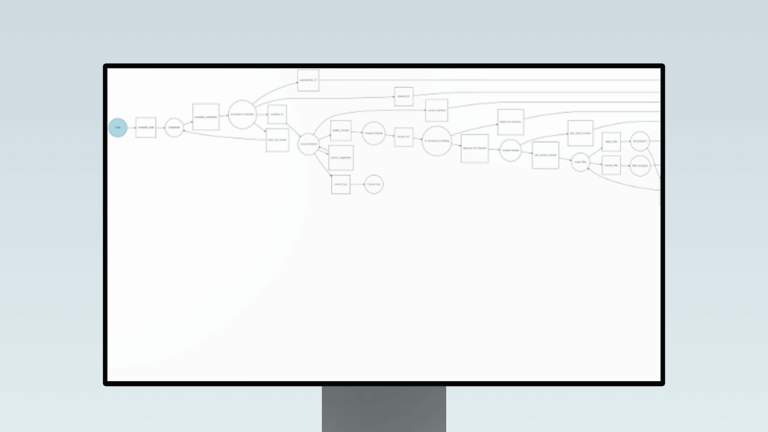
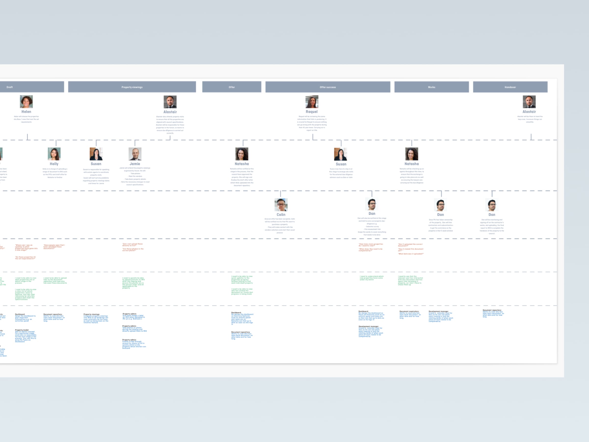
The client supplied a detailed yet complex end to end service map of all the stages which occur throughout their workflow from start to finish. The service map showed all of the possible routes which property may take during its time with Phi, from ‘purchase’ to ‘hand-over’. This service map was helpful to understand the process as an interconnected system however, it was not in a language/ format which could fully benefit our research.
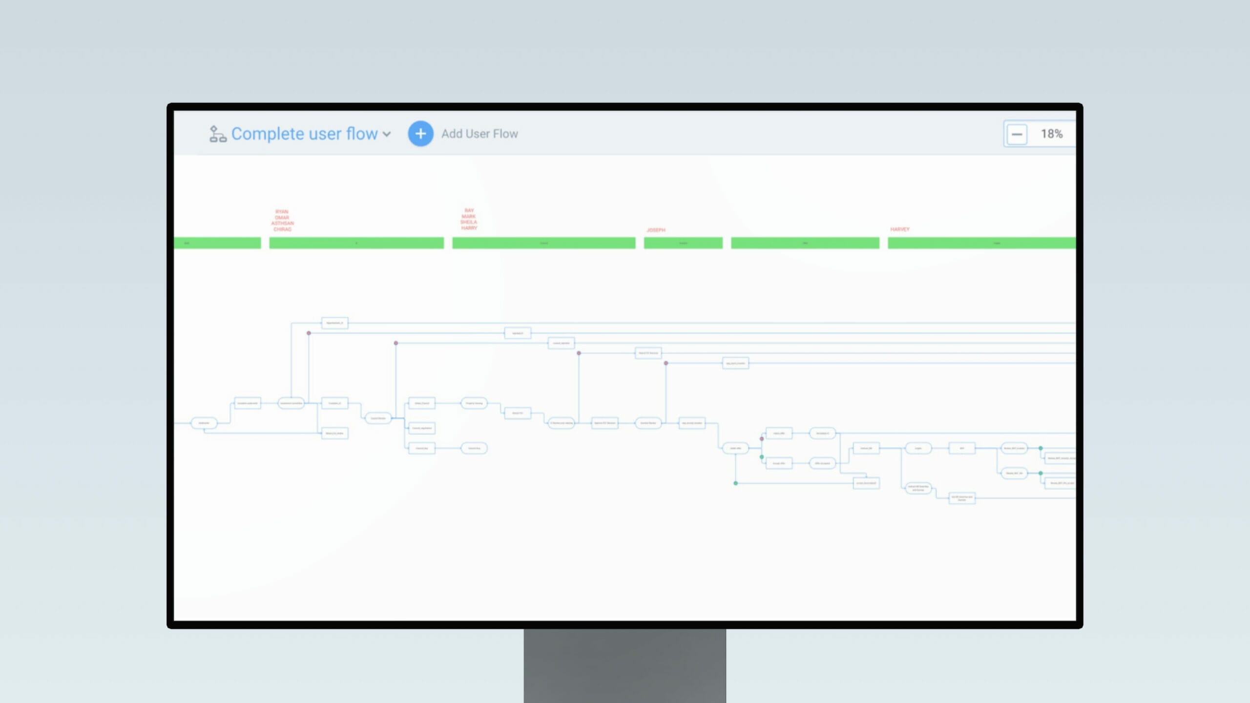
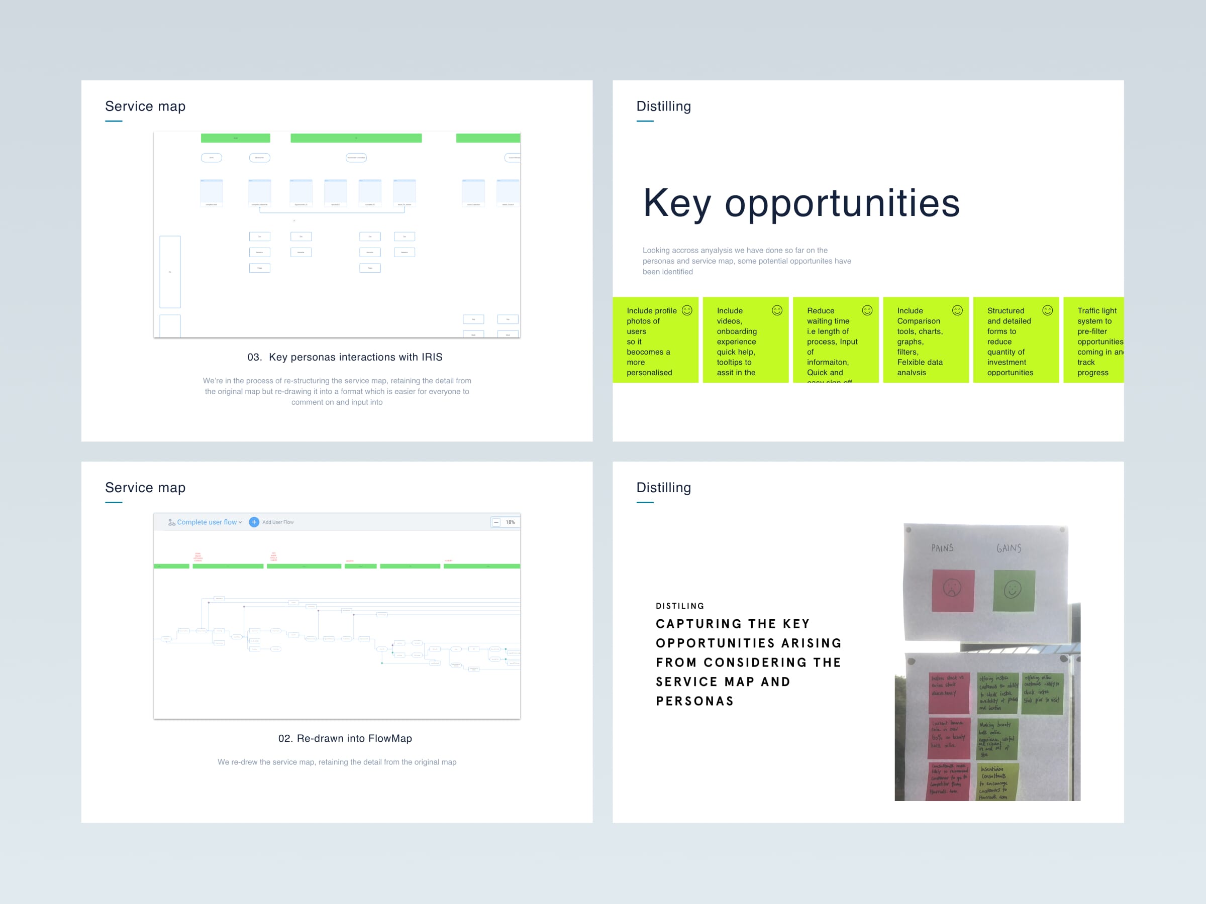
As service designers we needed to approach this service map considering interaction and usability between the different user’s and stages. At Full Clarity we often use a tool called FlowMapp to design our service maps, which provides structure and clarity even for the most complex systems. Firstly, we transformed the original service map into a clearer format, retaining all the original information (shown in first image). We then divided the process into nine key stages which helped identify what processes occur at each stage and thus which users are interacting with the system. We then took it a step further – we developed ‘stages’ into ‘screens’, by doing so we were able to slowly start working towards wireframing. From the original service map we divided some of the events into sub-stages, within these sub-stages we had screens where an action would occur. This was helpful in understanding the service as a whole and, not just a series of interactions.
We then looked to bring together our work from the persona mapping into the new service design map by associating individual users to each screen depending on their touchpoints at each stage. We modelled out the journeys of each user’s interaction with the system as well as addressed their questions and needs as both individual user journeys but also consolidated into one complete E2E workflow.
Once we had completed the initial research, we began working on a review of IRIS 1.0, which involved breaking it down to analyse individual screens considering our UX Audit best practices criteria and annotating what we consider potential issues. This was an effective way to capture all interface issues, big and small to ensure we can address these points along with the points in the service map touch points.
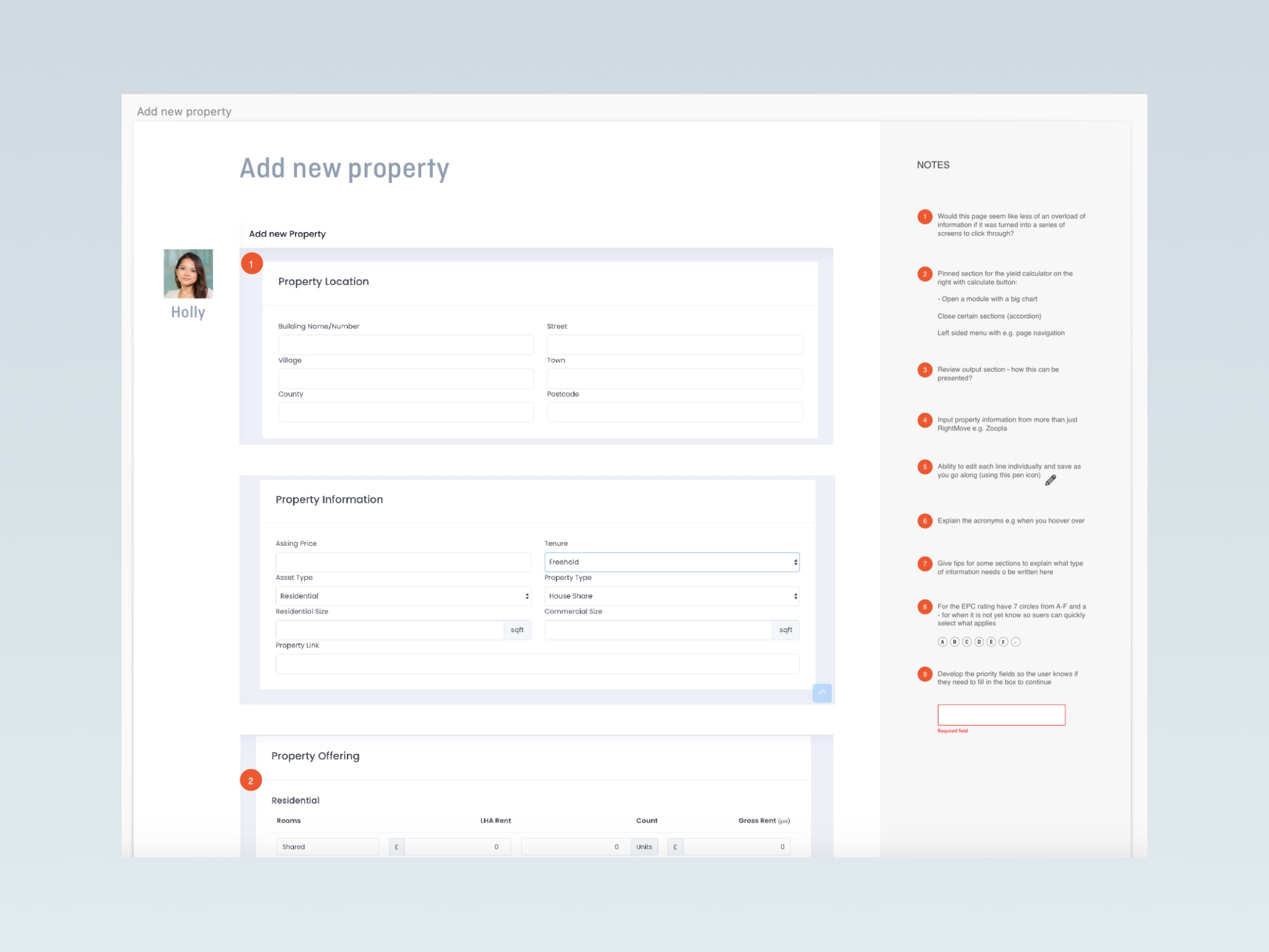
It was becoming apparent there were an overwhelming number of opportunities identified which we and the team at IRIS were wanting to introduce into IRIS 2.0. Our extensive research and analysis meant we had covered all aspects of the service. To keep a log of these concepts we used the same format from the previous exercise. These ideas ranged from simple UX best practises to radical design solutions which we felt passionately about introducing into the new and improved v2.0. The annotations from the review of the existing app were used to provide a solution to the problem. When working on the UX/UI design concepts these ideas were always considered and applied where necessary in the appropriate places
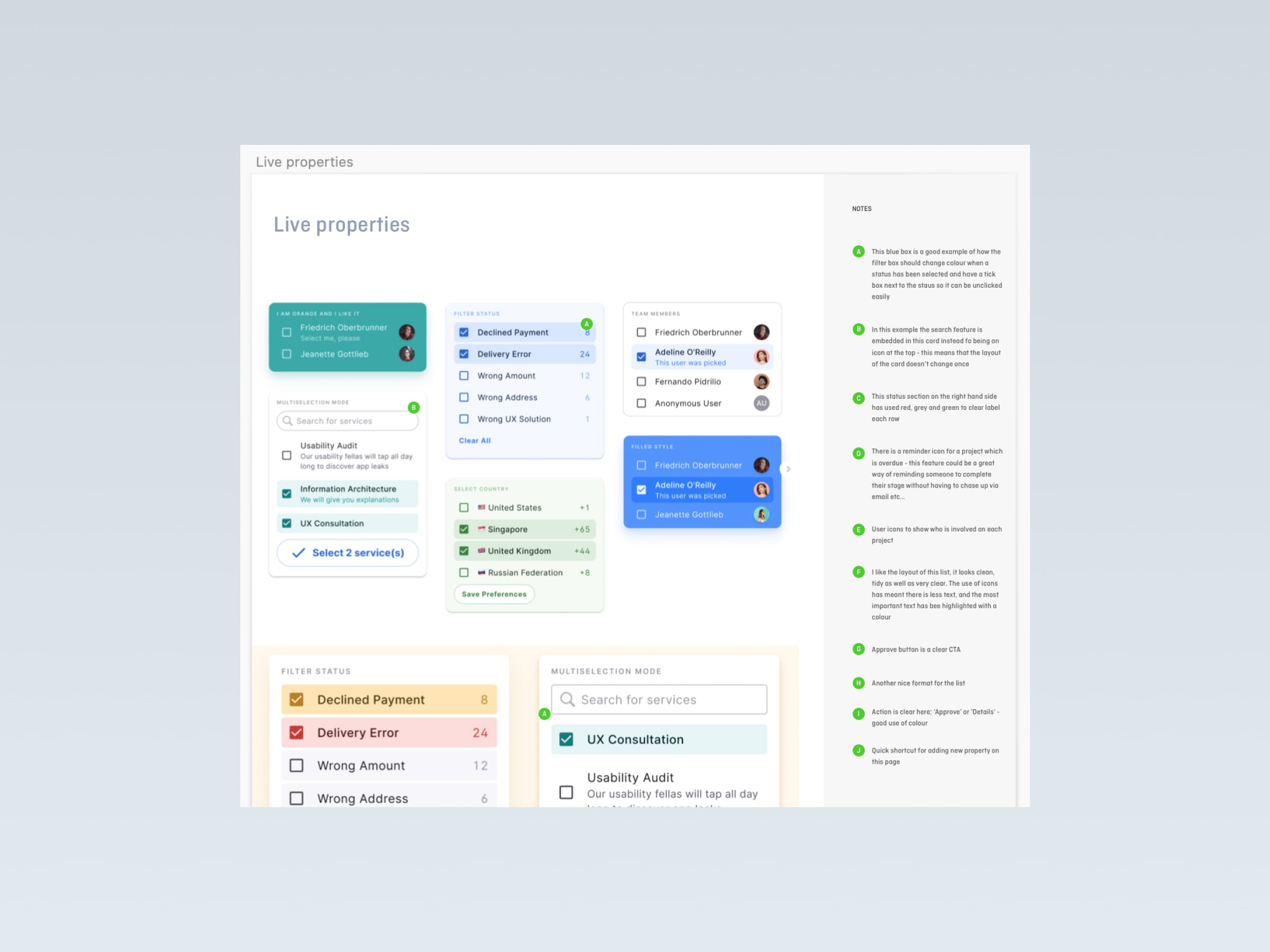
UX/UI concept design
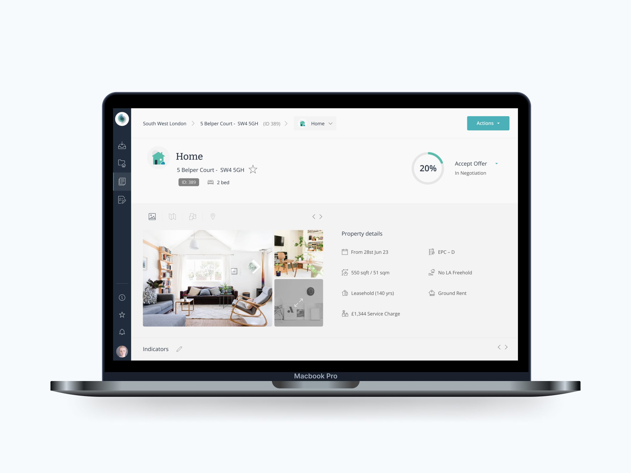
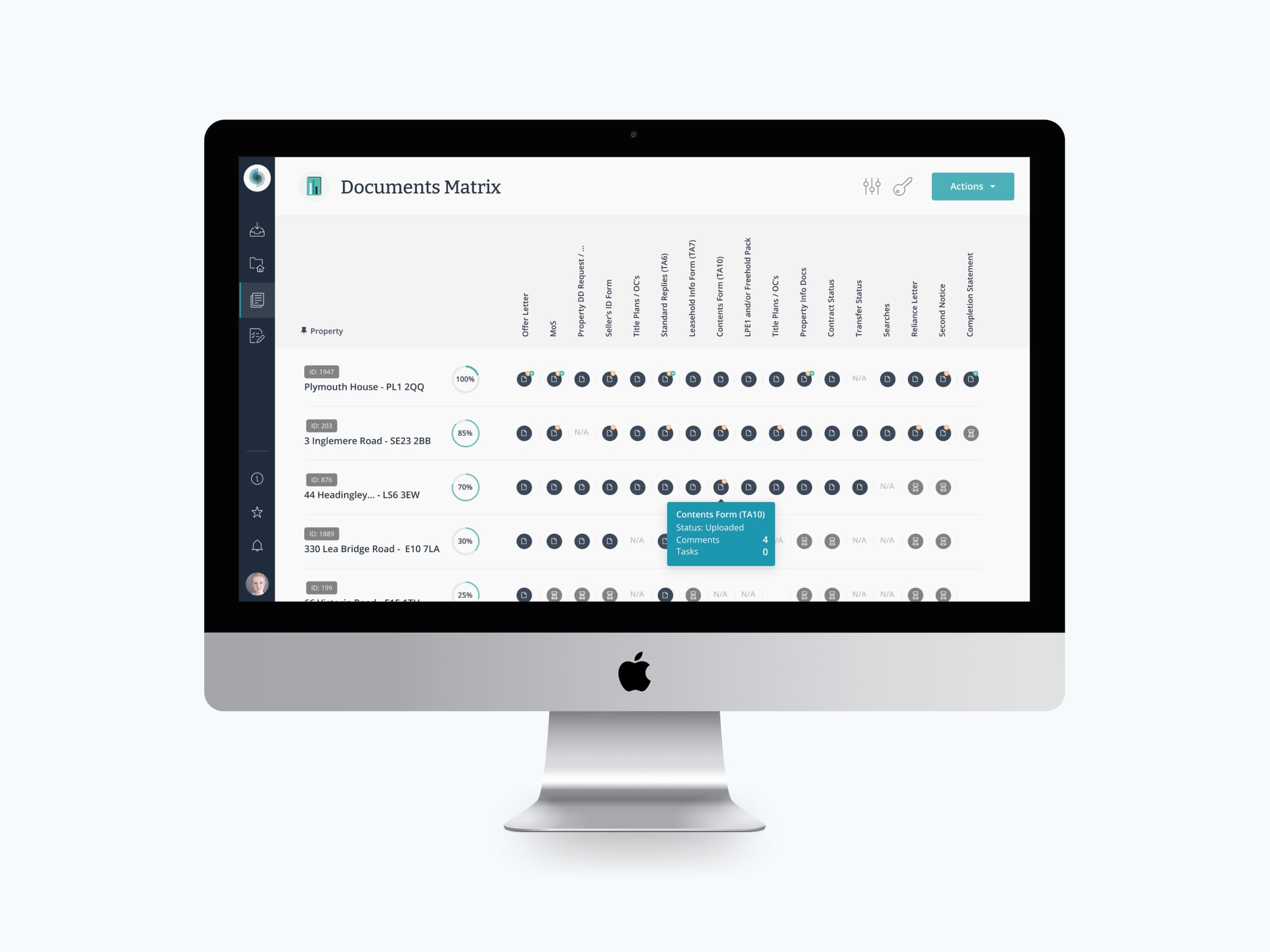
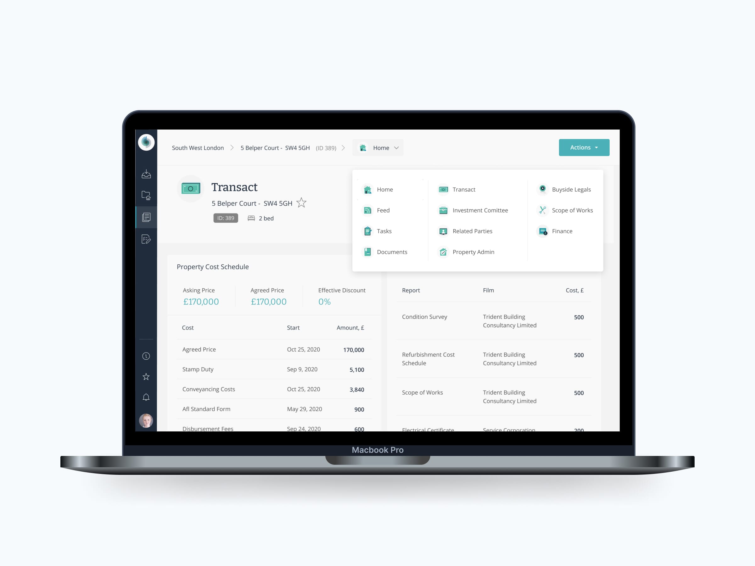
After extensive research into the current v1.0 service, we were ready to start conceptual designs for IRIS 2.0 – we had compiled a huge amount of research and were confident in the direction we were going in to create the most effective system possible for our client and users. We started with the most complex areas of the platform first, as those were the areas which added the most value to the business and users.
Stakeholder playback
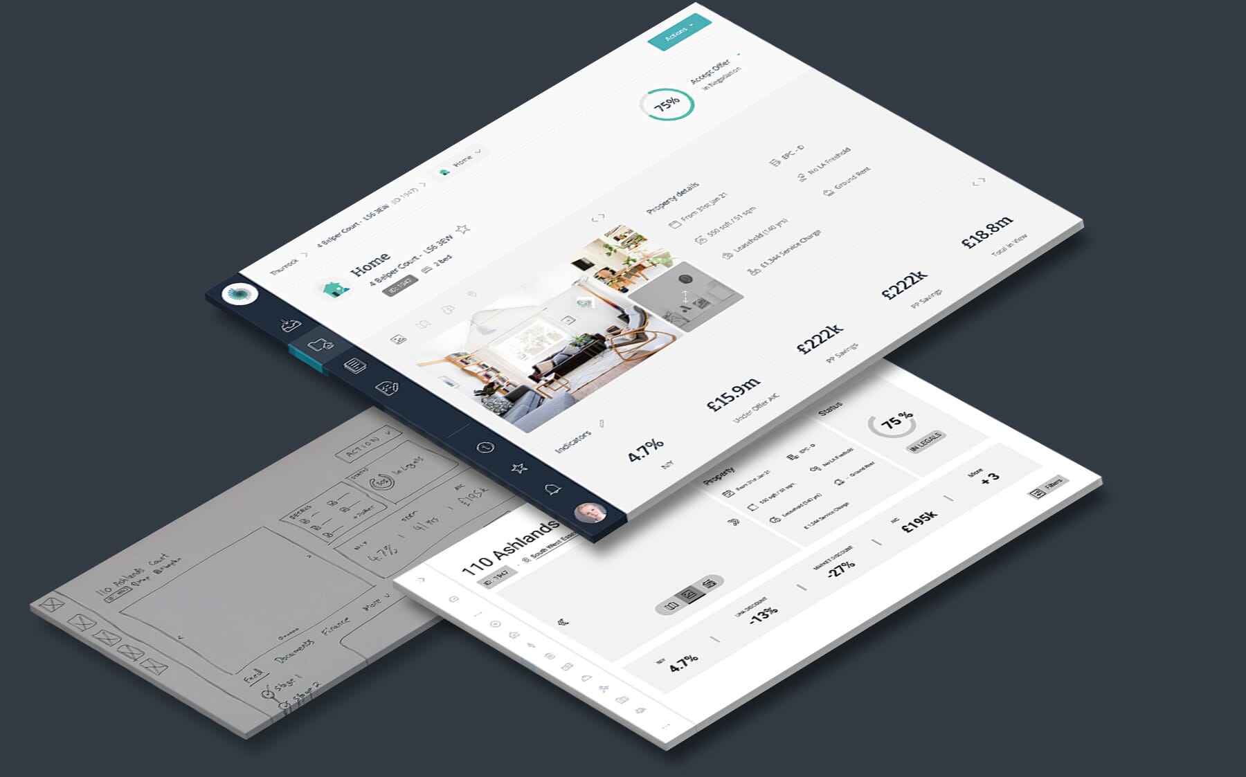
We had various playback review sessions to ensure our design decisions were aligned with the client’s expectations and goals. Furthermore, this ensured we got the concepts right to avoid larger issues further down the line. We had frequent reviews with the stakeholders to show our progress as well as listen to feedback. We acknowledged there were many users’ needs to consider so a high number of stakeholder from various departments attended the playback sessions, giving everyone the opportunity to speak up about the areas which affected their work. These meetings were instrumental in ensuring a productive workflow.
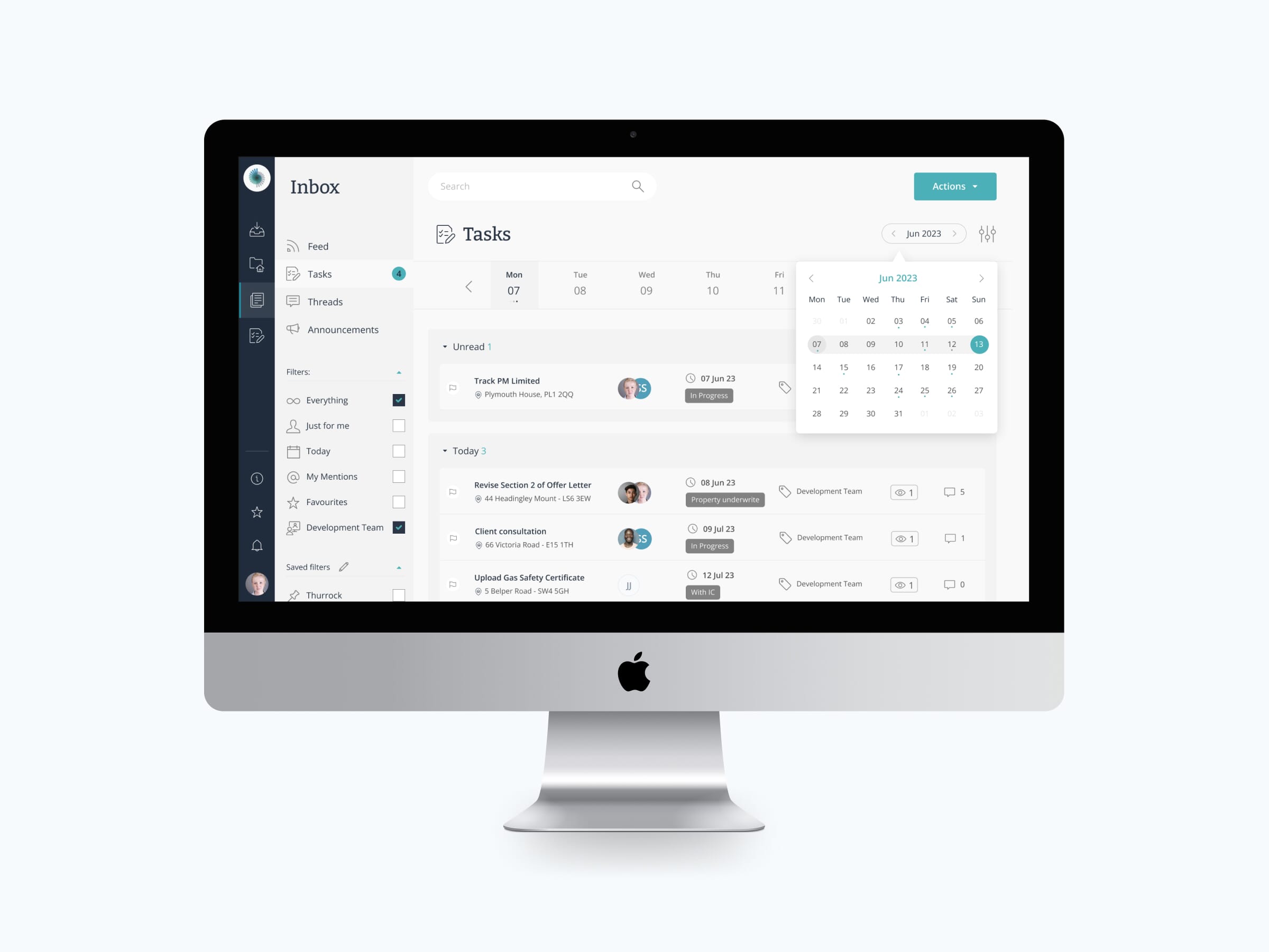
The complex nature of the various layouts meant careful consideration was made to use familiar patterns where appropriate. Good colour theory and typography were used to ensure good user interaction and accessibility. The crisp and clean visual design helped to frame the content while careful use of type styles and spacing reduced the visual load on the user allowing them to navigate and interact with the page clearly and easily to access the data they needed. We handed over the product designs of the new Iris 2.0 service and provided some fractional technical consultancy to ensure a smooth transition for Iris so they could build the new version themselves in-house.
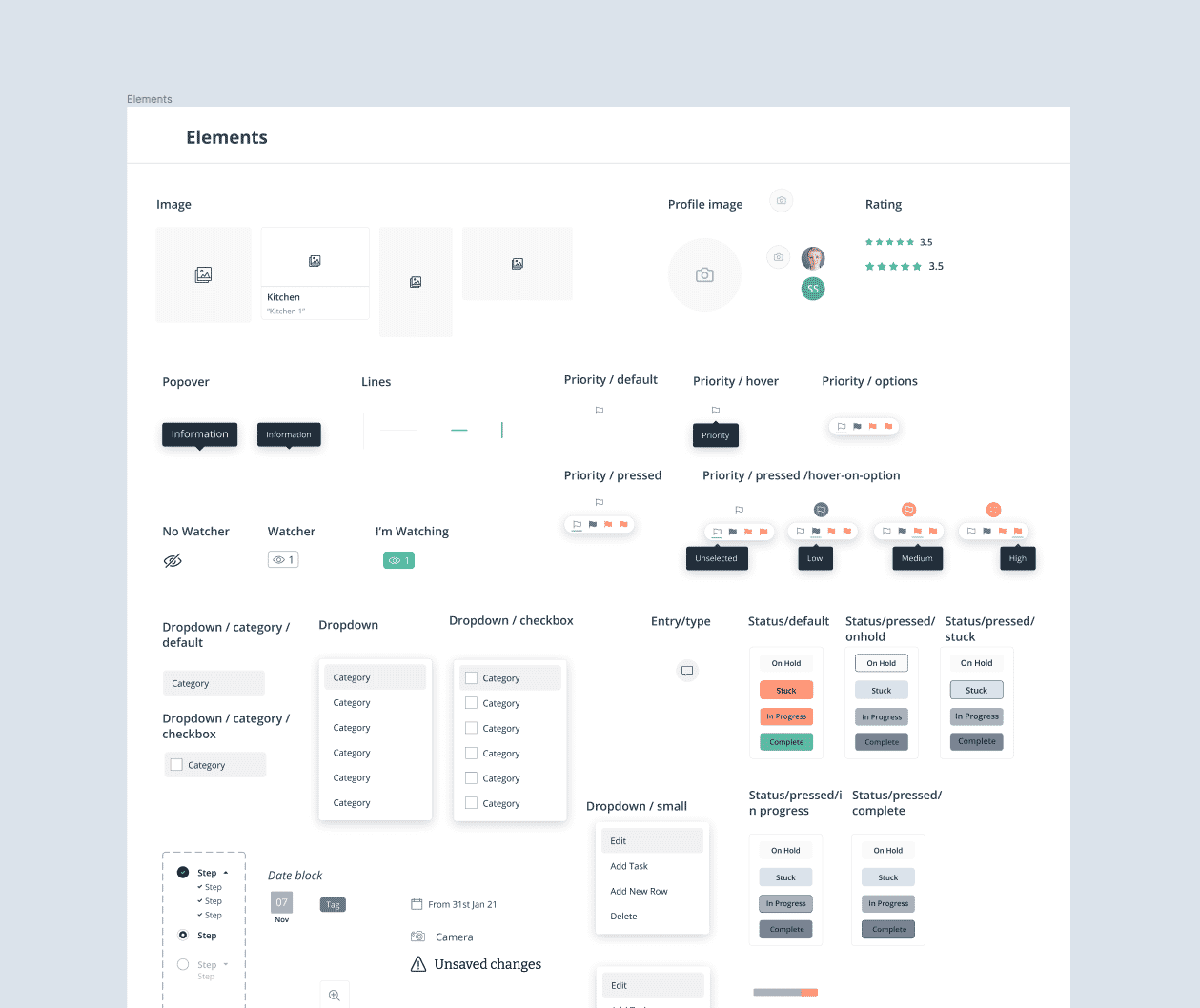
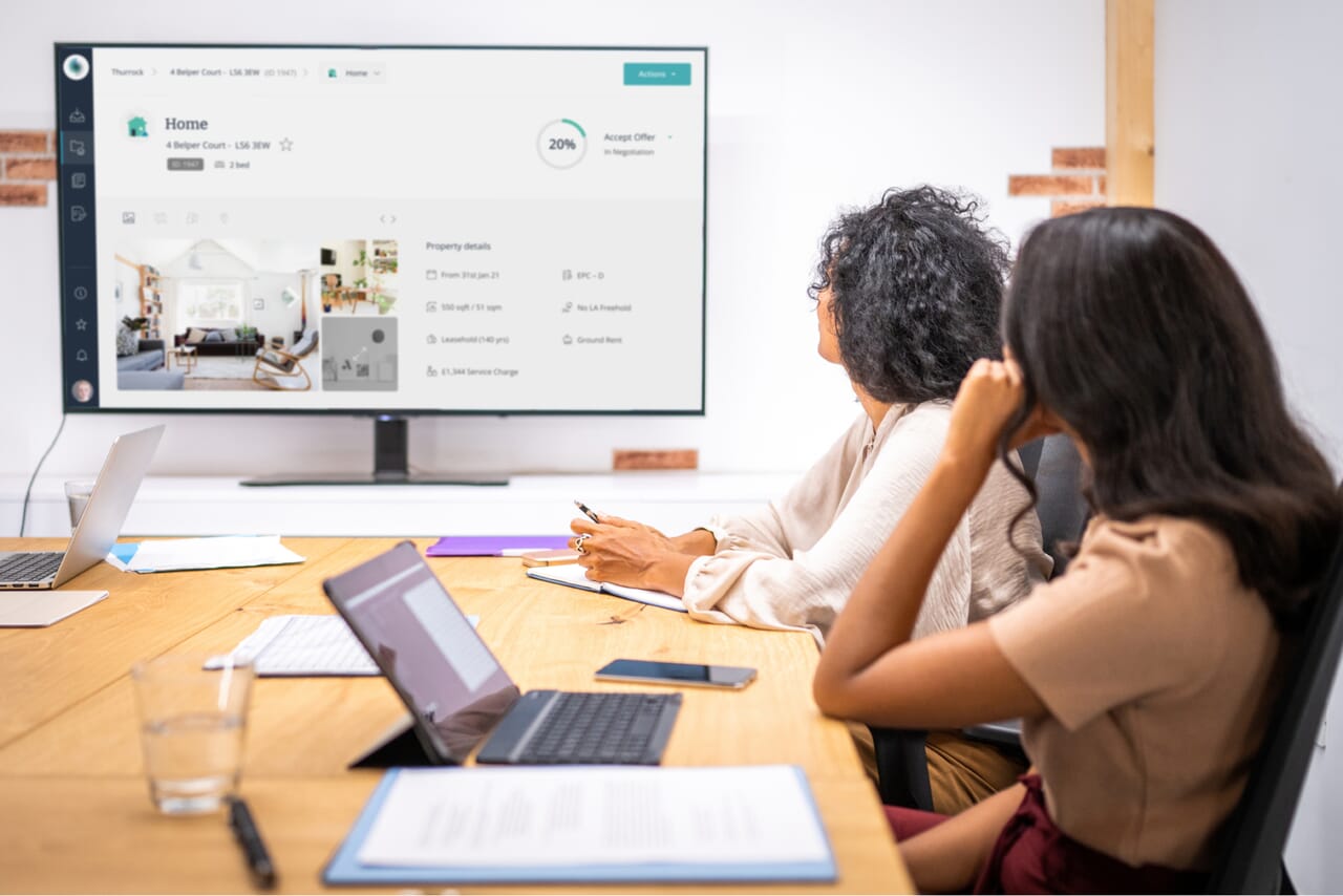
This was a large, complex system, and we’re confident that our design process resulted in a more intuitive and scalable design.

The designs we delivered to the client were meticulously crafted with a strong focus on user-centricity. We actively engaged with users throughout the entire process, commencing with comprehensive user interviews and continuing to solicit their feedback on the designs. This iterative approach ensured that the final designs were not only aesthetically appealing but also aligned with the needs and preferences of the target users.
Thorough research on user journeys and user flows enabled us to develop designs that offered intuitive experiences for a diverse range of users. Moreover, our diligent assessment of pain points at each stage of their journey enabled us to prioritise and address those concerns effectively within the designs, resulting in a more streamlined and user-friendly experience.
Iris is systematically changing the way councils identify, access, and secure affordable housing in their boroughs. We have already helped some councils eliminate rough sleeping from the streets, which we are immensely proud of.
Other client stories
