Enabling Asset managers to store and share secure investment data
At a glance
Complete UI redesign of the front end for a central repository platform enabling any member of the fund industry to store and share secure investment data.
Managing fund data is a huge challenge for many organisations, so Asset Logic have created a centralised platform for investment data which allows any member of the fund industry to create an online data and documents repository. The platform aggregates data and documents from any internal or external system into one online location so members
Project type
Sector
Services provided
Technologies
Project length
Understanding the key use cases
Following the initial discovery phase it became apparent that the platform essentially enabled members to upload data, and then once uploaded it gives the ability to set up a flexible data structure so members can mirror their exact investment structures. Once the investment structure was setup, the platform then offers the ability to share specific parts of the data structure with users of their firm, or different counter-party users from other external firms. The platform also enabled users to assign a responsible party to each field or set of fields, who becomes responsible for keeping them updated.
Understanding ‘financial objects’ data models
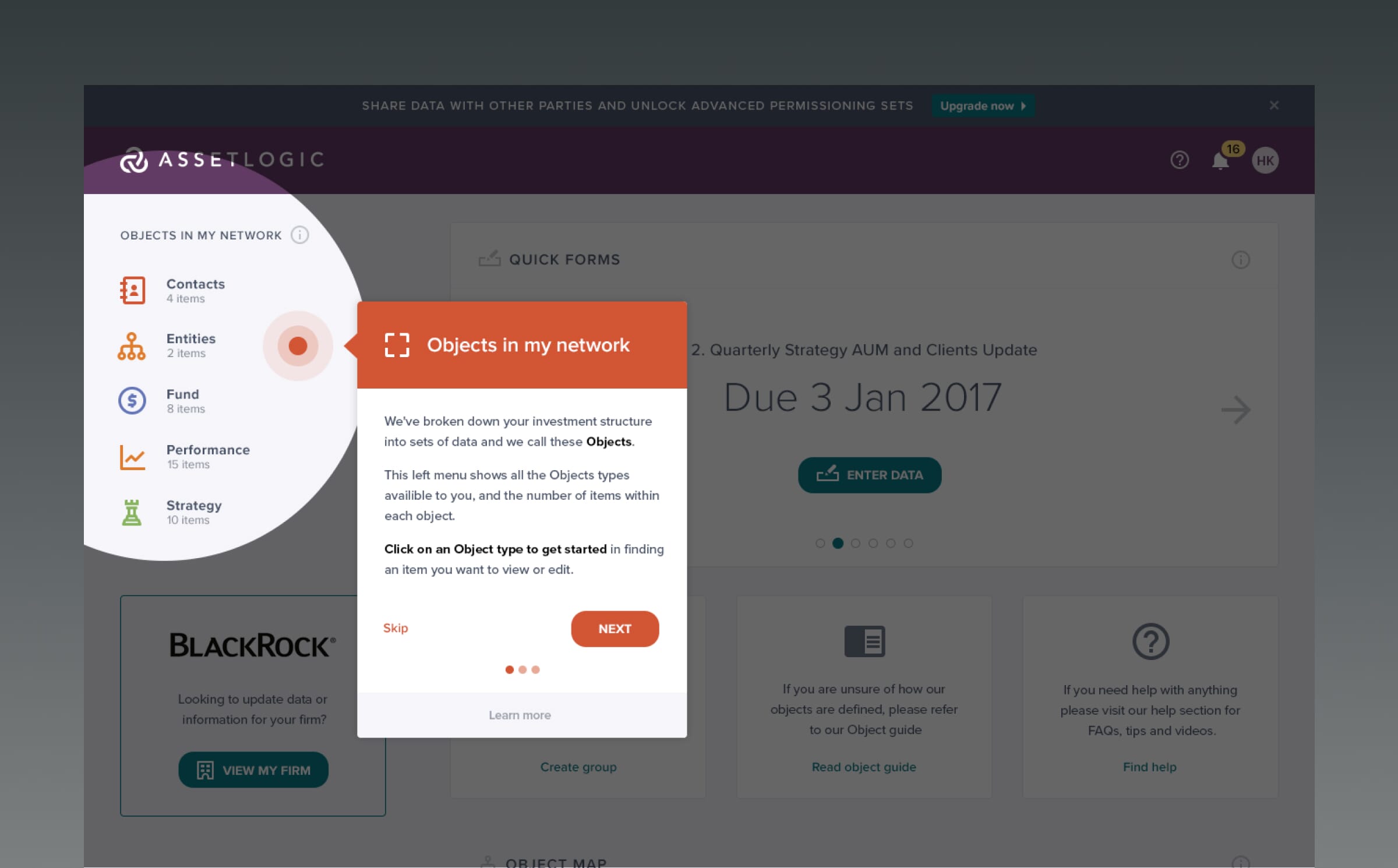
The platform architecture consisted of 15 different financial ‘object’ types including Funds, Private equity, Loans, Share classes. Each object type would contain multiple objects of that type, and when clicking into each object it would take the user into a details page which contained an extremely long page consisting of all the data for that object and with other linked object associated.
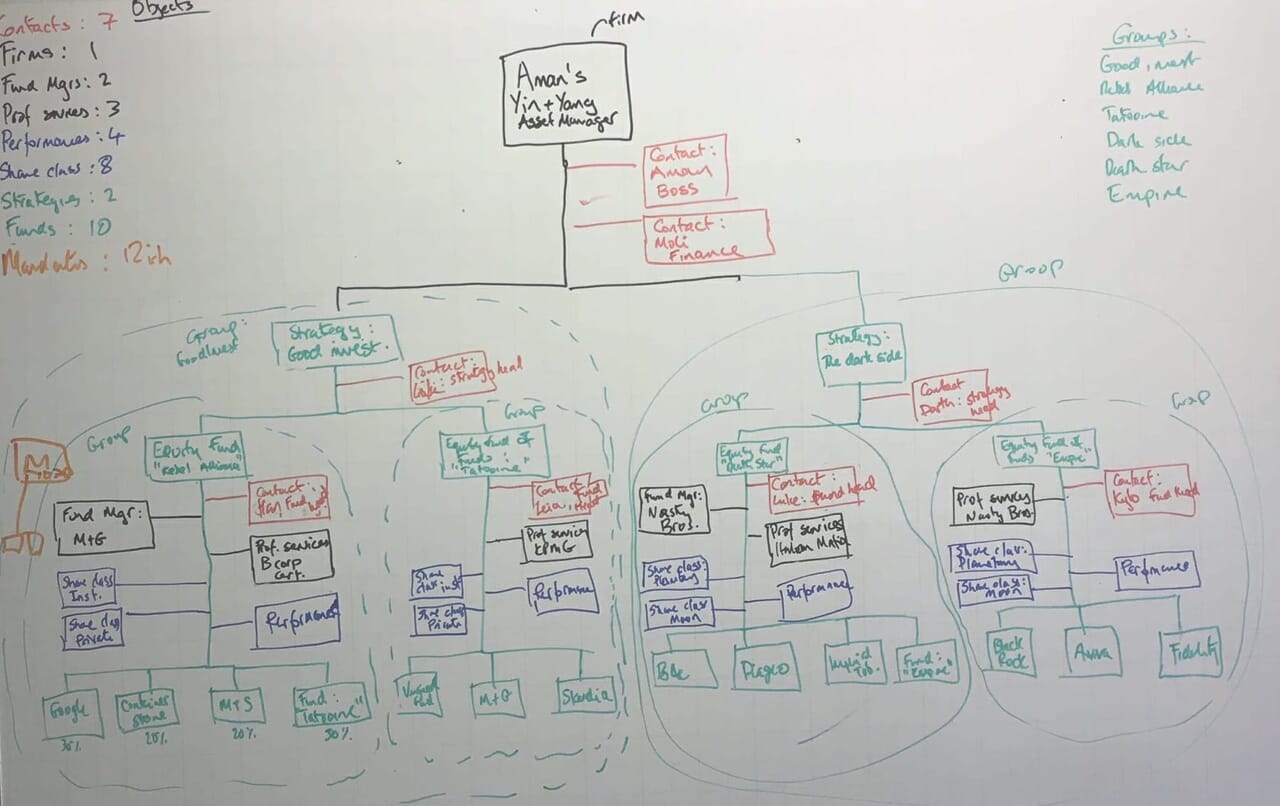
A critical part of our ux/ui redesign strategy was understanding the platform architecture that consisted of different financial ‘object’ types including Funds, Private equity, Loans.

Complexity to be made simple
Despite the platform’s powerful functionality, it became clear that the asset management UI needed significant improvements to enhance usability. The system provided immense value to users, but its complexity made it difficult to navigate and operate efficiently.
The project encapsulated the very essence of what Full Clarity do in our tagline of “Complexity made simple” The functionality of the platform was extremely powerful for users, and what the in-house backend team had built was a fantastic piece of engineering, but it was also extremely complex to understand, leading to frustration and increased cognitive load for its primary user base. It was therefore our role to help re-design the user experience to assist in making things easier to use for the users.
Update monthly finances
From UX research conducted with a key platform member Mercer who regularly use the platform, it was discovered that managers need to update their financials each month but at the moment there was no quick and easy way for them to be able to do this. Previously they would have to go in and out of the “Long form” (see details below) each and every time to update a couple of fields across a lot of objects.
We conducted a UX workshop to better understand the objects and fields the Asset Managers needed to update on a regular basis. A solution was designed which enabled the editing of the regularly accessed fields via a series of “Quick forms” for performance, strategy and firm clients assets under management.
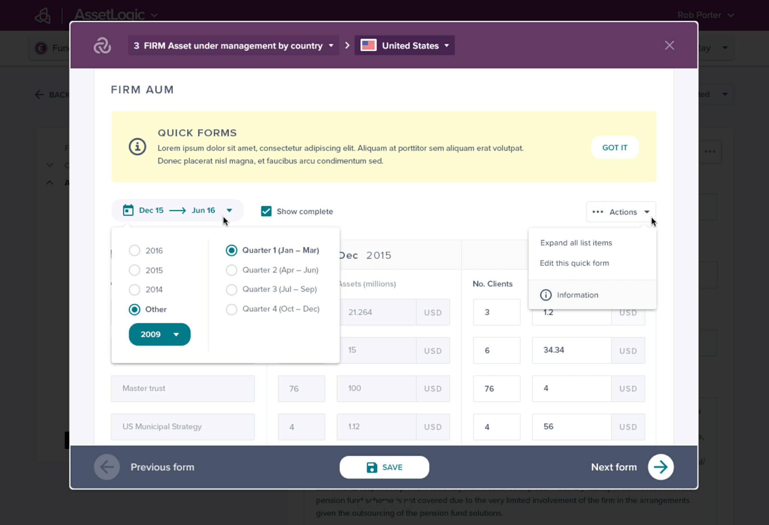
The new quick form solution was very warmly received by the users (the Asset managers) making a time consuming monthly administrative task for them much easier, and quicker due to the slicker asset management UI.
Updating 'object' information
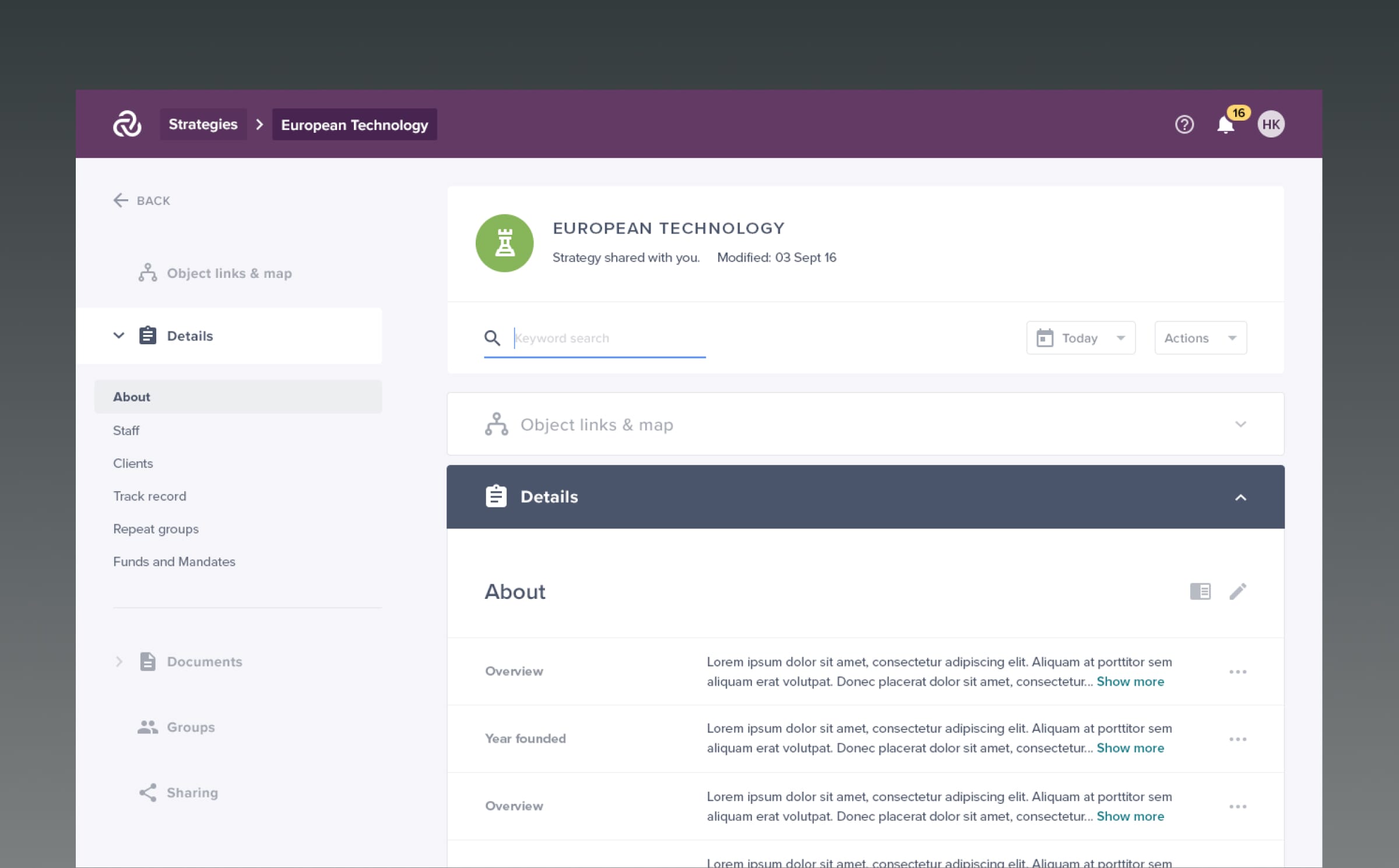
Despite the new addition of the time saving Quick forms, there still would be occasions where users would need to view/update/add/remove other information not in the Quick form across any of the Objects. So it was the Object “Long form” which contained every single data field stored against each and every object, and the existing UI for these pages was extremely long, extremely complex and not very user friendly.
We thoroughly and carefully re-design this long form to cater for every possible different data type that could be entered, viewed and edited. As the form was so huge and so complex, we tackled the form in sections and provided initial UX solutions to the client to help implement both quick wins and user led priorities.
Overtime we then moved onto more system wide structural changes and continued to work through all the other areas in the long form to improve the general usability and findability of each and every type of data field making it as easy and clear as possible for users to find, view and edit any form field in any object in the asset management UI.
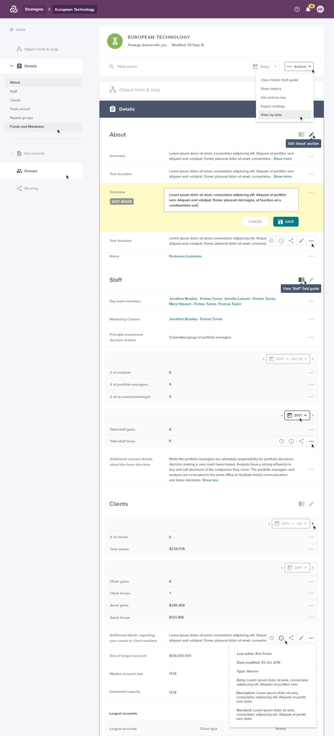
The UX/UI and then front end development of the long form took over a year to complete such was the extent of the complexity. What is shown above is only about 10% of the entire length of the page! It was the longest, most detailed and most complex single page most of our team have ever worked on.
Simplifying nested tables
One of the more complex challenges we faced as part of this UI redesign was designing a solution for nested and repeatable tables, which the client referred to as “Repeat Groups.” Essentially this UI pattern was where a set of data was displayed in a table in the long form and however, each line item within the table had a lot more nested financial data and information associated with it which users needed to be able to access. So essentially our challenge was to try and design an experience which enabled the user to view a table within a table within a table.
In addition to this, there were also many different types of repeat groups in long form so firstly we needed to understand all the different cases. We based our UX/UI designs around the “Assets Under Management” use-case as this was the most complex and extensive, and we set about coming up with UX solutions to display the nested and repeatable data sets. Once we have cracked the toughest repeat group the other variations fell into place.
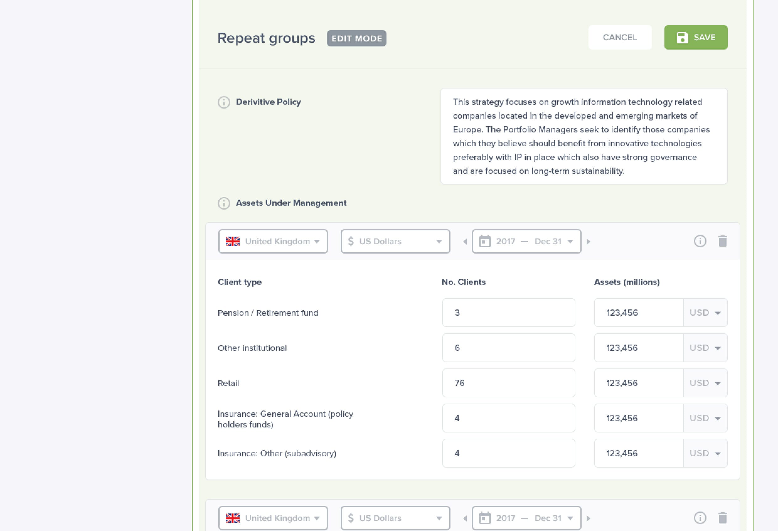
We also spent some time researching into one of the clients using the platforms existing admin area to be able to understand what data is most useful to be able to display within the new nested repeat groups tables, and the client was delighted with the UX design patterns we came up with to solves the problem of how to house the multiple layers of nested repeatable tables.
Edit mode usability improvements
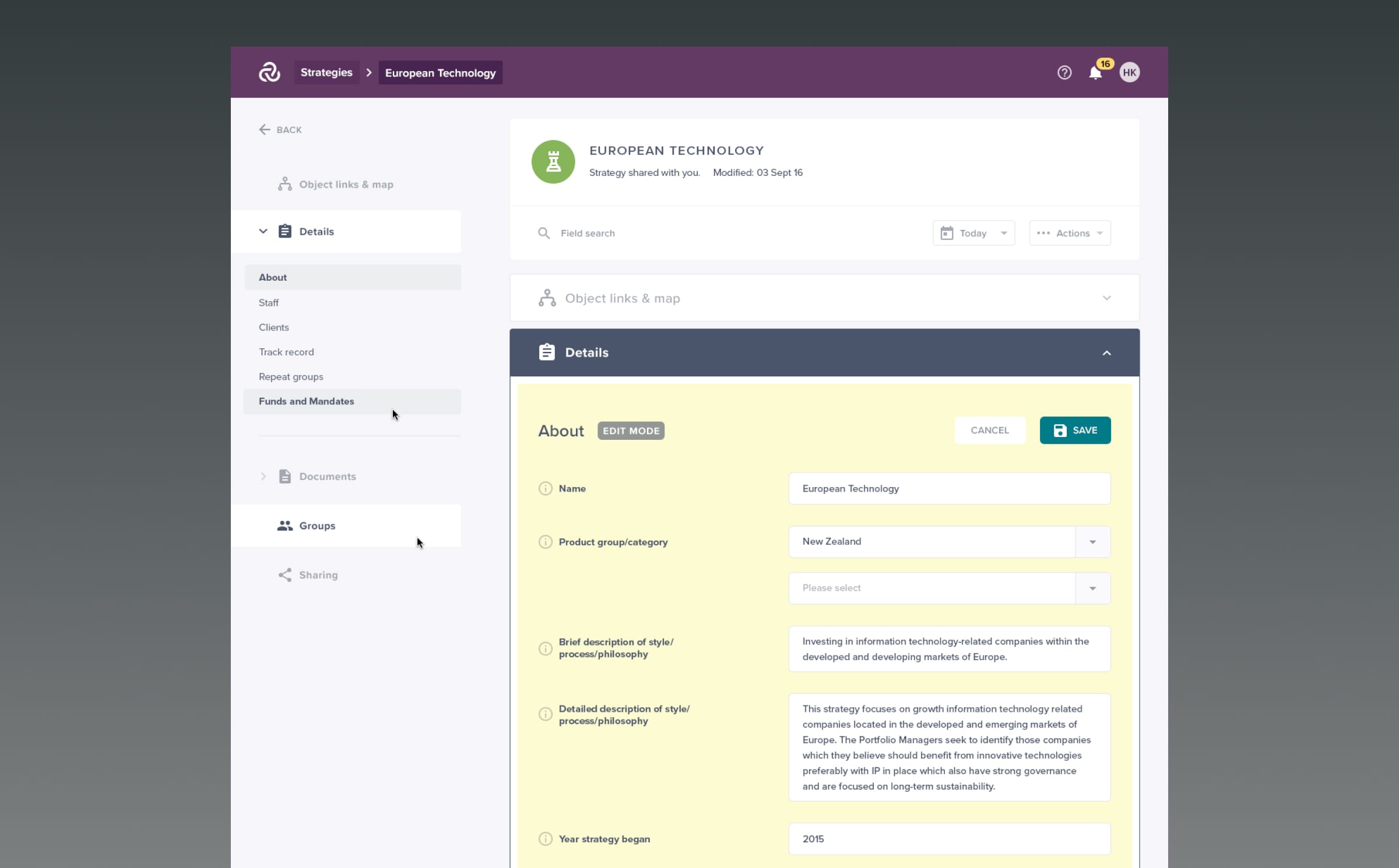
In addition to the view state for the long form, there was also the full edit mode each and every field type across all objects needed to be editable. The existing edit mode contained no navigation to find your way around, which meant the user had to manually scroll through hundreds and hundreds of fields to find what they wanted to edit.
As there were multiple use-cases here, we designs multiple UX solutions to solve this including providing one long edit mode where every field was editable, as well as page section edit views, and lastly also including field by field inline editing – this all enabled the user to edit in the way which suited the data they were changing.
We designed a left sided anchor point navigation that enabled the user to get a sense of where they were on the page and also to be able to quickly and easily navigate to a section or sub section on the long form. The left navigation was pinned to the left side of the browser so it was fixed, with the central/right hand column scrollable. When any of the form category headings or sub headings were clicked, the page on the right would swing up and down accordingly to anchor points. We worked on the interaction design during the front end development and this solution ended up being a highly useful new function that vastly improved the usability of the extremely long page.
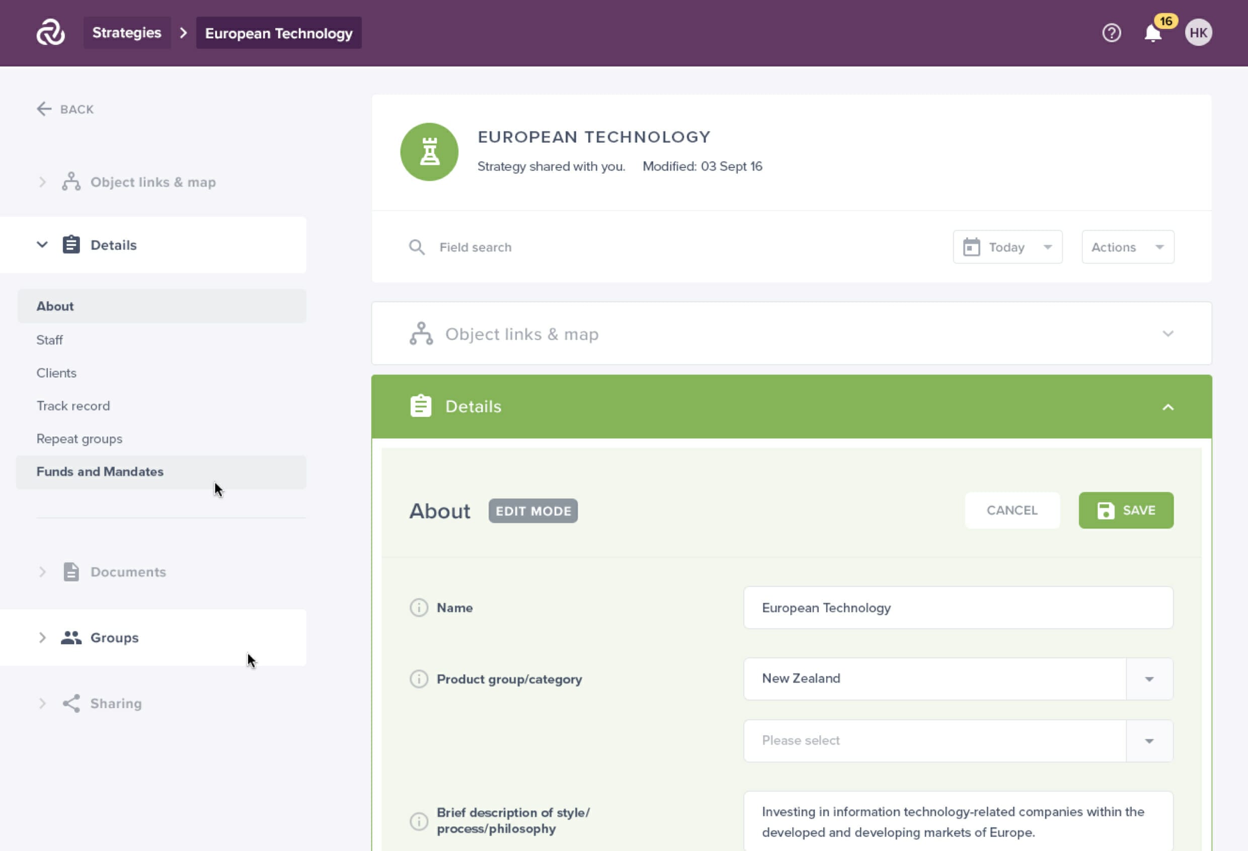
Amongst many other things we also introduced an advanced keyword search, filters, different views and a sort by to enable the user to have other methods of finding the set of form fields they were wanting to edit.
Data structure sharing wizard
One of the other most important functions of the Data Repository platform was the ability for users to be able to share specific parts of their investment data structure with people internally in their firm or with different counter-party users from other external firms.
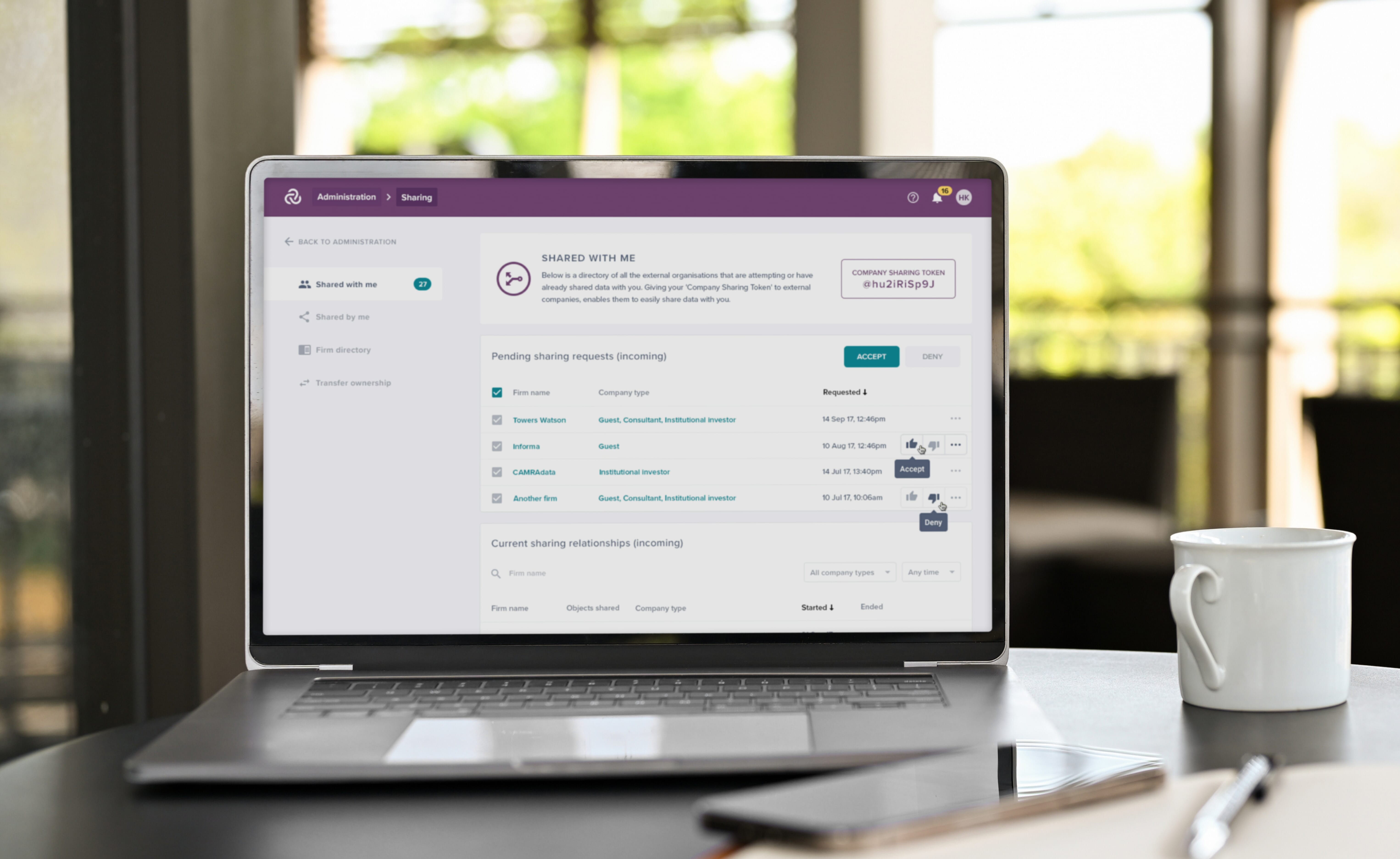
We designed an area for incoming and outgoing sharing relationships for pending, current and past requests. This area also included a firm directory of all the external organisations a user can share data with where they can then view and edit exactly what they share with each company by creating a set of default and custom permissions sets.
Once the firm directory was created to manage the incoming and outgoing sharing relationships, we also then designed a sharing wizard which helped take a member though 6 steps asking them questions about who they want to share with, the type of sharing request, whether they would like a default or custom permission set, and the specific objects they would like to share and with whom.
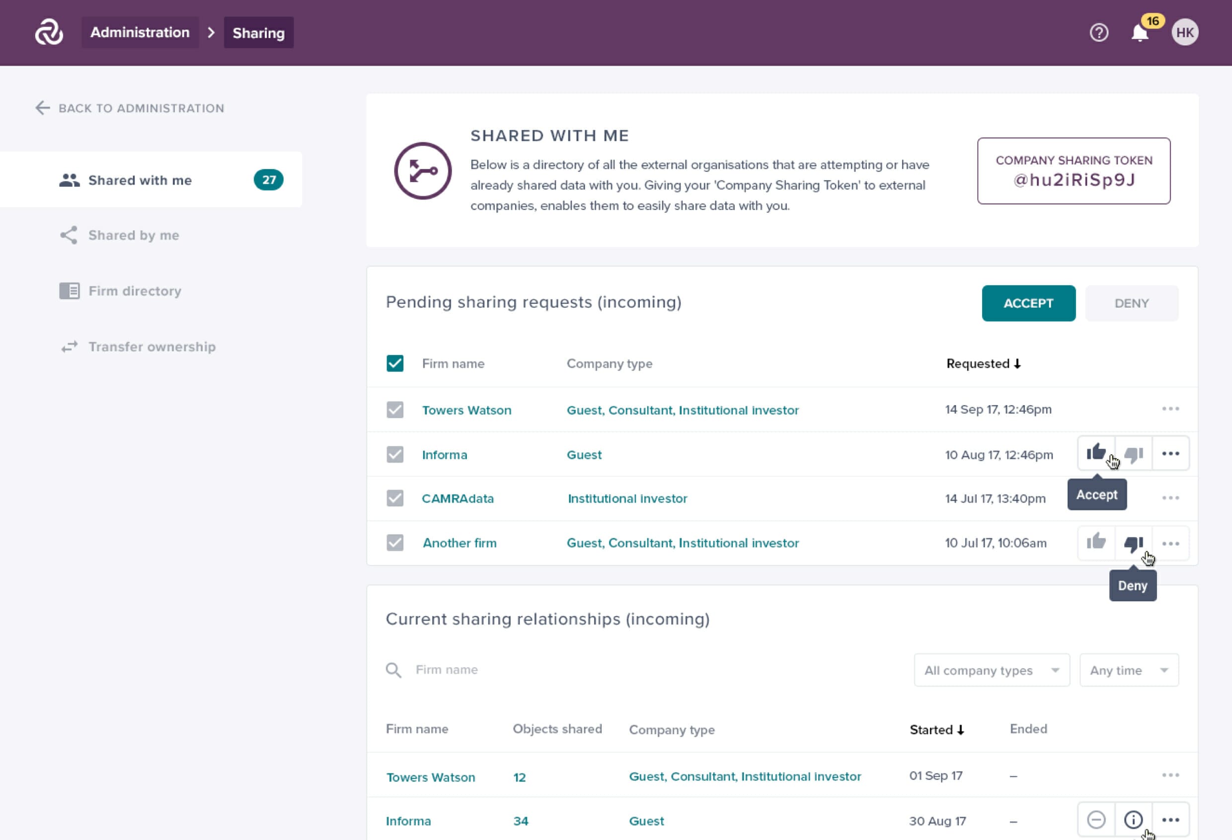
The solution we came up with helped to reduce friction and make the very complicated process much simpler by breaking it down into small bitesized tasks/questions/actions at each stage.
Our key partner Mercer love the look of the new long form design. Well done. We really like what you have done already too, thanks for getting this over so quickly.
Other client stories


