Postel’s Rule
Postel’s Law, also known as the Robustness Principle was created by Jon Postel – a great computer scientist who made significant contributions towards the development of the Internet. The Law states that:
Be liberal in what you accept, and conservative in what you send
One of the first things you’re taught when learning how to optimise user experience, is to reduce all the unnecessary input fields and steps in order to create less effort for the user. We want them to navigate through the systems quickly and most importantly, with ease.
However, we tend to see a lot of variation when it comes down to how each individual user interacts with the system. This is to be expected of course, as all our brains work in different ways as we perceive information differently depending on the content itself or the way in which it is presented to us.
In turn, this means that we have to consider a variety of ways in which the user may interact with each small task but also the overall navigation and flow of the system. This means attempting to consider each possible variation of ways the user can get from A to B and if this is a big system, with multiple users, this can be a huge task to undertake. As you can imagine, this can get confusing and overwhelming to have to visualise all the possible flows, however with the help of this great online tool, your life will become a lot easier!
FlowMapp is a collaborative UX tool which we use on almost all our projects at Full Clarity. The projects which we take on at Full Clarity are usually large, complex systems, so we create User Flows to help us visualise the flow through the system. We tend to break the structure down into specific flows throughout the whole project e.g. ‘Sign Up’ or ‘Create New Task’, and gradually add these smaller flows together into one overall flow of the system. This method works effectively in making sure every small detail has been considered before we ensure the overall flow is manageable. By doing so, we are considering all the possible ways a user might navigate the system, as well as giving them the freedom to use the app intuitively.
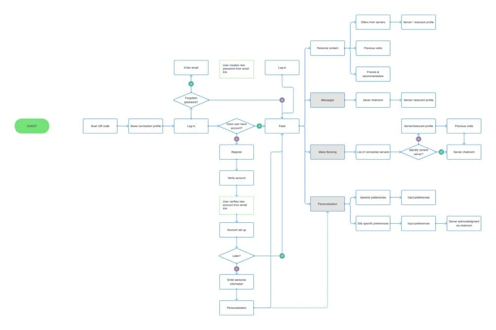
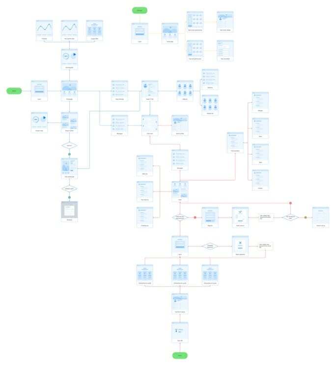
Having said all this, it is of course still a time-consuming task which requires a lot of cognitive effort as well as trial and error but we can confidently say that going through this process helps in considering things from a variety of different angles and plays a large role in the success of your new system.
Tesler’s Law
Tesler’s Law, also known as The Law of Conservation of Complexity, states that:
For any system there is a certain amount of complexity which cannot be reduced
In contrast to what I have previously stated above under Postel’s Law there will, of course, always be a level of complexity which we cannot remove. Simplicity is key, but cannot always be achieved, depending on the system which you are designing. Some complex systems require multiple fields and forms and if this information is crucial to the system, it is not our job to remove it, it is however our job to make this task seem easier.
Methods such as onboarding are a great way of spreading out the information over a few screens rather than placing it all on one, ultimately, reducing the cognitive load for the user. Another benefit is by splitting the content into smaller sections, possibly topics, the user only focuses on one topic at a time. By compartmentalising this information, the user’s productivity will increase, meaning the length in which the task is completed will reduce and it will be carried out with ease.
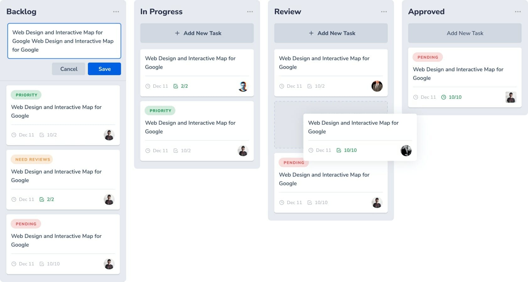
In addition, there are multiple ways of presenting information which will allow the user to understand the bulk of content in front of them. Where possible, you should always look for a more effective format which will present the information in a more digestible manner. For example, Kanban boards are a brilliant way of organising information into categorised groups e.g. states, which improves the visibility of the content. Kanban boards also provide the user with an overview of the whole project, allowing them spot bottlenecks whilst they are forming.
Zeigarnik Effect
Zeigarnik’s Effect stems from Bluma Wulfovna Zeigarnik, a renowned psychologist and psychiatrist who was greatly impacted on today’s understanding of memory. The Law states:
People remember uncompleted or interrupted tasks better than completed tasks
As humans, we have a tendency to be forgetful, whether this is down to interference, failure to store or even motivated forgetting, we all struggle with this common issue. For example we start a task and soon become distracted or something more important is required of us, leaving that task unfinished. If we fail to remember we began the task in the first place, it will most likely go unnoticed until several days or even weeks later we receive a memory trigger to remind us of that peeving forgotten task. As UX designers we can play a large role in preventing this from happening by presenting our users with triggers or reminders to ‘pick up where they left off’.
Progress bars are an effective way of reminding the user how far through a task or stage they are. Not only does it draw attention to the fact that it was never completed, but at a glance it also lets the user view how much more they have left, which might give them a sense of how long this might take. To give an example; the goal is to remind users that they are only 50% through a task which they started last Monday, by placing this information on their dashboard they will be reminded every time they log into the system.
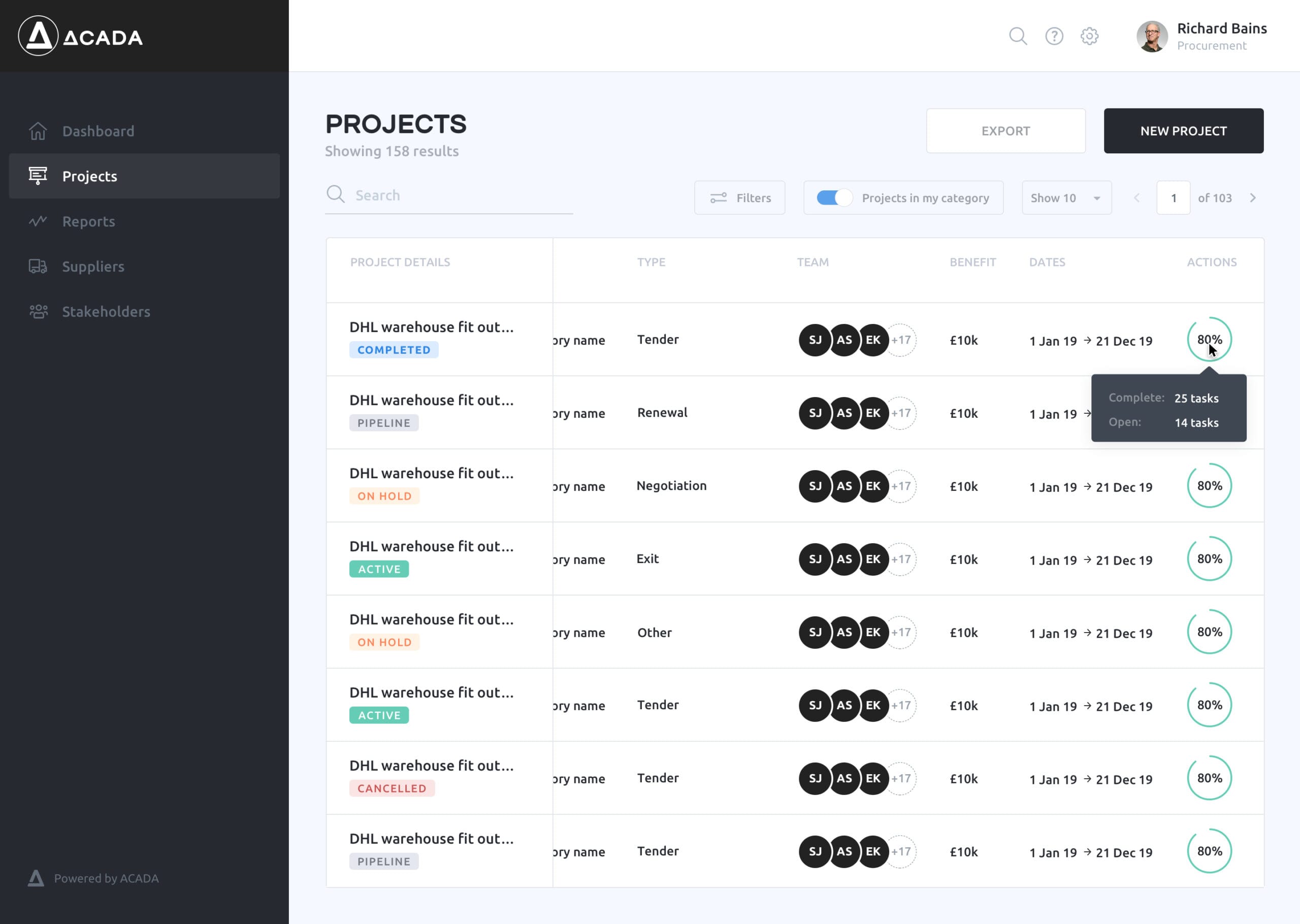
The image above is how we have used a progress circle in our UX/UI designs, to depict how near to completion each project was. This was an intuitive solution as there was a lack of space in each table entry and a progress bar would not make good use of the space. At a glance, the user would understand how much work left there is left to complete each entry, which also provides the user with a sense of urgency and drive to complete their work.
This is the end of the Laws of UX blogs, we hope you enjoyed this series!

Find out more
If you felt inspired by our UX approach to our work please do not hesitate to get in touch.


