The Law of Prägnanz
The next law to explore will be The Law of Prägnanz, which is part of a famous set of principles called the Principles Of Gestalt, it states;
People will perceive and interpret ambiguous or complex images as the simplest form possible, because it is the interpretation that requires the least cognitive effort for us
When designing a new interface, or even giving an existing one a facelift, the following principles are some of the most important to get right;
- Simplicity
- Consistency
- Hierarchical structure
Achieving the above achieves what most clients ask for which is a user experience which is “easy to use” – this is one of the most commonly requested things our clients ask for (even though surely come to us that will be a given!). To achieve the least cognitive effort, we need to understand what the user’s initial perception or interpretation of the page will be. The human eye likes to find simplicity amongst complex shapes, so it is important to avoid information overload when designing an interface. Our goal therefore is to simplify the structure to allow the human brain to digest the information in its true form. Therefore, by minimising content, the user will be able visually process and memorise the information easier. The example below shows structured content into grid based cards to allow the user to process the content quicker and there is little interpretation or cognitive load required.

Think about this theory as a bridge between human psychology and optimising the user experience. You want to consider our psychological tendencies to help you design an interface which will in turn, optimise the overall experience for your users. If you design a disjointed interface, the user’s perception of the experience will also become disjointed and ultimately, unenjoyable. The goal is to design an interface which will be clear for the user at first glance as this requires “the least cognitive effort”.
Fitts’ Law
This law may be one of the most applicable laws to designing an interface for optimum user experience. The law was created by Paul Fitts during his work relating to the human motor system. The law states that:
The time to acquire a target is a function of the distance to and size of the target
When you take time to think about this law, you will soon realise it appears all around you; for example the space bar on our keyboards. This is done as they are the most commonly pressed buttons and therefore saves us time if they are easiest to navigate. When designing an interface, you must consider where the primary button is placed on the screen, in relation to the other components, as well as the size and colour of the button to ensure it is easy to find and interact with.
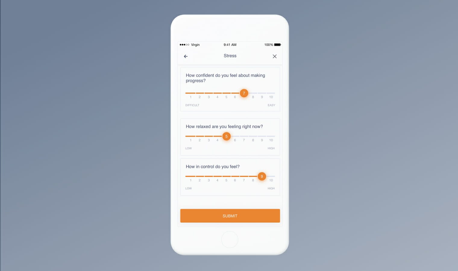
Firstly, you should consider the time it will take for your cursor to reach the button – a call to action should be placed on the screen where they can be easily acquired. In the example shown below the CTA button to submit is placed directly below the respective interactive sliders. Not only does this make the function of the button clear, but also reduces the time it takes to press on the button as it is near to where the users hand has been previously.
Of course this goes hand in hand with the size of the button. If the button is small, the user’s action will have to be more precise and thus expend more effort to reach their goal. Usually, the larger a button is, the more it is encouraged to be clicked upon. Importantly, when considering any mobile applications, a CTA button should be between 42-70 pixels in size.
However, there are a range of other factors which affect the user’s ability to navigate to important CTA components on an interface. For example, the button’s ‘clickable area’ (the area in which the user can click and see the result) should be extended to the entire target as this required less precision and therefore less effort. The UI consideration such as the colour and shadow of the button which will play a large part in making the button desirable to press and noticeable amongst the other components.
Serial Position Effect
The serial position effect was formed by Herman Ebbinghaus and states that;
Users have a propensity to best remember the first and last items in a series
There are two specific effects which form the larger ‘Serial Position Effect’:
- The ‘primacy effect’ states that there is more accuracy presented in recalling the first item in a sequence as you don’t yet have a cognitive burden of having to recall any other items.
- The ‘recency effect’ works as there is a higher chance of remembering items in our recent working memory as we saw them last.
Short term memory allows only three or four pieces of information to be remembered at any one time, meaning you don’t want to overload the interface with information your user’s can’t remember, possibly causing frustration and confusion. Although this isn’t always possible, there are ways of getting around this.
It can be effective to organise information into three sections with the CTA always placed at the bottom. The user will start at the top of the screen, reading the title which explains the functionality of the page, so they know what the intention of the screen is. Secondly, there is the bulk of information in the middle of the page, which the user isn’t expected to interact with. Lastly we have the important CTA at the end of the sequence, which allows the user to act upon what they have read. You want this to be the last feature the customer remembers and thus, interacts with on the screen.


Find out more
If you liked the sound of our considered approach to user experience design, please do not hesitate to get in touch, we would love to help on any upcoming projects you might have.
Related insights

The Laws of UX: Part 1