
The Laws of UX
To make sure we are all on the same page at Full Clarity, there are certain UX considerations we tend to follow, ensuring the solutions we are creating are coherently consistent. We believe it is important to be aware of UX design guidelines, and abiding by these laws ensures that little to no time is wasted during the UX design process due to altering small issues, which are pre acknowledged by our team.
It can be hugely beneficial to review these laws before diving into the UX design stages. We like to prepare ourselves by taking some time before starting work to assess these laws as this saves hours of re-work, as well as ensuring the design is absent of common UX faults.
In this article we will show examples of where we have considered each law in some of the UX work we have done at Full Clarity, to demonstrate how these UX laws are used practically.
Hick’s Law
Hick’s Law was named after the findings of two renowned psychologists called William Edmund Hick and Ray Hyman, the law states that;
The time it takes to make a decision increases with the number and complexity of choices
This law is universally acknowledged within user experience design. The more complicated a design becomes due to an increased number of buttons, options, or navigation paths, the harder it is to make a decision. This means that time can be wasted trying to navigate through what is a seemingly simple interface due to an overload of information to digest.
We have all seen web applications where there is just too much information to fit onto one screen. It might also sound familiar to just keep the features as we already have them and we have spent time and money building them, but are they helping or harming your users with the decision or feature overload.
There are simple ways to overcome this issue, which will enhance the user experience by creating a smooth flow of navigation and diminish the chance of any potential frustrations.
- Progressive onboarding
- Culling features and functionality which is no longer useful
- Simplify options into smaller steps
To show an example of this, we often use progressive onboarding at the beginning of the user journey to outline the features of the application and how they work. This method reduces the cognitive load for the user and allows them more time to soak up each individual point.
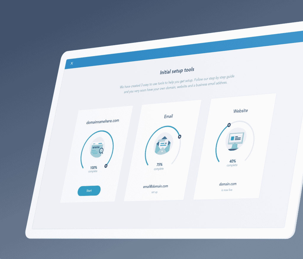
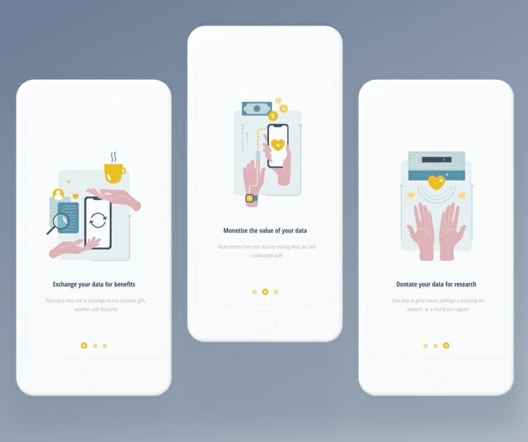
The above project screenshots show examples of where we have broken down information into smaller sections or decisions so the user can clearly see and digest the choices they have or the key information being presented to them. In the case of the mobile onboarding experience, instead of explaining the main features of the app in an indigestible paragraph, we used a three-step series with the use of custom drawn illustrations and clear titles which explained the benefits to the user, to ensure each feature was given time to be acknowledged and digested. It gives the users a friendly introduction to the app while allowing them to become familiar with the key areas, how it works and the benefits to them.
Jakob’s Law
This law was established by Jakob Neilson of the Nielsen Norman Group. The law states that;
Users spend most of their time on other sites. This means that users prefer your site to work the same way as all the other sites they already know
This law is about finding balance and familiarity. Although there is a lot to be said for having unique designs to ensure your work stands out from the rest, one must also consider the importance of not over complicating, and using established UX/UI designs patterns and layouts. If you were to take a moment to review your top five most used websites or apps, you will most likely see similarities in layout across them all. This is not down to coincidence or because certain sites have copied another, it is due to years of research and usability testing proving this is the best form of user experience.
Obviously we all want high quality UX design, although sometimes with structural decisions it is better to follow a well-known format which we have seen thousands of times before. In a more granular sense, this means that you do not want your users resenting using your design because they find it hard to use or it isn’t in the format they are familiar with.
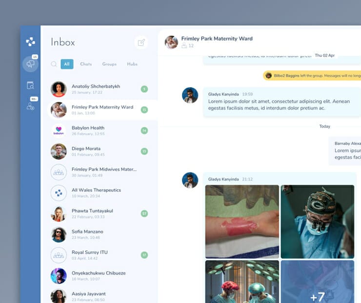

An obvious example of this is a messaging feature within a communications platform or app. Many of the interfaces we have worked on over the years have included internal messaging features, like the examples shown in the image above. We knew that the target users for this platform were not expecting an ingenious new messaging system, rather an efficient and secure system which allowed them to easily communicate with their colleagues. From the image above you can see that the chatroom follows a similar structure to that seen on renowned platforms such as Slack, WhatsApp or Facebook messenger. Of course, there is always room for improvements and new features as well as specialised types of messaging platforms directly relevant to the sector and target users, which will help distinguish your platform. The examples above are a specialist encrypted healthcare messaging platform, and a communications mobile app for business entrepreneurs.
Law of Similarity
Next we will explore the Law of Similarity, as part of Gestalt’s principles. The law states that;
The human eye tends to perceive similar elements in a design as a complete picture, shape, or group, even if those elements are separated
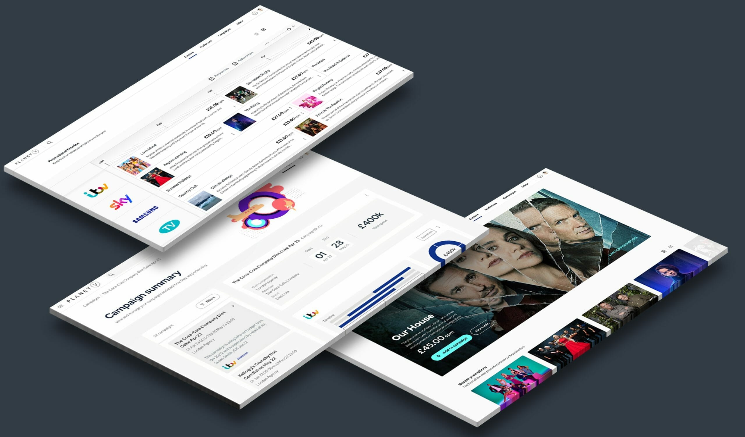
This law is particularly relevant to User Interface (UI) Design, as often on a small screen the components are positioned close to each other and can often be mistaken for the same feature. Designs should be carefully constructed to ensure there are clear differences between navigation and individual screen content. An efficient way to overcome this issue is to prioritise the consistency of the main navigation elements. This can be achieved by placing each navigation feature in the same position as the previous screen. As the user navigates through the interface, it will become ingrained in their memory of the way the interface works. In addition, these navigation elements should be styled consistently, and provide a contrast to the screen content. An example of this is shown below.

As you can see in the image above, we have placed all navigation elements in a darker coloured bar on the left hand side of the screen. Contrast can be used to differentiate certain components on the screen, meaning users can learn the structure of the platform. The navigation bars will remain in the same position, thus forming a consistent design. Users will quickly learn that they can navigate back to the home screen via this panel, as well as move smoothly to other important pages.

Find out more
These are just a few of the Laws of UX that we follow to create our designs at Full Clarity. We will be exploring more of these laws in the near future, so keep an eye out for Part 2.
If you liked the sound of our approach to user experience design, please do not hesitate to get in touch, we would love to help on any upcoming projects you might have!
Related insights

The Laws of UX: Part 2

The Laws of UX: Part 3


