

What is navigation UX?
Navigation UX refers to the design of systems that help users explore and interact with a product (whether that be a SaaS, web app, or other digital product). This includes primary navigation menus, secondary navigation, dropdown menu structures, in-page links, and supporting elements such as breadcrumbs, search bars, or effective search functions.
It is not limited to visual layout. Navigation UX is closely tied to how content and functionality are organised and how clearly that organisation is communicated to users. A well-structured navigation system allows users to move seamlessly through a web app without needing to stop and think about where to go next, often supported by clear visual cues and indicators of their current location.
Why navigation is critical to user experience
Navigation plays a central role in usability and overall user experience. If users cannot find what they need quickly, the overall experience suffers regardless of how strong the User Interface or functionality may be.
Clear navigation supports findability. Users should be able to predict where information lives and reach it with minimal effort. When navigation is unclear or inconsistent with the mental models users have, they are forced to search, guess, or backtrack, which increases cognitive load and frustration.
Navigation also affects decision-making. When too many options are presented at once, or when labels are unclear, users take longer to choose a path. This slows interaction and can lead to drop-off and churn, particularly in key journeys such as onboarding or feature adoption.
In digital products that are used regularly, inefficient navigation has a compounding effect. Small delays in finding information or completing tasks add up over time, reducing productivity and confidence in the product.
Key principles of effective navigation UX
Effective navigation is built on clarity and structure within your navigation design.
Clear labelling is essential. Navigation labels should describe content in straightforward terms, avoiding internal language or ambiguous wording. Users should be able to understand what they will find before they click within navigation menus or across a navigation bar.
Logical grouping helps reduce complexity, too. Related features or sections should be organised in a way that reflects how users think about their tasks, not how the system is structured internally. This allows users to scan your interface quickly and make decisions easier.
Prioritisation ensures that the most important destinations are easy to access. Not all areas of a platform need equal visibility. Highlighting key sections helps guide users towards common workflows.
Consistency across the product is equally important. Navigation should behave in predictable ways, with similar navigation patterns and structures repeated throughout the interface. This allows users to build familiarity and move more efficiently.
Hierarchy also plays a role. Shallow structures reduce the number of steps needed to reach content, while deeper structures can help organise more complex systems. The balance between the two depends on the size and complexity of the platform and its navigation systems.
Common navigation patterns (and when to use them)
Different navigation patterns are suited to different types of products and levels of complexity. Choosing the right approach depends on how much functionality needs to be surfaced.
Top navigation is often used in simpler platforms or hybrid marketing/product environments. It works well when there are a limited number of high-level categories and users need quick access to key areas through a clear navigation bar. They work particularly well on landing and splash pages.
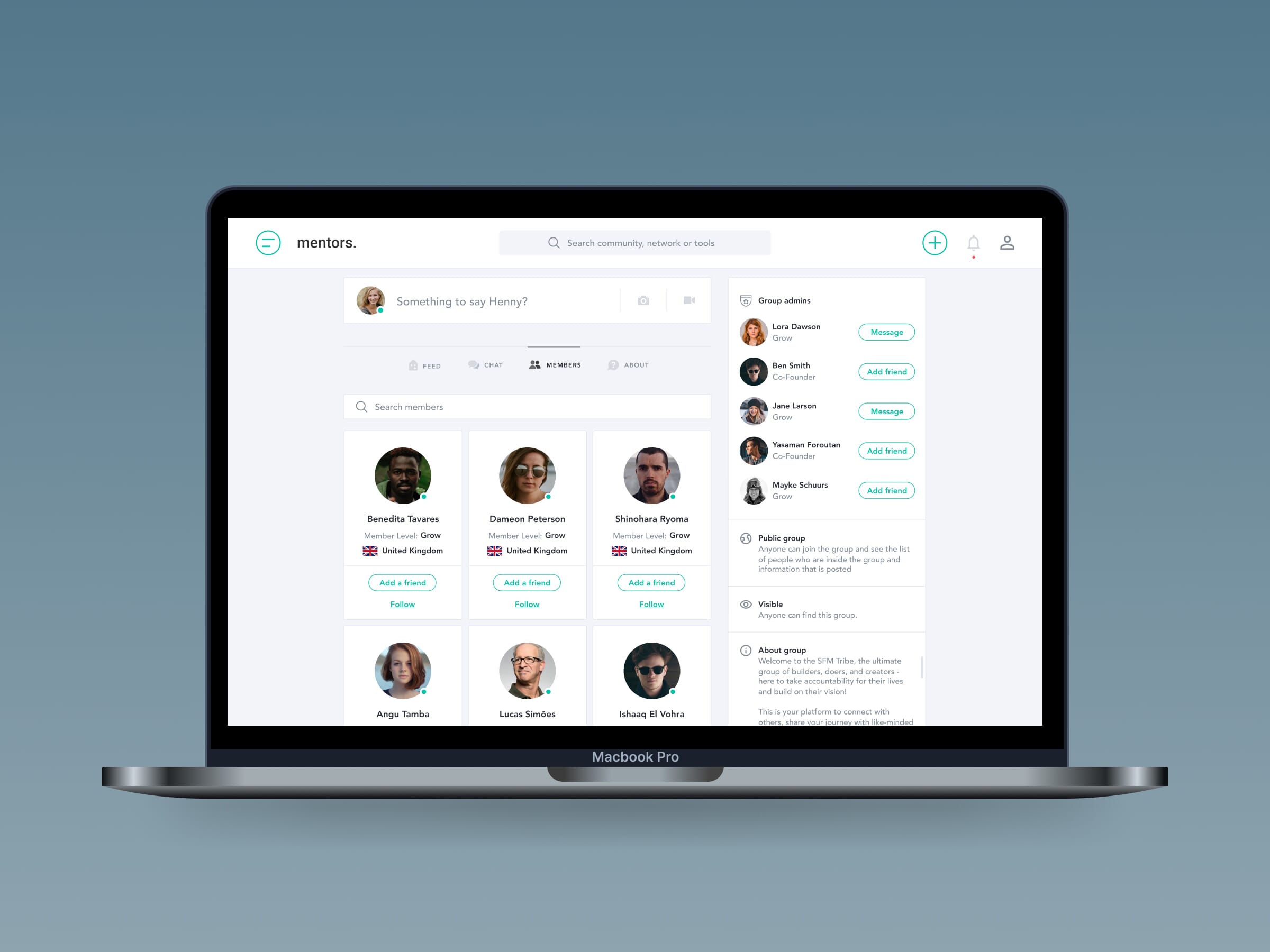
Sidebar navigation is more suitable for complex SaaS platforms. It allows for deeper hierarchies and supports workflows where users need to move between related sections frequently.
Mega menus can be useful in feature-rich platforms where multiple categories need to be exposed at once. When designed well, a mega menu can improve discoverability, but it requires clear structure to avoid overwhelming users.
Dropdown menu patterns are useful when secondary options need to be grouped under a primary category. However, overuse of dropdown menus or poorly structured dropdown menu interactions can increase cognitive load and make navigation harder to scan.
Hamburger menu patterns are commonly used on mobile devices where screen space is limited. While a hamburger menu can simplify the interface, it can also hide important navigation options if overused.
Breadcrumbs provide context within deeper structures. They help users understand where they are in relation to the wider system and allow them to move back through levels easily.
Search acts as a supporting mechanism rather than a replacement for navigation. It is particularly valuable in large platforms, but should not be relied on to compensate for poor structure.
Each of these navigation patterns can be effective, but their success depends on how well they align with the product’s structure and user needs.
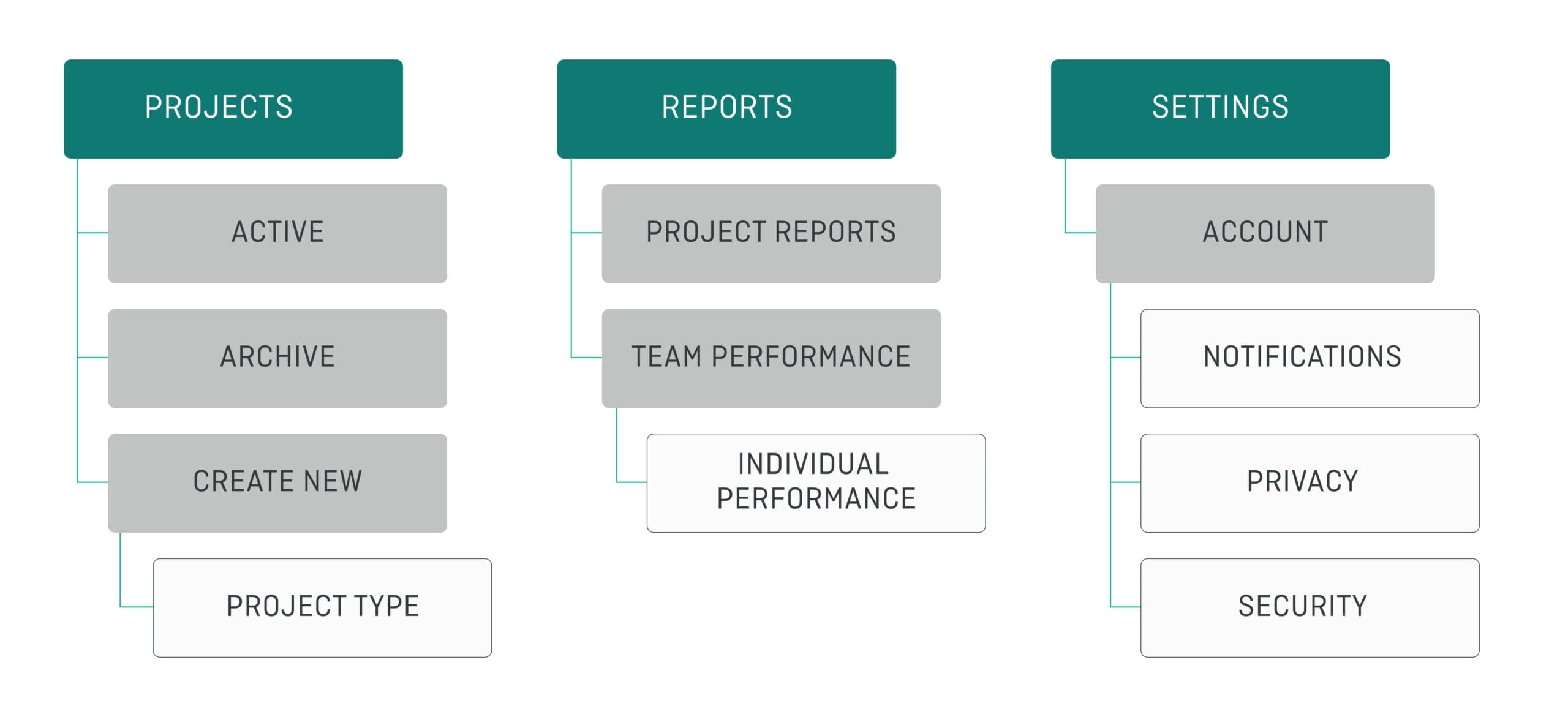
Navigation and information architecture
Navigation is the visible layer of a product’s information architecture. It reflects how features, data, and content are organised beneath the surface.
If the underlying structure is unclear, navigation will struggle to compensate. Users may encounter categories that overlap, labels that feel inconsistent, or pathways that do not match their expectations.
Improving navigation often requires looking beyond menus and into how the platform is structured. This might involve redefining categories, simplifying hierarchies, or aligning the system more closely with user mental models. Strong navigation design is directly dependent on strong information architecture.
When information architecture is well defined, navigation becomes easier to design. Labels are clearer, groupings feel more natural, and users can move through the platform with greater confidence.
Find out more
Interested in improving your products navigation? Get in touch with us today for support with your projects.
Related insights

Colour theory for UI design: UX UI colour best practice guide

![Information architecture design in UX: complete guide [2025]](https://fullclarity.sirv.com/media/2025/01/IA.png)

