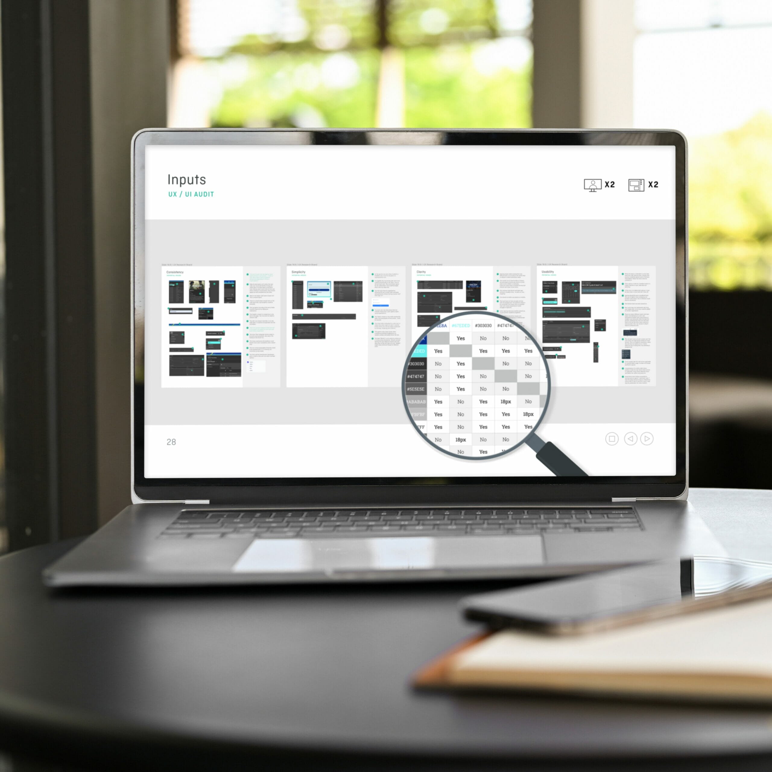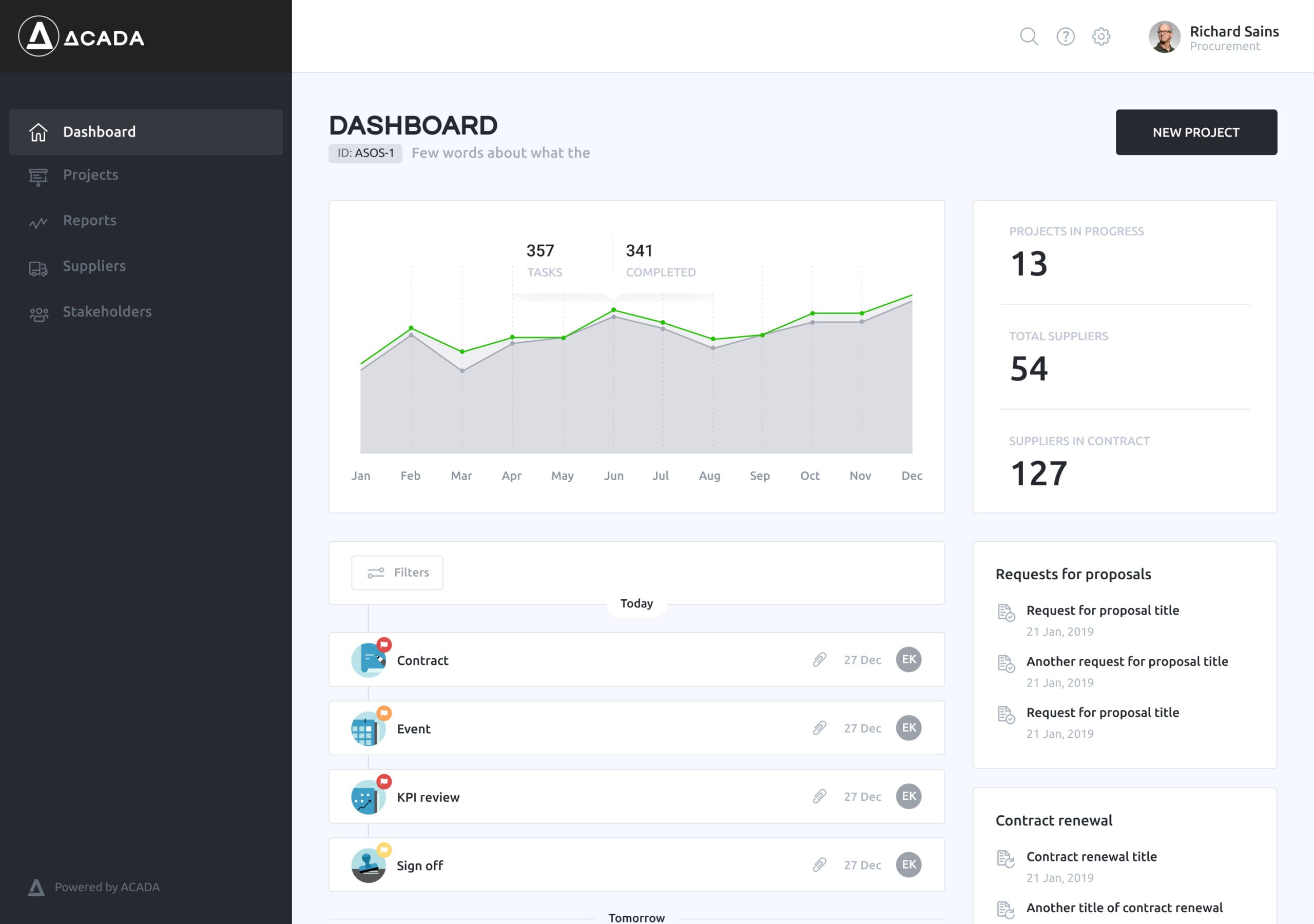
What is SaaS UX design?
SaaS UX design focuses on creating intuitive, user-centred experiences within SaaS products. Unlike traditional software, SaaS products are accessed online, making ease of use, accessibility, and user satisfaction critical to customer retention. When designing for SaaS products, simplifying complex workflows, reducing user effort, and continuously iterating based on feedback to refine the user journey are central to the process, and form the basis of many of the principles that we’ll discuss in this article. Ultimately, effective SaaS UX design ensures that even advanced features feel intuitive and approachable to a diverse user base.
Why is UX design important in SaaS?
Before explaining how to design for SaaS dashboards, it’s important to understand why the user experience is so important.
In SaaS, good UX design helps customers to achieve their goals quickly and with minimal effort. Plus, providing an intuitive experience not only improves user satisfaction but it also reduces churn rate, boosting customer loyalty and long-term business success as a result. This is why UX design is so important in SaaS – a good UX is best for business.
Successful role models in SaaS UX design include Slack and Dropbox. Slack revolutionised team communication by prioritising their UX, which undeniably contributed to their rapid growth and customer loyalty. Similarly, Dropbox made cloud storage easy to use, allowing users to upload, share, and access files with ease, making it a preferred solution for both personal and professional needs. Both of these businesses took a system that already existed and improved them by making the user experience significantly better. A strong UX in SaaS does more than attract users; it fosters engagement, impacting business success.
UX considerations for effective dashboard design – how to actually do it
Understanding user needs
Effective dashboard design starts with developing a deep understanding of your end-user. This is why it’s important to conduct thorough user research to pinpoint the features and workflows your users genuinely need. This will ensure that your dashboard aligns with user expectations and delivers truly valuable insights. Research methods such as user interviews, surveys, focus groups, and usability testing can provide vital insights into user preferences and behaviours.
Information architecture
An easy-to-use dashboard requires a logical structure that organises data clearly. Prioritising content based on user needs and creating a flow between different sections will help users find relevant information quickly and effortlessly. Cluttered or disorganised dashboards can lead to frustration, cognitive overload and reduced efficiency, which in turn, lead to abandoned flows and even churn. Employ tree testing and card sorting research trials before designing your dashboard to learn how to organise your information architecture best for your users.
User journey mapping
Understanding how users interact with a dashboard at each stage of their journey is crucial for designing meaningful experiences. User journey mapping is a method that we use to identify and investigate various user scenarios which in-turn, allows us to anticipate potential obstacles and design for smooth transitions between tasks. This helps to ensure that users can navigate efficiently.
Testing and feedback
Dashboard design should always be seen as an evolving process. Iterative usability testing allows designers to refine the interface based on real user interactions, identifying issues and enhancing the user experience. Gathering feedback at different stages ensures the design meets user needs and addresses any usability challenges so that you can optimise conversion rates down the line.
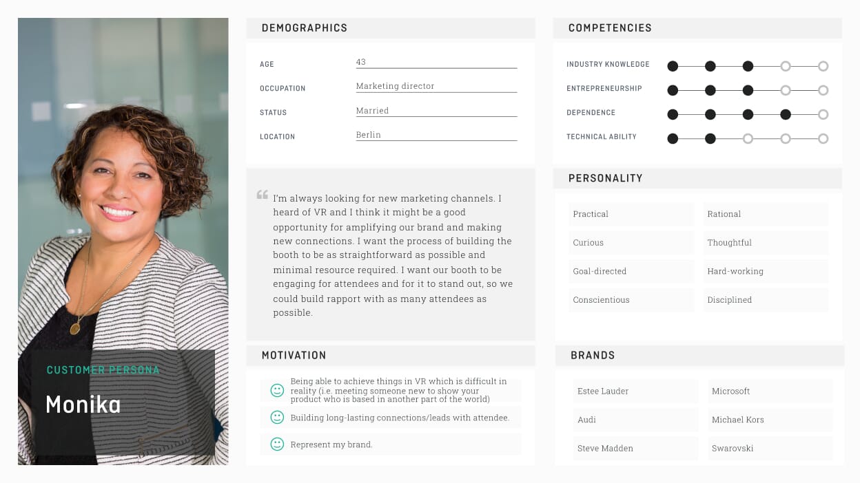
Best practices for good SaaS UX design
Make things as easy as possible
Effective SaaS UX design prioritises simplicity and efficiency. If you streamline workflows, you can help users complete tasks with minimal friction. To do this, you can reduce the number of steps needed to achieve goals and provide quick access to frequently used features. The goal is to create an experience that encourages user engagement and reduces the likelihood of frustration.
Providing clear feedback and guidance throughout the user journey
Feedback along the user journey is vital for satisfaction. Make sure that your dashboard offers real-time responses to different user actions, such as confirmations for completed tasks or notifications for errors. Additionally, incorporating tooltips, onboarding tutorials, and contextual help can guide users through their journey, helping them understand how to leverage the platform to its fullest. This clarity fosters confidence in using the application and encourages ongoing usage.
Make sure your dashboard is accessible for all
Great design is accessible to all users, regardless of their abilities. Implementing best practices for accessibility in your design process, such as using clear language, ensuring sufficient colour contrast, and providing keyboard navigation, is essential for creating an inclusive environment. Consider the varied and diverse needs of your user base and aim to accommodate all preferences and requirements. A commitment to inclusivity not only enhances user satisfaction but also expands your potential audience.
What is SaaS UI design?
On the flip side to UX, SaaS UI design focuses on the visual elements of your dashboard, rather than the user journey and experience.
Key principles for SaaS dashboard design include consistency, responsiveness, and clarity. Consistency allows users to predict element behavior; responsiveness ensures performance across devices. Clarity is vital for presenting information simply, helping users complete tasks efficiently.
Why is UI design important in SaaS?
Good UI design plays a vital role in making SaaS applications both user-friendly and visually appealing, which has a direct impact on engagement and retention (similar to UX design.)
A thoughtfully designed UI not only captures users’ attention but also makes it easy for them to navigate and interact with the software, joining hand in hand with the benefits of prioritising UX design. When users encounter an interface that’s intuitive and looks appealing, they’re far more likely to become loyal customers.
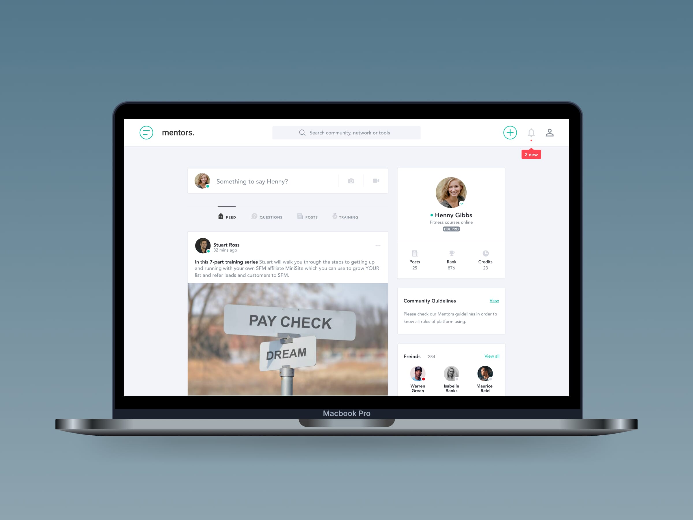
You can see this with applications like Trello and Asana. Their clean layouts, simple navigation, and effective use of colour and typography help guide users through complex tasks effortlessly. These examples highlight how intentional UI design not only enhances the experience but also supports long-term business growth.
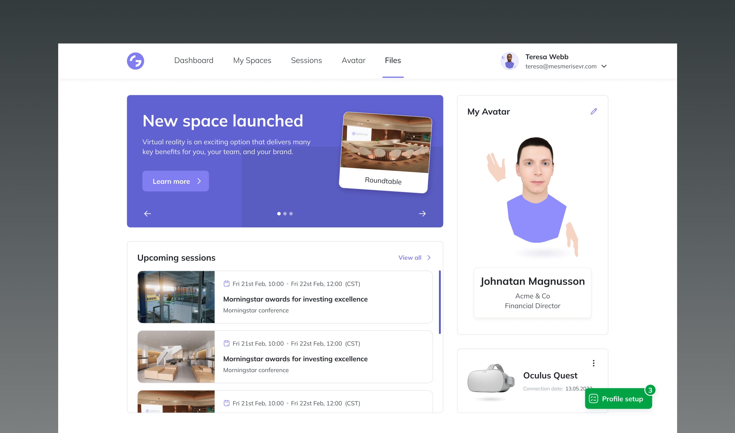
UI considerations for dashboard design
Creating an effective dashboard from a UI perspective requires thoughtful attention to design elements that balance functionality and aesthetics. By focusing on visual hierarchy, branding consistency, and responsive design, you can ensure a dashboard that is both intuitive and visually appealing.
Visual Hierarchy
Effective visual hierarchy guides users’ attention to key data points first, helping them to easily prioritise information. This can be achieved through the strategic use of size, colour, and positioning of various design elements. For example, larger fonts and vibrant colours can emphasise primary metrics, while muted tones indicate supporting information, allowing users to quickly get an overview without feeling overwhelmed.
Branding Consistency
A cohesive visual language that reflects your brand’s identity helps to foster familiarity and trust. Ensuring consistency in fonts, colours, and iconography across the dashboard reinforces brand recognition and enhances usability by maintaining a predictable design language throughout. This creates an experience that feels both professional and user-focused.
Responsive Design
As dashboards are often accessed on various devices, responsive design is crucial. A responsive UI ensures that the dashboard layout and features adapt seamlessly across screen sizes. This may involve rethinking menu placements, adjusting widget sizes, and optimising data displays to maintain usability across desktop and mobile devices alike but its crucial for customer retention.
Micro-interactions
Incorporating micro-interactions, such as hover effects and loading animations, makes the dashboard more dynamic and engaging. These small details provide immediate feedback, helping users understand interactions intuitively and creating a satisfying, responsive experience. Paying attention to small design elements like this can really make a difference to the overall user experience.
Best practices for good SaaS UI design
Effective UI design in SaaS applications is about more than just appearance—it’s about delivering a seamless experience that users can navigate with ease. These best practices help create a user interface that strikes the perfect balance between aesthetics, usability, and accessibility.
Designing intuitive navigation and controls
A well-designed SaaS UI should prioritise intuitive navigation, ensuring users can move through the dashboard without friction. This means implementing clear, easy-to-find menus and controls that minimise the learning curve for users. Whether through a top navigation bar, side panels, or dropdowns, the goal is to make essential features readily accessible while keeping the interface neat.
Balancing aesthetics with functionality
While a visually appealing design is important, it should never come at the cost of functionality. The challenge lies in creating a beautiful interface that enhances usability rather than distracts from it. This can be achieved by keeping the design clean and minimalistic, using visual elements like colour and typography to guide attention without overwhelming users.
Ensuring visual accessibility and readability
Accessibility is crucial to ensure that all users, regardless of ability, can effectively interact with the SaaS platform. This involves designing with sufficient colour contrast, providing scalable text options, and ensuring the UI is navigable via keyboard or screen readers. Readability also plays a role, as clear fonts and appropriately sized text are essential for maintaining user engagement and comprehension.
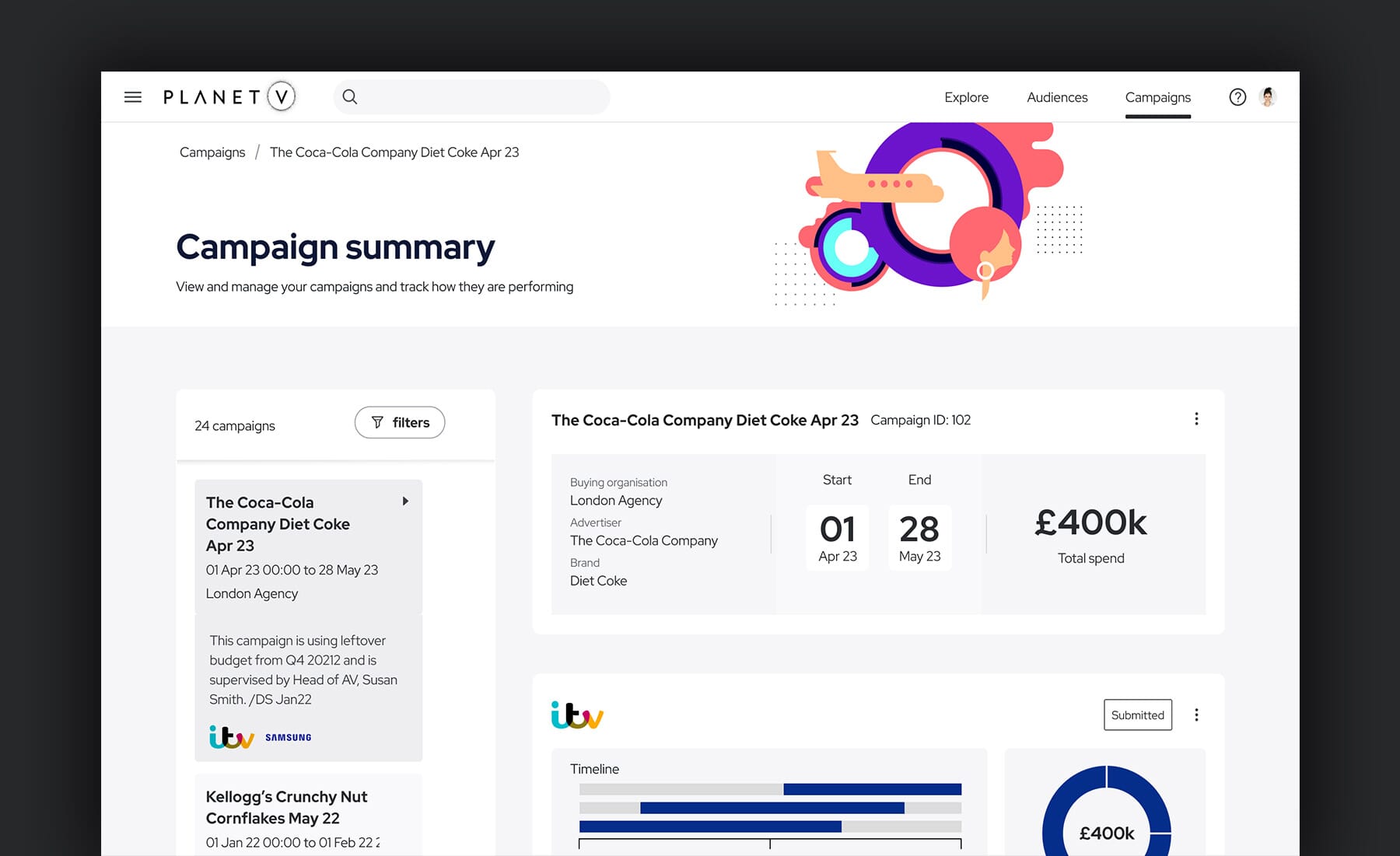
Prototyping and tools
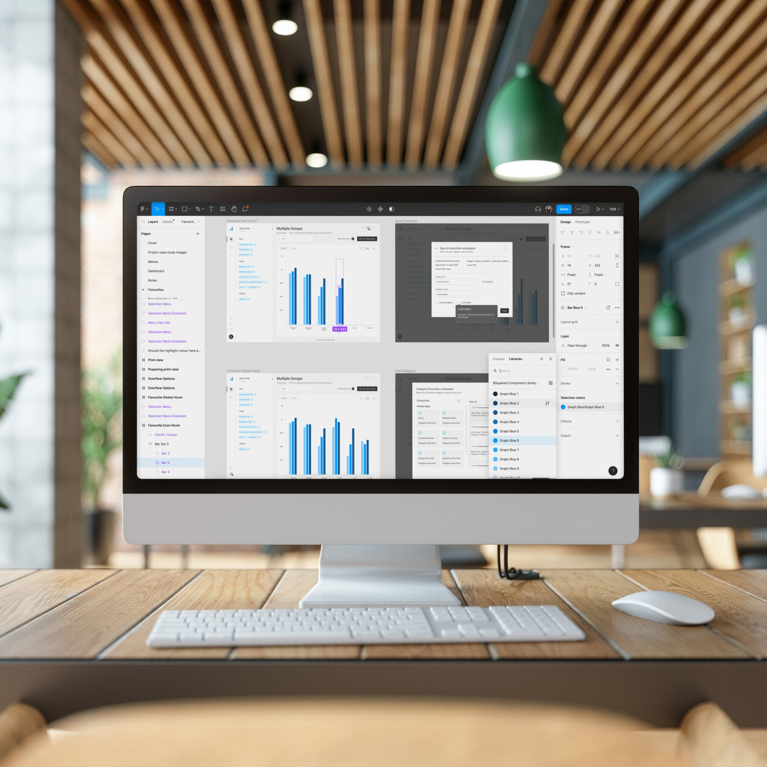
Prototyping is crucial in SaaS UI/UX design, enabling teams to test ideas and refine them before development. Below are some of the most popular tools, categorised by their primary use in UX and UI design.
UX prototyping tools:
- Figma: A cloud-based design tool known for its real-time collaboration features, ideal for creating s and conducting user testing.interactive prototype
- Adobe XD: Offers a streamlined environment for designing s, with a strong focus on wireframing and prototyping.user experience
- Axure: Great for creating detailed wireframes and prototypes with advanced user flow diagrams, often used for complex UX design projects.
UI prototyping tools:
- Sketch: A vector-based design tool used primarily for UI design, offering a vast library of plugins and integrations with prototyping platforms.
- InVision: Provides a seamless way to turn static designs into interactive prototypes, with features for feedback and collaboration.
- Framer: A powerful tool for creating high-fidelity UI prototypes, focusing on animations, micro-interactions, and responsive designs.
High-fidelity prototypes, created using these tools, can play a critical role in testing the look and functionality of your SaaS product before full-scale development.
Final thoughts
In SaaS dashboard design, both UX and UI are essential for creating intuitive, user-friendly experiences that enhance engagement and retention. Prioritising user needs, streamlining workflows, and maintaining a cohesive design that balances aesthetics with functionality are key takeaways for UX. Meanwhile, ensuring visual clarity, consistent branding, and responsive design are vital UI considerations.
As SaaS products evolve, so should your approach to design. Regularly gather user feedback, test new features, and remain open to adapting your dashboard to meet changing user expectations and business needs.
