

Atomic design theory
The atomic design methodology, developed by Brad Frost, emerged from his quest to create the ideal design system. Drawing inspiration from a wide range of industries, Frost sought out theories that followed similar principles and patterns to inform his organised and logical approach. He revisited his understanding of modular systems through the lens of basic chemistry concepts learned in school.
In our school days, we learned about the composition of the world through atomic equations. It begins with ‘atoms,’ the fundamental building blocks, progresses to ‘molecules,’ which are combinations of two or more atoms that enhance functionality, and culminates in ‘organisms,’ which are collections of several molecules.
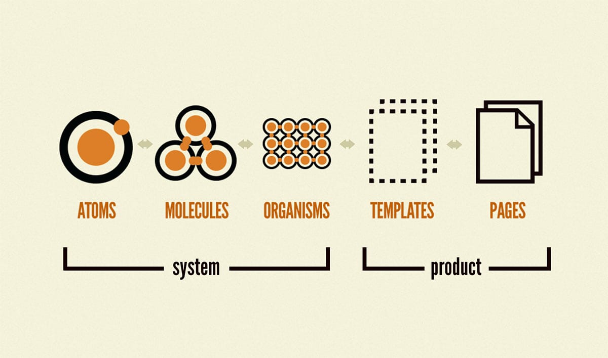
Frost recognised the parallels between elementary chemistry and the design system he envisioned for interface design. Designing wireframes involves combining individual items to build larger elements. Here’s how these parallels translate into practice:
- Atoms: e.g colors or icons
- Molecules: e.g buttons or text inputs
- Organisms: e.g headers or menus
- Templates & Pages: e.g series of cards that make up a page
This structured approach allows designers to systematically build complex interfaces from simple, reusable components, ensuring consistency and efficiency in the design process.
An iterative way of working
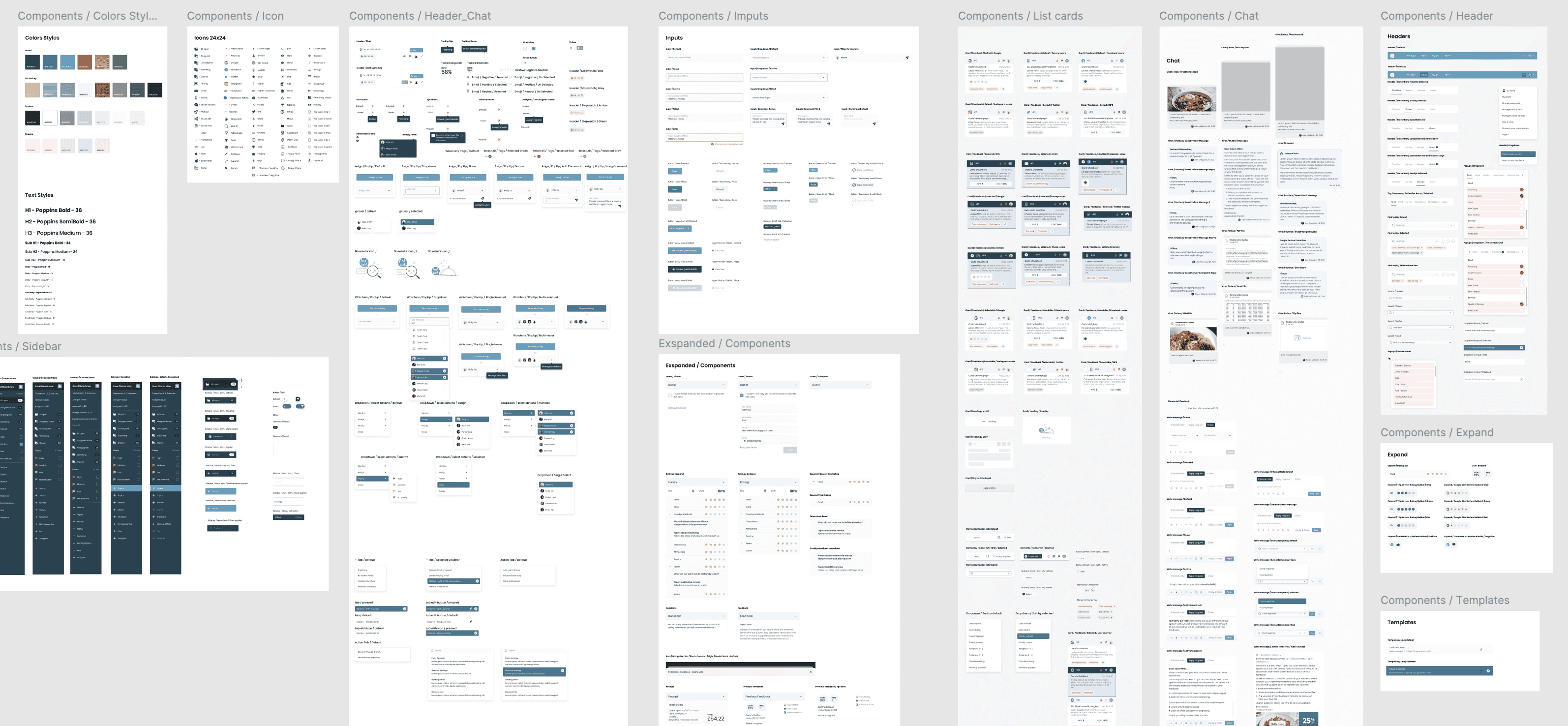
Design systems facilitate an iterative design process by allowing easy and efficient edits, which save time and effort. When a change is needed, such as a client request, designers can quickly update the master component. This update then cascades through all linked components, creating a seamless “waterfall effect.” Instead of laboriously altering each component individually, a single edit to the master component propagates throughout the entire design system, ensuring consistency and accuracy. This iterative capability is especially valuable in dynamic projects where client feedback or design requirements can evolve, enabling designers to swiftly implement changes and maintain a cohesive design.
Designing for development
Design systems also enable us to create every necessary state for a component to function effectively on a live platform, which is our ultimate goal. Each component is designed with default, active, filled, disabled, and error states to ensure comprehensive functionality.
Design systems achieve this by copying the original component to create various instances, which are then edited to produce slightly different versions. For example, a default input field can be modified by adding a darker text colour and a tick icon to represent a filled state. Once the designs are approved, generating these various states becomes an effortless task, ready for the developers to implement. This approach ensures a seamless transition from design to development, maintaining consistency and efficiency throughout the process.
The design system is then translated into a UI component library so a similar atomic process of re-usable components can be developed in the front end of the application by the React or Vue developers.
Find out more
If you need help with re-doing or evolving your design system, or help translating your design system into a React or Vue front end, please do get in touch.
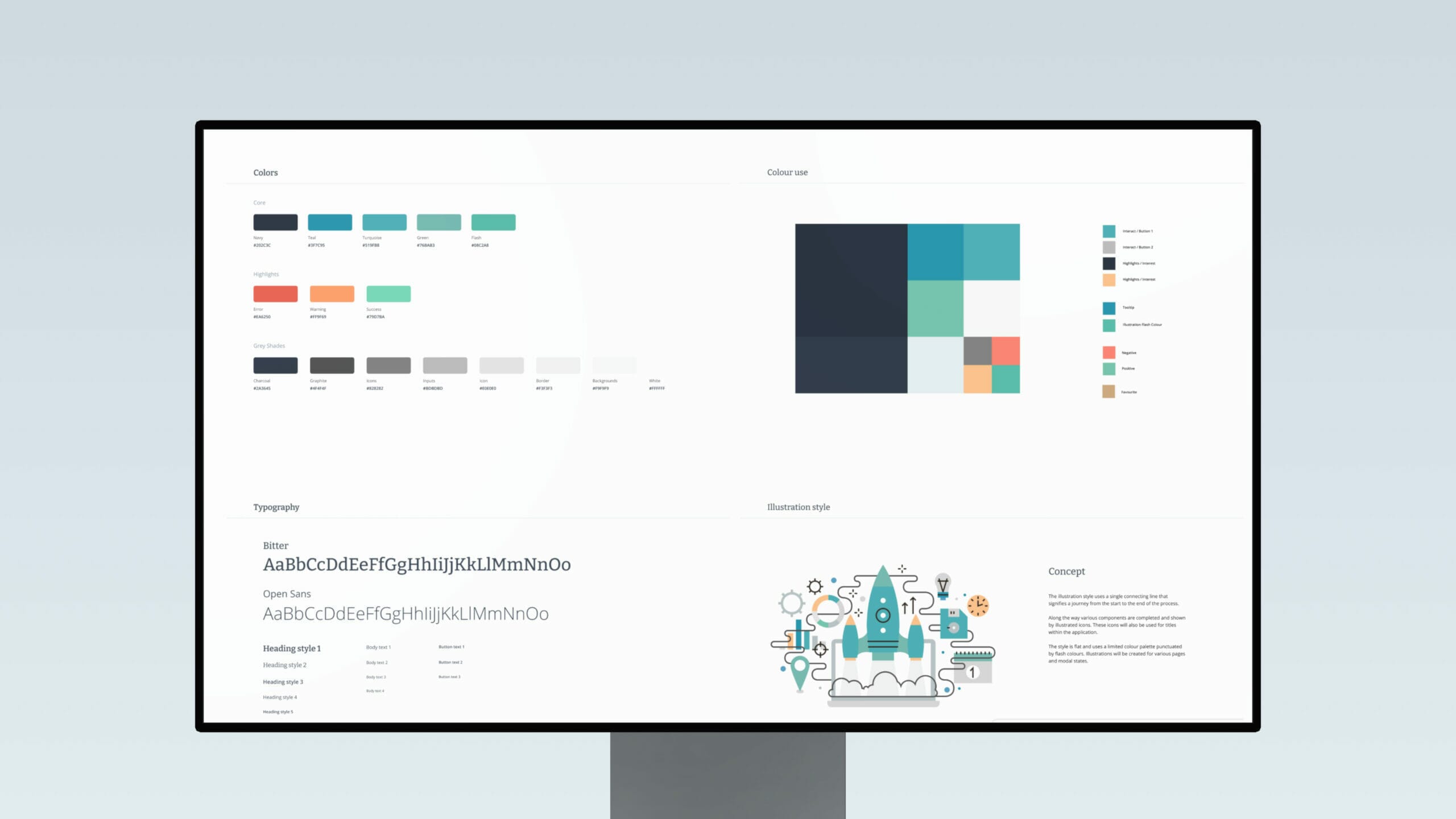
All of our projects are built off a UI design system – you can see some examples of our work here.
