
What is information architecture?
Information architecture (IA) is a cornerstone of user experience design. It refers to the way information is structured, categorised, and labelled to support intuitive navigation and usability. IA is about helping users find what they’re looking for efficiently, whether they’re searching for a product, completing a task, or exploring content.
Good IA considers two key components:
- Structure – How content is grouped and arranged into categories or hierarchies.
- Labelling – Using clear, consistent names for navigation elements, buttons, and links.
A practical example of poor IA would be a website with overly complicated navigation or vague menu options like “Stuff” or “More.” Good IA solves this by providing clear pathways, ensuring users can move through the digital space without confusion or second-guessing.
Why does information architecture matter in UX?
Without strong IA, even well-designed user interfaces can feel disjointed or frustrating. Effective IA reduces cognitive load, allowing users to navigate interfaces and complete desired actions without frustration. For businesses, this translates to better user retention, higher conversions, and an overall improved customer experience. Simply put, IA is one of many bridges between user needs and business success.
Key principles of information architecture design
In 2010, Dan Brown introduced eight guiding principles of information architecture that continue to serve as useful reference points for structuring digital information. These principles not only establish a robust IA foundation but also ensure scalability, clarity, and usability in complex systems. Below, we explore these principles with a focus on practical application in contemporary UX and IA design.
1. The principle of objects: treat content as dynamic
Content isn’t static—it has lifecycles, behaviours, and attributes. To build a future-proof IA, every piece of content should be treated as an object with its own metadata and relationships. For example, in e-commerce, products are more than just listings—they have attributes like category, price, stock levels, and promotional rules that need to be updated dynamically. Acknowledging this dynamic nature ensures that content remains relevant and adaptable to change.
2. The principle of choices: simplify decision-making
Overloading users with too many options can lead to confusion or decision fatigue. Instead, IA should prioritise presenting a limited, meaningful set of choices at each stage. For example, on a subscription service’s landing page, offering a straightforward choice between “Explore Plans” and “Learn More” is more effective than listing every possible plan detail upfront. This helps users focus and streamlines their journey.
3. The principle of disclosure: reveal information progressively
Rather than overwhelming users with all the information at once, design systems should disclose details progressively as needed. For example, a SaaS platform might show a high-level feature overview on its homepage, only revealing detailed use cases and advanced settings when the user clicks “Learn More” or navigates to specific product pages. This approach keeps interfaces clean while giving users control over how much they explore. A good example of this is seen on our Services page.
4. The principle of exemplars: use examples to clarify
Descriptive labels alone may not suffice to convey the content or purpose of a category. By using examples—such as icons, images, or previews—users can better understand what to expect. For instance, a recipe website that uses icons like “Gluten-Free” or “Quick Meals” next to category titles makes it easier for users to navigate based on their preferences. Exemplars reduce ambiguity and foster intuitive navigation, relying on mental models that will exist in your typical user.
5. The principle of front doors: design for multiple entry points
Not all users will land on the homepage first. In fact, over 50% of visitors often arrive via other entry points, such as search engines or campaign links. Your IA should account for this by ensuring that every page provides clear navigation, context, and pathways to other relevant sections. For instance, a blog post found via Google should allow users to easily discover related articles or return to the main site.
6. The principle of multiple classification: offer flexible categorisation
Users approach information in diverse ways, so it’s essential to provide multiple paths for discovery. For example, an online clothing store might enable browsing by category (e.g., tops, dresses), occasion (e.g., workwear, casual), or even season. By accommodating different mental models, this principle ensures accessibility for all user types.
7. The principle of navigation: keep it consistent
A consistent navigation system helps users orient themselves and build confidence as they explore. Avoid mixing different types of content in a single navigation bar or changing labels between sections. For example, a navigation menu that uses “Products” on one page but “Shop” on another for the same link can confuse users. Clarity and predictability in navigation foster trust and ease of use.
8. The principle of growth: plan for scalability
Information architecture should anticipate growth. The content you have today is likely just a fraction of what you’ll manage tomorrow. For example, a start-up’s blog may only have 10 articles now, but the IA should accommodate hundreds or even thousands of posts over time without causing clutter. This principle emphasises designing flexible, scalable structures that can adapt to evolving needs
How to design information architecture: complete guide
Designing effective information architecture (IA) is a process that requires both strategic planning and ongoing refinement. The primary goal is to create a structure that allows users to easily find and navigate content while ensuring that the system can grow and adapt over time. In this step-by-step guide, we’ll walk you through the essential phases of designing IA, integrating Brown’s eight key principles to ensure the process remains user-centred and scalable.
Step 1: Conduct user research
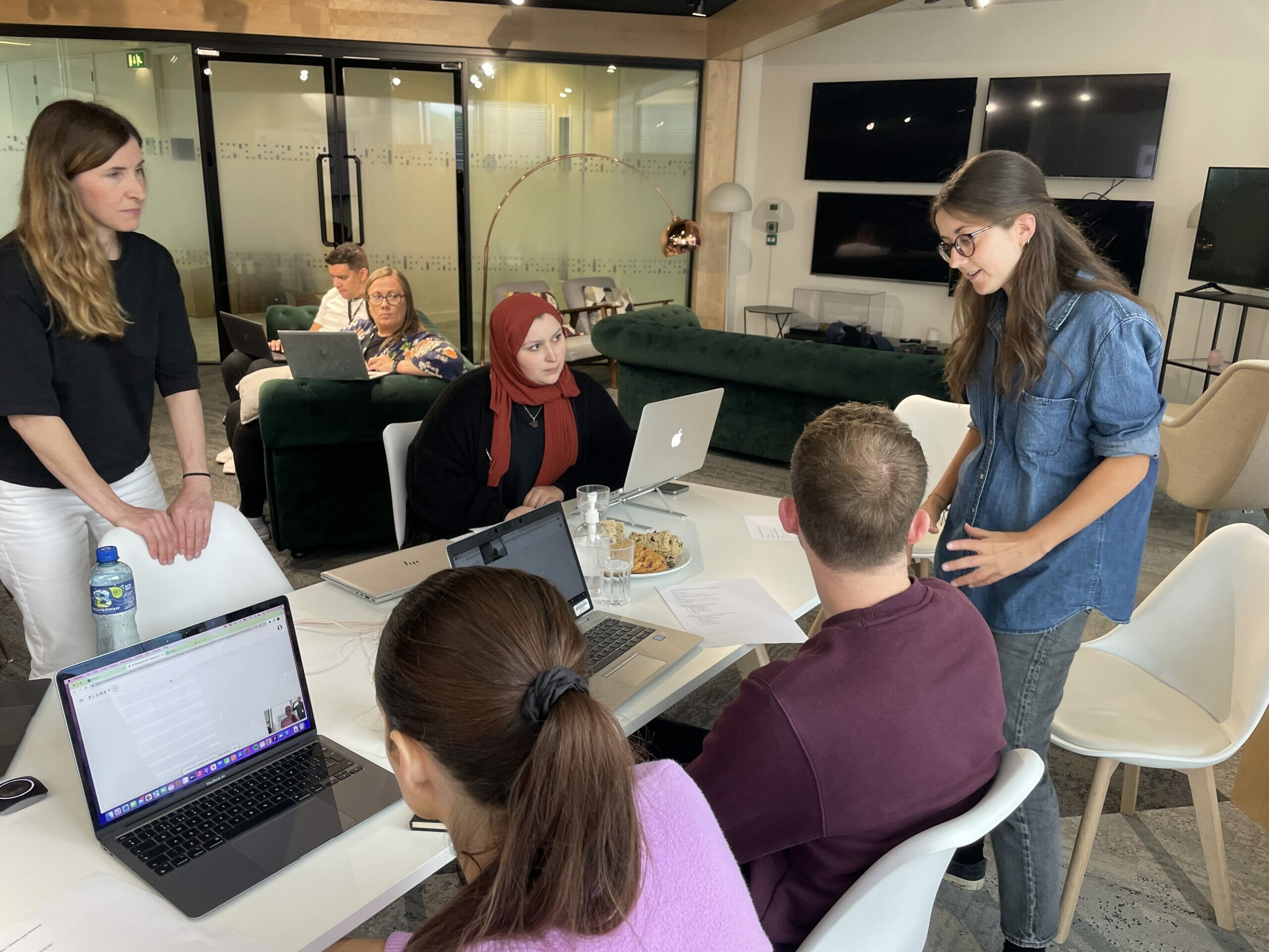
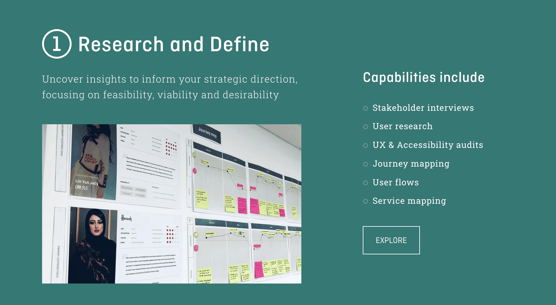
The first and most crucial step in designing IA is conducting user research. Without a clear understanding of your users’ needs, behaviours, and expectations, it’s impossible to build a structure that makes sense to them. This research can include methods like interviews, surveys, or usability testing. It’s essential to gather insights directly from the people who will be using the product, as their preferences will inform the decisions you make in later stages.
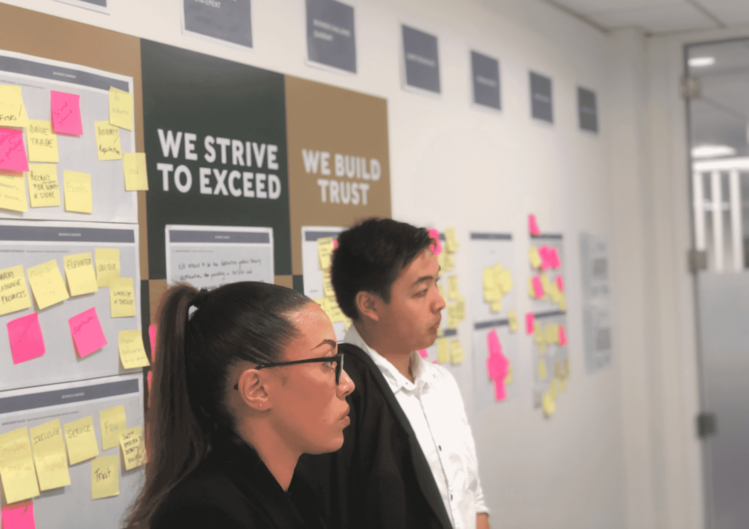
Step 2: Audit content and organise it into categories
Once you have a solid understanding of your users, it’s time to evaluate the content you have and organise it into logical, accessible categories. A content audit involves reviewing all the existing information, understanding how it fits together, and determining the best way to group it based on user expectations and behaviour. Content should be treated as distinct “objects,” each with its own attributes and characteristics. This is where The Principle of Objects comes into play. By treating each piece of content (whether it’s a product, article, or service) as a separate entity with its own lifecycle, you can create a more flexible and adaptable IA.
For example, imagine you’re restructuring a recipe website. By categorising recipes into types like “Desserts,” “Main Courses,” or “Drinks,” you can break each category down further based on user preferences such as cooking time or dietary requirements. Each recipe becomes an object with its own attributes, allowing you to easily organise them in a way that makes sense to your users. Content audit and organisation form the backbone of the IA, ensuring that the structure will accommodate future content without becoming cluttered or confusing.
Step 3: Create sitemaps and define navigation
With your content categorised, it’s time to start building the structure by creating sitemaps and defining how users will navigate through the system. A sitemap is essentially a visual representation of how content is connected and organised, providing a map for both users and stakeholders to understand the overall layout. During this step, it’s crucial to think about The Principle of Navigation, ensuring that your IA has a consistent and intuitive flow that users can easily follow. The navigation should be clear and logical, allowing users to understand how to get from one section to another without confusion.
Additionally, starting to consider The Principle of Multiple Classifications is important at this stage. This principle encourages offering users multiple ways to find content, as different users will have different preferences in how they access information. For example, consider a university website where the main categories are “Undergraduate Programs” and “Postgraduate Programs,” but you also offer filtering options like “Location,” “Faculty,” or “Course Type” to provide users with different ways to navigate. This ensures that no matter how a user prefers to search or browse, they can find relevant content in the most efficient way possible. Creating a sitemap and defining the navigation early on ensures the IA will scale as the website or application grows, providing a strong foundation for future development.
Step 4: Test and iterate
The final step in designing information architecture is testing and iteration. Even the most well-thought-out IA needs validation to ensure it meets the needs of real users. Tree testing and card sorting are popular methods for evaluating IA, as they provide valuable feedback on whether users can intuitively find the information they need. Testing helps you identify any potential problems or pain points where users may become confused or frustrated, and it allows you to refine the structure based on real-world use.
This phase also ties into The Principle of Growth, which suggests that an IA should be flexible enough to evolve and accommodate new content over time. As you test the IA, pay attention to how it can adapt as your content or product offerings change. For instance, if you’re designing an e-commerce site and tree testing shows that users are having difficulty locating “Customer Support” under the main navigation, you may need to adjust the IA to make it more visible. Additionally, user testing can reveal if your IA is scalable as new content, categories, or features are introduced. By iterating and refining the IA based on user feedback, you ensure that the system remains intuitive, relevant, and adaptable as your platform evolves.
Visual hierarchy and information architecture
In the context of Information Architecture (IA), visual hierarchy refers to the way that you can use design elements such as colours, shapes, and typography, to make it easier for users to find what they need and navigate through a website or app. The key is to align visual design with IA to create a seamless experience where content feels organised, purposeful, and engaging.
How visual design supports IA
Visual hierarchy is the arrangement of elements in a way that indicates their importance and guides the user’s eye to the most critical information first. This can be achieved through several design principles:
- Colour: Colour helps differentiate and group related elements, drawing attention to key content. For instance, using contrasting colours for primary buttons and links highlights their importance and makes them easily noticeable. Colour can also denote categories, such as using distinct hues for different sections of a site (e.g., a soft blue for “About” and a rich green for “Contact”).
- Shapes and Size: Larger elements tend to attract more attention, so adjusting the size of buttons, headings, or images can help users distinguish between primary and secondary actions. For example, a large, bold call-to-action button stands out more than smaller text links, making it clear where the user should click next.
- Spacing: Adequate spacing between elements ensures that content doesn’t appear cluttered. Proper white space around key elements helps users focus on the most important actions, such as forms, buttons, or headings.
What’s the value of information architecture for businesses?
If you’re researching IA because you’re debating whether it’s worth investing in, it’s important to know that IA is not just about creating a positive user experience—it’s also a strategic business move that can lead to serious tangible results. Whether you’re running an e-commerce platform, a SaaS company, or a content-heavy website, good IA can significantly impact key business objectives, from conversion rates to team efficiency. Here’s how:
Conversion rates: easier navigation = better user flow
When users can find what they’re looking for quickly and effortlessly, they’re more likely to take the desired actions, whether it’s making a purchase, signing up for a service, or contacting sales. Poor IA, on the other hand, creates friction—confusing menus, hidden content, or unclear categories can drive users away.
- Case in point: According to a study by Forrester Research, a well-designed user interface and IA can increase website conversion rates by up to 200%.
- Example: An online retailer optimised their IA by reorganising their product categories and improving search functionality, leading to a 35% increase in checkout completions.
User satisfaction: happy users come back
Good IA ensures a smooth, intuitive experience, which fosters trust and user engagement. When users can achieve their user goals easily—like finding information or completing a transaction—they’re more likely to return, recommend the business, and become loyal customers.
- Statistics: Research from Think with Google shows that 53% of mobile users will abandon a website if it takes longer than three seconds to load or if the navigation is confusing.
- Example: A travel booking platform revamped its IA by adding clearer navigation paths and search filters. The result? Higher repeat bookings and a notable boost in customer reviews praising usability.
Why IA matters to the bottom line
Businesses that prioritise IA often see long-term benefits beyond usability. Seamless user experiences build brand credibility, reduce bounce rates, and shorten the path to conversion. Internally, teams save time and reduce frustration, which boosts productivity and morale.
Final thoughts
Information Architecture (IA) is essential for crafting seamless, user-friendly digital experiences that align user needs with business goals. By applying foundational principles and integrating IA with visual design, businesses can create platforms that are intuitive, accessible, and efficient.
Good IA doesn’t just enhance usability—it drives measurable results, from increased conversion rates to improved user satisfaction and operational efficiency. In a digital landscape where clarity is key, investing in IA ensures businesses stay competitive and deliver lasting value to their real users.
Find out more
If your organisation needs expert guidance in crafting effective Information Architecture, please don’t hesitate to reach out.
Related insights
Tree testing in UX: Complete guide