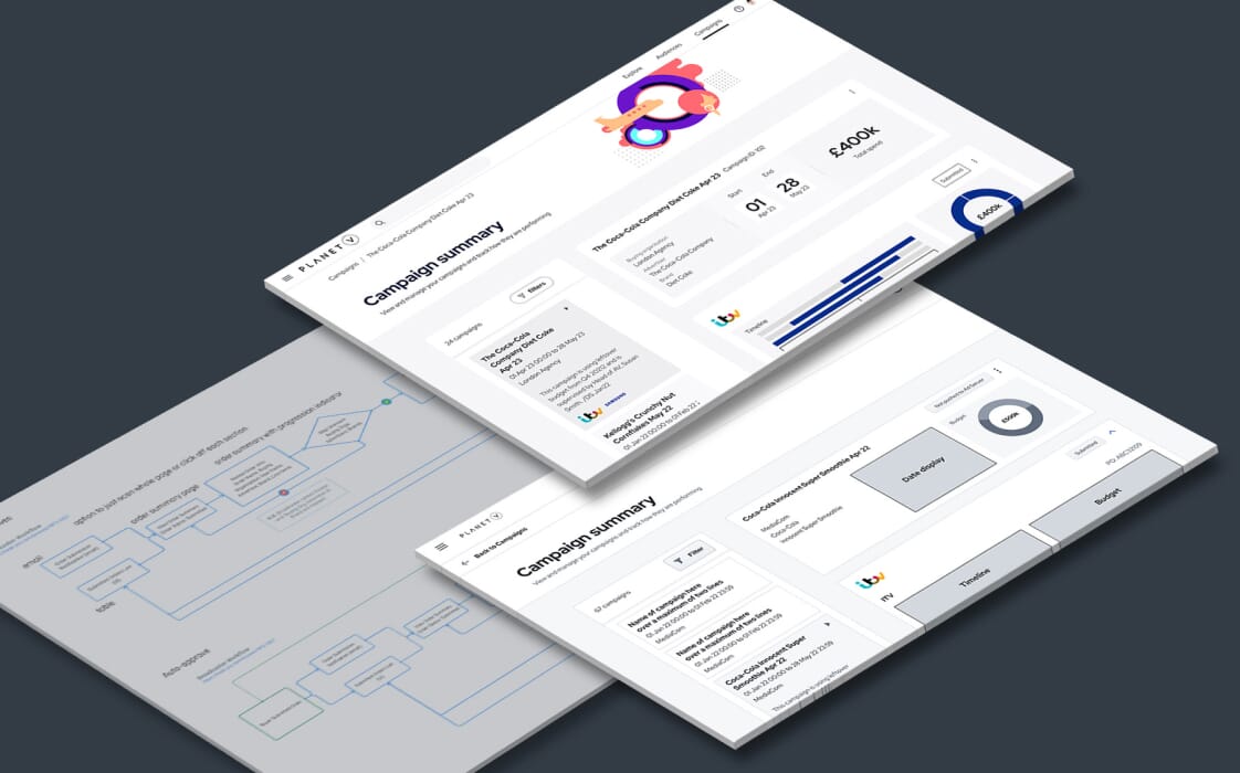
In the world of UI design, creating an interface that feels cohesive and intuitive is essential for a positive user experience. Gestalt psychology, a field focused on understanding human perception, offers valuable insights into how we naturally group, organise, and interpret visual elements. By applying Gestalt principles into their design process, designers can build interfaces that not only look visually pleasing but also guide users smoothly through each interaction.
Visual harmony isn’t just about aesthetics—it directly influences usability and helps users make sense of information quickly. When applied thoughtfully, Gestalt principles enhance the structural clarity of a design, guiding user behaviour and fostering a more seamless experience. In this article, we’ll dive into these classic principles, exploring their practical applications in UI design and how they can help you craft intuitive and visually balanced digital interfaces.
What are Gestalt principles?
Gestalt principles are at the heart of how we naturally make sense of the visual world. Rooted in They offer a framework for understanding how humans perceive visual information as organised, whole structures rather than disconnected parts. This means that when we look at a design, we tend to automatically group elements based on properties like proximity, similarity, and continuity, allowing us to interpret even complex visuals quickly and with ease. Our brains crave order and instinctively seek patterns, which is exactly what Gestalt principles help designers tap into.
For UI/UX design, Gestalt principles are really powerful tools. They give designers insight into how to create layouts that ‘click’ with users on a fundamental level. By designing interfaces that align with natural visual perception, designers can make information feel intuitive and engaging without overwhelming users. Think of it like building a visual map that users can follow instinctively. Using Gestalt principles to guide layouts allows for a more seamless user experience—one where navigation feels effortless, information is organised logically, and interaction with the interface becomes second nature.
In practice, applying Gestalt principles can help shape a clear visual hierarchy, reduce clutter, and create a sense of visual harmony.
Key Gestalt principles in UI design
Understanding and applying these key Gestalt principles effectively can transform a user interface from a collection of elements into a smooth experience. Let’s take a closer look at how each principle functions in UI design:
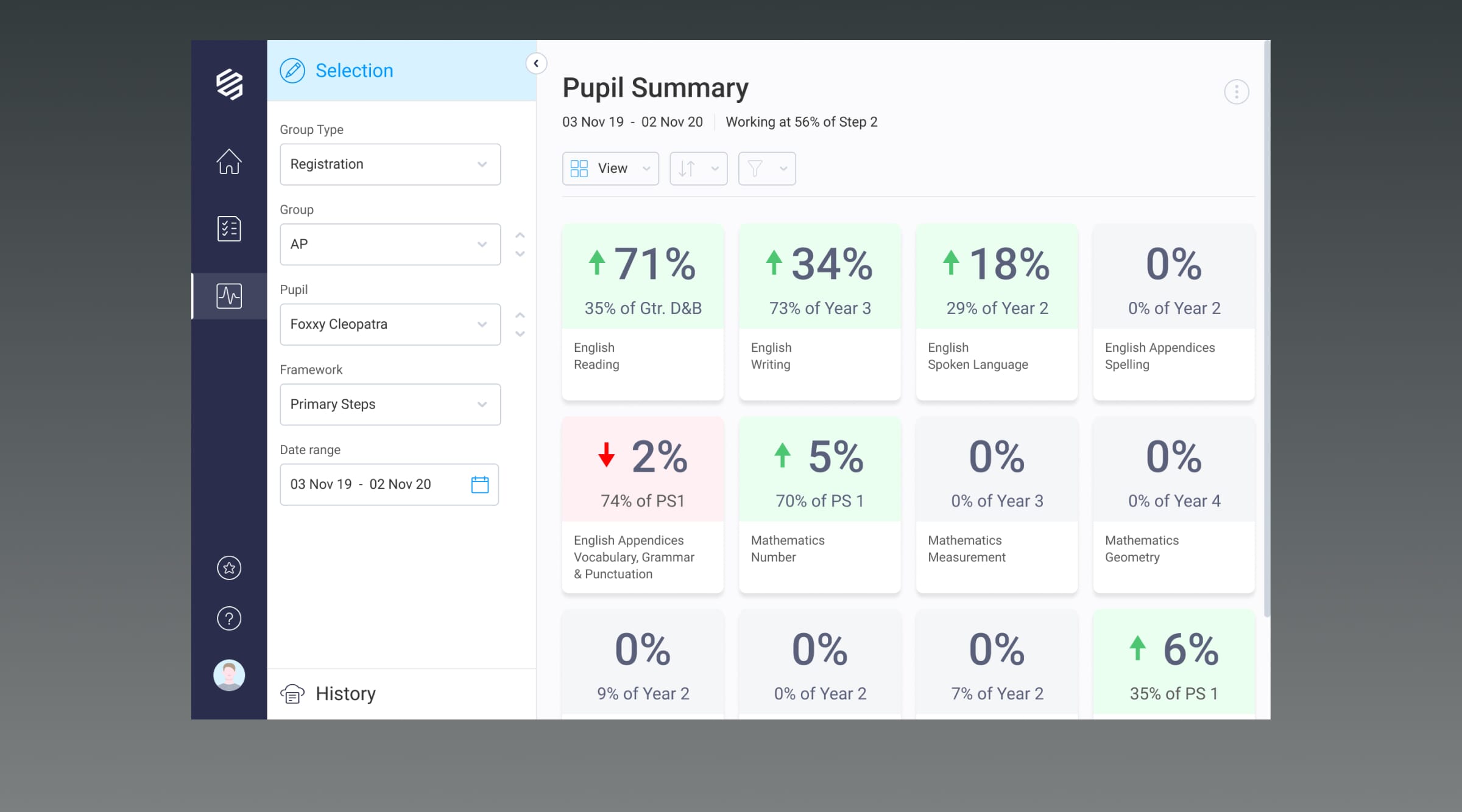
- Figure-ground principle: This principle helps users distinguish between the main content (the “figure”) and the background (the “ground”). In visual design, establishing clear figure-ground contrast is essential. For example, clickable buttons, forms, and key information stand out when designed with sufficient contrast against the background (using colour theory and shadows), making it obvious to users where to focus.
- Proximity principle: When elements are grouped close to one another, users naturally perceive them as related rather than as independent, individual elements. By placing related navigation options, buttons, or content clusters close together, designers can create a logical structure and improve navigation. For instance, grouping search filters beside a results list offers a clear, intuitive interaction.
- Similarity principle: Effective use of the principle of similarity creates cohesion through consistent use of styles, colours, or familiar shapes. By applying the same button styles or typography for similar functions, designers direct users effortlessly, as they intuitively understand the purpose of each element.
- Closure principle: Our minds fill in missing information to form a complete shape, even if it’s not fully outlined. In UI design, closure is useful for creating simplified icons or buttons that are quickly recognised without complex detail. For example, an outline of a magnifying glass immediately signifies a search function, even without intricate detailing.
- Continuity principle: Continuity directs users’ attention along lines, curves, or paths, creating a natural flow. Arranging elements in a line or sequence helps guide the eye smoothly across the interface, supporting intuitive navigation and leading users towards key actions.
- Common region: Enclosing common elements within boundaries or regions conveys grouping and order. By placing related content in shaded boxes, containers, or cards, designers can create well-defined sections, allowing users to easily understand which elements belong together.
These principles, when thoughtfully applied, turn a design from a simple visual layout into an organised, intuitive experience that resonates with users’ natural ways of seeing and understanding.
Practical tips for applying Gestalt principles in UI design
Applying Gestalt principles effectively involves more than just understanding them—it’s about strategically using them to improve functionality and enhance user experience. Here are some practical tips for incorporating these principles into UI design:
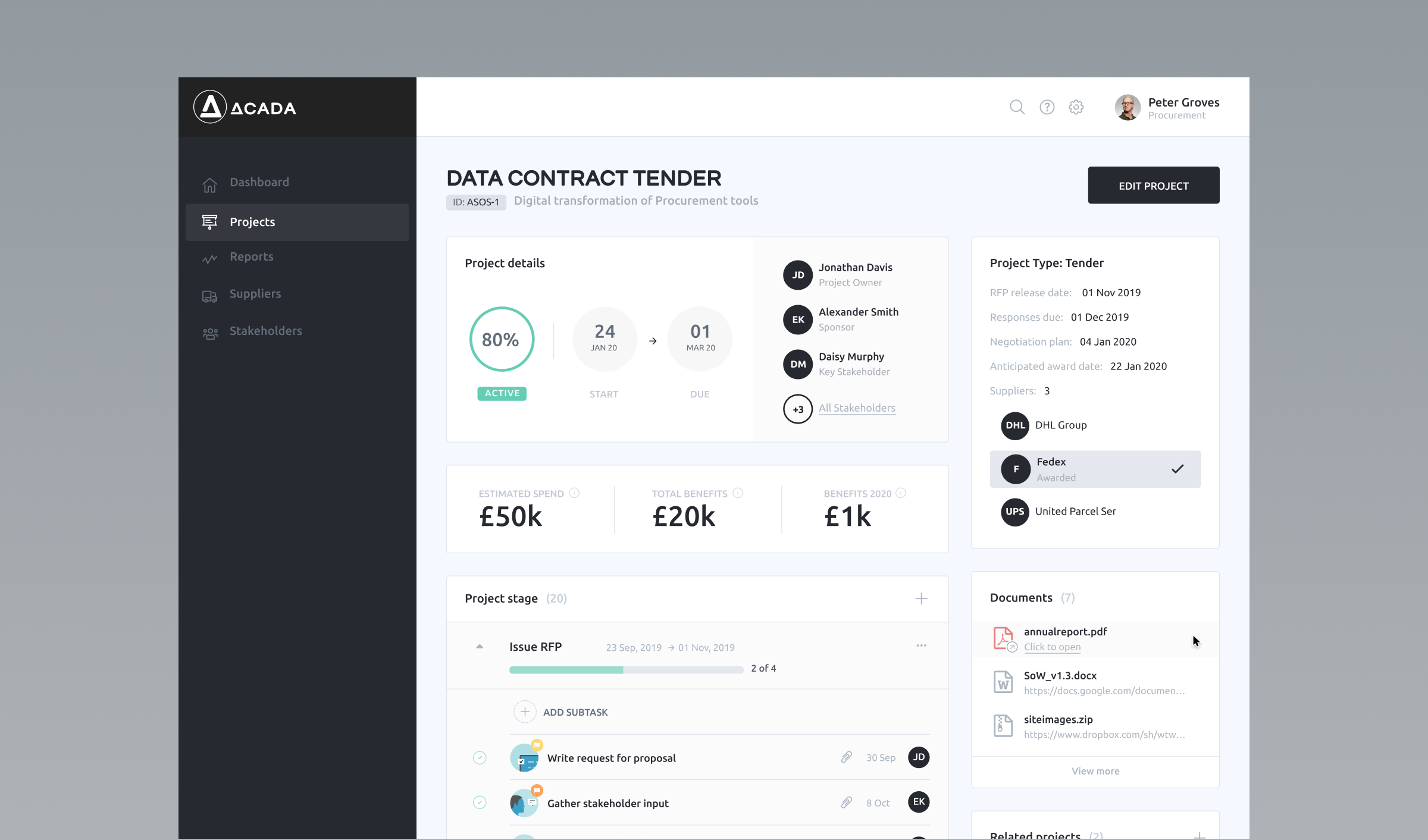
- Creating visual hierarchy: A well-established visual hierarchy is key to guiding users’ attention. Use proximity and size to prioritise elements; larger or closely grouped elements naturally draw the eye. For example, making primary call-to-action buttons larger and more prominent, or grouping related features together, helps users understand what’s most important at a glance.
- Improving navigation: Consistency is vital in navigation. Applying the principle of similarity (like using the same colour or shape for all navigation buttons) helps users quickly recognise and navigate key areas. Continuity also plays a role; aligning navigational items in a line or predictable sequence allows users to move through content intuitively.
- Grouping related content: Clarity is enhanced by grouping related elements together using proximity, common region, and figure-ground principles. For instance, placing product information in a distinct card or container visually ties related details together, making it easier for users to digest information without confusion.
- Making use of negative space: Negative space is as essential to a well-designed interface as the elements themselves. By using closure and space between elements, you avoid clutter and improve readability. A well-spaced layout lets users focus on content without feeling overwhelmed, creating a more pleasant and effective interface.
- Enhancing user flow: Continuity can be a powerful tool in directing user actions. By aligning elements along a natural path, designers guide users towards key tasks effortlessly. For example, a checkout process that flows horizontally or vertically along the page creates a seamless experience that follows users’ natural reading patterns.
Integrating these tips into your design process helps create a balanced, visually harmonious interface that not only looks good but also enhances functionality and usability.
Examples of Gestalt principles in popular UI design
To see Gestalt principles in action, you don’t need to look too far. Companies like Google, Apple, and Airbnb have set benchmarks in UI design by strategically applying Gestalt principles to make their interfaces intuitive, visually appealing, and functional.
- Google’s clean, intuitive layout: Google’s homepage is an excellent example of the figure-ground principle. By centring the search bar and using ample white space, Google makes it clear what the primary function of the page is. The search bar stands out as the main element, while other links and content fade into the background, allowing users to focus effortlessly on the main task.
- Apple’s consistency and cohesion: Apple’s website and applications are a showcase for the principle of similarity and the principle of continuity. Through consistent colours, shapes, and layout styles, Apple creates a seamless experience across pages and products. Each button, icon, and menu is designed with a similar look and feel, building cohesion and making navigation feel natural.
- Airbnb’s use of grouping and flow: Airbnb’s homepage leverages proximity and common region by grouping related information within visual cards. For example, property listings are organised with images, descriptions, and ratings contained within distinct sections, making it easy for users to scan and compare options. Airbnb also applies the principle of continuity in its booking process, guiding users step-by-step in a clear visual flow that reduces cognitive load.
In each of these examples, Gestalt principles contribute to clear, efficient, and user-friendly designs that enhance both aesthetics and functionality. For designers, these real-world applications demonstrate how fundamental visual principles can support intuitive, enjoyable user experiences.
Common mistakes when applying Gestalt principles
Even well-known design principles can be misused, leading to cluttered or confusing interfaces. Here are some common pitfalls to watch for when trying to implement Gestalt design principles in your interfaces:
- Overuse of grouping: While grouping related elements with proximity or common region helps clarify structure, overdoing it can lead to visual clutter. When too many elements are grouped too closely, it becomes harder for users to identify which items are most relevant.
- Lack of visual balance: Ignoring the figure-ground principle can make designs feel overwhelming and chaotic. Without a clear contrast between primary elements and the background, users may struggle to focus, impacting their ability to complete tasks smoothly, which inevitably leads to increased cognitive load.
- Inconsistent hierarchies in similarity: Poor use of similarity — for example, applying similar colours or shapes inconsistently — can lead to confusing or misleading hierarchies. If different buttons or actions appear similar when they serve different functions, users may end up misclicking or overlooking important pathways, ultimately reducing task efficiency.
Stay mindful of these common mistakes; failing to do so will cost you significantly, worsening your user experience and increasing frustration for your customers.
Gestalt principles in mobile user interface design
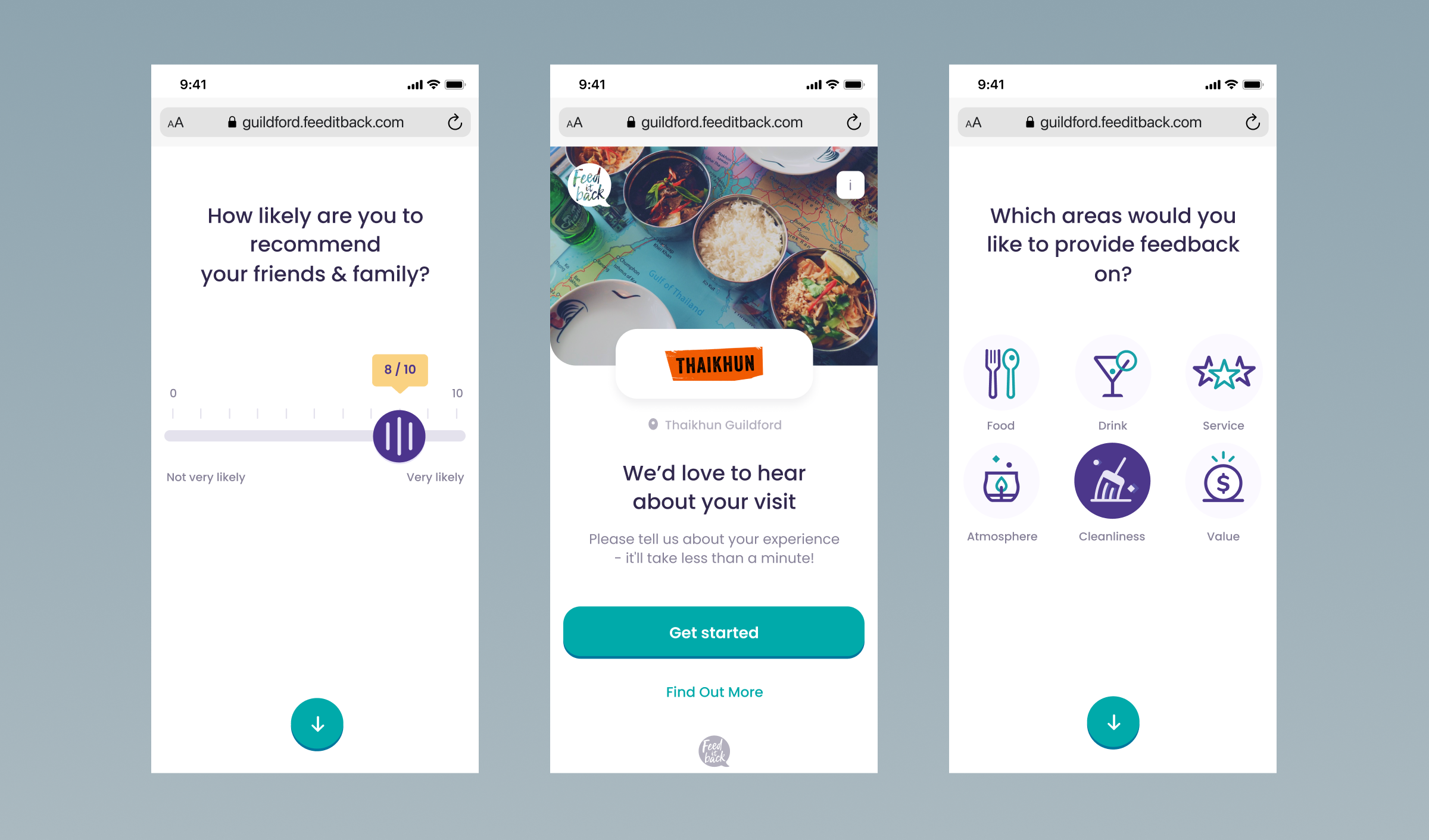
- Challenges in small screens: Applying Gestalt principles on mobile devices can be tricky, as limited screen space often restricts the options for grouping, hierarchy, and spacing. Elements must be carefully arranged to avoid clutter, while still guiding users’ focus effectively. For example, grouping common actions like ‘like’ and ‘share’ in mobile apps helps to establish familiarity and confidence when navigating new systems.
- Adaptation tips: On mobile, prioritise continuity by designing straightforward flows that naturally guide users to the next step, using proximity to group related items within tight layouts, and applying similarity to create a cohesive style that differentiates interactive from non-interactive elements. By adapting these principles with minimal, clear elements, mobile interfaces stay intuitive and user-friendly despite the smaller screen real estate.
Testing for visual harmony
- User testing for feedback: User testing is crucial for assessing visual harmony in UI design. By conducting sessions where real users interact with the design, you can gather valuable insights on how intuitive the visual elements are. This can involve tasks like navigating through menus or identifying key actions. Observing users’ behaviour, asking follow-up questions, and measuring these qualitative research insights will help identify whether the design aligns with their mental models and if it creates a pleasant, cohesive experience.
- A/B testing for design variants: A/B testing allows you to compare two or more design variations to understand which version resonates better with users. By testing different layouts, colour schemes, or positioning of elements, you can directly measure the impact of Gestalt principles on user engagement and usability. For example, a test comparing two layouts that use proximity or similarity differently could reveal which version guides users more naturally and efficiently through tasks.
- Iterative design improvements: Refining User Interface design is an ongoing process. As users provide feedback, it’s important to adjust the design iteratively, improving visual harmony, flow, and readability with each update. This could involve revising groupings, adjusting visual cues for better figure-ground distinction, or testing new ways of structuring content. By continually refining the design based on real-world feedback, you ensure that the interface remains intuitive, effective, and aligned with user expectations.
Final thoughts
Incorporating Gestalt principles into UI design is a powerful way to enhance user experience by creating visually harmonious, intuitive, and engaging interfaces. When applied effectively, these principles help guide users through digital environments with ease and clarity, ensuring that design elements work together cohesively. However, it’s crucial to avoid over-application or misinterpretation, as poorly executed principles can lead to confusion or clutter.
At Full Clarity, we specialise in helping businesses implement design best practices, ensuring that your UI not only looks great but also functions seamlessly. Whether you need consulting on how to apply Gestalt principles effectively or require assistance in managing your UI design projects, our team of experts can guide you through the process. We’re here to help you create user-friendly, visually compelling interfaces that enhance engagement and drive results.
Find out more
If you’d like some support with your UI design process please don’t hesitate to reach out.


