Improving customer experience for iconic luxury dept store
At a glance
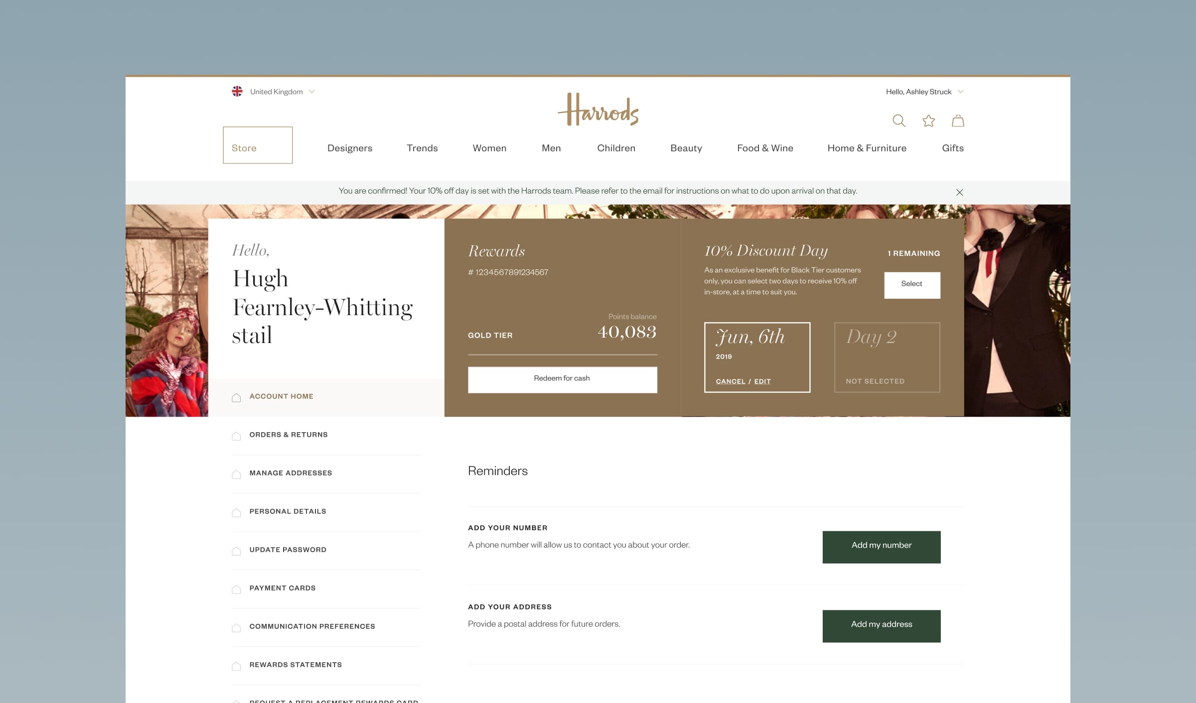
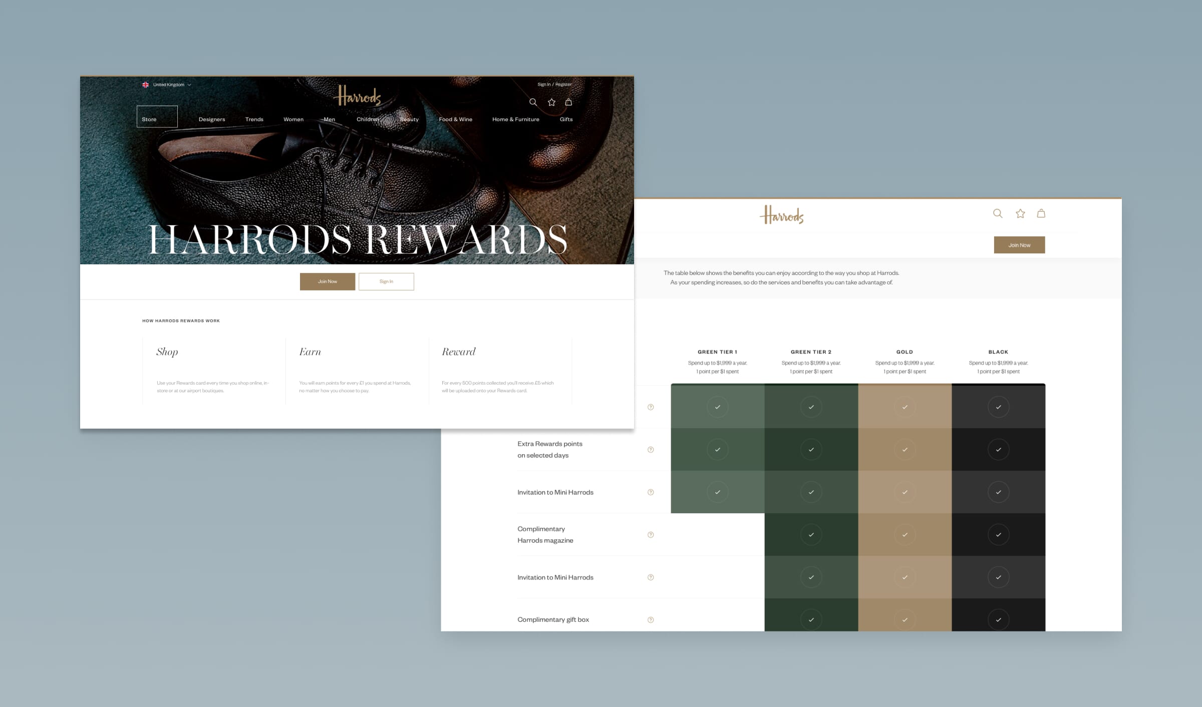
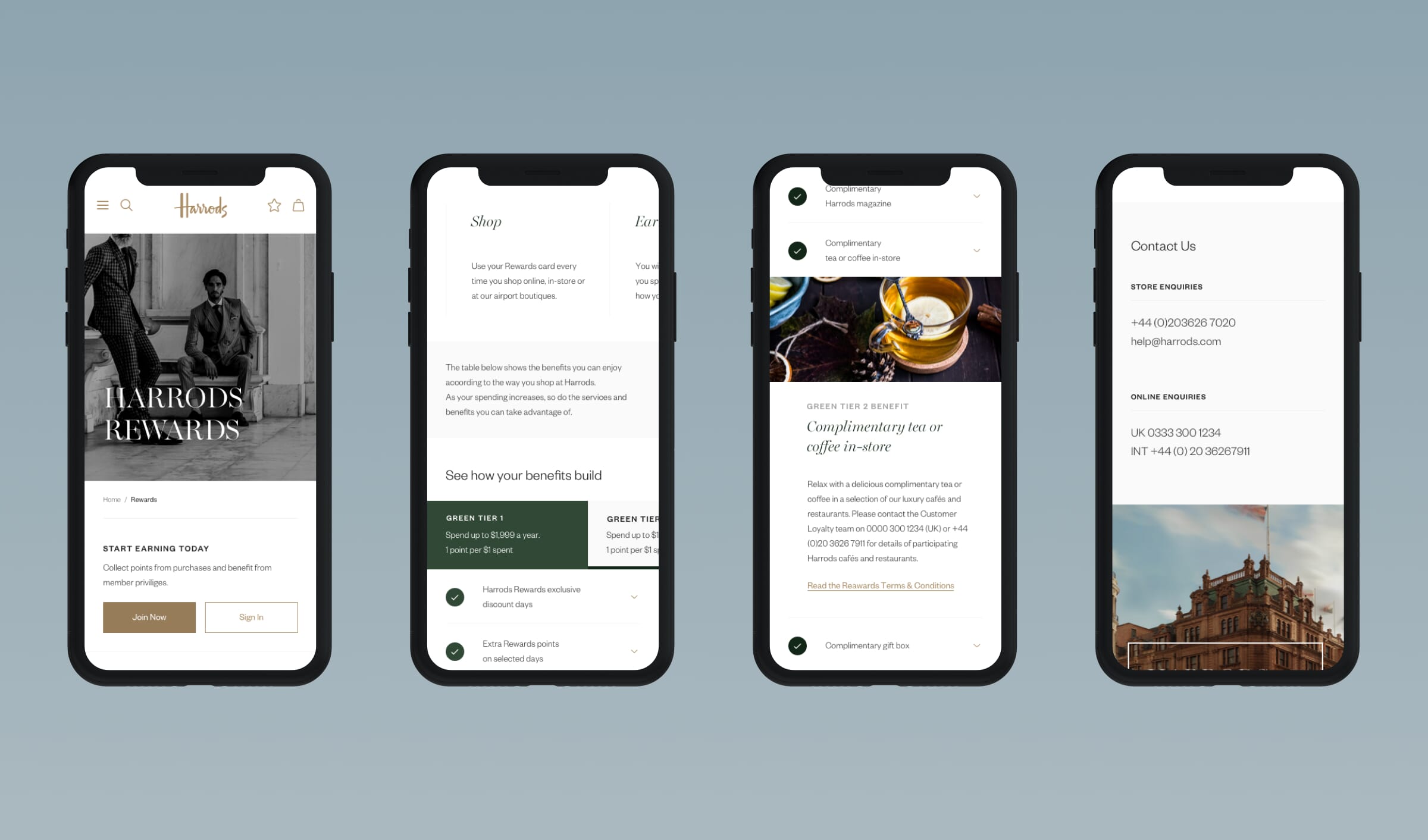
Full Clarity partnered with Harrods to optimise user engagement and elevate the customer experience across four key initiatives: Beauty Halls landing pages, Marketing Communication Preferences, Knowledge Base, and Customer Self-Service. Combining in-depth research, UX audits, and strategic design, we delivered solutions that enhanced personalisation, improved user journeys, and empowered self-service capabilities. By streamlining content accessibility and aligning the digital journey with Harrods’ luxury brand standards, the projects successfully connected in-store and online experiences. The results not only optimised user engagement but also improved customer satisfaction while reducing reliance on support teams, delivering a seamless, user-centred experience.
Project type
Sector
Services provided
Project length
Key requirements
Harrods wanted to create a seamless and luxurious online experience that mirrored the in-store journey. The focus was on improving website navigation, showcasing exclusive treatments, services, and events, and integrating personalisation to reflect Harrods’ premium branding. Additionally, the project aimed to connect the in-store and online experiences, making it easier for customers to explore offerings, book treatments, and discover Harrods’ luxury proposition. The goal was to unify the customer journey and elevate the online presence to match the iconic in-store experience.

Customer surveys
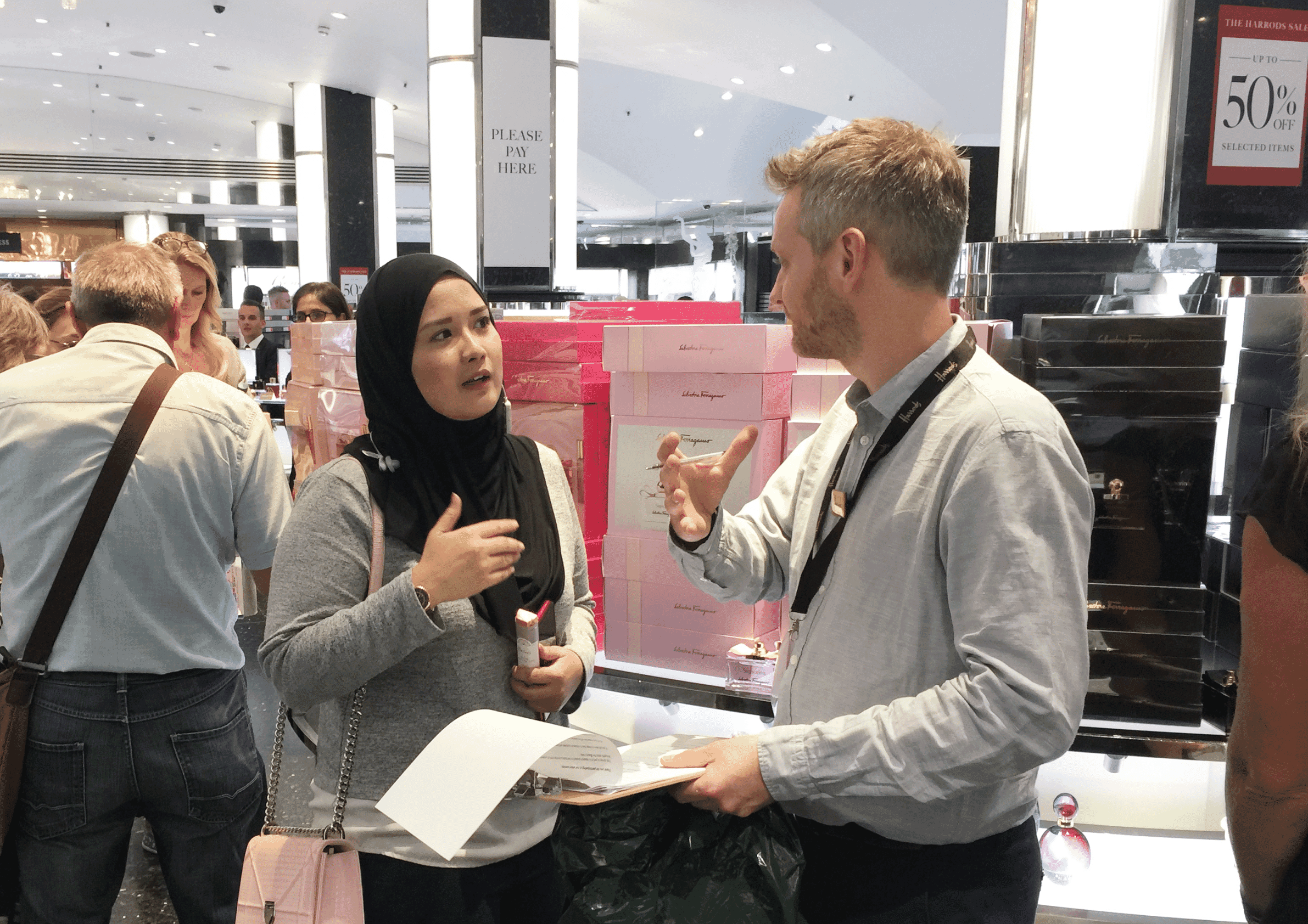
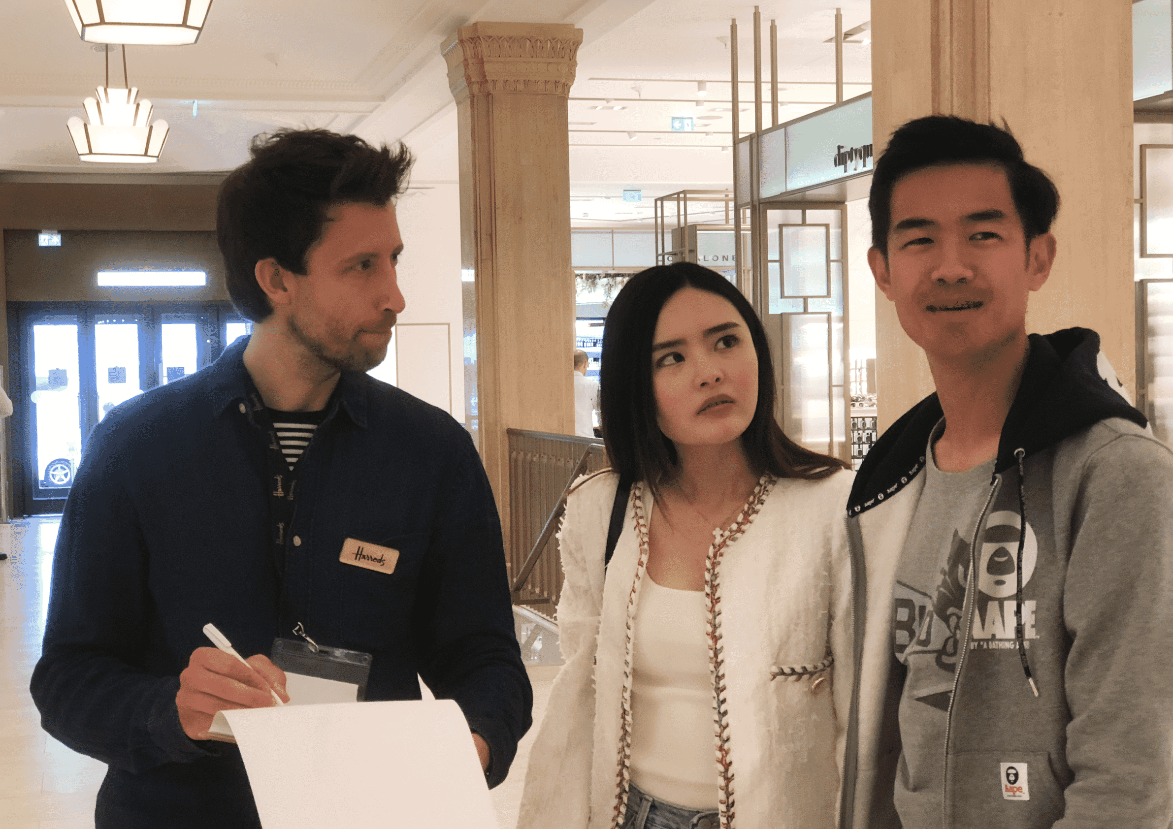
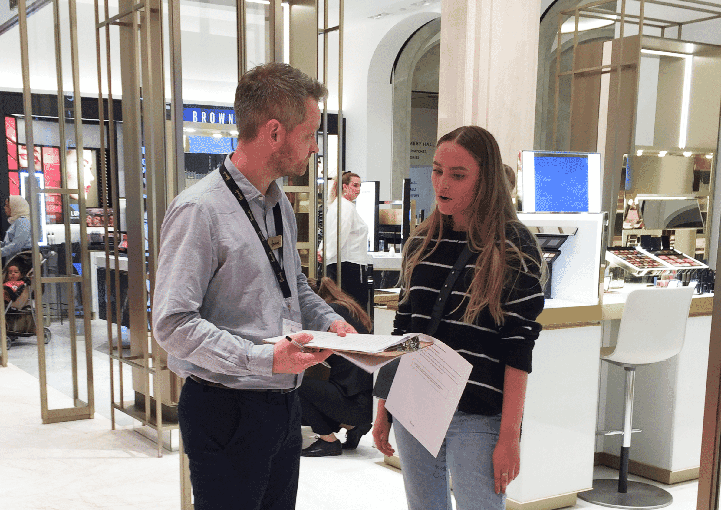
We conducted customer surveys in Harrods’ Beauty Halls to understand visitor attitudes towards the current products, services and customer experience. Key insights revealed that many customers valued the ability to try products before purchasing, particularly with beauty items like perfumes. Navigating the physical Beauty Halls proved difficult for customers searching for specific brands or products and additionally, online research was a common behaviour, with Instagram and Harrods.com being key sources for product information. To enhance the website landing page designs and optimise the customer’s experience, our key insights were to incorporate features like brand-specific navigation, virtual product try-ons, and showcasing Harrods-exclusive products to mirror the in-store experience.
Observational field research
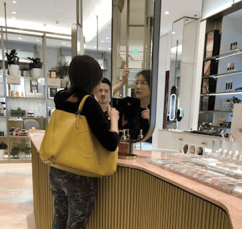
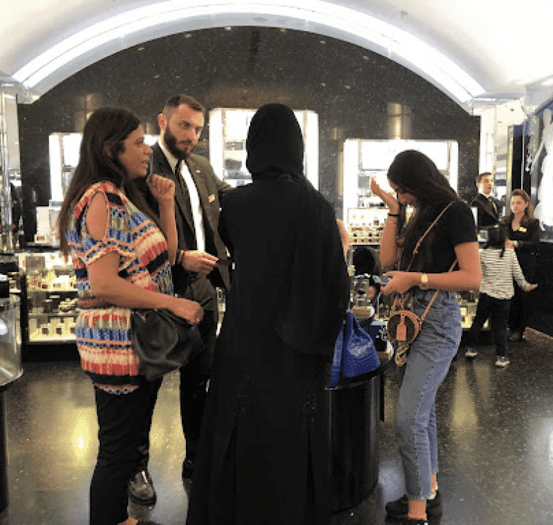
We conducted field observations in Harrods’ Beauty Halls, analysing how customers interacted with the space, products, and staff. Observations revealed distinct shopper types—planned, impulsive, and browsers—who frequently explored in groups and shared products via their phones. Customers sought information on exclusive products, events, and services. Key stages included searching for trending products, testing items, and comparing options before purchase. These insights informed improvements to navigation and enhanced the integration of digital and in-store experiences, making it easier for customers to book services and access Harrods’ unique offerings, such as treatments and masterclasses.
Staff Interviews
As part of our UX research, we also conducted interviews with staff members working in Harrods’ Beauty Halls to gain insights into the in-store customer experience. Key findings revealed that customers often sought personalised services such as makeovers, skincare sessions, and product consultations, yet many were unaware of the full range of services available. The physical environment including the “Magic Mirror” AR Makeup mirrors, seating areas, and exclusive product displays—created a luxurious, immersive experience. These insights we took into our website landing page designs, emphasising personalisation, highlighting Harrods exclusives, and showcasing in-store services to reflect the exclusive in-store experience online.
UX workshops
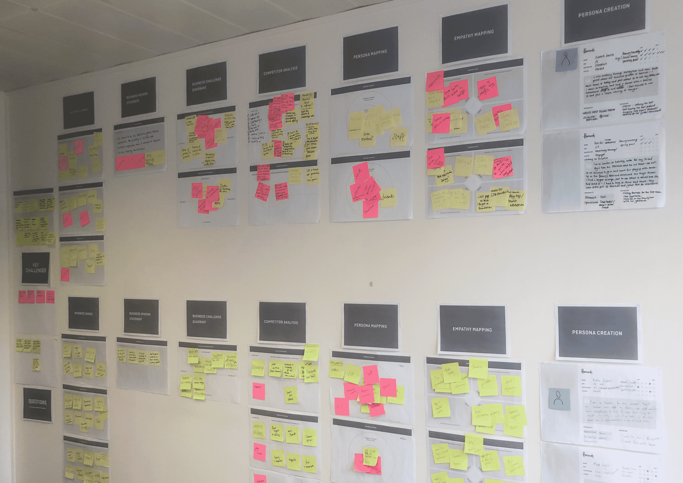
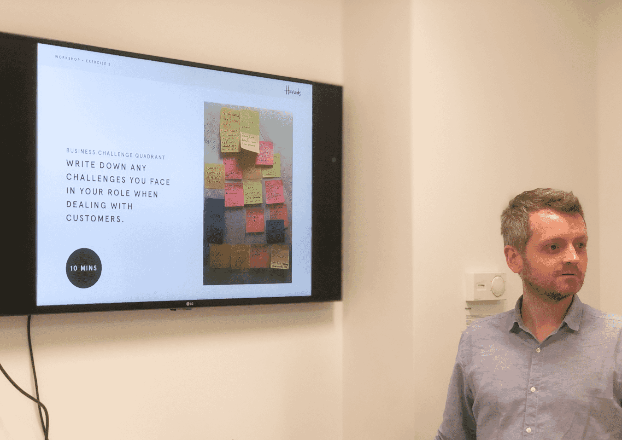
We ran several ux workshops attended by in-store retail teams members, marketing departments as well as content/editorial teams as well as beauty team for .com. The workshops helped us to understand who the customers are, challenges they face and who their main competitors are. These interactive sessions with the internal stakeholders helped us to understand who the customers are, the store end-to-end experience, challenges they face and who our main competitors are. We also did several sessions with senior stakeholders of each department to understand wider strategies and the plans they have in the near future for their business units.

Customer Journey mapping
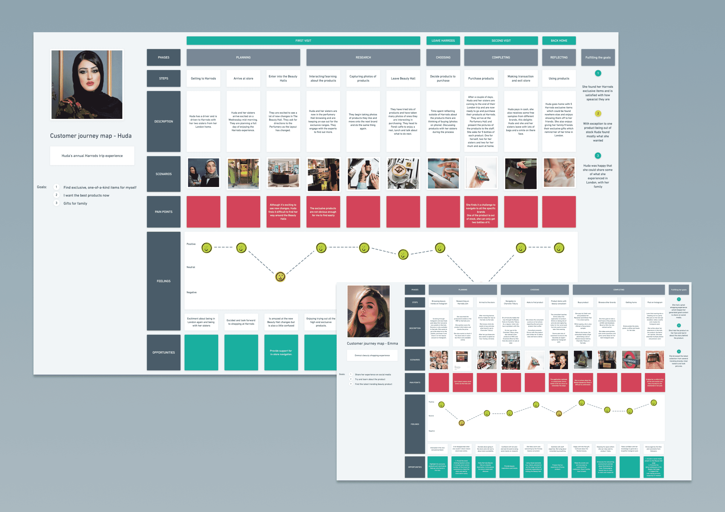
Customer journey mapping enabled us to understand the customer experiences within Harrods’ Beauty Halls. The mapping highlighted key stages, from initial excitement upon entering the store to challenges in navigating the space and finding specific products. One significant finding was that exclusive products were highly valued, but locating them proved difficult, and stock availability was a recurring issue. These insights pointed to opportunities online to improve the navigation and providing better visibility of product availability to enhance the overall joined up offline/online customer experience.
Key outcomes
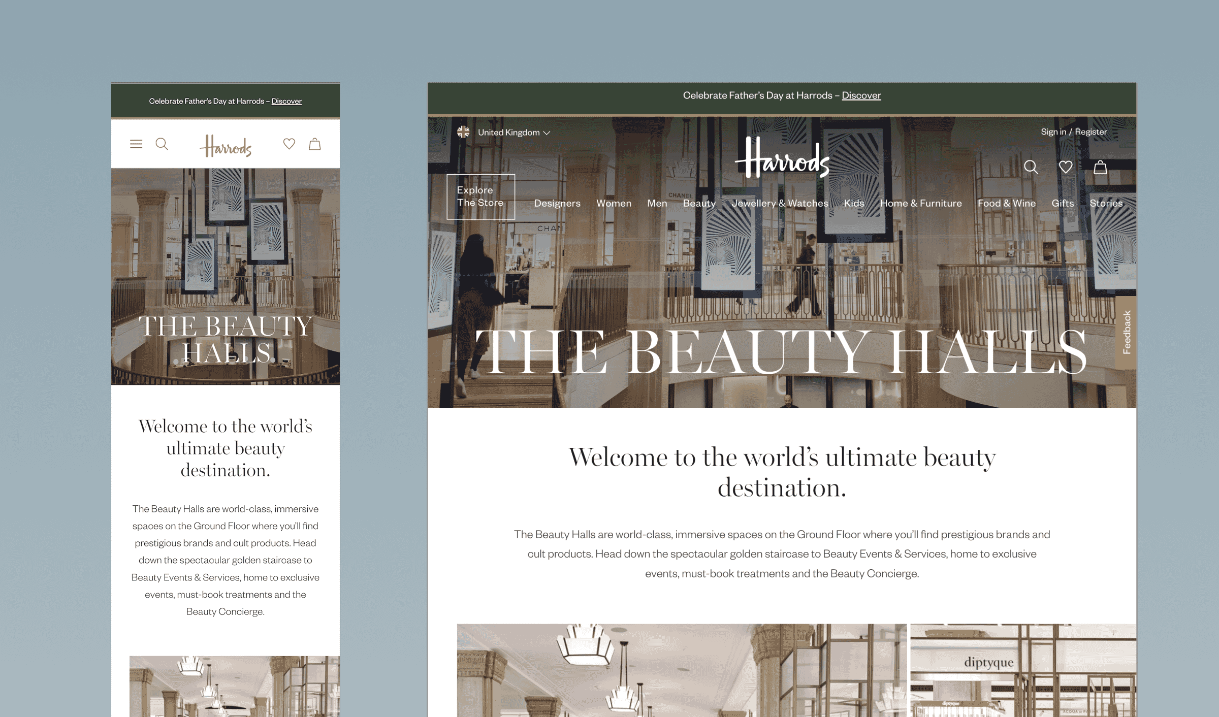
Our research was distilled into key themes of personalisation, intuitive navigation, and seamless access to luxury offerings. From these actionable insights, we developed structured Content Design to align with customer needs, highlighting events, services, and exclusive products. This content design informed the UX/UI process, creating a seamless user journey for exploring exclusive offerings, booking treatments, and discovering Harrods’ luxury proposition. The result was a unified, user-centred design that upheld the brand’s premium positioning while addressing customer needs both online and in-store.
Key requirements
Harrods tasked Full Clarity with enhancing the Communication Preferences centre within the customer Account area to allow customers to customise topics and channels for marketing communications based on their reward tier, while ensuring GDPR compliance. The solution needed to streamline consent management and improve user engagement seamlessly.
Stakeholder workshops
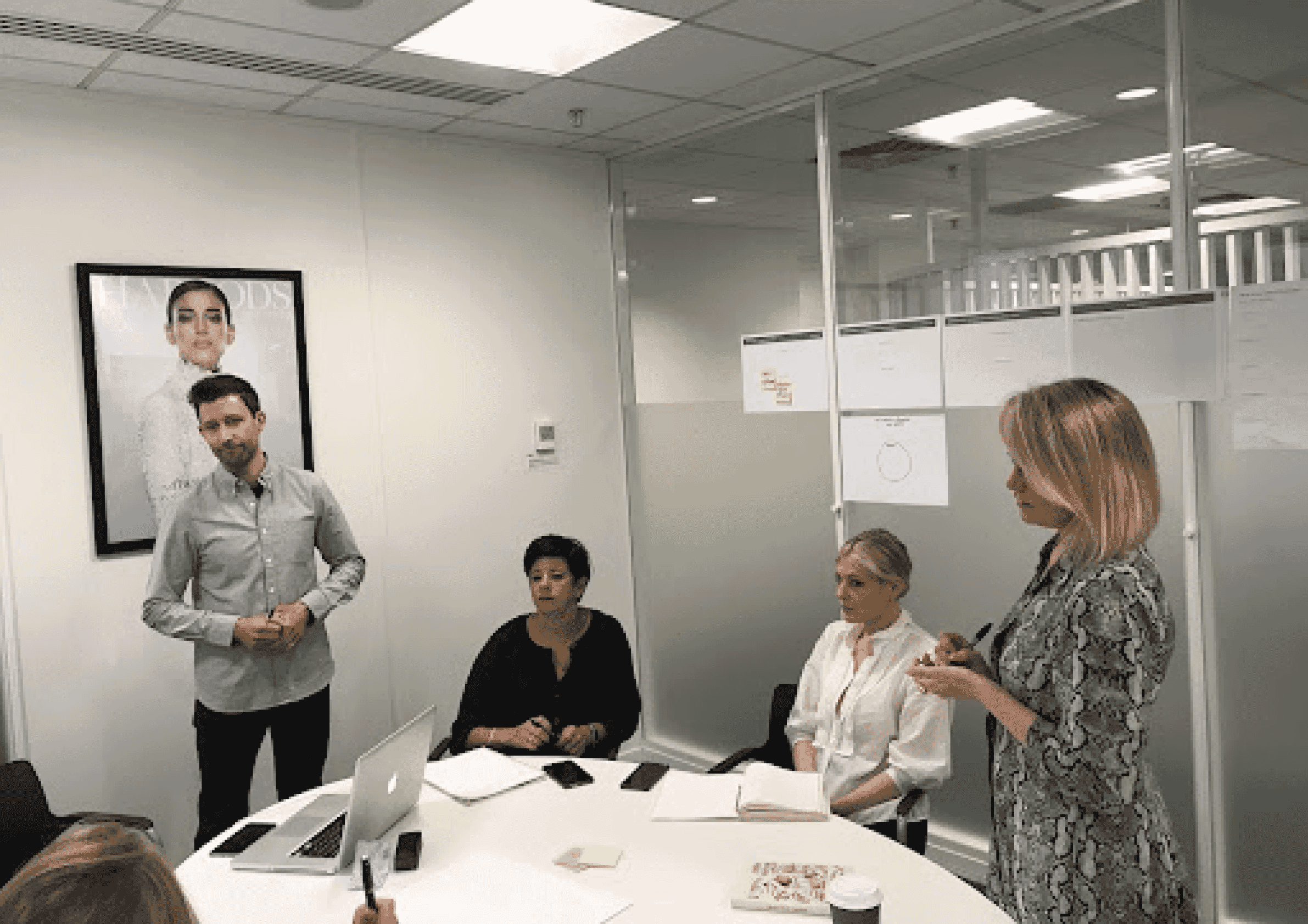
Full Clarity facilitated a stakeholder workshop with teams from Digital Design, Marketing, Customer Experience, and Digital Strategy.
The session identified key pain points and opportunities for improvement, gathering valuable feedback to ensure the redesign of Harrods’ communication preferences met both business and customer needs.
User flows
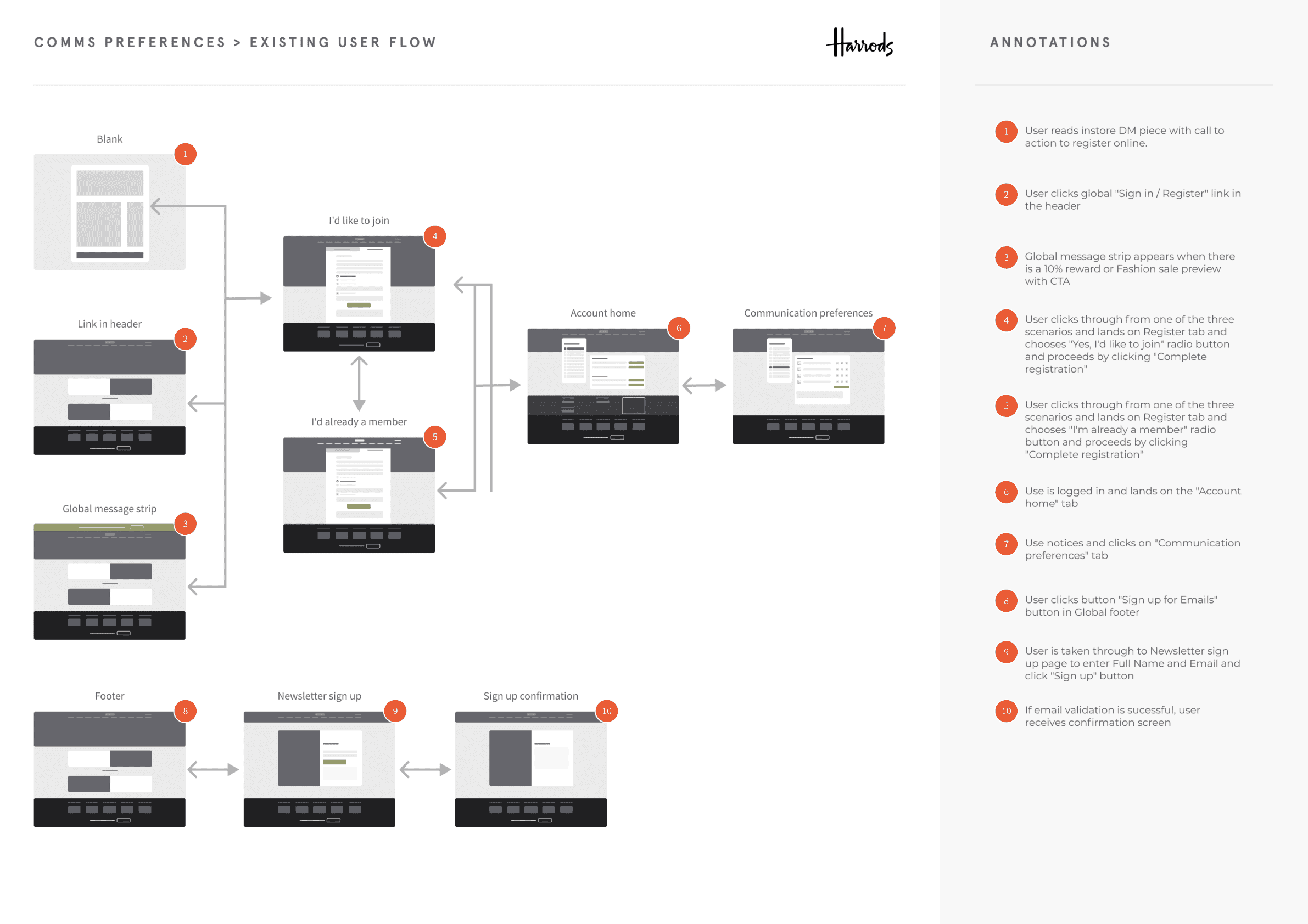
Full Clarity’s analysis of Harrods’ communication preferences user flow identified multiple steps and scattered actions that caused user drop-off. Critical tasks, like signing up for emails, were disjointed across various touchpoints. The insights suggested streamlining the process, reducing steps, and consolidating actions to create a smoother, more intuitive user journey and improve engagement.
Key outcomes
The project highlighted the need to present communication preferences as subscriptions to high-value content linked to the customers Harrods rewards tier, rather than generic marketing consent. Personalisation was lacking and should be tailored based on demographics and behaviour. Clear descriptions of content and frequency were crucial, as was integrating personalised entry points throughout the website. Lastly, full GDPR compliance was essential, ensuring proper consent management and retention of preferences, enhancing customer trust and satisfaction.
Key requirements
Harrods engaged Full Clarity to transform their Knowledge Base into a customer-facing platform that supplied information about Harrods FAQs, while addressing key usability challenges. The brief included auditing the existing platform to identify usability issues and providing UX/UI recommendations for improvement. A key requirement was seamlessly integrating the external Knowledge Base with Harrods.com, ensuring clear navigation, especially on mobile, to minimise user disorientation and frustration when switching between platforms.
User journeys
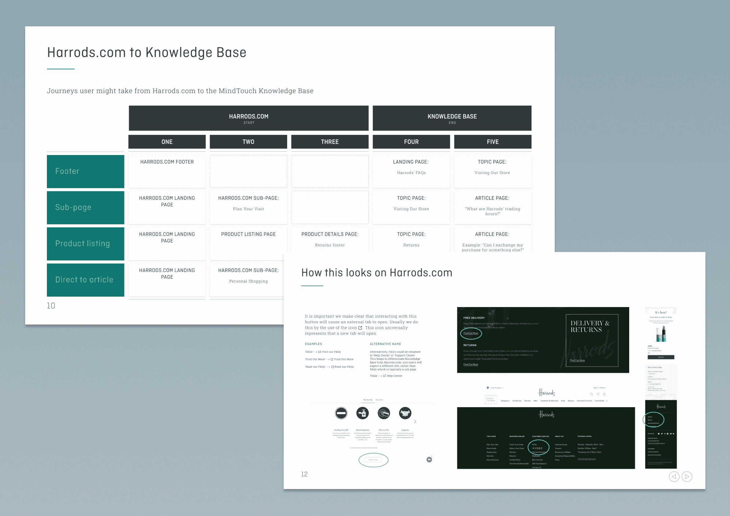
Initially, we focused on the journeys users may take from Harrods.com to Knowledge Base and vice versa. By understanding the routes which may lead users onto the new site, we could establish where they may enter and ensure we had considered all journeys. The journeys from Knowledge Base to .com had not been established yet, therefore it was our job to recommend various ways which users could take to navigate back onto their journey on Harrods.com
Competitor research
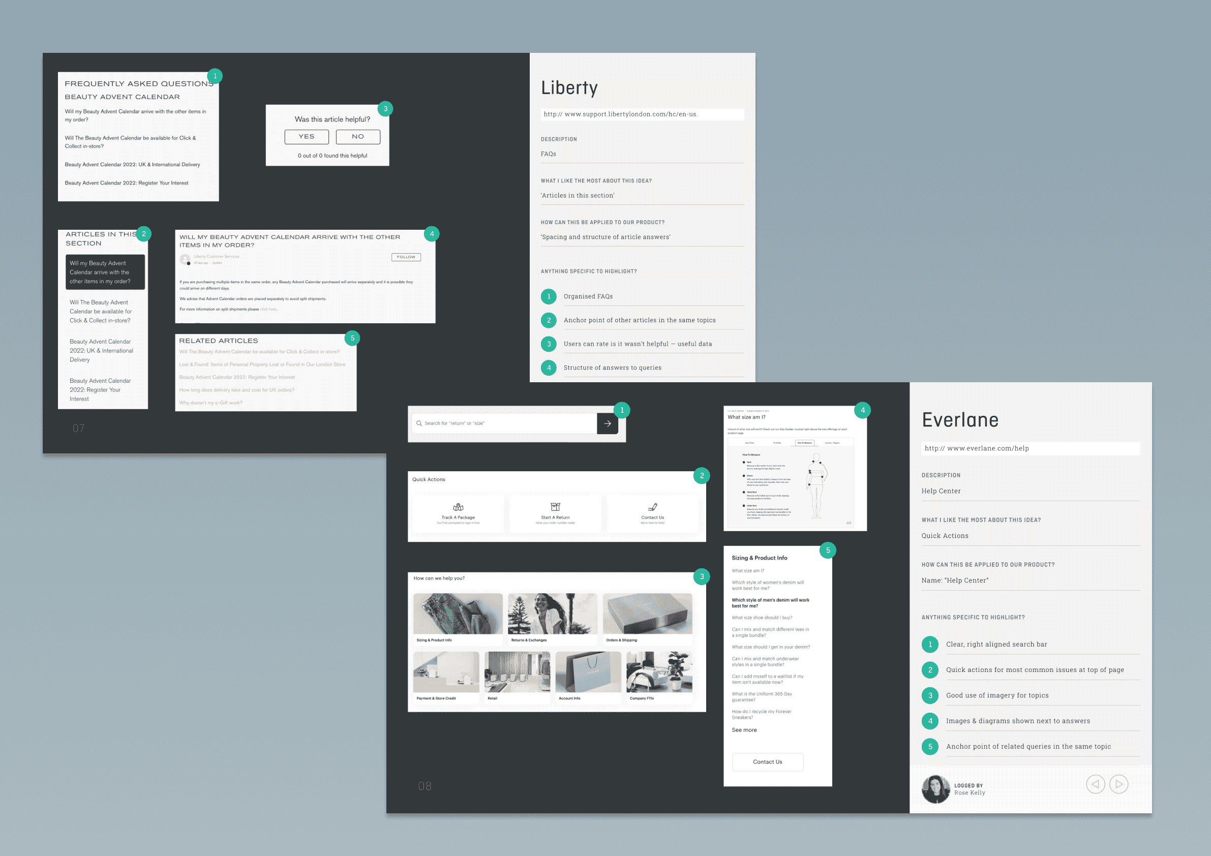
We then undertook research on existing platforms to gain insight into how other e-commerce platforms are presenting the FAQs to their customers. This is always an invaluable exercise as you can learn what works well but also where there is room for improvement. One key finding was that most similar sites are broken down into several pages with single actions. This reduces the cognitive load, by breaking down a lot of information into several steps. Carrying out competitor research before we started the UX audit meant we had prepared ourselves to raise issues related to Knowledge base platforms as well as general UX concerns.
UX/UI Audit
The UX/UI audit identified issues such as unclear navigation that was not configured to Harrods’ content, confusion caused by new tabs opening—particularly on mobile—and a lack of integration between the Knowledge Base and Harrods.com, which created usability challenges as the platform did not reflect Harrods’ branding. The audit focused on navigation, search functionality, and overall site structure to ensure a seamless user experience. These findings were categorised into high, medium, and low priorities to guide actionable recommendations, ensuring the site’s functionality and usability aligned with customer expectations.
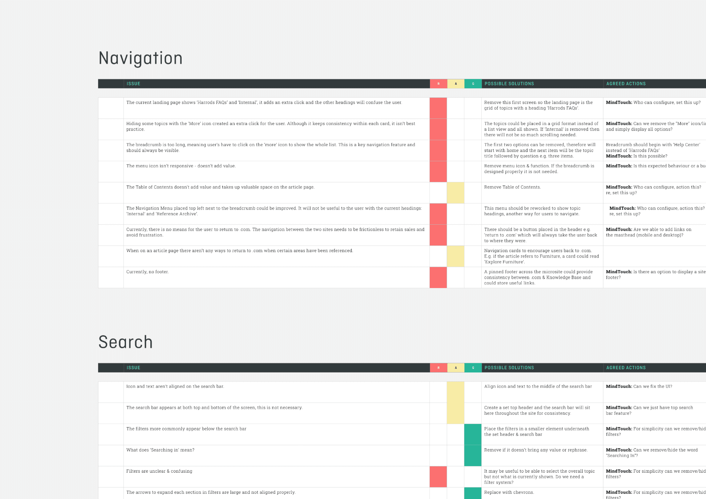
Content Audit
The Content Audit reviewed Harrods’ existing FAQs within the Knowledge Base platform, focusing on adapting the content for a customer-facing experience. Key issues included the use of internal language unfamiliar to customers, which made actions unclear and potentially frustrating. We identified opportunities to incorporate links within the content, seamlessly guiding users back to Harrods.com. Another challenge was ensuring content aligned with Harrods’ tone of voice while providing clear, actionable language for users. The audit prioritised issues that could impact user understanding and navigation, with recommendations tailored to improve clarity, accessibility, and integration across platforms.
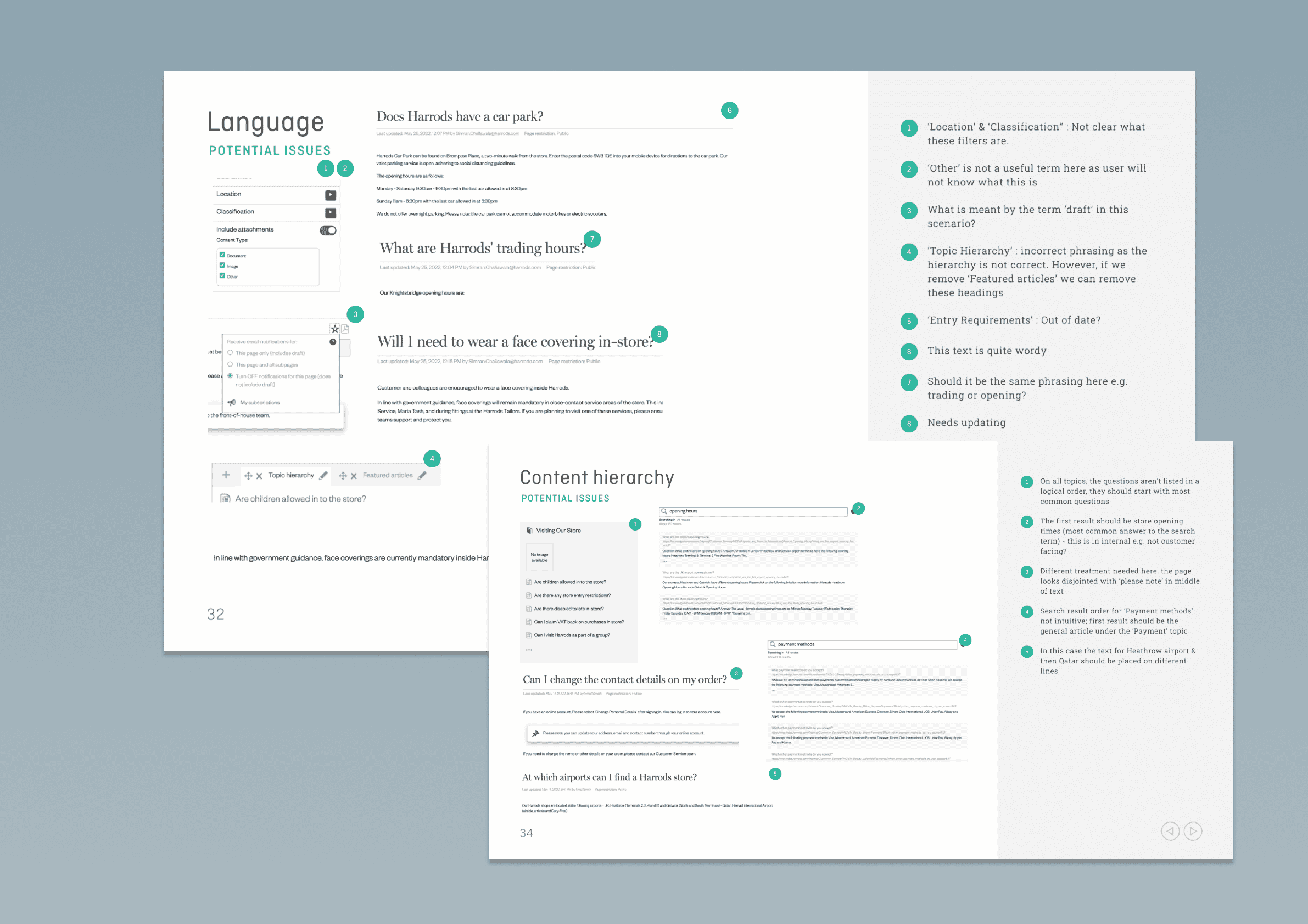
Key outcomes
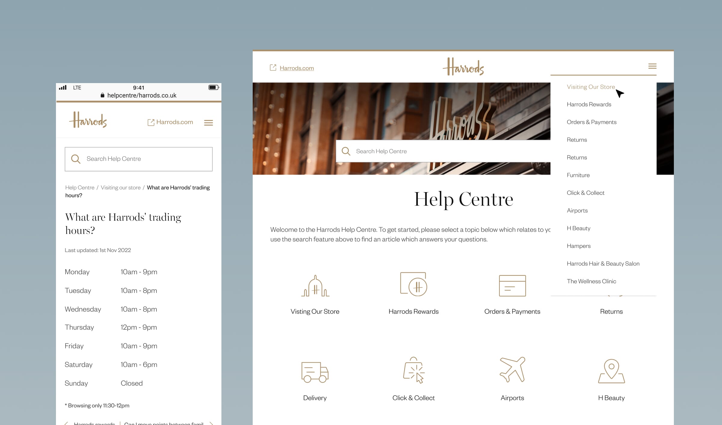
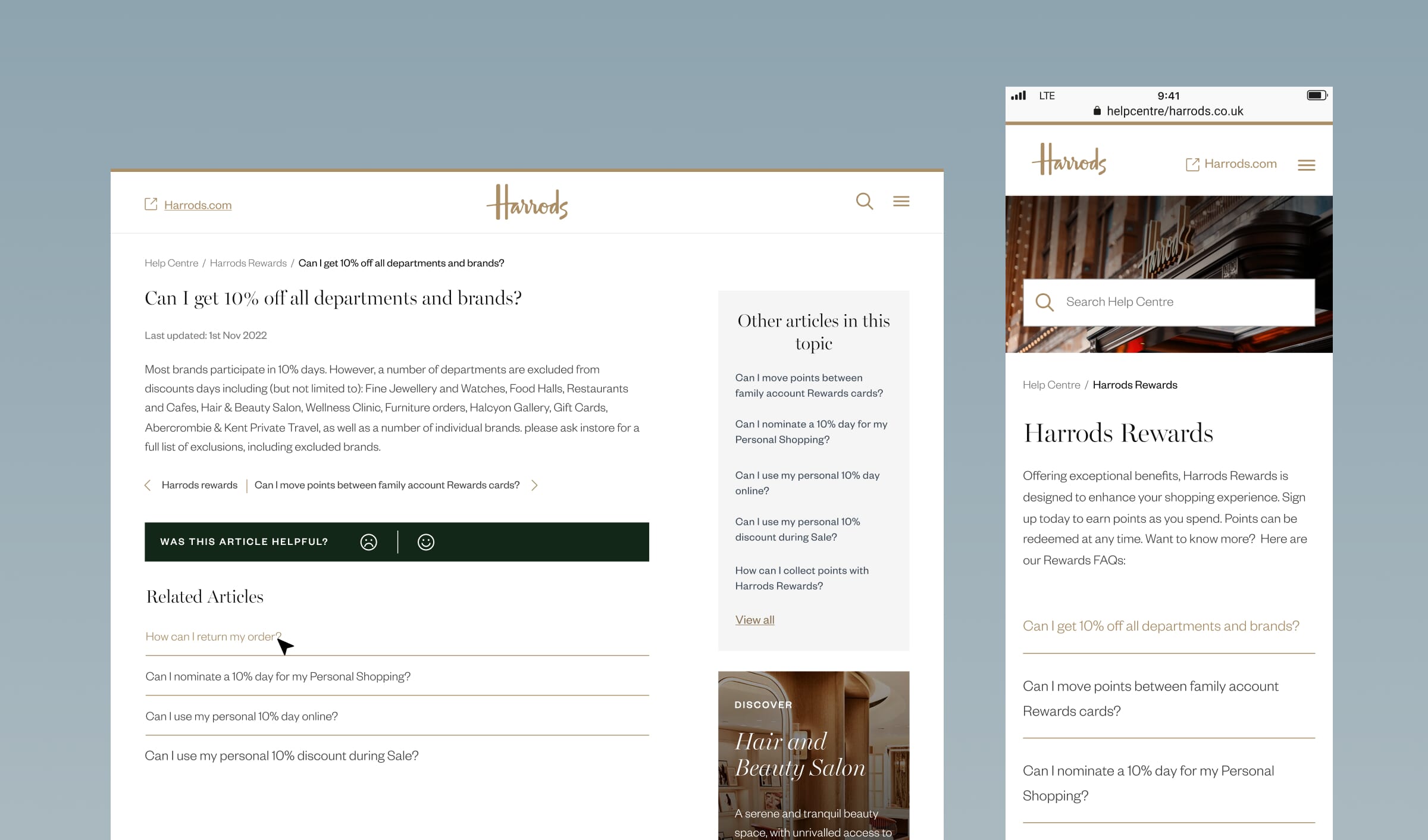
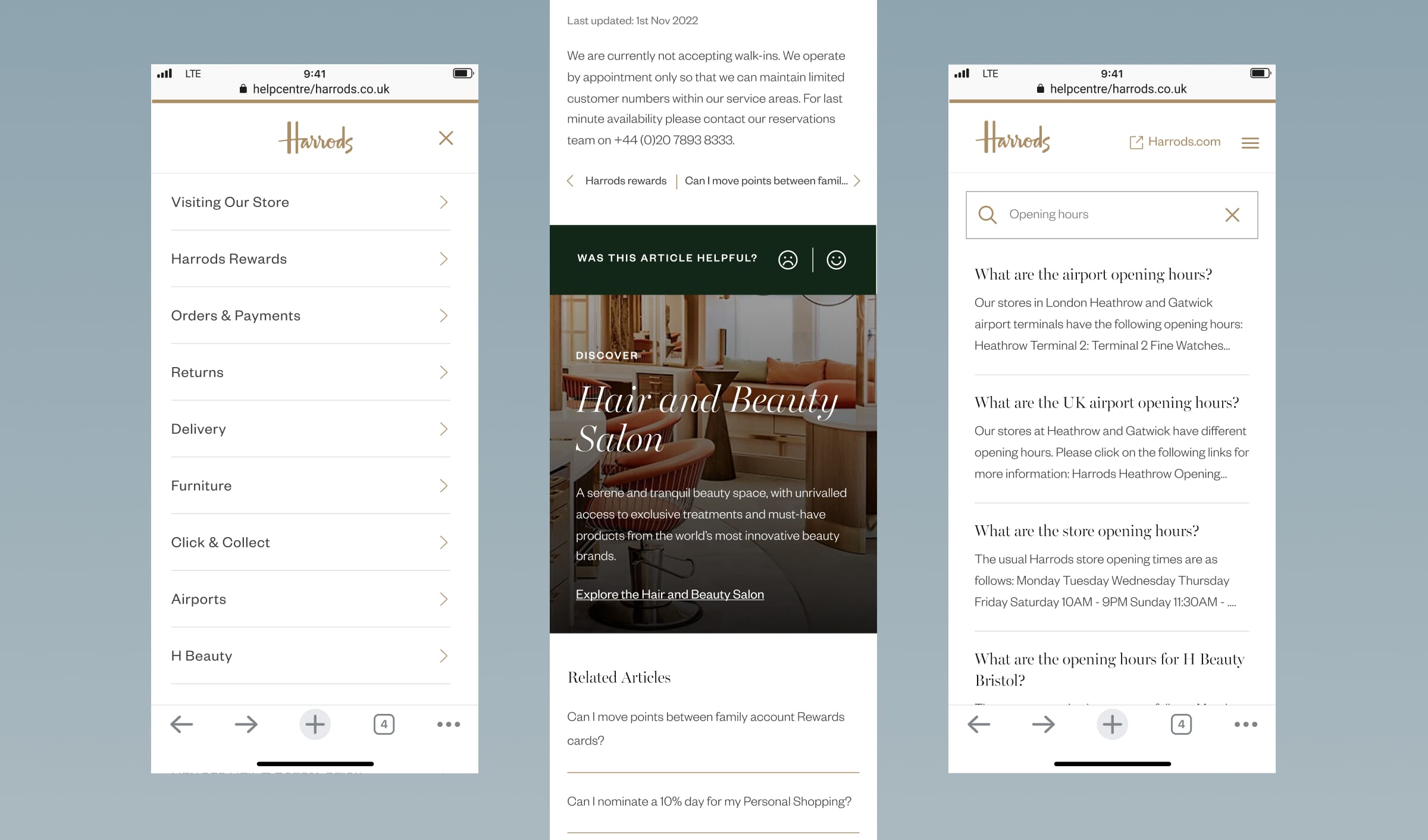
After a stakeholder playback presentation we then presented UX/UI designs which visualised the recommended changes we suggested for Harrods’ Knowledge Base to improve navigation, usability, and branding. We implemented an “open external site” icon to clarify tab behaviour, renamed the platform “Help Centre” for customer clarity, and simplified breadcrumbs to three levels for smoother navigation. A dropdown menu allowed easy topic access, while unnecessary features and internal terminology were removed for a cleaner interface. Harrods’ branding was integrated throughout to maintain consistency with the main site, ensuring a cohesive and user-friendly experience. Collaboration with MindTouch throughout the design process ensured alignment with platform constraints.
Key requirements
Harrods faced a challenge in managing the volume of low-value customer enquiries directed to their service team, such as basic questions like store opening times. This created a need to redirect resources to higher-value tasks while still ensuring customer satisfaction. Harrods wanted Full Clarity to create solution that balanced business and customer objectives by empowering customers to self-serve through intuitive search functionality, engaging content, and seamless connections across touchpoints, including FAQs, forms, and chatbots.
Frequently asked questions
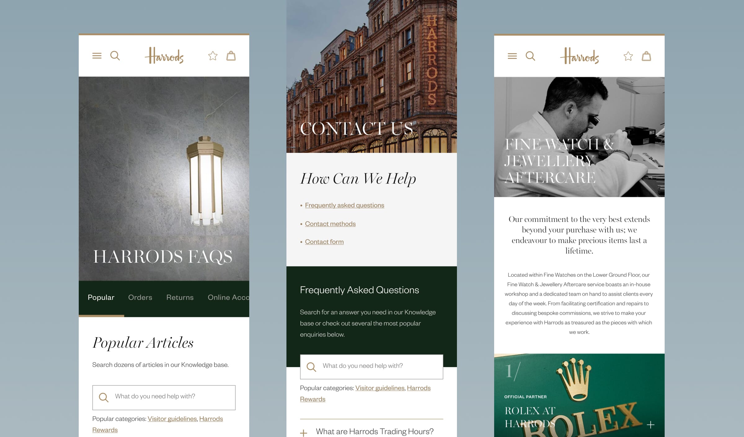
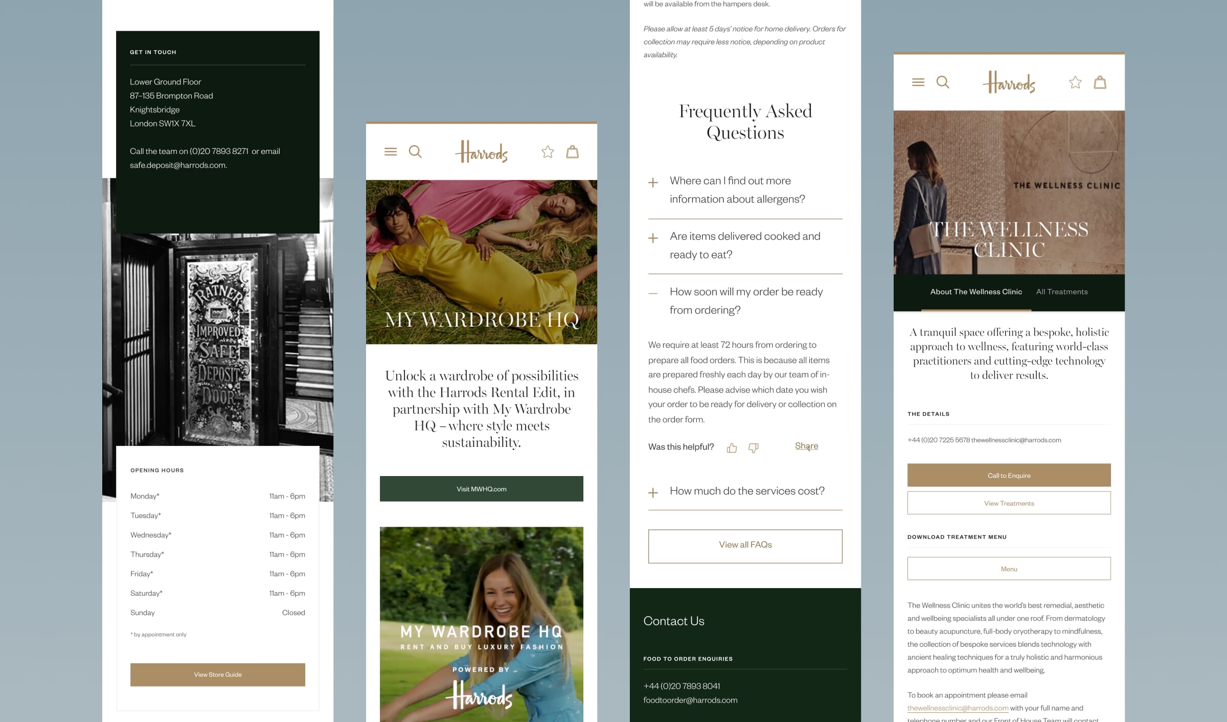
The FAQs page audit identified key issues in content organisation and usability, which were addressed through new UX/UI designs. Articles were restructured into intuitive categories, such as Payment and Delivery, with dedicated category-specific landing pages to enhance navigation. High-demand topics like Orders and Returns were given greater prominence, alongside a dynamic list of top-performing articles to improve discoverability. Robust navigation and search functionality were introduced, including intuitively categorised suggestions to guide users effectively. Features like downloading, sharing, and providing feedback were incorporated to boost engagement. A hub-like design was implemented, consolidating content across sections for improved accessibility and a seamless self-service experience.
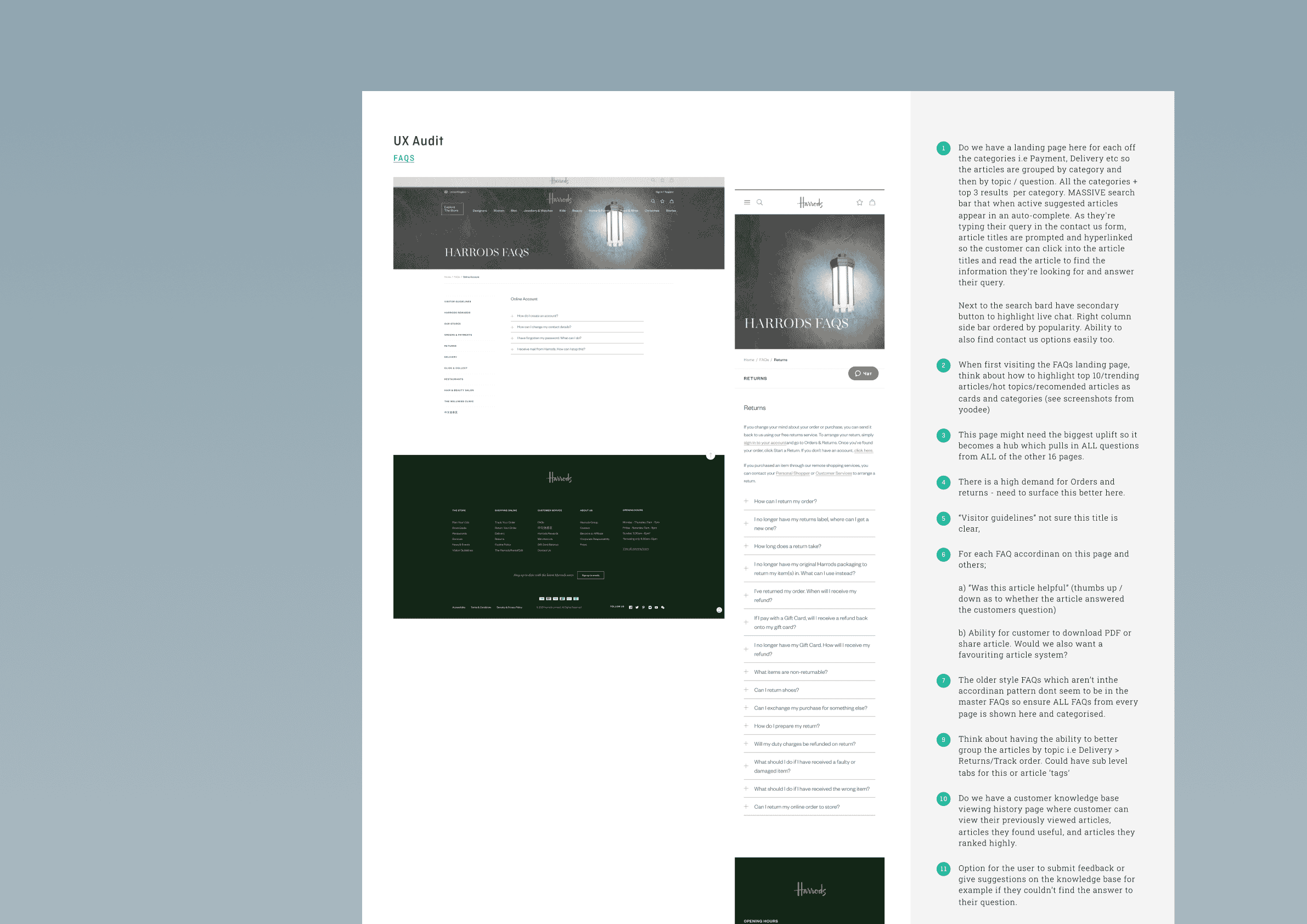
Contact us touchpoints
The Contact Us page audit revealed several areas for improvement in supporting user needs, which informed the new UX/UI designs. Key enhancements included surfacing relevant support modules and FAQs before form submission to reduce unnecessary enquiries. Dynamic dropdown menus were introduced to streamline enquiry types, and autocomplete functionality was added to reduce user frustration when selecting topics. Live chat was repositioned for greater prominence, ensuring it was easy to find and prioritised for high-value interactions. Related articles were better integrated to assist users contextually, while the option to attach files to forms provided additional clarity and functionality. These improvements created a more efficient, user-friendly self-service experience.
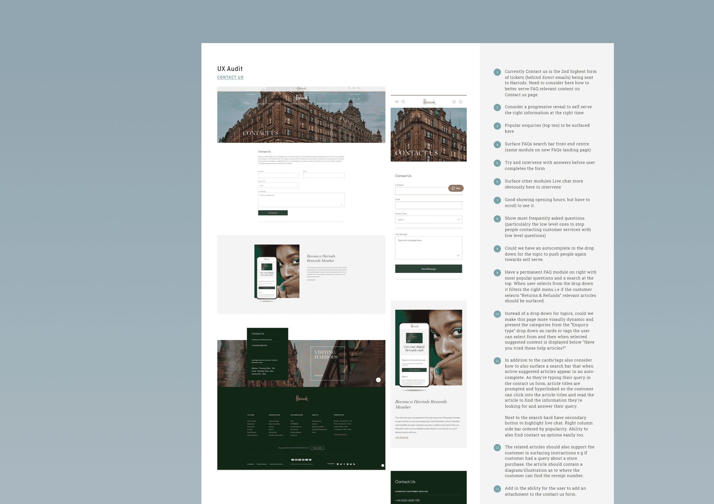
Key landing pages
In addition to the high-priority Contact Us and FAQs pages, key landing pages such as Return Items, Track Order, and My Account were redesigned with integrated self-service FAQ widgets to address customer needs. These widgets dynamically surfaced relevant content, including return instructions, order tracking updates, and account management tips, ensuring users could resolve queries efficiently. The redesign focused on embedding these modules seamlessly within each page, creating intuitive pathways for users to access answers without leaving their current journey or contacting customer support. This streamlined approach aligned with Harrods’ goal to enhance customer self-service while reducing dependency on service teams.
Key outcomes
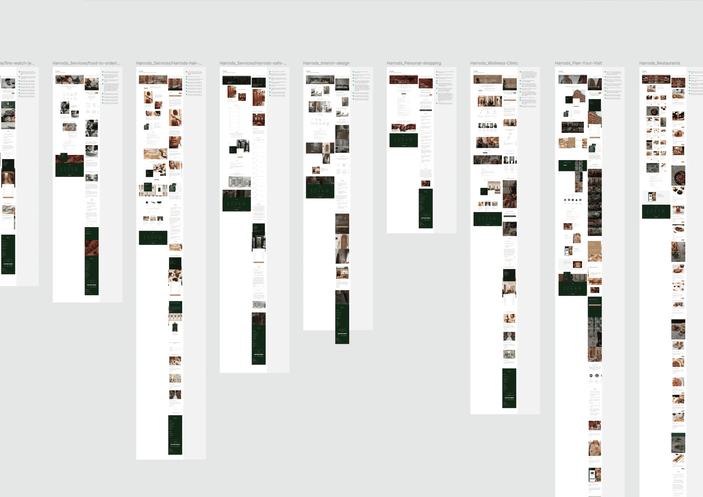
Following comprehensive planning, research, and a UX audit of each page, we created new designs for the FAQs and Contact Us pages, alongside self-service FAQ widgets tailored for other priority pages such as Return Items, Track Order, and My Account. These designs focused on enabling customers to resolve queries independently with dynamic, context-relevant support. The final UX/UI designs streamlined navigation, improved content accessibility, and reduced reliance on customer service teams. The results delivered a cohesive, user-centred experience, aligning with Harrods’ goal of empowering customers while optimising internal resources. The final designs are showcased in the carousel below.
I can’t thank you enough for all the hard work you have put in for us, it’s really helped me in driving up the recognition across the business in the value of a considered, user-centred-design led approach…. and I think the results speak for themselves – very much appreciated.
Other client stories


