
Responsive HTML/CSS/SASS

Whether you’re in the opening phases of product development, or making improvements to an existing digital product, we’re here to help you bring your vision and goals to life.

Clean, semantic markup is the foundation everything else is built on, from accessibility to SEO.

Jon, Technical Director

The foundation of every great interface

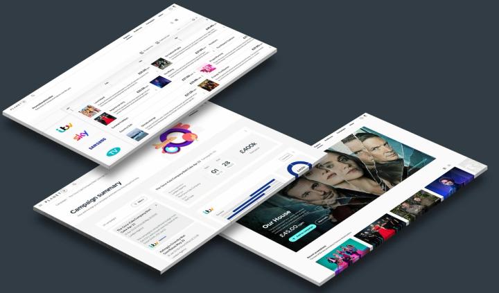
However advanced the technology behind a product, people experience it through HTML and CSS. We write clean, semantic markup and well-organised styles that turn designs into fast, accessible interfaces. Getting these foundations right makes a product easier to use, easier to find in search and easier to build on.

Looks right on every screen

People switch between phones, tablets, laptops and large monitors throughout the day. We build responsive layouts that adapt to every screen size, using modern CSS techniques such as Flexbox, Grid and container queries. Interfaces stay usable and consistent wherever they're viewed, and we test across browsers and devices to make sure of it.

Styles that scale

As products grow, stylesheets can become hard to manage. We use Sass, design tokens and clear naming conventions to keep styles organised, consistent and easy for any developer to work with.

Technologies used

Semantic HTML5 and modern CSS, including Flexbox, Grid and custom properties, with Sass for maintainable stylesheets, design tokens for consistency, and automated testing across browsers and devices to catch layout issues early.

Some questions you might have

Semantic HTML describes what each part of a page is, such as headings, navigation, lists or buttons, not just how it looks. This helps screen readers and other assistive technology, improves how search engines understand your content and makes code easier to maintain. It's one of the simplest ways to make a site more accessible.

Yes. We regularly turn Figma designs into responsive, production-ready front ends. We review designs early to spot gaps, such as missing states or breakpoints, and work closely with designers to make sure the finished interface matches the intent, not just the static screens, across every screen size.

Accessibility is built in from the start. We use semantic markup, sufficient colour contrast, keyboard-friendly navigation and clear focus states, and follow the Web Content Accessibility Guidelines (WCAG). We test with automated tools and by hand, including with screen readers, so the interface works for as many people as possible.

Modern CSS can do much more than it once could, and we use its native features wherever possible. Sass adds helpful tools for larger projects, such as mixins, functions and an organised file structure, which keep styles consistent and maintainable. Both compile to standard CSS, so there's no impact on performance.

Book a virtual coffee

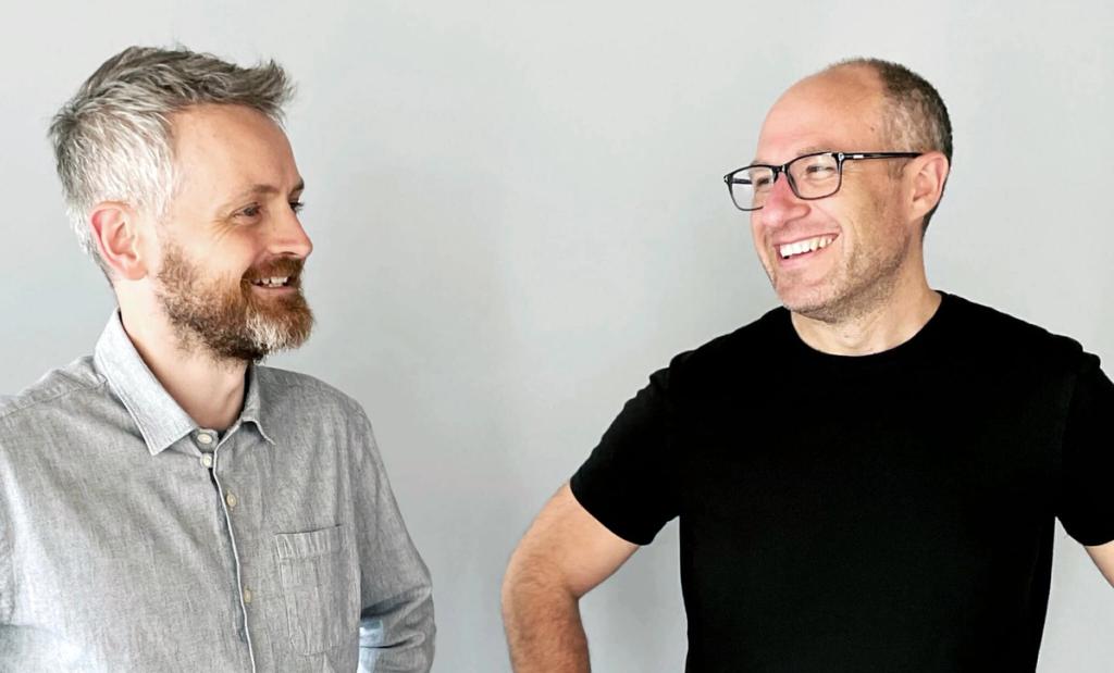
Speak directly with our founders Ed and Jon about how we can help you on your Innovation or Transformation project.

Contact
Ed & Jon