UI states

States are a fundamental part of interface design, representing all the possible variations of a UI element or screen. From buttons and form fields to entire pages, designing for states ensures that every scenario, depending on user interaction or system response, is accounted for, creating clarity for users and efficiency for developers.

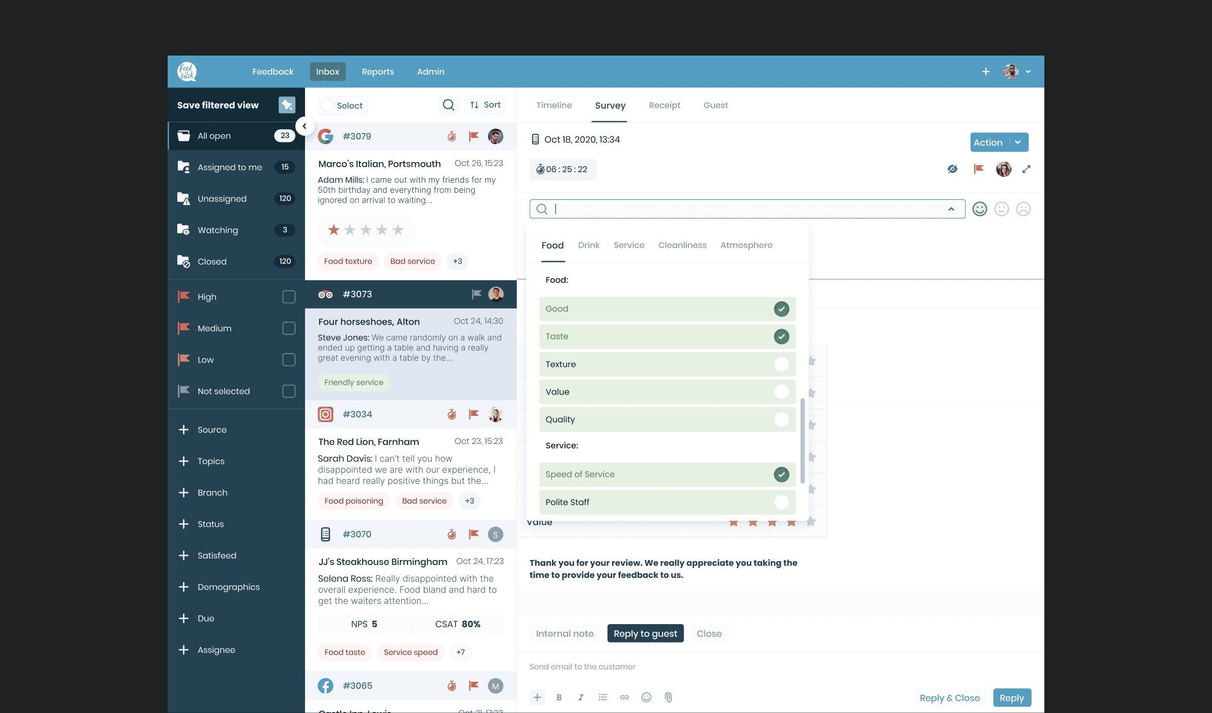
What are design states?

A state refers to the visual and functional condition of a component or page at a specific moment in time. Most elements in a user interface don’t remain static, they change based on user interaction or system feedback. A simple example is a text input field, which may have different visual treatments for:

  • Default: empty and ready for input
  • Filling: when a user is actively typing
  • Filled: after input has been completed
  • Error state: when incorrect information is entered
  • Success: when input is accepted or validated
  • Selected state: when a choice has been made
  • Pressed state: when a button or element is actively being clicked or tapped
  • Empty states: when there is no content to display yet, such as a blank search result page

Each of these is a state, and designing them ensures that the experience feels polished, intuitive, and complete.

Why states matter

Designing for all possible states is essential to creating a UI design that works well in real-world scenarios. It’s not just about visuals, it’s about delivering functional clarity and feedback that supports user behaviour.

Well-considered states:

  • Provide critical feedback: showing users whether an action was successful or needs correction
  • Prevent confusion: by clearly indicating what’s happening or required
  • Guide user behaviour: helping users understand how to move forward in a process
  • Reinforce brand personality: through consistent tone, microcopy, and design details
  • Increase engagement and retention: by making the experience feel responsive, reliable, and user-centric

When users feel guided and informed at every step, they’re more likely to complete actions, trust the product, and return to use it again.


Designing every possibility

We go beyond designing just the ‘happy path’. Our process includes mapping and designing every possible route a user might take, including error states, edge cases, and alternate flows.

This means we:

  • Identify key UI elements and interaction points
  • Define all relevant component states for each (hover, active, disabled, selected state, pressed state, empty states)
  • Design each state visually and contextually
  • Document behaviours and transitions clearly for developers

This level of detail supports both usability and technical implementation, ensuring that no part of the interface is left undefined and no user left unsure of what to do next.


Bridging design and development

From a development perspective, states are non-negotiable. Developers cannot build what has not been defined, and that includes how UI elements behave under different conditions.

When states are clearly designed and documented, it speeds up development, reduces guesswork, and prevents bugs. Developers can code with confidence, knowing exactly how each element should look and function in every scenario. Standards such as Material Design also highlight the importance of consistent UI design, providing a useful framework for ensuring every state is covered.

By designing states as part of the final design phase, we help bridge the gap between design intent and technical reality, ensuring a smoother handover and a more reliable end product.

A better user experience, by design

States are not just a technical necessity, they’re a key part of the user experience. They play a crucial role in keeping users informed, engaged, and on track. Whether it’s a subtle progress bar animation, a carefully considered empty state, or a bold error message, each state helps shape how users feel about your product. Avoiding frustration is central to good UX design, by keeping users informed, you ensure they always understand what’s happening and maintain confidence in the platform.

A thoughtful approach to states is one of the ways we help create interfaces that are not only usable, but delightful, aligning user behaviour with business outcomes through smart, responsive design.


Typical outcomes include:

  • Comprehensive coverage of all possible states across key UI elements
  • Reduced friction during user interaction through clear feedback and guidance
  • Faster development handover with fully defined states and transitions
  • Improved user experience and confidence through consistent design
  • Interfaces that align technical implementation with user needs and business goals

FAQs

Why are states important in UI design?

States show how components respond to user interactions or system processes. They provide visual cues that guide users, reduce confusion, and confirm that actions have been received or completed. Without clearly defined states, users may feel lost or uncertain and developers may struggle to build the interface as intended.

What kinds of components need states?

Nearly every interactive element in an interface needs multiple states. This includes buttons, text inputs, dropdowns, alerts, progress bars, and more. Even pages may have different states, such as loading, error, or empty-state views. Defining these ensures a consistent, complete experience.


Do all states need to be designed visually?

Yes. Especially for high-fidelity handovers. Visualising each state helps developers understand how elements should look and behave under different conditions. In some cases, annotations or written documentation may also accompany visuals to explain transitions or behaviours more clearly.

Book a virtual coffee

Speak directly with our founders Ed and Jon about how we can help you on your Innovation or Transformation project.

Contact
Ed & Jon

Contact details

Find us

Cheyenne House
West Street
Farnham, Surrey
GU9 7EQ

Cheyenne House
West Street
Farnham, Surrey
GU9 7EQ

Contact form

Looking for a long term partner to support your business?

By browsing our website you agree to our cookie policy. You can opt-out anytime from our cookies page