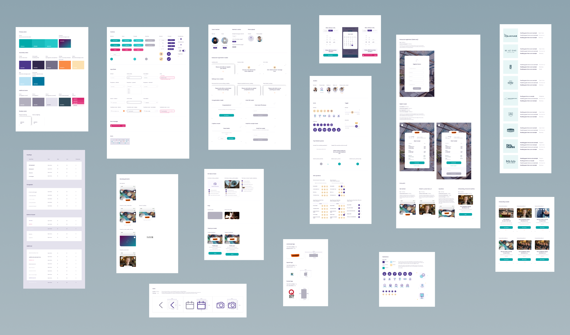
What theming looks like in practice
In practice, theming revolves around design tokens. These are named variables that represent core visual decisions, such as primary colours, font sizes, spacing units, or border treatments. Instead of hard-coding values across components, tokens are referenced throughout the interface.
For example, a primary brand colour might be defined once and applied across buttons, links, and highlights. If the colour changes, updating the token updates every component that references it. The same applies to typography scales, spacing systems, and layout rules.
A structured theming approach also considers hierarchy. Base tokens define foundational values. These can then be extended or overridden at a theme level, allowing consistent variation without fragmenting the system.

