

Quantitative UX research methods vs qualitative UX research methods
When we explored qualitative research, we found that it helps uncover the why behind user behaviour since it provides more insight into user motivations, emotions, and pain points through methods like interviews and usability testing. It’s invaluable for gaining deep, contextual insights, but it’s often based on smaller sample sizes, making findings harder to generalise.
Quantitative user research, on the other hand, focuses on the what. It’s all about numbers, patterns, and statistical validation. By leveraging user research methods like surveys, analytics, and A/B testing, quantitative research provides measurable insights at a bigger scale, making it ideal for identifying trends and validating design decisions.
Whilst they both have their place, the best UX strategies don’t choose one over the other, they use both in combination. While quantitative data highlights problems, qualitative research explains them. Together, they provide a complete picture of user behaviour.
When to use quantitative UX research
Now that we understand how quantitative UX research focuses on large-scale insights, the next question is: when should we use it? While qualitative user research helps uncover deeper motivations, quantitative methods excel in scenarios where measurable data is key to making informed design decisions.
Scenarios where quantitative methods are most effective
- Identifying usage patterns – When you need to understand how users interact with your product at scale, tools like analytics and heatmaps (such as those offered by Hotjar or Mouseflow) can reveal trends in navigation, feature engagement, and drop-off points.
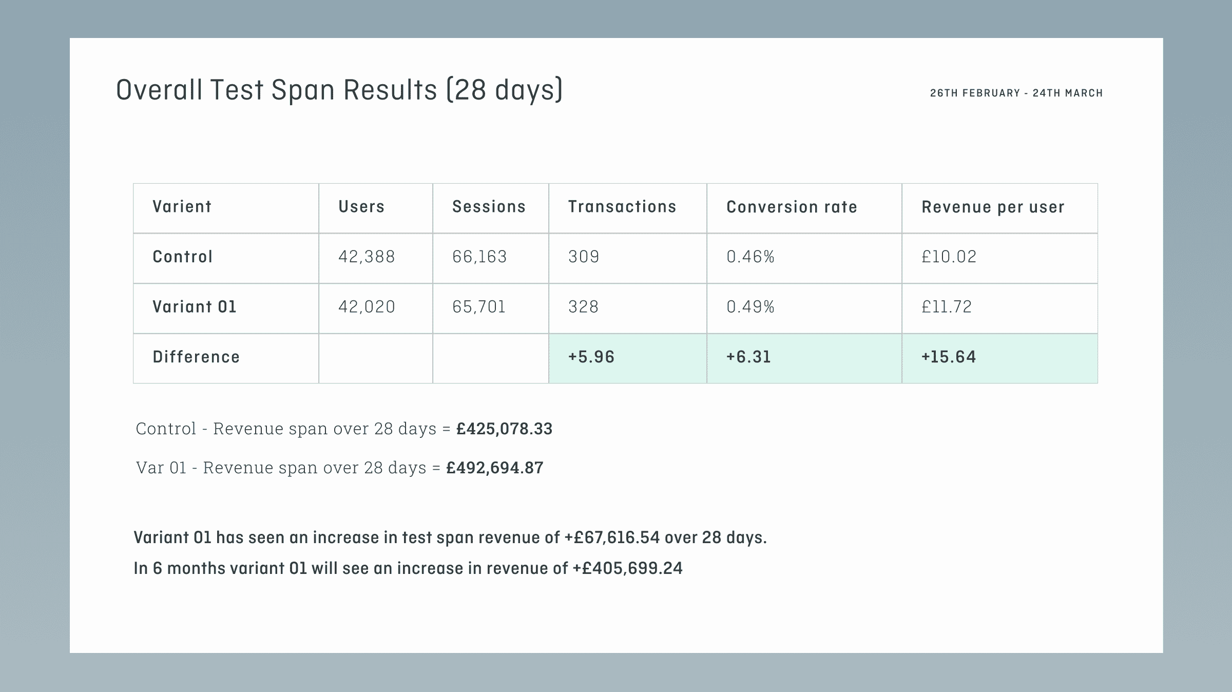
- Benchmarking UX performance – Quantitative usability testing (such as time-on-task measurements or success rates) helps track improvements over time and compare different versions of a design.
- Validating design hypotheses – A/B testing and large-scale surveys allow teams to confirm whether a design change has the intended effect before committing to a full rollout.
- Measuring satisfaction and perception – Surveys and desirability studies help quantify user sentiment, making it easier to track satisfaction and brand perception over time.
How it fits into a broader UX research strategy
While quantitative research provides data-driven insights, it works best as part of a mixed-method approach. For example, if analytics show a high drop-off rate at a particular step in a user journey, qualitative research can help uncover why users are struggling. By combining both methods, teams can make informed decisions with both statistical confidence and human-centred understanding.
Core quantitative UX research methods
Quantitative UX research relies on measurable data to assess usability, identify patterns, and validate design decisions. Below are key methods used to gather those insights.
1. Analytics (app & web analytics) – measuring user behaviour and key metrics
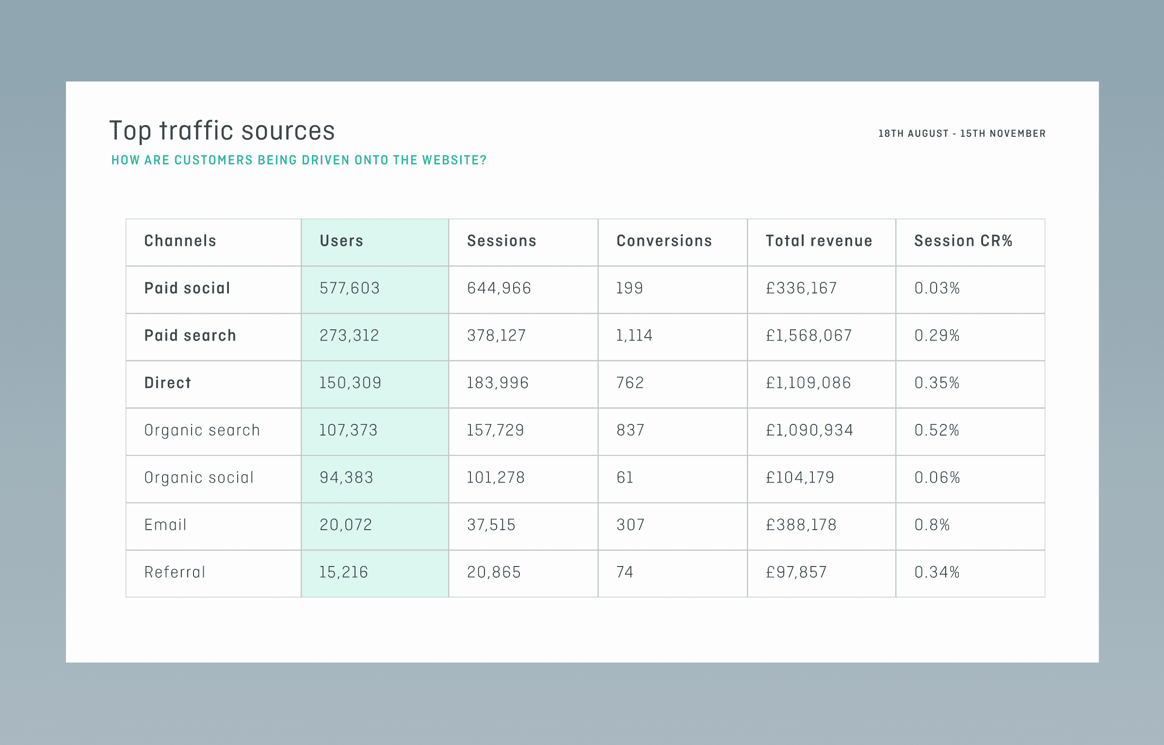
Analytics tools, such as Google Analytics, Mixpanel, and Hotjar, provide data on how users interact with a product. This method is useful for tracking trends, identifying friction points, and evaluating engagement.
Key metrics:
- Page views & session duration – How long users engage with key pages.
- Click-through rate (CTR) – Interaction with calls to action and key elements.
- Bounce & drop-off rates – Where users leave the journey.
- Conversion rates – Completion of goals such as sign-ups or purchases.
These sorts of analytics are most effective for detecting usability issues and tracking trends over time. However, they do not explain why users behave a certain way, making them most useful when combined with qualitative research.
2. Benchmarking usability testing – measuring usability over time
Unlike one-off usability tests, benchmarking tracks usability metrics across multiple iterations of a product. This allows teams to monitor progress objectively and quantify improvements.
Common metrics:
- Task success rate – Percentage of users who complete a task.
- Time on task – Time taken to complete key actions.
- Error rate – Frequency of mistakes or misclicks.
- System usability scale (SUS) – A standardised questionnaire assessing usability perception.
Best use case: Benchmarking is valuable when tracking usability improvements across design iterations or comparing different product versions.
3. Tree testing – Evaluating information architecture (IA) effectiveness
Tree testing assesses the effectiveness of a product’s navigation structure. Users are given a task (e.g., “Where would you find your order history?”) and asked to locate information in a simplified, text-based site structure.
If you’d like to read our more in depth guide on tree testing, feel free to check out our full length comprehensive article on the topic. In summary, though:
- It measures how easily users find content.
- It highlights navigation issues and confusion points.
- It provides quantitative success rates and time-to-completion metrics.
Best use case: Tree testing is particularly useful when designing or restructuring navigation systems. For a more detailed breakdown, see our full article on this research method here.
4. Card sorting – Structuring content for usability
Much like tree testing, card sorting helps optimise information architecture by allowing users to group content into categories that make sense to them.
Two main approaches:
- Open card sorting – Users create and label their own categories.
- Closed card sorting – Users sort items into predefined categories.
How to interpret results:
- Identify patterns in grouping – Do users categorise content in similar ways?
- Detect inconsistencies – Where do different users sort the same content differently?
- Use cluster analysis tools – Software like OptimalSort can visualise sorting trends.
Best use case: Card sorting is useful when designing or reorganising navigation, ensuring categories align with user expectations.
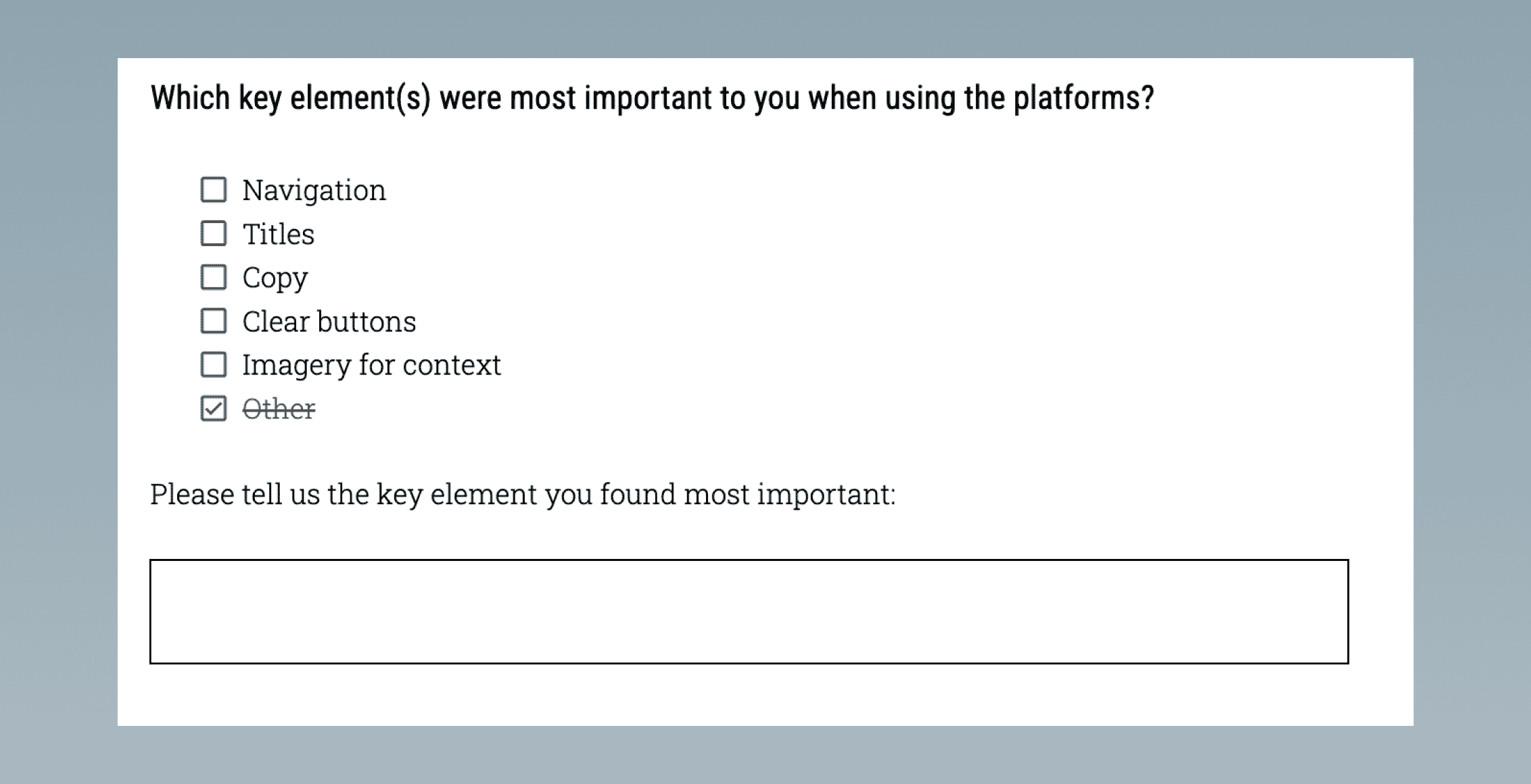
5. Surveys & questionnaires – structuring questions for reliable data
Surveys provide insight into user sentiment at scale, but their effectiveness depends on how they are designed. Poorly structured surveys can introduce bias and lead to unreliable data.
Best practises:
- Use a mix of question types – Combine open-ended, multiple-choice, and Likert-scale questions.
- Avoid leading questions – Instead of “Was the checkout frustrating?” ask “How would you describe your checkout experience?”
- Keep it concise – Longer surveys increase drop-off rates.
- Segment respondents – Tailoring questions to user groups improves relevance.
Best use case: Surveys are most useful for gauging satisfaction, uncovering user needs, and validating design decisions when paired with behavioural data. Whilst surveys and questionnaires sit somewhat between typical qualitative and quantitative research methods, their ability to provide qualitative insights at scale is exactly what makes them so powerful.
6. Desirability studies – Assessing emotional responses to design
Desirability studies measure users’ emotional responses to a product’s visual design, helping teams refine branding and UI elements.
Common methods:
- Microsoft’s reaction words – Users select descriptors (e.g., sleek, intuitive, confusing).
- A/B testing with emotional response questions – Comparing different design versions.
- Visual preference tests – Users rate or rank design elements.
Best use case: Desirability studies help ensure a design aligns with brand perception and resonates with target users.
How to analyse quantitative UX data
Collecting quantitative user data is only the first step; it only becomes truly valuable through accurate interpretation of that data. Poor analysis can lead to misleading conclusions and ineffective design decisions that can set you further back. Below are key principles for extracting meaningful insights.
Interpreting key metrics
Each research method generates different types of data, so understanding how to interpret key metrics is crucial.
- Engagement metrics (e.g., session duration, page views, click-through rates) – These indicate how users interact with a product, but they don’t always reveal intent. High engagement can signal interest, but it may also indicate confusion if users struggle to find what they need. This is why we typically recommend combining methods that gather quantitative engagement metrics with qualitative research methods like user testing and interviews.
- Conversion rates – A critical measure of success in UX. If a product or feature has a low conversion rate, quantitative data can show where users drop off, but further research may be needed to understand why.
- Task success rates – Measured in usability testing, this shows the percentage of users who complete a task as intended. It’s useful for evaluating design effectiveness but should be supplemented with qualitative feedback to identify obstacles.
- Error rates – Tracking how often users make mistakes, such as entering incorrect information in a form, can highlight usability issues that may not be obvious from surface-level data.
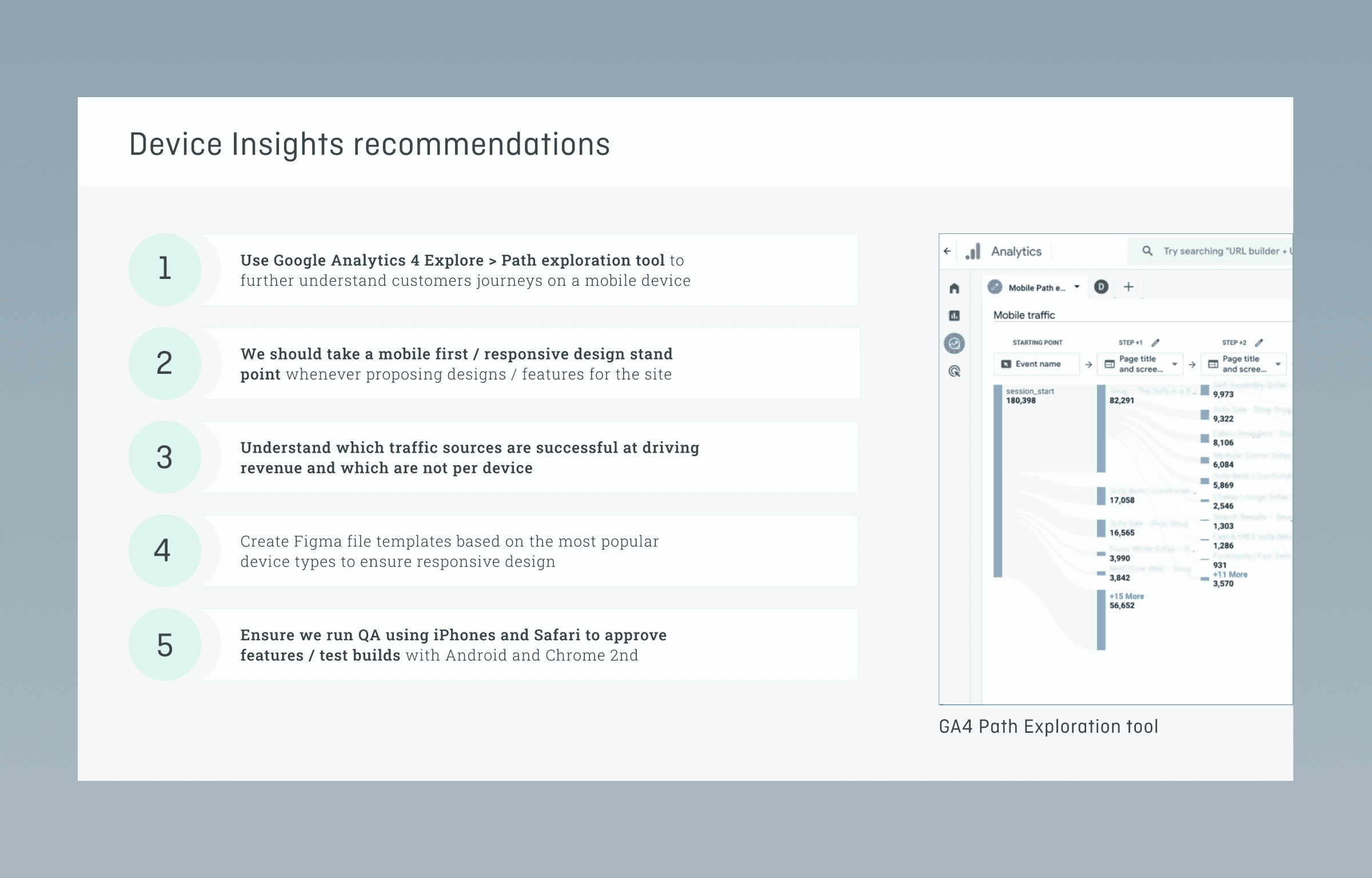
- Heatmaps & clickstream data – Tools like heatmaps and click tracking provide visual insights into where users focus their attention. These should be analysed alongside usability test results to understand why certain areas get more engagement.
Avoiding Common Mistakes
- Correlation vs. causation – Just because two data points move together doesn’t mean one causes the other. For example, an increase in sign-ups after a redesign could be due to external factors like a marketing campaign rather than UX changes.
- Focusing on vanity metrics – Metrics like page views and time on site can seem impressive but may not reflect meaningful engagement or usability. Instead, focus on actionable metrics that align with business and user goals; these might instead be conversions, completed tasks or sign ups.
- Ignoring outliers – Outliers can skew results, especially in small data sets. Identify and assess whether they represent actual user behaviour or anomalies before making design decisions. Minimise the impact of these by conducting your research on a big enough scale.
- Overlooking context – Quantitative data lacks the ‘why’ behind user actions. Whenever possible, supplement findings with qualitative insights to get a fuller picture.
By applying these principles, teams can transform raw data into actionable UX improvements, ensuring that design decisions are based on valuable insights rather than assumptions.
Utilising mixed methods in UX research
While quantitative user research provides broad trends, qualitative research uncovers the underlying reasons behind user behaviour. Combining both methods offers a more complete understanding of the user experience.
- When to combine – Use quantitative methods to identify patterns and problem areas, then apply qualitative research to explore the ‘why’ behind them. For example, if analytics show high drop-off rates at checkout, usability testing can reveal whether confusion or friction is the cause.
- Real-world applications – A/B testing can highlight which design performs better, but user interviews can explain the preferences behind those choices. Similarly, surveys can quantify satisfaction levels, while follow-up interviews provide deeper context.

Pros and cons of quantitative UX research
Strengths
- Scalability – Large data sets allow for statistically significant insights, making results more reliable.
- Objectivity – Data-driven findings help reduce personal bias in decision-making.
- Measurability – Clear metrics track changes over time, showing the impact of design updates.
- Cost effective – Gathering quantitative data is typically cheaper and lower-effort than qualitative methods.
Limitations
- Lack of context – Numbers indicate what’s happening but not why, requiring qualitative methods for deeper insight.
- Potential for misleading data – Poorly designed surveys, biased sampling, or misinterpreted analytics can lead to incorrect conclusions.
- Limited flexibility – Once a quantitative study is launched, adjusting questions or data collection methods can be difficult without restarting the process.
Conclusion: leveraging quantitative research for better UX
Quantitative user research plays a crucial role in understanding user behaviour at scale. By focusing on measurable data, it helps teams identify trends, evaluate design decisions, and track improvements over time. However, numbers alone rarely tell the full story. The most effective UX strategies combine quantitative insights with qualitative research to balance statistical validity with deeper user understanding.
When used correctly, quantitative methods provide the clarity needed to make informed design choices, reduce guesswork, and create better user experiences. The key is knowing when to apply them, how to interpret the results accurately, and when to complement them with qualitative insights. With a well-rounded approach, UX teams can build products that are both data-driven and user-centred.
Find out more
Need expert UX research support? Contact Full Clarity today to refine your strategy and improve user experience.
Related insights

Tree testing in UX: Complete guide