What is heuristic evaluation in ux?
Definition
Heuristic evaluation is a usability inspection method where a small group of UX/usability experts evaluate an interface based on established usability principles, or “heuristics.” Rather than involving end-users directly (like you might see with most other testing/research methods), heuristic evaluation relies on expert evaluators and UX specialists to identify potential usability issues that could hinder the user experience. As a result, it’s a fast, relatively low-cost way to pinpoint design flaws, often catching issues early on, when adjustments are easier to make.
Popular heuristics
Most UX audits follow Jakob Nielsen’s 10 Usability Heuristics, which offer a practical framework to assess a design’s effectiveness. These heuristics cover core elements like visibility, error prevention, flexibility, and ease of use, helping evaluators structure their assessment. Other usability heuristics, like Ben Shneiderman’s “Eight Golden Rules of Interface Design,” are also popular, especially in contexts like software and web applications where certain usability factors might weigh more heavily, but Nielsen’s is what we’ll focus on in this article.
Heuristic evaluation vs. user testing
Unlike user testing, which involves actual users interacting with a design, heuristic evaluation is an expert-driven process. This approach is efficient for identifying issues quickly without needing a test group or extensive scheduling. However, it’s worth noting that heuristic evaluations won’t replace user testing; they’re complementary. While expert reviews are great for spotting obvious usability problems and design inconsistencies, user testing reveals how real users respond to the product, which often surfaces issues that experts alone wouldn’t catch. Therefore, rather than one being superior, both are invaluable tools that serve distinct roles within a well-rounded usability testing strategy.

When to use heuristic evaluation in ux design
Heuristic evaluation can be especially useful at specific stages within a UX project, most commonly after the initial design and prototyping phase. This is usually the most advantageous time to conduct an audit as you’ve likely mapped out user flows, created wireframes, and possibly even developed an interactive prototype. Running an evaluation at this point in the design process allows you to catch fundamental usability issues early, before moving into more costly user testing or full development. By identifying usability roadblocks at this stage, your team can refine and improve the design efficiently, saving time and resources down the line.
In broader usability audits, heuristic evaluation plays a key supporting role. While user testing methods (like user interviews, tree tests etc.) provides direct user feedback on how customers interact with a product, heuristic evaluation brings a more structured, expert-led perspective to the table. This balance helps ensure that both obvious and subtle usability issues are addressed, covering different angles of the user experience.
Step-by-step guide to conducting a heuristic evaluation
Conducting a heuristic evaluation involves a series of structured steps that keep the process focused, effective, and consistent. Here’s our best-practice guide to getting started with heuristic evaluation for those looking to conduct one themselves:
Planning the evaluation
Before diving into the evaluation itself, it’s essential to set clear objectives. Begin by defining the specific goals for the audit—what aspects of the user experience are you most interested in improving? This might range from identifying general usability issues to targeting areas like navigation, accessibility, or visual clarity.
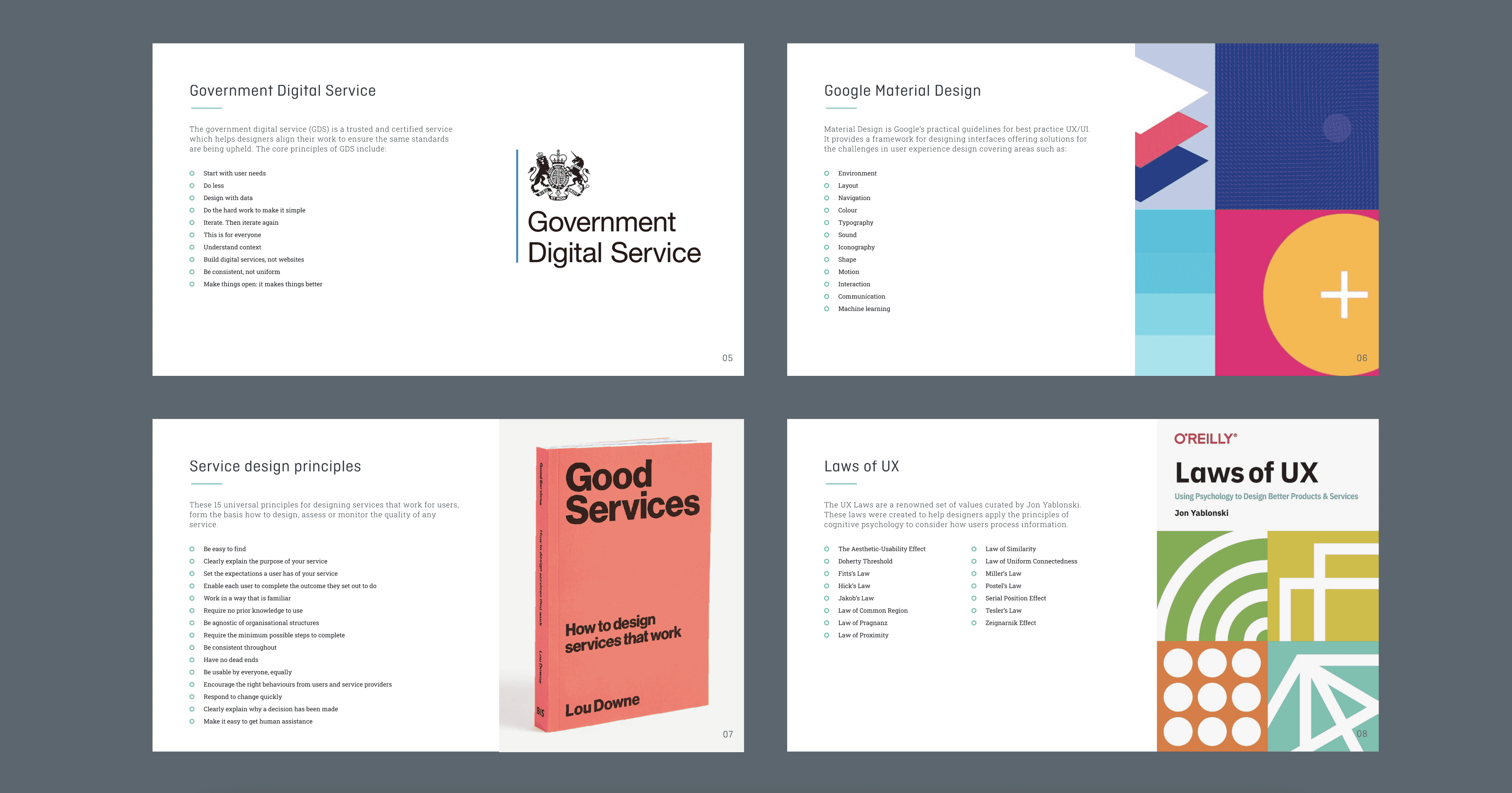
Next, choose the heuristics that will serve as the foundation of the evaluation. Jakob Nielsen’s 10 Usability Heuristics are a popular and reliable choice, covering fundamental principles like visibility of system status, error prevention, and consistency. However, depending on the product or user base, you might consider additional or customised sets of heuristics that align more closely with specific needs or industry standards. Here’s a quick breakdown of Nielsen’s, though, in case you want to start there:
- Visibility of system status: Users should always know what’s happening within the system, thanks to clear feedback and timely updates. This means that loading indicators, confirmation messages, and progress bars are essential to keeping users informed, reducing confusion and potential frustration.
- Match between system and the real world: Design should reflect familiar, real-world concepts that users already understand. By using language, icons, and structures they recognize, you create a more intuitive experience—whether it’s a shopping cart icon for ecommerce or a trash can for deleting items.
- User control and freedom: Users should feel in control of their interactions. Offering “undo” and “redo” options or easily accessible back buttons gives them the freedom to explore without fearing they’ll make irreversible mistakes, making the interface feel safer and more approachable.
- Consistency and standards: Consistency is key to intuitive design. Familiar patterns, terminology, and layout conventions help users navigate your interface confidently. For example, sticking to commonly understood icons and menu placements ensures that users can rely on their previous experiences, regardless of the device or app.
- Error prevention: It’s better to prevent mistakes than to have users correct them. Thoughtful design choices, such as disabling unavailable options or providing clear instructions upfront, minimise the chance of user errors and save time. This might involve something as simple as a confirmation step before a significant action.
- Recognition rather than recall: Reduce the cognitive load by making essential information readily available. Interfaces should avoid placing the burden of memory on the user. This might mean displaying recent searches in a search bar or keeping navigation menus visible, so users don’t have to remember where to go.
- Flexibility and efficiency of use: A good interface accommodates both novice users and experienced users. Providing keyboard shortcuts, customizing options, or offering a quick-access menu enhances productivity for advanced users while keeping the design simple enough for beginners.
- Aesthetic and minimalist design: Every element on the screen should serve a purpose. Unnecessary information or complex visuals can distract users and complicate navigation. Keeping layouts clean and focusing on the essentials improves usability, making interactions more efficient and visually appealing.
- Help users recognise, diagnose, and recover from errors: When errors occur, the interface should offer clear messages and possible solutions in plain language. Instead of technical jargon, error messages should guide users toward a resolution, empowering them to correct their actions confidently.
- Help and Documentation: While a well-designed interface minimizes the need for assistance, readily available help or documentation is invaluable. Providing tooltips, FAQs, and guides can assist users when they’re stuck, ensuring they can easily find answers without feeling frustrated or stuck.
Finally, select your evaluators. For best results, aim for a small group of UX professionals—ideally 3 to 5 evaluators. Each evaluator will bring unique insights, and combining multiple perspectives helps reveal a broader range of issues than a single evaluator might identify alone.

Conducting the evaluation
Once planning is complete, evaluators can begin navigating the interface independently, working through each screen or interaction with the chosen heuristics in mind. The evaluators should document any usability issues they encounter, noting the specific heuristic that each issue violates and any contextual observations that might aid in understanding the problem.
This process often involves revisiting certain areas or flows within the interface, as evaluators assess different aspects of usability such as feedback mechanisms, error prevention, and user control. Each issue should be recorded in detail to create a comprehensive report. Some UX teams use tools like Google Sheets or UXCheck to keep evaluations structured and ensure findings are easy to track and share.
Rating issues
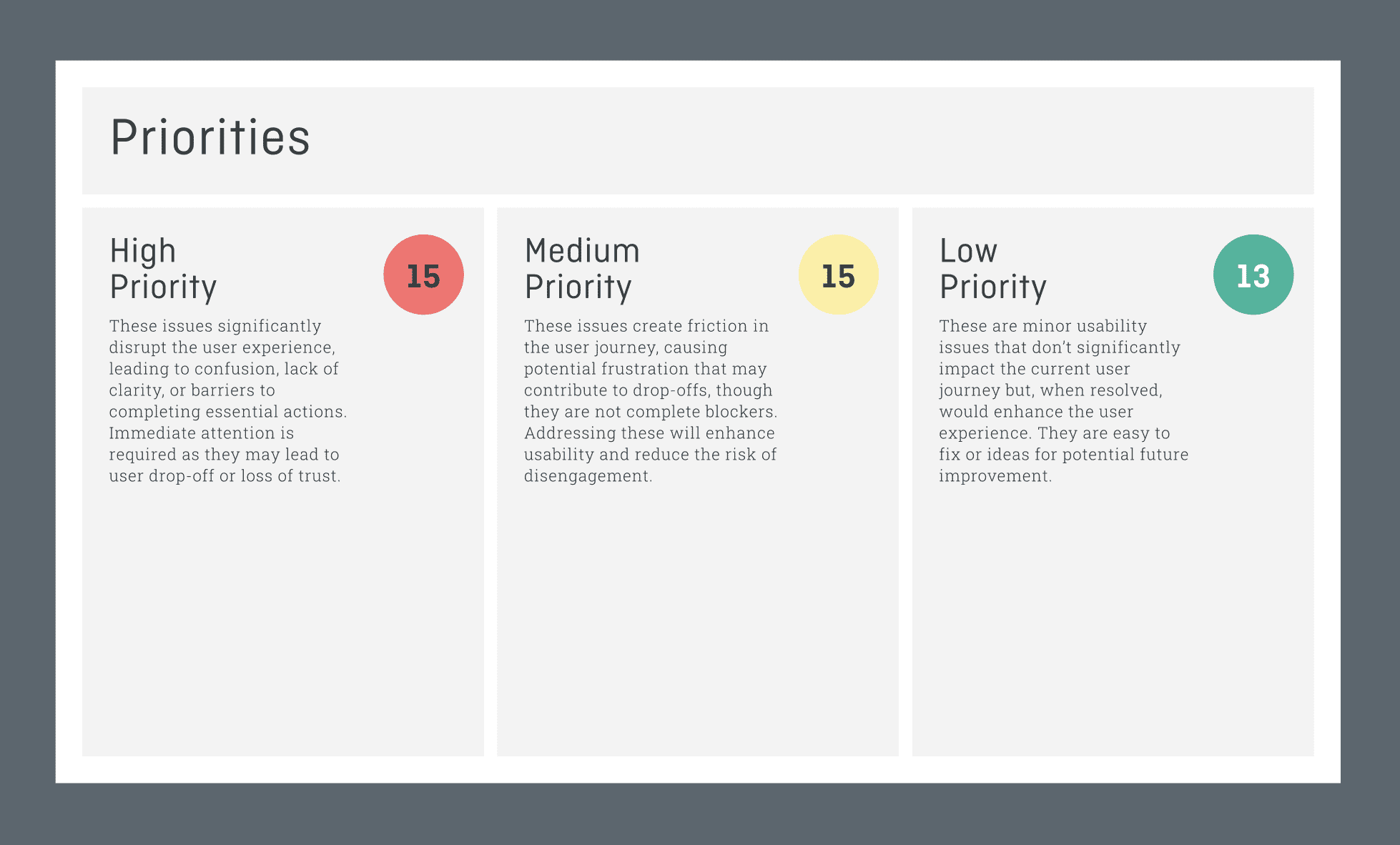
To prioritise fixes effectively, evaluators rate the severity of each issue. Common severity levels include:
- 1 (Low): Usability issues that don’t seriously disrupt the user experience but may cause slight frustration, these can be easily fixed.
- 2 (Medium): Significant issues that can impact user satisfaction and overall usability, likely requiring attention.
- 3 (High): Severe issues that hinder basic functionality, create confusion, or lead users to abandon tasks; these demand immediate attention.
This rating system helps product teams understand which issues to address first, making the evaluation results more actionable.

Key metrics and measurement for heuristic evaluation
Once you’ve identified and rated usability issues, the next step is to document and track these findings in a way that drives effective action. Organising the results well is crucial to making sure your team can understand the issues and prioritise fixes accordingly.
Severity ratings
Severity ratings are an essential part of heuristic analysis, as they help teams focus on the most pressing issues first. In a heuristic evaluation, each issue is typically rated based on its impact on the user experience. The criteria often include factors like:
- Frequency: How often users are likely to encounter this issue.
- Impact: How much the issue disrupts or affects the user’s experience and ability to complete tasks.
- Persistence: Whether the issue can be easily bypassed or if it consistently blocks user progress.
The final severity rating—usually using the scale from 1 to 4 seen above—helps clarify which issues need immediate attention versus those that are less urgent.
Tracking and reporting
After rating the issues, effective documentation and reporting are key to ensuring that findings lead to meaningful improvements. Many UX teams use a tracking sheet or evaluation tool, such as Google Sheets, Airtable, or project management software, to capture a detailed account of each issue.
In a clear and actionable report, each issue should be documented with:
- Issue description: A brief summary of what’s wrong, including any specific heuristics violated.
- Location: Indicate where in the interface the issue occurs, such as specific screens, buttons, or flows.
- Severity rating: Based on the criteria mentioned above, clearly note the severity to aid in prioritisation.
- Suggested fix: Provide potential solutions or recommendations for addressing the problem. Even if these are high-level suggestions, they can be useful starting points for the design team.
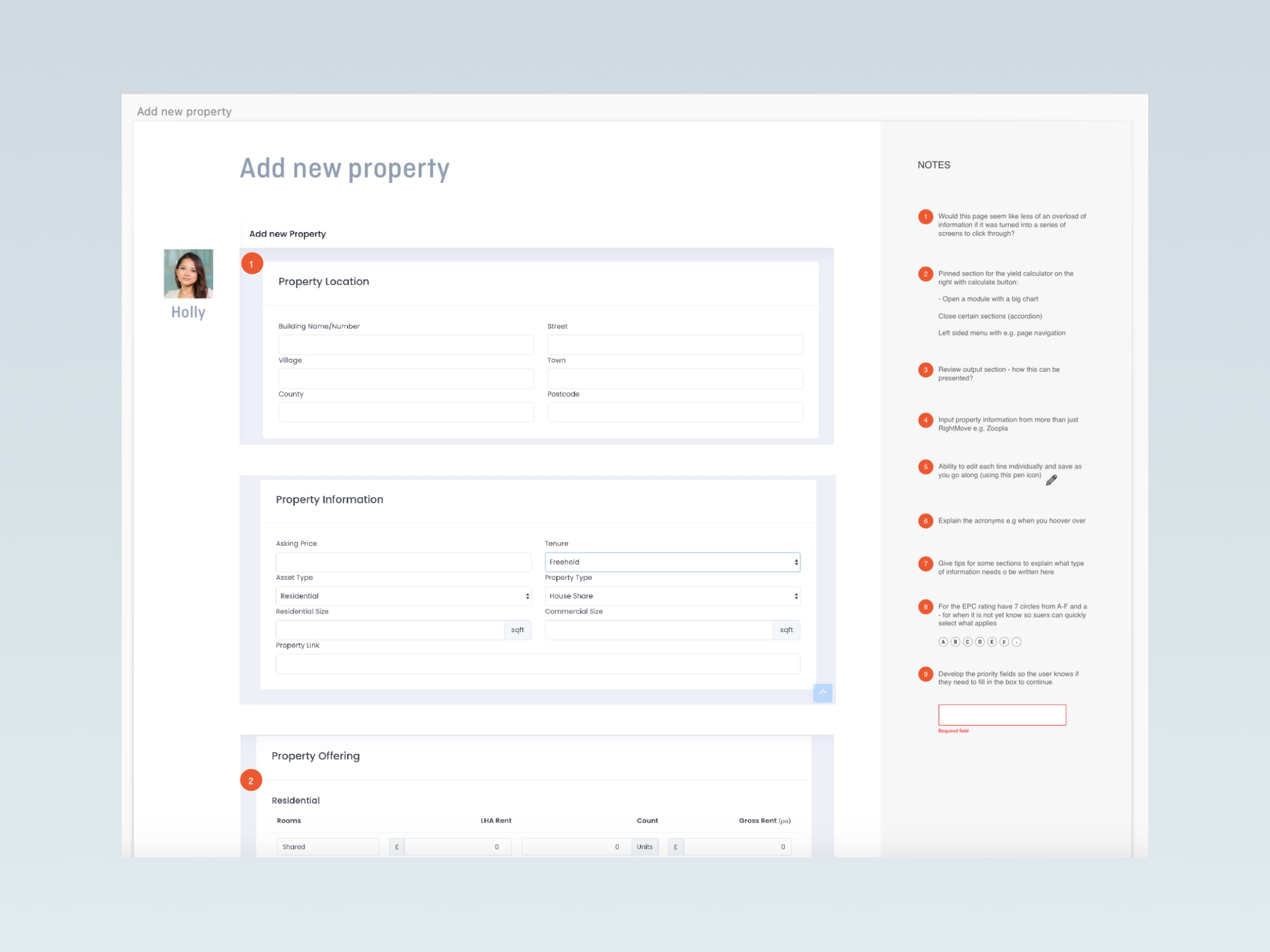
- Supporting screenshots or annotations: Visual aids can be extremely helpful in illustrating each issue, especially for cross-functional teams.
A well-structured report provides a solid foundation for UX and design teams to understand the scope of usability issues and confidently prioritise solutions, allowing those to develop a clear roadmap with concrete steps to a final product. Following up with these insights and iterating based on both heuristic findings and subsequent user testing often yields significant improvements.
Practical benefits of heuristic evaluation in usability audits
As we’ve already discussed, heuristic evaluation is a powerful tool for pinpointing usability issues early on, which can save you both time and money in the long run. Its particularly useful when you need quick, actionable insights without the extensive commitment that user testing might require.
Efficiency
Compared to traditional usability testing, which can be time-consuming and costly, heuristic evaluation allows you to identify key usability issues in a fraction of the time no matter which design phase you’re in. It’s a great method for conducting a quick usability audit, especially when resources are limited or when you’re working with a tight project timeline.
You also don’t need a large sample size to get valuable feedback. A small team of experienced evaluators can offer meaningful insights, which means it’s easier to conduct and implement than running extensive user tests.
Early usability insights
One of the most powerful aspects of heuristic evaluation is its ability to uncover common usability issues before they become major blockers down the road. Because it’s based on expert judgement rather than direct user interaction, issues that may be overlooked in early stages are flagged early, giving you a chance to improve the design before any user testing or development takes place.
Catching these problems early means fewer iterations down the line and a smoother, more effective user experience by the time the product is ready for release.
Impact on design decisions
Heuristic evaluation provides tangible, actionable feedback that can directly influence design decisions.
The feedback you receive through heuristic evaluation is invaluable when refining the overall user experience. It can inform decisions about layout, structure, and the finer details that make a product more intuitive. With heuristic evaluation insights, your design team can prioritise changes that will have the greatest positive impact on user satisfaction and usability.

Common challenges and pitfalls of heuristic evaluation
While UX/usability audits are a a useful tool, it’s important to be aware of the potential challenges that come with it.
Subjectivity and bias
One of the key challenges with heuristic evaluations is the inherent subjectivity of the process. Evaluators will bring their own experiences and biases to the table, which can affect how they perceive and rate usability issues. An experienced evaluator may flag something as a major issue, while a less experienced one might overlook it entirely.
To mitigate this, it’s helpful to involve multiple evaluators with diverse backgrounds, as this can help balance out individual biases. Additionally, using a well-defined set of heuristics (like Nielsen’s 10 Usability Heuristics) can help standardise the evaluation process and minimise the impact of personal bias on the results.
Limitations without user involvement
While heuristic evaluation is highly effective at identifying potential usability issues, it doesn’t provide the same level of insights as user testing, which involves observing real users interacting with the product. Without the input of actual users, it’s possible to miss critical user pain points or misunderstand how users interact with the interface.
That’s why heuristic evaluation should not be seen as a replacement for user testing, but rather as a complementary tool.
Applicability across projects
Another consideration is that heuristic evaluation isn’t always the best fit for every project. Some issues may only surface through more specific user behaviours, which could be difficult for evaluators to predict.
Similarly, if a design is still in very early concept stages, it may not be possible to evaluate heuristically with enough detail. For these types of projects, user testing or prototyping could be a more effective option for getting actionable insights. As always, understanding the context of your project and its stage will help you determine whether heuristic evaluation is the right method.
Last thoughts
In summary, heuristic evaluation serves as a valuable tool in any UX designer’s toolkit, offering quick, expert-driven insights into usability problems that can significantly improve the user experience. It’s an efficient method for identifying issues early in the design process, often before more extensive user testing is conducted, and is particularly useful for flagging obvious flaws in interface design.
While it has its limitations—such as the potential for evaluator bias and the absence of direct user feedback—its benefits far outweigh these drawbacks when used alongside other testing methods. By focusing on well-established heuristics, you can quickly assess and address usability concerns, streamlining the design process and enhancing your product’s overall user experience. This approach not only supports improved user satisfaction but also helps reduce bounce rates, reduce cognitive load, increase engagement, and boost conversion rates, ultimately contributing to key business metrics and product success.
At Full Clarity, we specialise in conducting heuristic evaluations and usability testing for a wide range of projects. With our expert team, we can provide you with the actionable insights you need to improve your design and user experience. Whether you’re looking to identify usability issues early on or fine-tune an existing interface, we’re here to support your UX strategy with in-depth evaluations that make a real difference.

Find out more
If you’d like some support with your UX design process, or need usability experts to conduct heuristic evaluations for your product, please don’t hesitate to reach out.


