

What is colour theory in UI design?
Building a foundation in colour theory is the first step towards mastering UI colour best practices. Colour theory in UI design involves understanding how different colours interact and how they can be combined to create interfaces that are both functional and aesthetically pleasing. It’s about choosing colours that not only look good together but also enhance usability and accessibility. If you can leverage colour theory well, you’ll be able to create a harmonious UI colour palette that guides users’ attention and improves their user experience. Colour theory encompasses several key components, including the colour wheel, colour harmony, and the psychology of colour. Now, we’ll break these down to understand how they each contribute to colour theory in UI design.
Understanding the colour wheel in UI design: Creating harmonious UI colour schemes
The colour wheel is an essential tool in UI UX colour theory – it provides a visual representation of colours arranged by their ‘chromatic relationships.’ Developing an understanding of these relationships and how to use the colour wheel effectively can help designers create visually appealing and functional interfaces. If you’d like to test it out for yourself, you can find various online tools that demonstrate the colour wheel in action and allow you to play with colours to identify your favourite shades/palettes – here’s a link to Figma’s online colour palette generator.
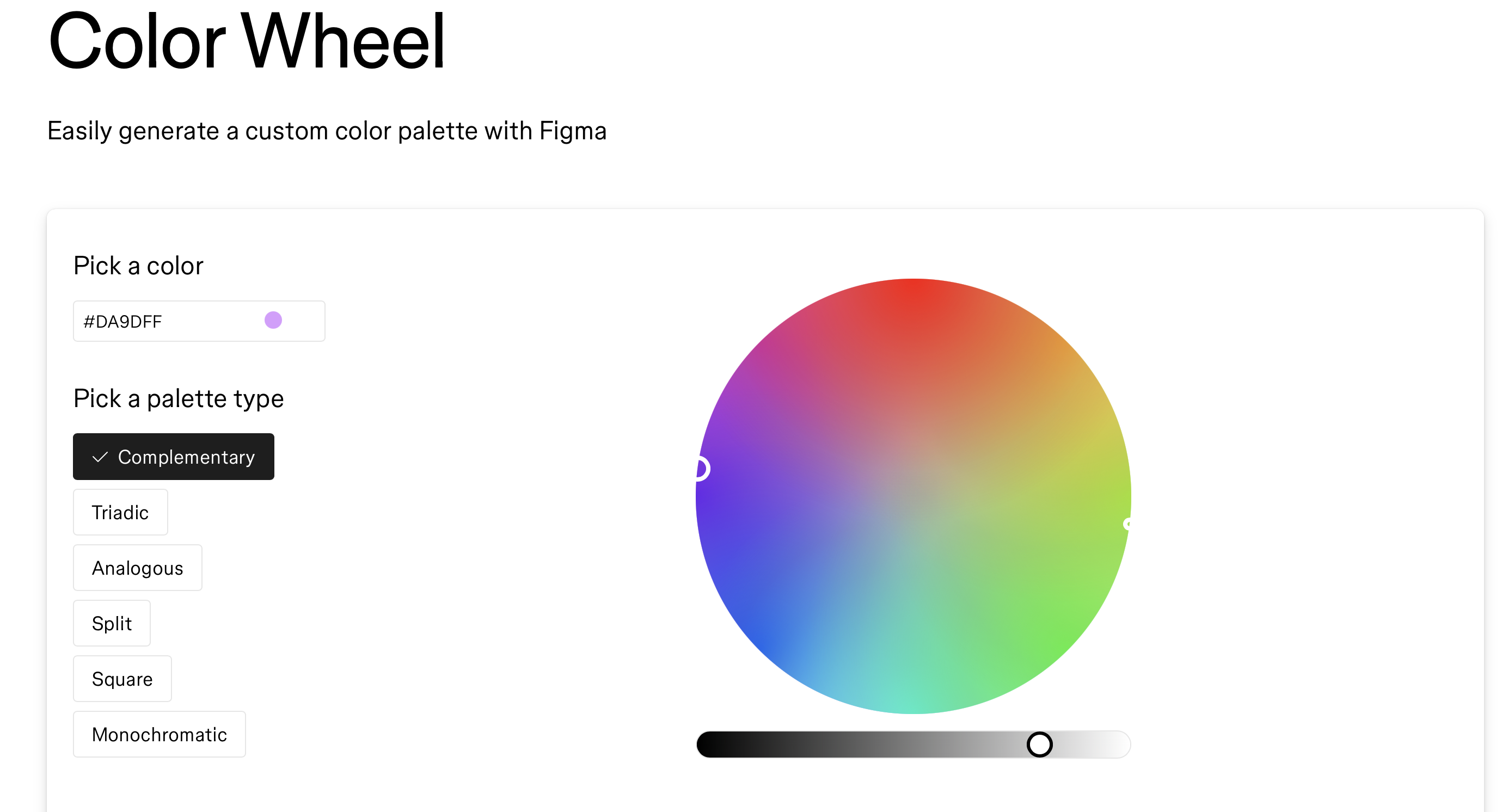
The colour wheel includes:
- Primary Colours: Red, blue, and yellow.
- Secondary Colours: Green, orange, and purple (created by mixing primary colours).
- Tertiary Colours: Colours formed by mixing a primary and a secondary colour, such as red-orange or blue-green.
Using the colour wheel, designers can develop ‘harmonious’ colour schemes that work well for UI and UX design. Some examples of the best colours for user interfaces include:
- Analogous Colour Scheme: Utilises colours adjacent to each other on the colour wheel, creating a harmonious and soothing effect e.g Green, yellow-green, and yellow.
- Complementary Colour Scheme: Pairs colours opposite each other on the wheel, offering high levels of contrast and making elements stand out. E.g Blue and orange.
- Triadic Colour Scheme: Employs three colours evenly spaced around the wheel, providing a balanced yet vibrant palette. E.g Red, yellow, and blue.
- Split-Complementary Colour Scheme: Uses a base colour and two adjacent colours to its complement, offering strong visual contrast with less tension. E.g Blue, yellow-orange, and red-orange.
- Monochromatic Colour Scheme: Monochromatic schemes involve different shades, tints, and tones of a single colour, creating a cohesive and elegant look. E.g Various shades of blue.
Using the colour wheel (in combination with an understanding of the basics of colour theory) can help you find the perfect colour palette for your UI. Experiment with the colour wheel to see how different colours interact and blend together – after some testing, we’re sure that you’ll come up with some beautiful colour combinations.
The psychology of colour: Influencing user emotions
When using the colour wheel to craft your UI colour palette, you should try to consider how different colours on the wheel can make us feel as the end-user and how these feelings might affect the success (or failure) of your design. ‘Colour psychology’ suggests that certain colours can evoke certain feelings/reactions in people, so building an understanding on how you can use each of these colours to your advantage is worthwhile. Here’s a barebones summary of how each colour can be used to evoke each feeling:
- Red: Conveys urgency and excitement, ideal for call-to-action buttons.
- Blue: Evokes trust and calmness, suitable for corporate and financial platforms.
- Green: Symbolises growth and tranquility, perfect for wellness and finance apps.
- Yellow: Represents energy and attention, good for highlighting important information.
- Purple: Suggests luxury and creativity, often used in premium or creative designs.
- Black and White: Black signifies sophistication; white conveys simplicity. Together, they create a timeless look.
Selecting colours based on their psychological impact can enhance user engagement and create a more intuitive interface.
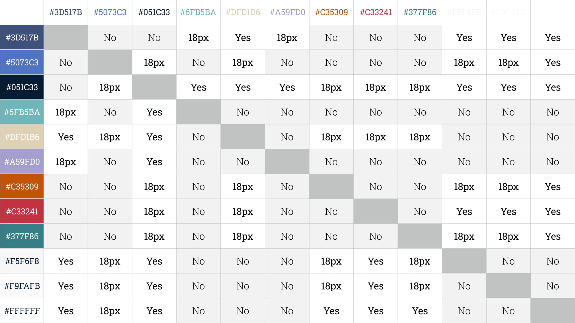
Importance of colour contrast: Ensuring readability and colour accessibility
Moving on to accessibility, it’s vital that written content on interface applications can be easily read and accessed by a range of users with different vision capabilities. So, what is the process for determining the extent of accessibility? Leaving text style aside for a moment, defining the contrast between the background colour and the text colours is a primary consideration for best practices in UI.
To determine accessibility, an equation is used to calculate the contrast between two different colours. The resulting score can then be grouped into a colour contrast ranking order. There are 4 levels in the ranking order: Fail, AA+, AA, and AAA.
To achieve optimum readability, it is recommended that colour contrast should pass a score between 4.5 and 7.0 (AA to AAA). To put these colours to the test, we use tools such as Colorable, Able, and Contrast Checker, which will produce a colour contrast score by using foreground and background hex (colour) codes. Using tools like these can help you avoid some of the common accessibility issues that designers can encounter and ensure that your UI interface is accessible.
Colour and visual hierarchy: Organising elements for user clarity
When discussing best practice in UI design, ‘visual hierarchy’ is another topic that should also be considered. Visual hierarchy refers to the organisation of elements in accordance with their importance. Achieving a balanced visual hierarchy not only reduces cognitive load for the user but increases the task completion rate while creating a smoother and more enjoyable user experience.
The squint test is a simple way to assess the visual hierarchy of your interface. To carry out the squint test, take a step away from your designs and squint your eyes so that the page appears fuzzy. The purpose of this is to check that you’re seeing the most important elements first, the second most important elements second, and so on.
The most important elements are often referred to as primary calls to action. The forward progress buttons, such as ‘sign up,’ ‘post,’ or ‘compose email,’ are examples of these primary calls to action. A primary call to action should be the element that stands out the most on the screen, and, if it’s not, some reshuffling is needed.
To ensure that the primary call to action is drawing the most attention on the page, it is best practice to use high-contrasting colours (we aim to achieve a colour contrast rating of AA/AAA). Inserting brand colours into the primary call to action is also a good technique, although we’re careful not to overuse the brand colour. We believe that finding the right balance between all of the elements on the screen is key.
The second most important elements are often referred to as secondary calls to action. Examples include ‘cancel,’ ‘edit,’ ‘skip,’ or ‘filter.’ We will frequently place several secondary calls to action on one screen, while a single forward progress button is reserved for the primary call to action.
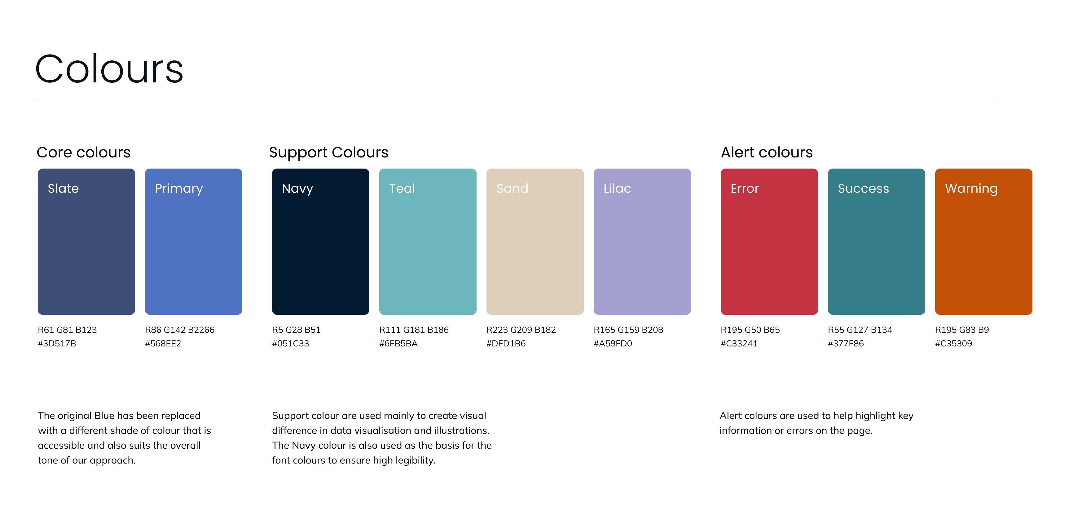
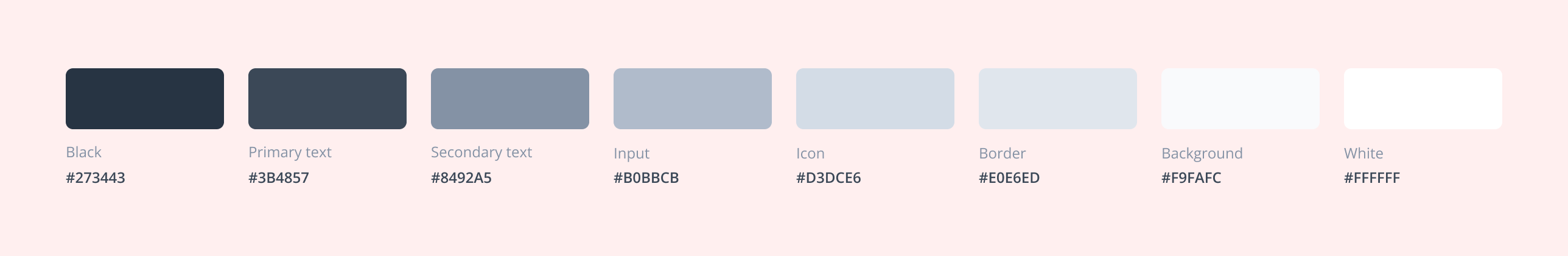
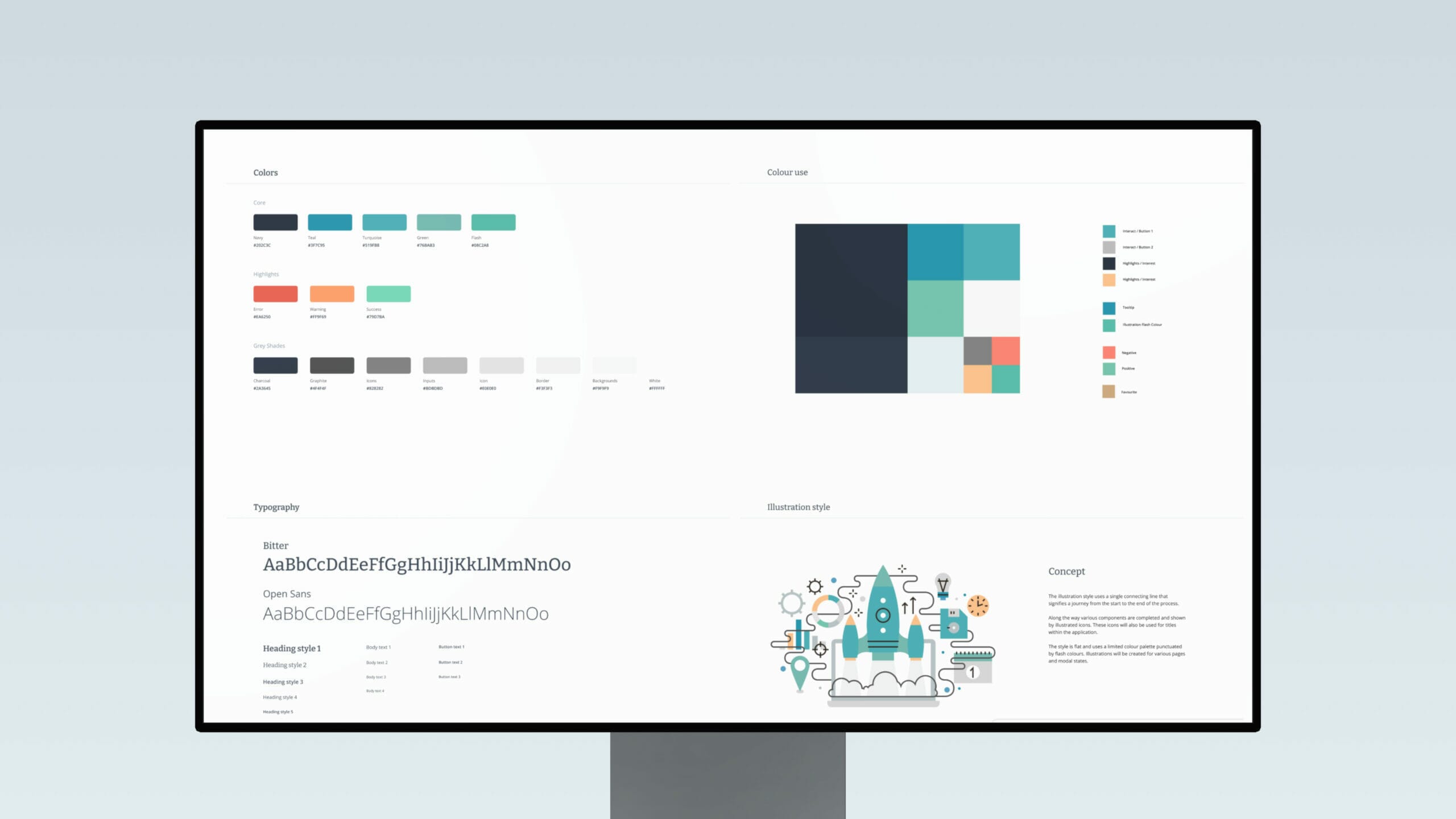
50 shades of grey: mastering neutral tones for modern UI design
User interface designers love to use many variations of grey in their designs, whether that be for dark text, icons and other design elements, light backgrounds, or dividers. This is particularly true for interfaces that heavily feature user-generated content, such as Facebook and Twitter. So, due to its prevalence in design, learning how to use grey effectively is a crucial aspect of understanding UI colour best practices.
Mastering the grey colour palette on your user interface can provide the perfect platform for ‘white-labelling’ (the ability to put someone else’s logo on it and make it feel like part of their brand). Furthermore, finding the right combination of grey tones can accentuate your brand colours and primary CTAs while providing a modern and timeless feel to a product.
At Full Clarity, we aim to come up with 3-5 different grey colours when designing our user interfaces. We find that sticking to a solid and strict system that organises grey colours creates a more efficient and effective design process.
We never use a fully desaturated grey on a coloured background, as this can make the tone look unnatural and flat. As an alternative, we often use the same hue and then tone down the darkness or opacity to create a good colour match between grey and coloured elements. To keep our palette consistent and complementary, we slightly alter the brightness and saturation of existing primary and secondary colours to produce darker and lighter greys for the design.
Perfecting shadows: Adding depth and interactivity to UI elements
Shadows, another crucial element to UI design, have been used in UI design since the early days. Shadows make elements leap off the screen, creating visual cues that give the user the idea that they can interact with the element in a specific way. For example, users will assume that an inverted shadow is an input field and therefore information is required from them. In addition, elements that appear raised suggest to the user that they could be pressed down. We often see this technique being implemented into buttons.
Implementing shadows into the user interface not only allows the user to better understand and navigate through a product but also speeds up onboarding times, increasing the efficiency of an application.
When it comes to perfecting shadows on user interface elements, it’s a good idea to revert back to basics by following the principle that light comes from above and naturally casts a shadow downwards.
We avoid pure grey not only on our elements but on our shadows as well. Instead of the default grey tone, we add a tone from a neutral colour palette to the shadow. This gives it more of an organic appearance. If an element is coloured, we might also try inserting that colour into its shadow for an even more realistic look.
While adding shadows can be fun and stimulate visual interest for your user, it’s important to remember that adding shadows and gradients to elements has drifted in and out of UI trends for years. We like to make sure that our shadows are applied subtly and are not overused, as this can make any interface look slightly outdated.
Finally, adding a lighter shadow gradient onto an element is likely to reduce its colour contrast. Therefore, it’s important to check the colour contrast rating to ensure that the content has passed the AA standard.
The 60-30-10 rule in UI design: Balancing colour usage for effective design
Finally, the 60-30-10 rule is another classic design principle that you can use to help create balanced and visually appealing interfaces. It suggests that you should divide your colour palette into three parts:
- 60% of a dominant colour (typically for the background)
- 30% of a secondary colour (for elements like navigation, headers)
- 10% of an accent colour (for primary calls to action or highlights)
This rule is effective because it creates a sense of balance and harmony in the design and simplifies the process of choosing your UI colour palette. By limiting the use of colours, it prevents the interface from becoming too chaotic or overwhelming and mitigates the risk of cognitive overload. The dominant colour sets the tone and provides a consistent backdrop, the secondary colour adds variety and interest, and the accent colour draws attention to the most important elements.
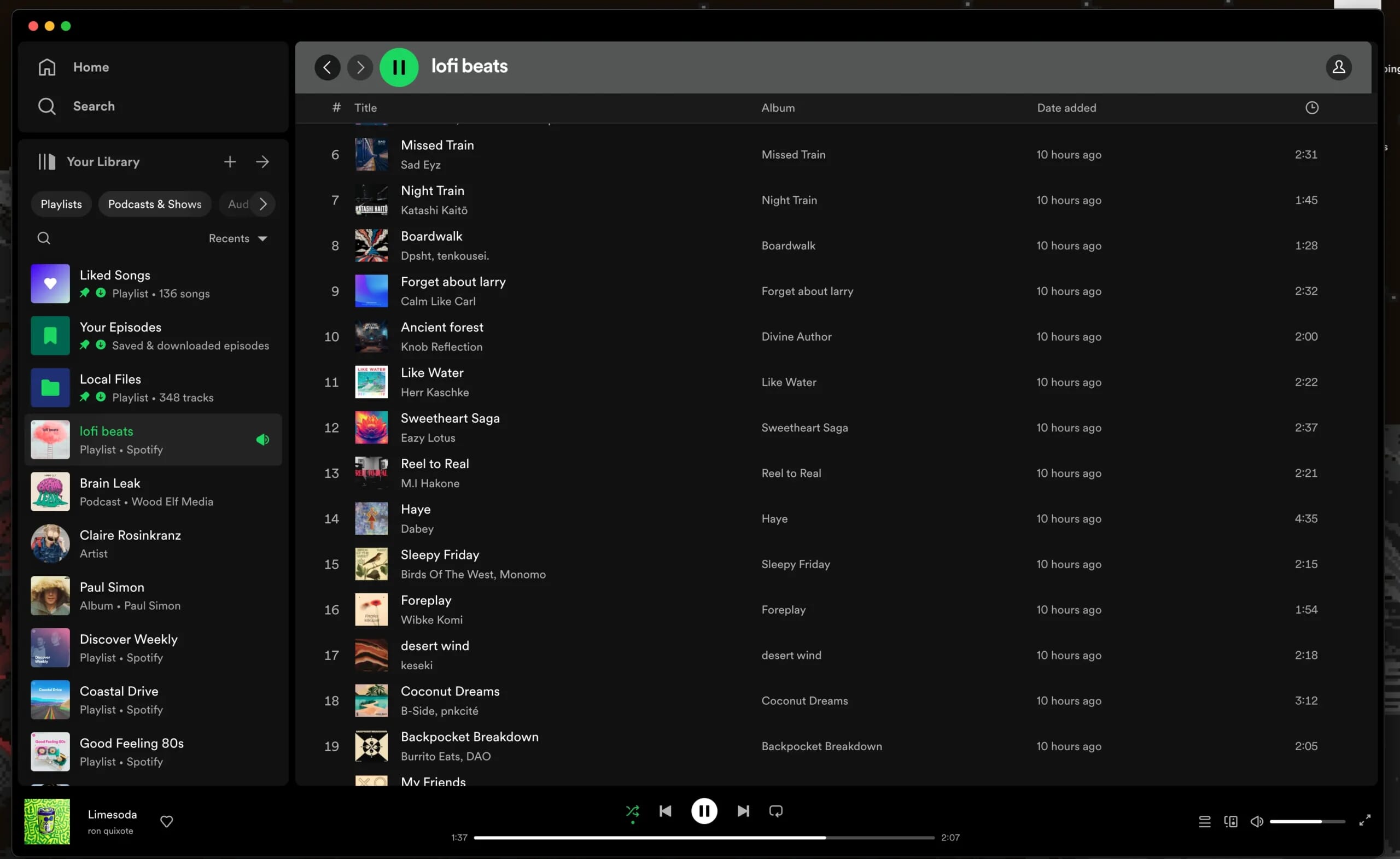
One popular example of a brand that effectively uses the 60-30-10 rule is Spotify. Their UI design features a dominant background colour (black), a secondary colour for navigation and headers (greys), and an accent colour for calls to action (green.) This creates a clean and organised look that enhances usability. Bear this rule (and the example of Spotify) in mind when designing and you might find it easier to craft an attractive and compelling design.
Find out more
If you need help with crafting the perfect UI interface for your project, or want to learn more about how to optimise your UI platforms, please do get in touch.
All of our projects are built off a UI design system – you can see some examples of our work here.

