What is responsive design?
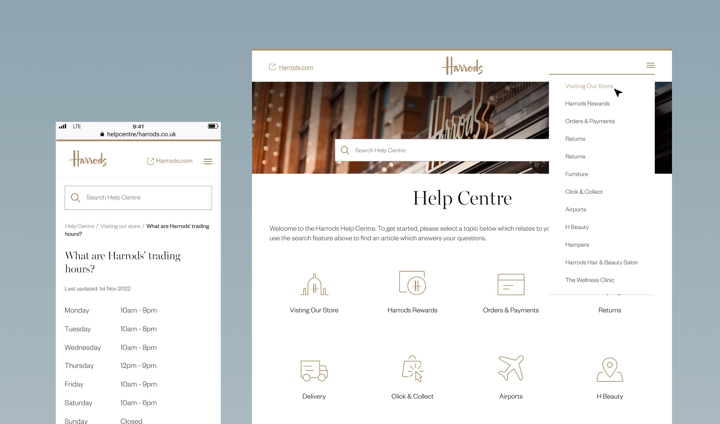
Responsive design is an approach to web and user interface design that allows layouts, images, and content to adjust automatically based on the user’s device, screen resolution, and orientation. Instead of designing for fixed widths, we design fluid frameworks that expand or contract gracefully.
The core principles behind responsive design include:
- Fluid grids: flexible layouts built using relative units rather than fixed pixels.
- Flexible images and media: visuals that resize and scale within their containers.
- CSS breakpoints: predefined thresholds that trigger layout changes for different screen widths.
- Mobile-first design: starting from the smallest screens to ensure clarity, simplicity, and performance before scaling up.
Together, these elements ensure that the user experience feels natural and consistent, whether viewed on a phone, tablet, laptop, or widescreen display.
